How to Make a Template for Encelade Presentations 2026
Your team probably has a deck called “Final Sales Deck.” There’s also “Final Sales Deck v2,” “Latest Sales Deck,” and the one a rep copied six months ago and never updated. One has the current logo. One has the old pricing slide. One breaks the moment someone pastes a screenshot into it. All of them claim to be the template.
That mess doesn’t slow revenue teams down only at the design layer. It creates messaging drift, stale metrics, and avoidable review cycles. Sales reps waste time fixing slide spacing. Solutions engineers rebuild technical diagrams from scratch. Marketing updates brand rules in one file while customer-facing teams keep presenting from another.
A real template solves a different problem than often believed. It isn’t just a set of approved colors and slide backgrounds. A template is a pre-structured layout that standardizes recurring content and leaves room for the parts that change, which is why it makes repetitive production faster and less error-prone, as noted in this fact-sheet template guide on reusable document structure.
For presentation teams, that means building a system, not a file. The system needs fixed brand rules, repeatable slide logic, clearly defined placeholders, and room for dynamic content like charts, live metrics, embedded product views, and account-specific details. If your team is still shipping static attachments, it’s worth looking at a PowerPoint alternative for B2B teams built for web-native presentation workflows.
When people ask how to make a template, they usually mean, “How do I stop every deck from turning into a custom project?” That’s the right question. The answer starts with structure, then moves into governance, interactivity, and automation.
Table of Contents
- Introduction: Why Your Old Templates Are Holding You Back
- Designing Your Template’s Brand System
- Building Your Core Theme and Layouts in Encelade
- Supercharging Your Template with Live Data and Interactivity
- Deploying Your Template for Scale and Automation
Introduction: Why Your Old Templates Are Holding You Back
Most old templates fail for a simple reason. They were built as design artifacts, not operating systems.
A legacy slide master can lock in a title position and a footer style, but it can’t tell a rep which proof point belongs on a discovery recap, which chart belongs in a quarterly business review, or how a solutions consultant should present product capabilities without pasting in static screenshots. It gives you surfaces. It doesn’t give you decisions.
That gap shows up fast in revenue work. Teams build one “master” deck for every use case, then duplicate it until nobody knows which version still reflects the current story. The template becomes a dumping ground instead of a repeatable method.
Why a slide library is not a template
A slide library is helpful. It gives people examples. But examples alone don’t create consistency.
A usable presentation system needs three things working together:
- Fixed standards: Brand elements, spacing rules, approved layouts, and naming conventions must stay stable.
- Controlled flexibility: Reps need room to tailor the story for a prospect, region, or use case without breaking the deck.
- Dynamic inputs: Some content should update from source systems instead of being manually copied each time.
Old templates break because they ask people to remember the rules instead of encoding the rules into the presentation itself.
That’s why “how to make a template” is really a workflow question. The right build reduces judgment calls on routine work and preserves judgment for high-value work, like tailoring the narrative to the buyer.
The six parts that matter
Modern presentation templates work best when they combine design structure with delivery logic. That’s especially important in browser-based decks where content can be interactive, data-driven, and shared by link instead of attachment.
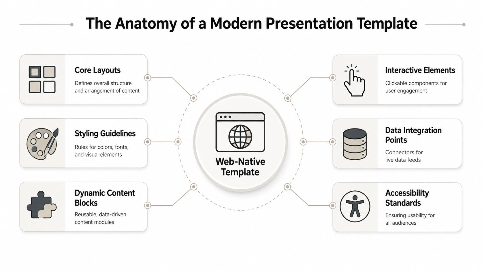
Think of the system as six connected parts:
| Component | What it does | What happens if you skip it |
|---|---|---|
| Core layouts | Defines repeatable slide structures | Every author invents their own composition |
| Styling guidelines | Locks color, type, and visual hierarchy | Brand drift shows up immediately |
| Dynamic content blocks | Creates reusable modules for repeated stories | Common slides get rebuilt every time |
| Interactive elements | Supports clickable demos and guided exploration | The deck stays passive |
| Data integration points | Connects charts and metrics to live sources | Numbers go stale |
| Accessibility standards | Keeps content readable and usable | Good information becomes harder to consume |
A static deck usually starts with appearance. A scalable template starts with content architecture. That’s the shift commonly missed.
Designing Your Template’s Brand System
If you open the editor before defining the rules, you’ll build a deck that looks good once and falls apart under team use.
Brand systems sound abstract until you watch five people build five “on-brand” slides that all look different. One uses dark navy headers, one uses black, one centers everything, one adds shadows, and one shrinks the logo until it’s unreadable. None of them are wrong in isolation. Together, they erode trust.
Start with rules, not slides
Your brand system needs to answer practical questions that creators hit every day.

Start by defining four categories:
- Color roles. Don’t just list brand colors. Assign jobs to them. Decide which color is for primary headings, which supports charts, which marks alerts or callouts, and which should never appear behind body text.
- Type hierarchy. Write down which styles exist and what each is for. Heading, subheading, body, caption, stat callout, footnote. If your team has to choose font sizes from memory, they’ll make different choices.
- Spacing behavior. Set grid logic and padding rules. Define how far text sits from the edge, how much white space belongs between sections, and what alignment defaults are allowed.
- Logo and asset usage. Specify approved lockups, minimum display size, dark-mode variants if needed, and where logos don’t belong.
Practical rule: If a designer can’t hand your style guide to a sales rep and get a predictable result, the guide is still too vague.
One overlooked lesson from physical template making applies here. DIY guidance often focuses on tracing an outline but ignores fit tolerance, even though professional templates need exact labeling and attention to cumulative error to avoid downstream mistakes, as discussed in this video on template accuracy and labeling. Presentation systems have the same problem. A few small alignment choices that are “close enough” on one slide turn into a deck that feels sloppy by slide twelve.
Build a one-page system your team can follow
You don’t need a massive brand manual to build a strong presentation template. You need a one-page operating sheet that creators can use.
Include items like these:
- Approved text styles: Heading, body, quote, data label, and annotation.
- Chart defaults: Which colors map to primary series, comparison series, targets, and exceptions.
- Image treatments: Corner radius, crop behavior, border rules, and whether captions are required.
- Component naming: Use labels that make sense under deadline pressure, such as “Customer Quote Hero” or “Two-Column Proof Layout.”
- Placeholder instructions: Tell users what belongs in each field. “One-sentence outcome statement” is better than “Text.”
A good test is whether a new team member can build a clean customer-facing slide without opening another deck for reference. If they can’t, your system still depends on tribal knowledge.
Building Your Core Theme and Layouts in Encelade
The fastest way to build a weak template is to start from decorative slides. Start from recurring sales conversations instead.
A quarterly business review is a useful example because it combines narrative, proof, and data. The presenter usually needs an opening summary, a recap of goals, current performance, a few problem areas, and a forward plan. That pattern repeats across accounts. The details change. The structure doesn’t.
Build around a sales conversation
A well-structured expert-report template follows a fixed sequence. It identifies the questions posed, lists the facts considered, explains the methodology, and then maps opinions back to sources because that structure improves reliability and makes outputs easier to audit and compare, according to these guidelines for writing an expert witness report.
The same logic works for presentations. Revenue decks perform better when each layout has a job in the story.
For a core presentation theme, build these foundations first:
- Title layout: For meeting name, account, presenter, and context.
- Section divider: For transitions between narrative blocks.
- Text and media layout: For capability explanation, customer stories, or implementation snapshots.
- Data layout: For charts, KPIs, or trend discussion.
- Proof layout: For testimonials, analyst commentary, or technical validation.
- Closing layout: For decisions, next steps, or action items.
Here’s the software view that turns those ideas into reusable assets.
Create the layouts your team actually reuses
A lot of template projects fail because they include every possible slide type. That feels thorough. It also makes adoption worse.
Keep the first version lean. Build the layouts your team uses every week, not the edge-case slide that appears twice a year. In a browser-based editor, define the theme first, then build the reusable slides — title, data, proof, closing — with example content the next person swaps out for text, images, charts, and embedded modules. If your team wants to drive this programmatically, Encelade’s API documentation is the right place to validate setup steps.
Use a short decision filter before adding any layout:
| Question | If the answer is yes | If the answer is no |
|---|---|---|
| Does this slide support a recurring stage in the sales process? | Add it to the template | Keep it in a separate library |
| Does the team use it across segments or regions? | Standardize it | Leave it custom |
| Can placeholders guide content quality? | Turn it into a layout | Keep it freeform |
Use placeholders to control flexibility
The fill-in content is where a template stops being a design file and starts acting like a system.
Write each fill-in area with intent, not content type. “Customer challenge in one sentence” is better than “Body text.” “Primary proof metric” is better than “Number.” “Clickable product view” is better than “Embed.”
That approach helps in two ways:
- It improves authoring speed. People don’t have to decide what the slide wants from them.
- It improves review quality. Managers can spot weak content faster because each field has a purpose.
Don’t give the field team unlimited flexibility. Give them the right boundaries.
If a layout is too rigid, people stop using it. If it’s too loose, it stops being a template. The sweet spot is a structure that guides the story while leaving room for account-specific substance.
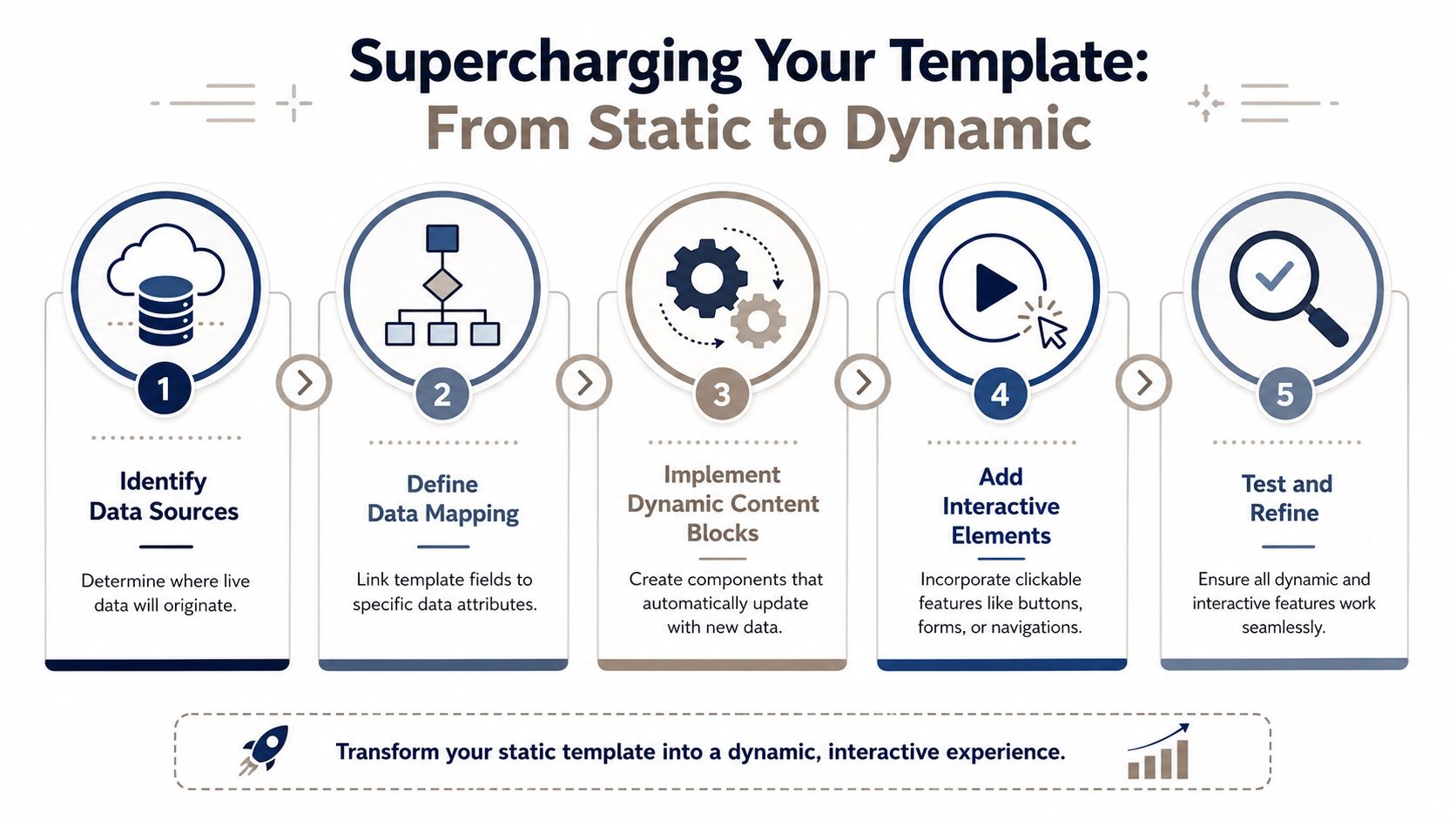
Supercharging Your Template with Live Data and Interactivity
This is when a presentation template becomes more than a formatting system.
Static decks force teams to choose between speed and freshness. If a rep copies data into slides manually, the deck can be customized quickly but drifts out of date. If they wait for a polished report, the moment passes. A dynamic template removes part of that trade-off by designing live inputs into the layout from the start.
Make data readable before you make it live
Modern template design is increasingly driven by data presentation. Guidance on statistical infographics recommends visual patterns such as icons, bold numerals, descriptive headers, and chart-based layouts, and it advises grouping statistics by topic, key information, or region. That reflects the broader shift from one-off reports to reusable structures for analytical communication, as described in this resource on designing statistics infographics.
Before you connect a chart to a spreadsheet, decide how the information should be read:
- Lead with the takeaway: Put the conclusion above the chart, not buried in speaker notes.
- Use descriptive headers: “Pipeline by region” is better than “Performance.”
- Segment related stats: Group by business question, geography, or motion so the slide scans quickly.
- Reserve bold numerals for the few values that matter most: If every number shouts, none of them does.
A quarterly business review layout might include a headline metric row at the top, a trend chart in the center, and a short interpretation block on the side. The structure stays fixed while the data source updates.
Add interaction where it changes the conversation
Interactivity is useful when it helps the buyer explore something they care about. It’s noise when it exists only to look modern.
A few high-value examples:
- Live chart blocks: Connect a chart to a live source — a Google Sheet, HubSpot, Stripe, or Google Analytics — so the numbers come from the source instead of being pasted in by hand. This works well for usage reviews, adoption snapshots, and territory performance discussions.
- Interactive maps: A standard map, a 3D globe, or a dotted region map is useful when territory, region, or account distribution changes the story.
- Product model embeds: If your product has a physical form factor or spatial context, a native 3D model can explain more than three static screenshots.
- Device or UI mockups: Helpful for walking through workflow changes without leaving the deck.
Here’s the operational point. Don’t add a widget because the platform supports it. Add it where the rep normally says, “Let me switch tools and show you.”
A strong interactive slide removes a context switch during the meeting.
That’s also where a web-native platform such as Encelade’s presentation API for programmatic deck generation fits into the larger system. It lets teams map structured inputs to presentation outputs so recurring decks can be generated from data and content sources instead of assembled by hand.
Versioning, permissions, and API workflows
Once a template includes live data and interactive blocks, governance matters more.
Treat the template as a shared product with release discipline:
- Version the master: Document what changed in the theme, layouts, and data connections.
- Separate editors from users: Brand and enablement owners should control the master. Field teams should create new decks from it.
- Test data connections: A broken chart connection is worse than a blank slide because it looks authoritative.
- Create fallback behavior: Decide what appears when data is missing, delayed, or incomplete.
If your team wants personalized decks on demand, generate them through the presentation API from your structured inputs — notes, spreadsheets, and exports — and connect the charts to live data sources, rather than hand-assembling one-off presentations. That’s what makes automation stable. The template becomes the contract between your design system and your data systems.
Deploying Your Template for Scale and Automation
A template only creates value when the team can use it repeatedly without breaking it.
That sounds obvious, but many companies finish the design work and ignore distribution. Then reps keep working from old exports, regional teams fork the master, and operations loses control of what customers see.
Govern the master without slowing the field
Good governance doesn’t mean centralizing every edit request. It means deciding which parts are fixed and which parts are variable.
Use a simple ownership model:
| Asset type | Owner | What should stay locked |
|---|---|---|
| Theme | Brand or design ops | Colors, typography, logos, spacing rules |
| Core layouts | Enablement or presales leadership | Placeholder structure, approved modules, narrative flow |
| Instance decks | Sales reps, solutions engineers, marketers | Account-specific content only |
That split prevents the most common failure mode. Teams shouldn’t edit the master just to change customer details. They should create new decks from the master and fill the intended fields.
For teams that still need static deliverables, keep export paths available. Some stakeholders will want PDF or PPTX files for procurement, archives, or offline circulation. That’s a format requirement, not a reason to build the whole system as a static file.
Treat the template like an operating asset
For technical and scientific opinions, the most defensible templates document reliability markers such as testability, peer review or publication, known or potential error rate, operational standards, and general acceptance. They also benefit from recording key assumptions and tooling so the process is transparent and repeatable, as explained in this guide to documenting reliable expert methodology.
Revenue teams can borrow that mindset without turning presentations into compliance documents.
Document the operating method behind your template:
- What inputs feed it: CRM data and notes, spreadsheets, product assets, approved messaging blocks.
- Who approves changes: Brand, product marketing, sales enablement, or solutions engineering.
- How it’s tested: Layout rendering, data mapping checks, export review, mobile review.
- When it’s updated: Product launch, messaging change, regional adaptation, or reporting change.
This is the shift that matters most when you’re learning how to make a template. You’re not creating a prettier deck. You’re creating a repeatable presentation engine that supports faster turnaround, tighter brand control, and cleaner buyer conversations.
If you want a practical way to turn raw notes, spreadsheets, CRM context, and live widgets into shareable web-native decks, Encelade is one option to evaluate. It’s built for teams that need structured themes, interactive presentation layers, and API-driven generation instead of another static slide file.