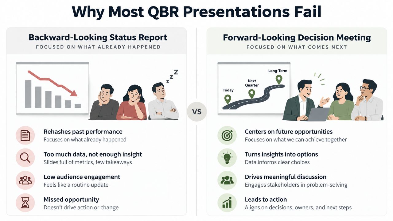
As your rep opens the case study deck, the prospect barely glances at the title slide. Slack wins the room. The deck is polished but is burdened with too much story and not enough proof. A strong case study presentation format helps your buyer quickly understand if your result is relevant to their problem. A strong case study presentation format does one job well, and that job is time efficiency.
The cleanest decks don't read like project recaps, and the best case study presentation formats ask and answer the most crucial questions. Finding the answer to those questions is what makes the claimed outcomes relevant and worth caring about. This type of format wins (especially when the room is full and the next meeting is already booked with five competing priorities).
Table of Contents
- Why Most Case Study Decks Fall Flat
- The Nine-Block Results-First Deck Structure
- Choosing One Slide Versus a Full Story
- Slide Density and the Attention Budget
- Turning Claims into Charts, Widgets, and Proof
- A Live-Data Rewrite of a Stale Case Deck
- A Pre-Send Checklist for Every Case Study Deck
Why Most Case Study Decks Fall Flat
A rep opens a stale PDF. The buyer's eyes start to glaze over before the second slide even finishes. This normally happens because the deck tries to tell the entire story instead of proving if the result can be reproduced in a similar scenario. With proof that's easy to scan, and hard to ignore, a strong case study presentation format wins.
What the deck should accomplish
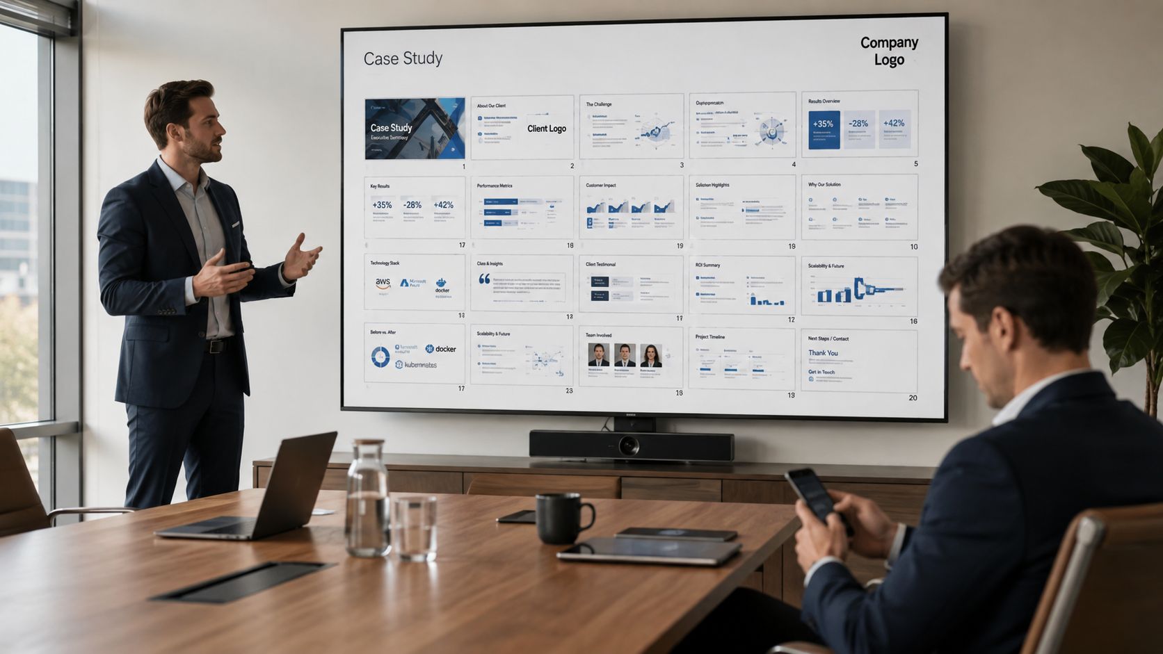
The best of decks act as a decision aid for revenue teams. The best decks provide clarity of proof, speed of scan, and a memorable narrative, in that order. A slide that doesn't help the buyer understand the problem, trust the result, or visualize the fit for their account adds no value.
The default design of most decks, unfortunately, suggests that audience members will act as readers, not as decision makers. Buyers do not want a detailed history of your company; they want to see the shortest, most direct path from problem to solution. This explains why the problem-solution-results format persists, and is the default ordering in most presentation guides. The key to great presentation design is accounting for that structure, as explained in Storytelling in Presentations. Slide assignments should be done with great care and consideration so that the design of the slides does not turn your presentation into a slide dump.
Practical rule: if a slide cannot be explained in one sentence, it needs to be cut, simplified, or split.
How to check your current deck
Start by checking three things. Does the deck articulate the buyer's problem using numbers instead of adjectives? Does each major claim contain a supporting visual? Is the answer to the question, "What is the result," easily understood by a busy stakeholder, without a lot of background?
If the answer was no to any of the three, it means the deck is set up to work against you. The critical test is straightforward. If your deck feels like a summary of work already done, it will likely read as self-indulgent. If your deck reads as a proof package that enables the buyer to make a decision, then it is doing sales work.
The Nine-Block Results-First Deck Structure
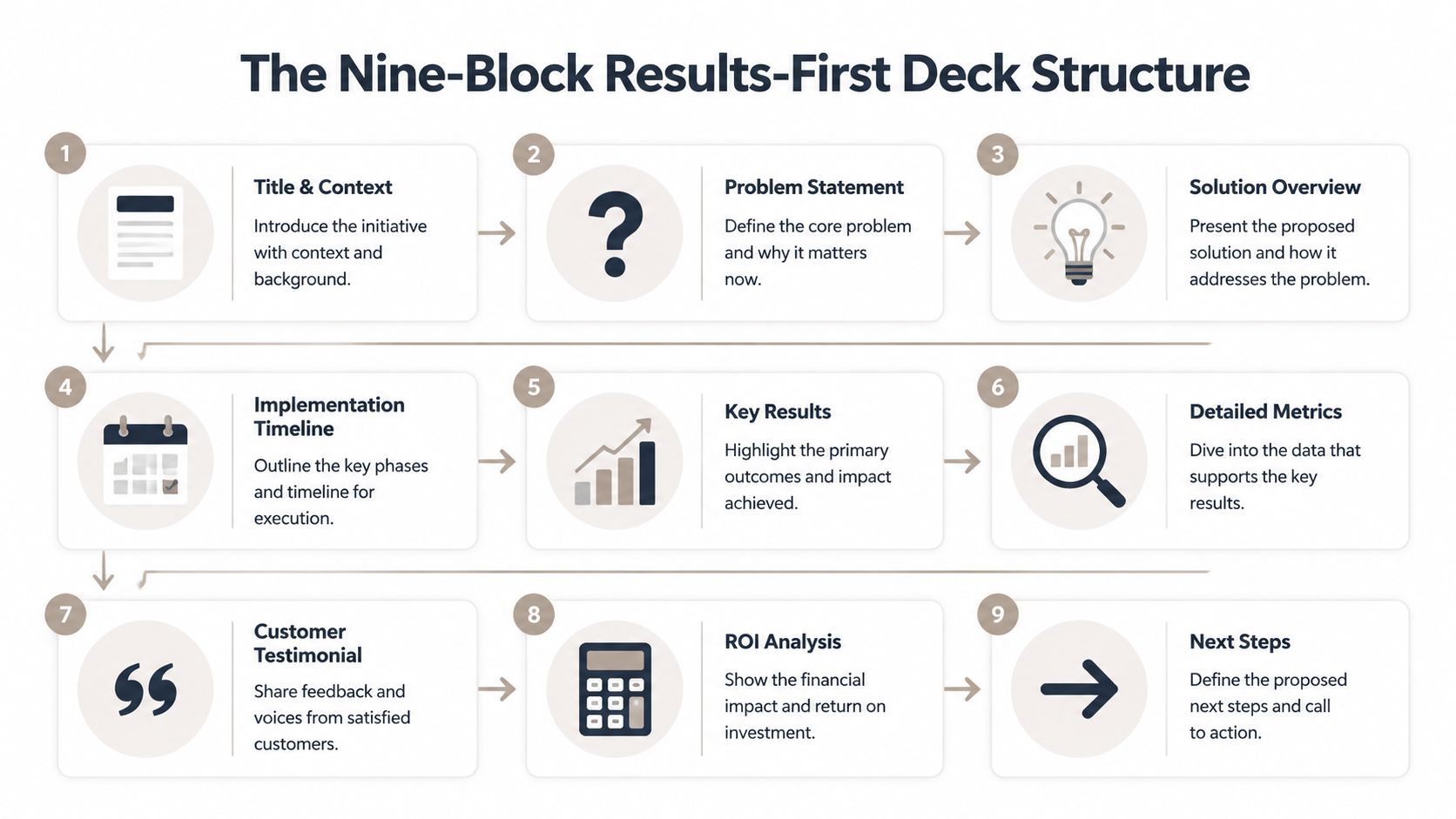
The best case study decks don't take equal space to cover each element of the story. Effective case studies tell a brief cyclical story, beginning with context, moving to hard evidence, and offering an obvious next step. For AE and SE teams, the most effective structure is a nine-block progression that focuses on a single engagement, a single buyer pain, and a single result. If you want to understand the narrative framing, our case study template that converts offers the same structure but does not include the slide design.
Blocks 1 through 3 establish context
Title and context of the deck should do more than just identify the customer. Your slide should inform the buyer what type of engagement this was and how this was important to this specific customer. A short subhead is helpful when a deck is forwarded and presented without any narration.
Problem statement works best when paired with a sharp metric, as succinct as you can make it. The buyer should recognize the problem and focus on the solution, not linger on the framing.
Solution overview should be concise. Two or three sentences, or a bulleted list, should describe the result and be offered as the solution.
Blocks 4 to 6 show the work and the evidence
Implementation timeline belongs here because buyers want to know if the outcome was a quick fix or a real rollout. A timeline is much easier to read than process notes buried in a paragraph.
Key results should get the most focus. Anchor a slide to a single engagement to represent a key result, and make this slide the most prominent. This will help your buyers understand the result of this account.
A multi-slide format only earns its keep if the deck needs more texture than a summary can provide. In that case, the next slide can hold detailed metrics, with the strongest chart first and the supporting data beneath it so the main takeaway stays visible.
Blocks 7 through 9 close the loop
Customer testimonial evidence of adoption and confidence should be used to provide comment cards; however, only include comment cards that contain results, not generic praise.
ROI analysis should be in the same format as the engagement. The result should describe the outcome in a value-add frame that the buyer can defend.
Next steps should make it easy for the buyer to continue the discussion, whether that is a deeper technical review, a stakeholder walkthrough, or a procurement-ready deck.
The quick audit is simple. If you can't give an individual block an explicit task, the deck is too verbose.
Choice of Slide or Case Study
Case study decks typically fail due to a mismatch between the slide count and the buying moment. Some teams squeeze an elaborate win into one page and forego the evidence a buyer needs. Others stretch a simple proof into a lengthy deck and lose people before reaching the end result. The appropriate format is a function of the audience, the stage of the deal, and the level of reinforcement needed for the claim.
One Slide Is Enough
A case study slide works great as a cold open, a recap email with a case study attachment, or as an executive summary within an extended pitch deck. It is appropriate when the buyer doesn't need a deep dive on implementation, but rather evidence of success with a similar client.
A one-slide study typically includes client name and industry, a one-sentence problem statement, a brief solution summary, and a couple of key result indicators. This shape fits the advice that a one-slide study captures a proof and is appropriate for quick discussions, whereas multi-slide studies are for extended discussions (Deckary). SlideModel estimates that including multiple customer stories in a consolidated deck means budgeting four to six slides per case inside a 15 to 20-slide presentation (SlideModel).
A one-slide case study is intended to be very succinct.
When the entire tale is worthwhile
A buyer who is technical or for whom the implementation is complex calls for a multi-slide deck. The same is true if the deal is late enough and the focus is on depth over brevity. In such scenarios, the slides must have context and detail to illustrate the results for the likely concerns.
The published ranges cluster tightly. Deckary puts multi-slide case studies at 8 to 15 slides (Deckary), StudyUnicorn recommends condensing a written case down to 8 to 12 slides (StudyUnicorn), and a UX-interview guide aimed at portfolio presentations lands on around 10 slides (Open Doors Careers). The similarity in these ranges is a good signal that roughly ten slides is the upper bound for a case study to retain scanability and not turn into a document.
The general rule of thumb is to align the degree of detail to the level of confidence needed. For a buyer who just needs to have confidence, keep it brief. For a buyer who needs to defend the purchase, provide everything.
Slide Density and Attention Budget
A case study deck only does its job if the time is made available to listen to it. An email allows for a longer deck because the buyer can choose to skim it, but every slide takes from the focus of the meeting. Slide count and meeting length are the same thing, which we examined in detail in how many slides fit in a 15-minute presentation.
Put most of the room on analysis
Allocated time equates to more importance than time spent overall. The introduction and problem should be brief, the analysis should take up the bulk of time, and the recommendation should span just a few minutes. Buyers will assess whether the evidence is real, logic is sound, and the conclusion is worthwhile.
The analysis section should take up most of the space as this is where the claim is substantiated. This should be where you place the comparisons of trends and peer benchmarks along with the rationale for the path selected. Thin analysis will make your deck appear as marketing material, whereas focused analysis will make the room pay attention.
Use density limits to protect readability
There must be guardrails for slide density. Slides should be kept light, with no more than 3 bullet points per slide, and 1 key visual per slide when it adds value over the text. This is consistent with the presentation design guidelines in the Open Doors Careers guide. Type should be large enough to read from the back of the room or in a shrunken screen-share window, and the visual hierarchy should do the sorting for the audience, as covered in data visualization best practices. The point is not to make every slide look the same. The point is to keep the audience from doing more work than the presenter.
When time is short, remove support before you remove proof. The gist of an explanation should be kept in the results slide. Anything that won't impact the decision should go in the appendix.
Turning Claims into Charts, Widgets, and Proof
Without proof, case studies feel like well-designed opinion. Buyers will spot gaps in arguments. Each statement should be a supporting visual that shows a comparison, instead of an explanation. Before-and-after comparisons, hero charts, and quote widgets should do the trick, especially if the format allows for interactive proof.
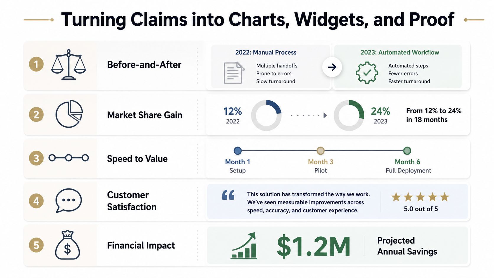
Match the claim to the visual
Slides should clearly illustrate before-and-after results, instead of getting lost in a paragraph. To enable comparison, place the contrast on the slide. The market-share or share-of-wallet results should be in a chart, and speed-to-value results should be shown as a timeline. Testimonials should be shown as quote cards.
Your deck should be as readable as possible. The deck should be informative even to someone who is not there to give the presentation and is reading the case studies out of order, or only scans the slides before a meeting.
Keep every slide sparse enough to scan
Density is where a lot of decks lose the room. Hold the line at three bullets, give the one visual room to breathe, and let type size and contrast carry the reading order. That approach lines up with data visualization best practices, which also favors charts and clean visual hierarchy over text-heavy slides.
A slide should do one job. If it is trying to explain the problem, the proof, and the next step all at once, the audience will begin to ignore the presenter.
If a slide cannot function without its title, the visual is not doing enough work.
Use interactive proof when the meeting calls for it
Static screenshots work for procurement packets, but are not always enough for a live evaluation. When a buyer needs to understand a workflow, a live calculator, product mockup, or embedded chart can carry more weight than a paragraph of explanation. A web-native deck also allows a team to present proof in the room and export a PDF for legal, procurement, or the internal follow-up thread.
The format choice is ultimately based on what the buyer will do next. If they need to circulate the asset, a static PDF is usually sufficient. If they need to verify the logic with a technical lead, interactive proof gives them more evidence without requiring everyone to rework the slides. The rule is simple. The visual should carry the argument even if the speaker is interrupted.
Interactive Proof to Replace Dated Case Studies
Visit a standard logistics case study. They all have the same elements: a title slide, a customer logo, a few text-heavy pages, and a static PDF that hasn't been updated in months. Reps send these because they think they are low risk, but all these stale assets have the same effect and create distance where there is none. This is what happens when a standard case study is rebuilt to include a web-based story that has live metrics and a reusable proof asset.
The first major change is to the headline number. Because this number is subject to frequent change, the rep no longer builds it into a slide image, and instead pulls it directly from a spreadsheet link that will update the number dynamically. The buyer trusts the result immediately, as it is unencumbered by a screenshot or buried among countless footnotes.
What changes in the conversation
Dense results catalogs are replaced with simple chart widgets that the buyer can read instantly. A device mockup provides the customer portal, a video shows the workflow, and styling panels keep the whole deck on brand while leaving each slide intact. The shift is likely from "send me the PDF" to "can we review this with my technical lead?"
An interactive format conveys recent, shareable proof. A team can walk the buyer through the interactive deck, then send a PDF for procurement or circulation.
Where the format is useful
The format is most helpful in cases where the proof demands interactivity, time-sensitive data, or a high level of personalization because the same proof may be used in varying ways: prepping for a call, doing a presentation, following up, and sharing proof offline. For teams building that kind of workflow, how to make interactive slides is a better starting point than yet another static template.
The buyer doesn't need more pages. They need a single path from claim to evidence.
A Pre-Send Checklist for Every Case Study Deck
Presenting a case study deck to potential buyers can be intimidating. Buyers want to feel confident in the deck before purchase. A case study deck should have a title slide, summary of the problem, solution, execution proof, results, and the next steps. All of this should answer the question of what, why, how, and when. If any of these parts are missing, the deck will be considered unfinished.
| Outcome Type | Anchor Metric | Best Visual |
|---|---|---|
| Efficiency gain | Time saved on a workflow | Before-and-after comparison |
| Revenue impact | Pipeline or sales movement from one engagement | Bar chart or KPI card |
| Adoption proof | Product or feature usage within the account | Line chart or usage trend |
| Customer confidence | Direct customer language from the engagement | Quote card |
| Operational improvement | Reduction in manual steps or handoffs | Process diagram |
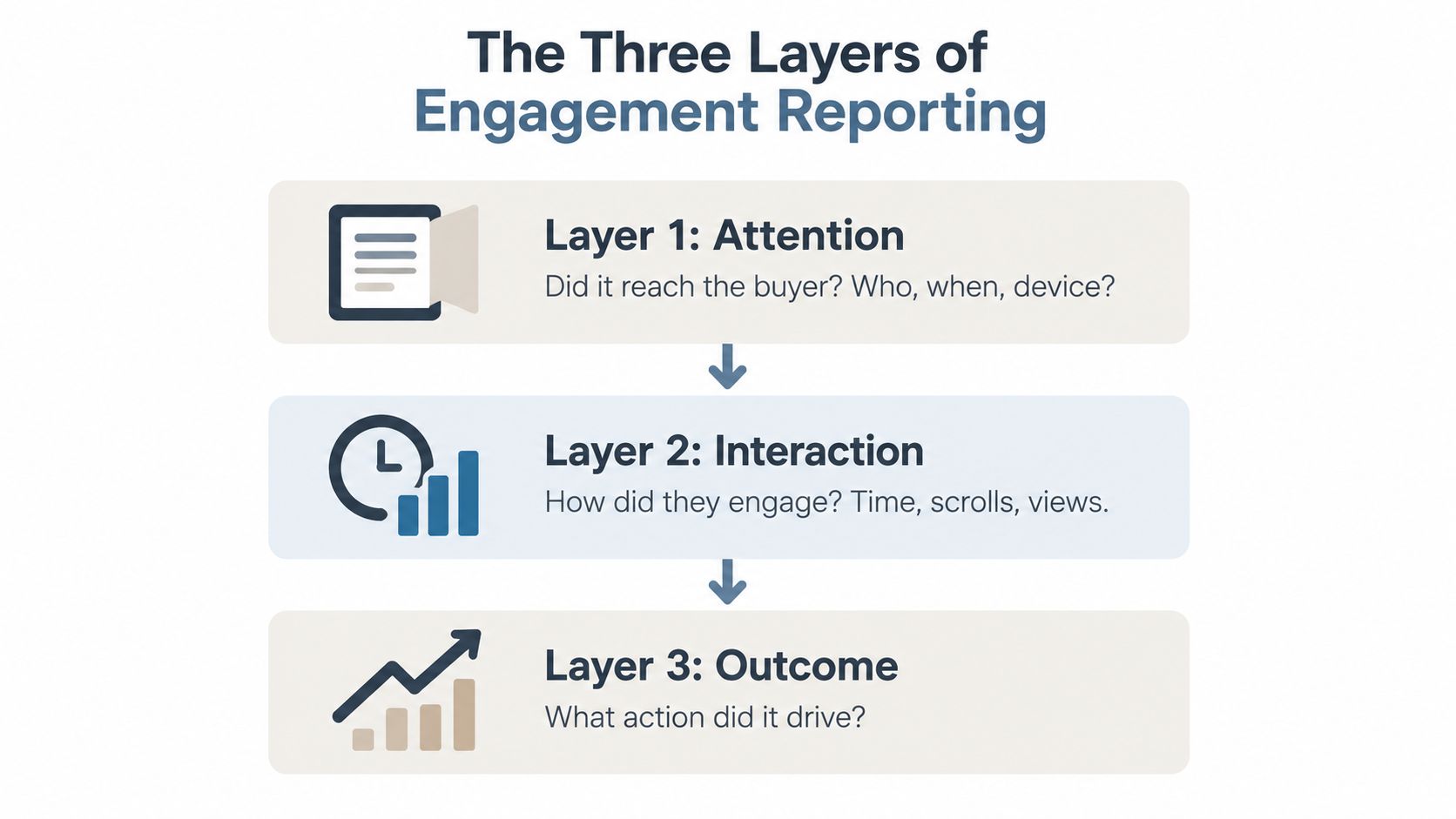
Prior to sending the deck out, format it for the needs of the revenue team and fit the time you have with the audience, ideally with a PDF export ready for procurement. Each slide should carry one visual and one metric where possible. After you send the deck, analyze the average response time, how long buyers stay on the results slide, and whether they ask for more meetings. These signals are more useful than subjective comments.
For case study decks that don't stay static on a shared drive, check out Encelade. They make web-native decks so results slides can show real-time data, interactive proof stays on screen during a presentation, and a one-click PDF export is easy for procurement, or schedule 30 minutes here to look at a real deck.