A rep closes a discovery call, sends a recap deck, and waits. The email goes unanswered. The CRM shows no stage change. The deck could have been opened, forwarded to procurement, skimmed on a phone, or completely ignored. Without engagement reporting, all four possibilities look identical.
Revenue teams need more than proof that a link was clicked. They need a practical way to identify who paid attention, what content created friction, and which signal deserves a sales action. The useful output isn’t a more colorful dashboard. It’s a better decision in the next account review, follow-up queue, or forecast meeting.
Table of Contents
- What Engagement Reporting Means for Revenue Teams
- The Three Layers of Engagement Reporting
- Key Engagement Metrics Worth Tracking
- Data Sources That Feed Your Engagement Report
- Building a Revenue-Ready Engagement Dashboard
- Common Pitfalls That Skew Your Numbers
- Turning Engagement Signals into Sales Actions
- A 30-Day Engagement Reporting Checklist
What Engagement Reporting Means for Revenue Teams
Engagement reporting turns buyer activity around shared content into signals a revenue team can use. A trackable presentation link can show who opened a deck, how long they stayed on individual slides, which pages they visited, and whether they returned. That gives an AE more context than a sent email or a static file attachment.
The distinction matters after a customer meeting. If the economic buyer views the commercial slide and the technical evaluator spends time on the implementation section, the rep has a reason to tailor the next conversation. If several contacts open the recap but stop before the proof or pricing content, the manager can question the narrative rather than asking the rep to “follow up again.”
Practical rule: Treat engagement reporting as evidence for a decision, not as a verdict on buyer intent.
Link-based presentation tools have made this type of reporting a mainstream product expectation. Most report total views, unique viewers, time spent per slide, completion rate, and viewer location, and some add an access form that connects a named viewer with their behavior.
That makes engagement reporting different from generic website analytics. Marketing analytics may tell you how a page performed across an audience. Revenue engagement reporting asks whether the right people at a target account consumed the right asset at the right point in the deal.
The weekly test is simple: can a rep identify who needs a call, can a manager see which deal is losing momentum, and can enablement find the slide that repeatedly causes drop-off? If the dashboard can’t answer those questions, it may be measuring activity without improving execution.
The Three Layers of Engagement Reporting
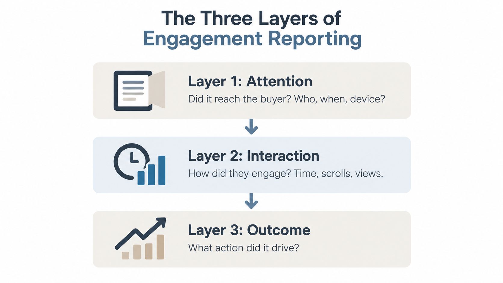
A useful report stacks three layers. Each layer answers a different question, and none is sufficient on its own.
Layer one measures attention
Attention establishes whether the content reached the intended audience. Track opens, unique viewers, viewing time, access date, device, and named account association. A high open count with one unique viewer often means repeated consumption by one person, not broad committee engagement. A low open count may indicate poor distribution, an incorrect contact, or a deal that has gone quiet.
This layer helps an SDR decide whether a follow-up is premature. It helps an AE distinguish “the buyer hasn’t seen it” from “the buyer saw it and didn’t respond.”
Layer two measures interaction
Interaction shows what happened after the open. Per-slide dwell time, scroll behavior, page transitions, revisits, internal shares, comments, and embedded CTA clicks reveal where attention concentrates or disappears. This is where presentation analytics has moved past simple open counts: the useful question is no longer whether someone looked, but where they slowed down.
A repeated visit to an implementation slide can prompt a technical follow-up. A sharp exit before the business case can send the asset back to marketing or enablement for revision. Interaction is diagnostic, not proof of purchase intent.
Layer three measures outcomes
Outcome connects content behavior to commercial movement. Look at meeting bookings, replies, conversions, stage progression, opportunity activity, and eventual revenue influence. This layer prevents the team from celebrating an engaging asset that doesn’t help buyers take the next step.
The three layers work as a chain:
- Attention confirms reach.
- Interaction reveals content behavior.
- Outcome tests commercial relevance.
A report becomes decision-ready when a manager can move from one layer to the next without changing tools or losing account context.
Key Engagement Metrics Worth Tracking
The right metric earns space on the dashboard by changing a weekly action. Start with a small set, then add detail only when a rep or manager can explain what they’ll do with it.
Opens and unique viewers show reach and audience breadth. Total opens can reveal repeat interest, but unique viewers identify whether engagement has spread across the buying group. Trigger action when a key contact hasn’t opened the asset or when several people at the account begin viewing it.
Time on document and average view duration indicate consumption, but they need context. Google Analytics 4 counts engagement time only while the page is in focus or the app screen is in the foreground, which helps separate an active session from a passive tab, as explained in Google’s user engagement documentation. Use low active time to review content fit, not to accuse a buyer of disinterest.
Benchmarks show why that context matters. Graphed’s rule-of-thumb ranges for web pages treat 1 to 2 minutes as a fairly healthy average for many standard pages, 2 to 4 minutes as a sign of strong engagement on high-value content, and over 4 minutes as exceptional, typically reserved for detailed guides and technical tutorials. Those are one practitioner’s guideposts for web pages, not measured norms for sales decks, so compare like with like rather than imposing one target on every asset.
Scroll depth and slide transitions identify whether viewers move through the narrative. A viewer who reaches the commercial section has demonstrated more useful progression than someone who merely opened the link. Set an action threshold around a meaningful content boundary, such as the proposal, proof, or implementation slide.
Revisits often point to unanswered questions or internal discussion. A revisit deserves a task when it comes from a relevant stakeholder or follows a meeting. Repeated reloads by the same person are still noise.
Shares and forwards can signal committee distribution, but they don’t identify the quality of the audience unless the system captures recipients. Ask the account owner to map new viewers to roles before treating the activity as buying-group momentum.
Embedded CTA clicks, meeting bookings, and reply rate after send are directional outcome signals. They deserve more weight than passive views because they represent an explicit action. Compare them with opportunity stage and contact role rather than using a universal benchmark.
Engagement score can combine multiple signals, but composite scores hide assumptions. Keep the ingredients visible, cap repeated events, and require a named contact or account association before routing an alert.
| Metric | What It Signals | Action Threshold |
|---|---|---|
| Opens | Whether the asset reached a viewer | Follow up when an intended contact remains inactive |
| Unique viewers | Breadth across the buying group | Map new viewers to roles and update committee coverage |
| Active time | Depth of consumption | Review the relevant section when time is unusually low |
| Slide or page revisits | Possible unresolved interest | Ask a focused question about the revisited content |
| Shares and forwards | Internal distribution | Confirm recipient identity and buying role |
| CTA clicks | Explicit next-step interest | Assign a follow-up task to the owner |
| Engagement score | Prioritized signal across events | Inspect the underlying events before acting |
For broader guidance on connecting measurement to business impact, use this framework for measuring impact. The priority is not to track everything. It’s to put named-viewer activity, meaningful content progression, and downstream action where the team can see them together.
Data Sources That Feed Your Engagement Report
An engagement report is only as reliable as the joins behind it. Each source captures a different part of buyer behavior, and each leaves important gaps.
Link-based delivery
Trackable presentation links record opens, viewer identity when available, visited slides, time spent per slide, and revisits. They’re useful because they preserve the relationship between an asset and a recipient instead of treating a downloaded file as the end of measurement.
They can’t determine who was actually looking at the screen. Forwarded links may create activity from an unexpected person, while privacy controls, blocked scripts, shared devices, and automated traffic can distort the record.
CRM synchronization
The CRM adds commercial context. It can connect a viewer to an account, opportunity, owner, stage, persona, and contact role. That connection turns “someone viewed the deck” into “the technical evaluator at an active opportunity reviewed the implementation section.”
A CRM still can’t infer motivation from behavior alone. It can show that a contact engaged, not whether the contact approved the business case or is comparing vendors. Judge any CRM integration by field mapping, identity resolution, permissions, and how reliably activity becomes a usable sales record. Direction matters too. Encelade’s HubSpot integration, for example, can write the deck URL, engagement totals, and proposal status back to a linked deal, while the Salesforce connection only reads data into the deck.
Live data connections
Warehouse queries, APIs, and BI integrations keep engagement views current without manual exports. Live connections are especially useful when managers need account activity beside pipeline data, forecast changes, or campaign context.
Freshness is not the same as accuracy. A live feed can update an incorrect identity match just as quickly as a correct one. Set ownership for schema changes, failed syncs, duplicate contacts, and missing timestamps.
Conversation intelligence
Meeting and conversation tools provide qualitative context. They can help connect a shared asset to a question, objection, commitment, or follow-up discussed during the call. That context explains why a buyer revisited a slide or ignored a section.
Even with that context, the data still needs interpretation. A buyer’s question about pricing could signal interest, skepticism, or simply a procurement step. Combine the qualitative note with opportunity context and a clear next action.
| Source | What It Captures | Key Limitation |
|---|---|---|
| Link-based delivery | Opens, viewers, slide activity, revisits | Forwarded links and blocked tracking create ambiguity |
| CRM sync | Account, contact, owner, stage, persona | Identity and field mapping can be incomplete |
| Warehouse, API, or BI | Combined, refreshed reporting | Bad source data remains bad after synchronization |
| Conversation intelligence | Questions, objections, commitments | Qualitative signals require human interpretation |
Building a Revenue-Ready Engagement Dashboard
Build the first dashboard around decisions, not available fields. Before selecting a chart, write the decision that row should support: who gets a follow-up today, which opportunity is slipping, or which asset needs revision.
Start with the top row
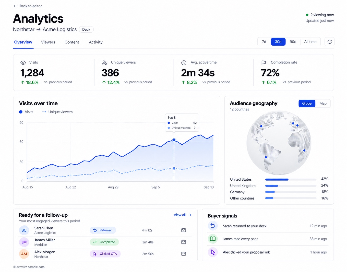
Put the highest-signal views where reps won’t need to hunt:
- Named contact views: Which relevant people opened the asset?
- Key-slide active time: Which commercial or technical sections held attention?
- Account-level engagement: Is activity broadening, concentrating, or going silent?
Keep the top row short. A dashboard that displays every event forces the user to perform the analysis manually, which means most users won’t perform it.
Add slices that match revenue work
Use filters for stage, owner, persona, account, asset, and date range. Stage helps managers compare engagement with deal momentum. Persona reveals whether a financial buyer is seeing the business case while a technical buyer sees implementation detail. Asset filtering separates a content problem from an account problem.
Do not create a slice unless someone will use it in a meeting or workflow. A filter that never changes a task is interface decoration.
Wire the data and define alerts
Connect the report to a warehouse, API, or BI layer so the numbers don’t depend on spreadsheet exports. Then define alerts around meaningful changes:
- A previously quiet account becomes active.
- Several contacts view the same asset.
- A key stakeholder stops before a critical section.
- An opportunity shows engagement without a scheduled next step.
- A high-value asset receives repeated views but few explicit actions.
The alert should contain the account, contact, asset, event, owner, and recommended next step. A notification that only says “new engagement detected” creates another inbox problem.
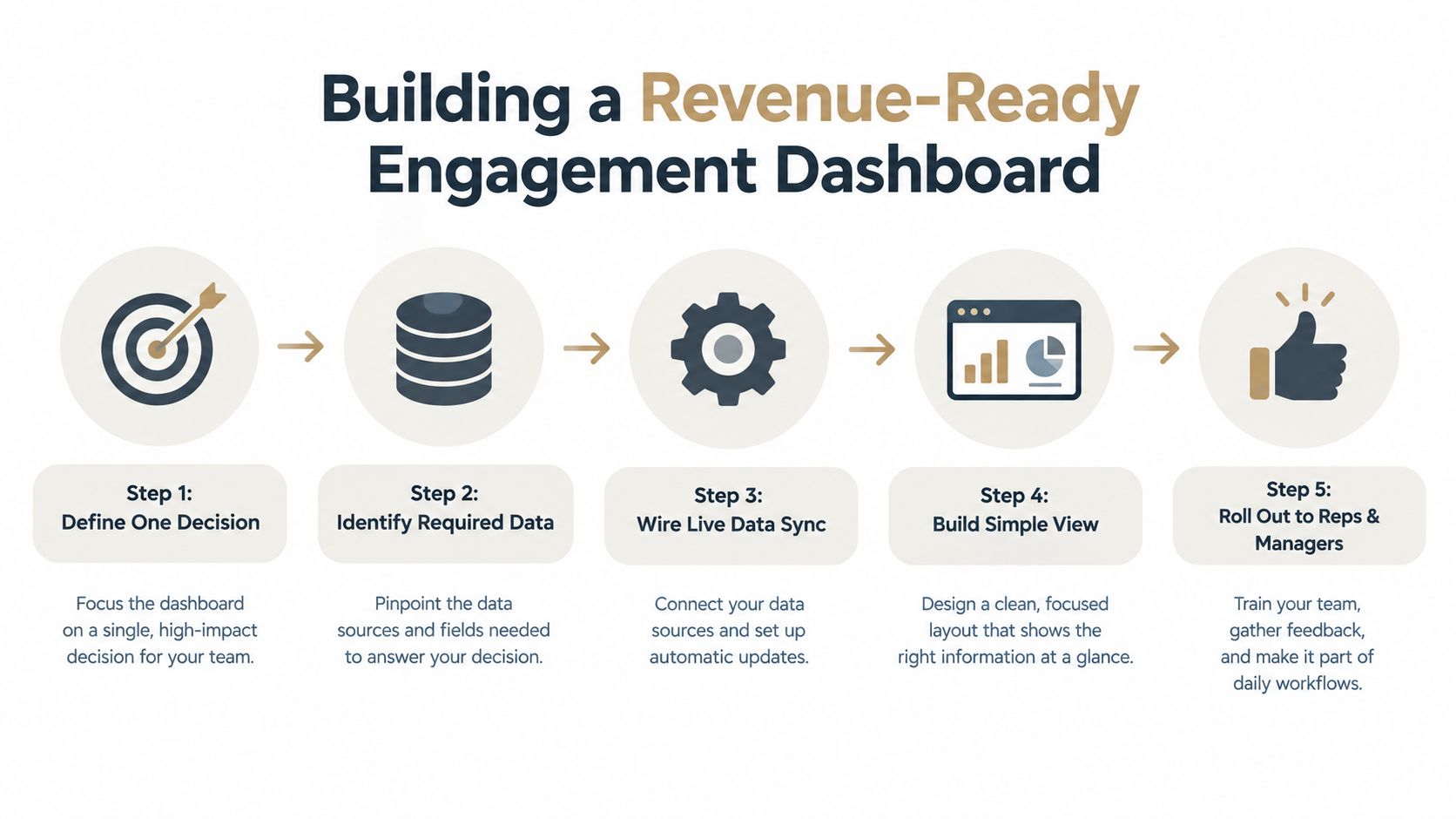
A live reporting layer is useful only when it supports a recurring operating rhythm. Real-time data dashboard guidance is relevant here because freshness, ownership, and action design matter as much as visualization.
A short weekly review keeps the report in use. In 15 minutes, each owner names one account signal, their interpretation of it, and the action they are committing to. Managers should also remove tiles nobody uses so the dashboard doesn’t turn into a museum of tracked events.
Common Pitfalls That Skew Your Numbers
The most dangerous engagement reports look precise while measuring the wrong behavior.
Time metrics are particularly easy to misread. Classic time-on-page calculations rely on timestamp differences, so the final page in a session records as zero seconds because no later timestamp exists. Kissmetrics’ explanation of time-on-site measurement describes this structural problem and why a duration figure needs a conversion or completion figure sitting next to it.
A tab left open can also inflate apparent attention, while a viewer who reads with the deck on a second screen or in an unfocused window can be undercounted by a foreground-only timer. Use foreground activity where available, then pair time with transitions, clicks, scroll depth, or another explicit interaction.
Views aren’t intent
Raw views mix accidental opens, repeat visits, forwarded links, internal testing, and genuine research. Unique viewers reduce one form of distortion, but they don’t solve identity, role, or motivation. Require a qualified context filter before a rep treats activity as a high-priority signal.
Engagement isn’t business lift
A deck can generate attention without moving a deal. Consumer marketing has the clearest evidence of that gap. Kantar’s Creator Game Plan research, an analysis of more than 15,000 branded creator assets on TikTok, YouTube Shorts, and Instagram, found that only 6% delivered both strong platform engagement and strong brand-building potential. The same caution applies to revenue content: engagement is a diagnostic layer, not proof of persuasion, pipeline influence, or deal impact.
Use an explicit “so what” test before shipping a dashboard:
- What changed? Identify the event or pattern.
- Who owns it? Assign the account or content owner.
- What happens next? Define the action and deadline.
- What outcome will validate it? Check for a reply, meeting, stage movement, or another qualified result.
If no one can answer those questions, remove the metric or move it to an analytical view.
Turning Engagement Signals into Sales Actions
A signal becomes useful when it creates a specific play for a specific person. The AE, SDR, and manager shouldn’t receive the same alert because they don’t own the same decision.
Give AEs account-level plays
When a prospect reaches the proposal or implementation section and then stops, the AE should avoid sending a generic “checking in” message. The better move is a focused question tied to the content, such as whether the commercial assumptions or rollout approach need clarification.
A high-intent view can trigger a rapid response, but speed alone doesn’t establish intent. Route the alert with the contact name, account, viewed section, opportunity stage, previous meeting context, and a suggested reason for outreach. The AE can then choose a call, a concise email, or a stakeholder-specific asset.
Give SDRs coverage tasks
Multi-stakeholder activity is more valuable than isolated activity because it can reveal buying-group coverage. When several roles engage with one deck, the SDR can map the committee, identify the missing persona, and coordinate with the AE before launching another sequence.
The SDR’s task shouldn’t be “contact everyone who viewed.” It should be “confirm role and next step for the new participant.” That distinction protects the account from robotic follow-up.
Give managers exception views
Managers need patterns, not a stream of notifications. A useful exception view highlights opportunities where engagement and execution disagree, such as strong account activity with no scheduled meeting, repeated revisits without a response, or a critical stakeholder who hasn’t accessed the material.
Inside presentation workflows, tools such as Encelade can support view notifications, a follow-up queue that ranks the most engaged viewers, and signal badges for returns, completions, and CTA clicks. Those features matter when they keep interpretation and action close to the evidence. The operating rule remains the same:
Every engagement signal needs a named owner, a reasoned interpretation, and a deadline.
Review the result in the next pipeline meeting. If the action didn’t draw a qualified response, don’t just assume the signal was worthless. Check whether the message fit the viewer’s role, whether the asset answered the right question, and whether the account had a real next step to take.
A 30-Day Engagement Reporting Checklist
A month is enough to establish a working measurement loop, provided the team resists building a giant dashboard first.
Week one, instrument and connect
- Instrument decks: Use trackable, link-based delivery for the customer-facing assets that matter most.
- Sync the CRM: Connect viewers to accounts, contacts, owners, stages, and roles.
- Document exclusions: Separate internal testing, known automation, and ambiguous forwarded activity from qualified buyer behavior.
Week two, choose the core view
- Select seven core metrics: Start with named viewers, unique viewers, active time, key-slide progression, revisits, explicit CTA activity, and a qualified downstream action.
- Wire live feeds: Use the warehouse, API, or BI layer that keeps the report current and preserves source context.
- Define the vocabulary: Agree on what counts as a viewer, an active session, a revisit, and an outcome.
Google Analytics 4 offers a useful model for that vocabulary. It counts a session as engaged when it lasts longer than 10 seconds, has a key event, or includes at least 2 page or screen views, according to Google’s engagement rate documentation. Those rules can inform your own definitions, but revenue teams should still tie the report to account context and commercial outcomes.
Week three, build and test
- Create the first dashboard: Put account and contact context above asset-level detail.
- Add slices: Use stage, owner, persona, asset, and account.
- Pilot alerts: Test spikes, drop-offs, and silence with a small group before sending them to the full revenue team.
Week four, operationalize
- Roll out playbooks: Give AEs, SDRs, and managers different actions for the same underlying signal.
- Run the review ritual: Ask what changed, who owns the response, and what result will validate the decision.
- Complete the retro: Review which signals changed follow-up behavior and which connected to pipeline outcomes. Remove anything that only generated reporting noise.
Measurement more broadly is moving toward first-party, consent-based interactions. Improvado’s social media reporting guide describes lead forms, gated downloads, event registrations, and direct conversations as consent-based signals worth tracking separately from vanity metrics, and the same logic applies to sales content: an explicit action outweighs a passive click. AI can help interpret patterns across decks, meetings, CRM records, and live data, but the team still needs clear definitions, permission-aware collection, and human review.
Encelade helps revenue teams create and share interactive, link-based presentations with page-level engagement, time-on-slide visibility, named recipient links for proposals, CRM inputs, and live data connections. Use it when you want a web-native presentation workflow that turns buyer attention into signals AEs, SDRs, and managers can act on.