You’re in a meeting, the forecast looks good on paper, and then someone asks for the latest pipeline movement by region. The report on screen is already stale, the rep who owns the account is in another call, and the conversation shifts from action to speculation. That’s the point where a real time data dashboard stops being a nice-to-have and starts becoming the thing that keeps a revenue team from guessing.
A good dashboard isn’t just a prettier report. It’s a live operating surface for sales, presales, and customer-facing teams that need to decide while the moment is still in front of them. When the data is fresh enough to trust, the team can act on it instead of explaining why it was correct yesterday.
Table of Contents
- From Stale Reports to Live Decisions
- Defining a Real-Time Dashboard
- The Engine Room: Streaming vs Polling Architectures
- Designing for Action: UI, UX, and Performance
- Activating Live Data for B2B Sales Teams
- Your Next Steps in Real-Time Analytics
From Stale Reports to Live Decisions
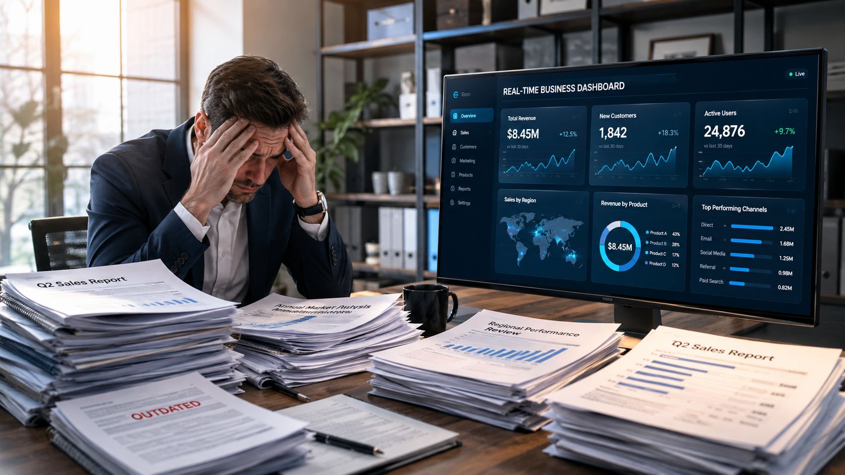
A sales leader opens a weekly report before a pricing call and sees a clean story, except the deal changed two hours ago. The account executive is already handling a new objection, the trial usage pattern shifted this morning, and the team is still discussing a version of the truth that no longer applies. That gap between what happened and what the team sees is the hidden cost of latency.
A real time data dashboard is built for that kind of moment. It turns streaming data into actionable signals so users can watch operational changes as they happen and respond without delay, which is a different job from periodic reporting. In practice, the dashboard is not there to archive history. It is there to help people act while there is still time to change the outcome.
What changes when teams stop waiting for batch reports
Static reporting works when the decision horizon is slow. Quarterly planning can live with overnight refreshes. Pipeline intervention, live demos, launch monitoring, and service escalation all run on a shorter clock.
Practical rule: if the decision loses value while people wait for the next export, the dashboard should be designed as a live control surface, not a snapshot.
That shift changes how teams work. The dashboard becomes the place where a manager notices a threshold breach, a presales consultant sees a trial account stall, or a sales engineer catches a live usage spike during a client review. In those moments, the value is not the chart itself, it is the speed of the next conversation.
A live dashboard also changes trust. When everyone can see the same current signal, fewer meetings get stuck in arguments over whose spreadsheet is correct. The team can spend more time deciding what to do next and less time reconciling old numbers.
Defining a Real-Time Dashboard
A dashboard is real time when the data is current enough for the decision in front of the user, and when the system responds fast enough to keep the workflow usable. The practical test is simple. If a rep is updating a live customer review, or a presales manager is watching a demo account, the screen has to reflect what is happening now, not what happened a few minutes ago. In Microsoft Fabric’s overview of real-time dashboards, the reference point is data that is fresh enough for immediate use and queries that return quickly enough for interactive work.
Freshness and latency are different things
Freshness tells you how old the data is. Latency tells you how long the user waits for a response. A dashboard can be current but feel slow, or it can respond quickly while still showing stale inputs, and either problem makes it hard to use for live sales or customer-facing decisions.
A speedometer and a quarterly fuel report answer different questions. The speedometer helps the driver act now. The report helps the team review patterns later. A real time data dashboard has to behave like the speedometer during live pipeline reviews, customer calls, and escalation checks, because the value is in the action that follows the number.
Data freshness without query speed creates frustration. Query speed without freshness creates false confidence.
Match the refresh cadence to the decision
Different metrics need different cadences. Critical live metrics should update in seconds, operational trends can often sit in a window of a few minutes, and summary views can refresh on a slower cycle. That range is what makes “real time” a working design choice instead of a single switch.
The dashboard should also show the timing context around the number. Users need to know whether they are looking at an active signal, a windowed trend, or a delayed source before they decide what to do. Without that context, a normal swing can look like a problem, and a delayed metric can be mistaken for current reality.
Trust comes from visible context
The strongest live interfaces make timing visible. They show the update window, the age of the data, and the boundaries of the view so a salesperson, manager, or presales engineer can judge the signal before reacting. When the dashboard is built this way, it supports the conversation instead of getting in the way of it.
The Engine Room: Streaming vs Polling Architectures
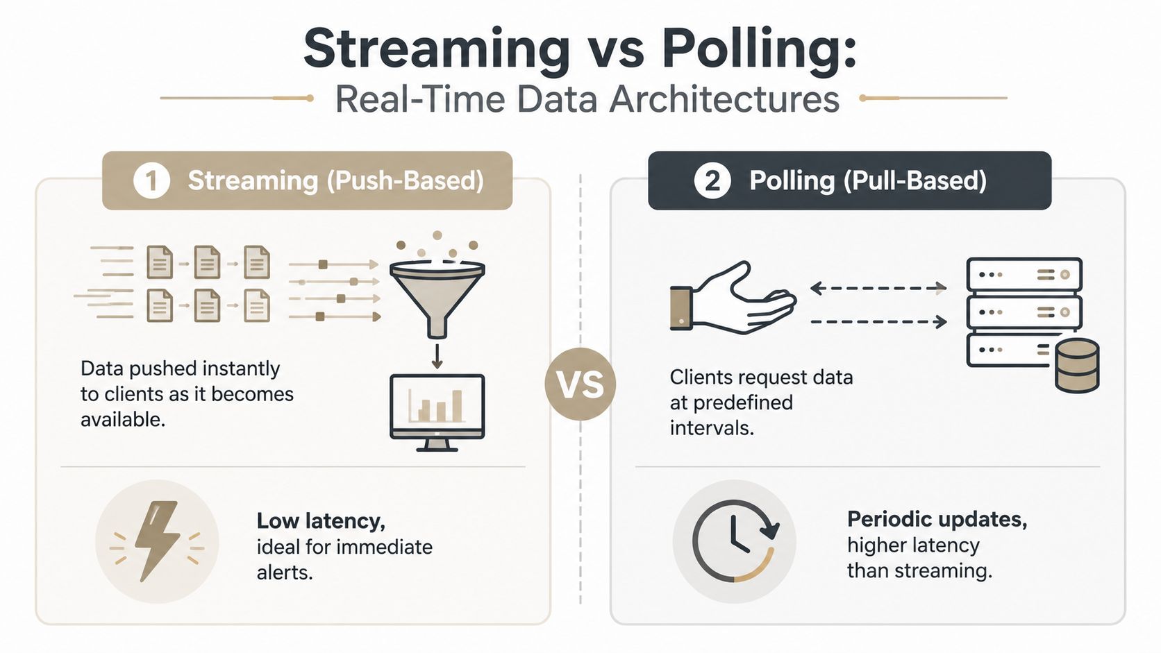
A real-time dashboard only feels real time if the transport path keeps up with the business event. WebSocket-based delivery can push updates with sub-second latency, while polling usually refreshes every 5 to 30 seconds. Polling is simpler to implement, but it is less responsive for operational monitoring, according to this technical guide to building real-time dashboards. For a rep in a live deal room or a manager watching an escalation, that difference decides whether the screen supports the conversation or lags behind it.
Push beats pull when the user must react immediately
Streaming behaves like a live notification feed. The event arrives when it happens, so the dashboard reflects current activity instead of the last scheduled check. Polling is closer to checking email on a timer. It works for lower-stakes status views, but it trails the actual business event.
In low-latency production systems, the common pattern is stream source → event processing → cache or store → push to UI. Teams often pair WebSockets with Redis for pub/sub and caching, or use event hooks like PostgreSQL LISTEN/NOTIFY when the source of truth is database-driven. For teams that need to surface live signals from systems outside the warehouse, a REST API integration is often the cleanest way to bring that data into the dashboard without waiting on a batch export.
The trade-off is responsiveness versus complexity
Push-based transport reduces stale state and helps anomaly detection happen sooner, but it also increases connection management work. Teams need reconnection logic, throttling, and session handling so bursty updates do not overload the interface or destabilize the session.
Polling is easier to ship and easier to reason about. It can fit dashboards used for periodic review rather than immediate action. The mistake is treating it as real time just because it refreshes often.
| Attribute | Streaming (Push) | Polling (Pull) |
|---|---|---|
| Update model | Server pushes changes as events happen | Client asks for data on a schedule |
| Typical responsiveness | Sub-second latency is possible | Often 5 to 30 seconds between refreshes |
| Operational fit | Alerts, live demos, incident views | Status checks, lower urgency reporting |
| Complexity | Higher, because of connections and reconnection logic | Lower, because the request pattern is simpler |
| User experience | More immediate and continuous | More periodic and less responsive |
A diagram comparing the two architectures is often enough to settle the discussion. Streaming suits live sales calls, presales demos, and incident rooms where someone must react to a change on screen. Polling suits review cycles where the team needs current enough data, not instant propagation.
Throughput matters once the dashboard gets busy
A dashboard that handles around 100 updates per second faces a very different set of constraints than one handling 100,000 updates per second, as this system-design walkthrough points out. The bottlenecks shift toward rendering, fan-out, and write amplification rather than ingestion alone. At that point, the UI needs throttling, downsampling, and lazy loading, or the screen becomes noisy and slow even while the backend still works.
Designing for Action: UI, UX, and Performance
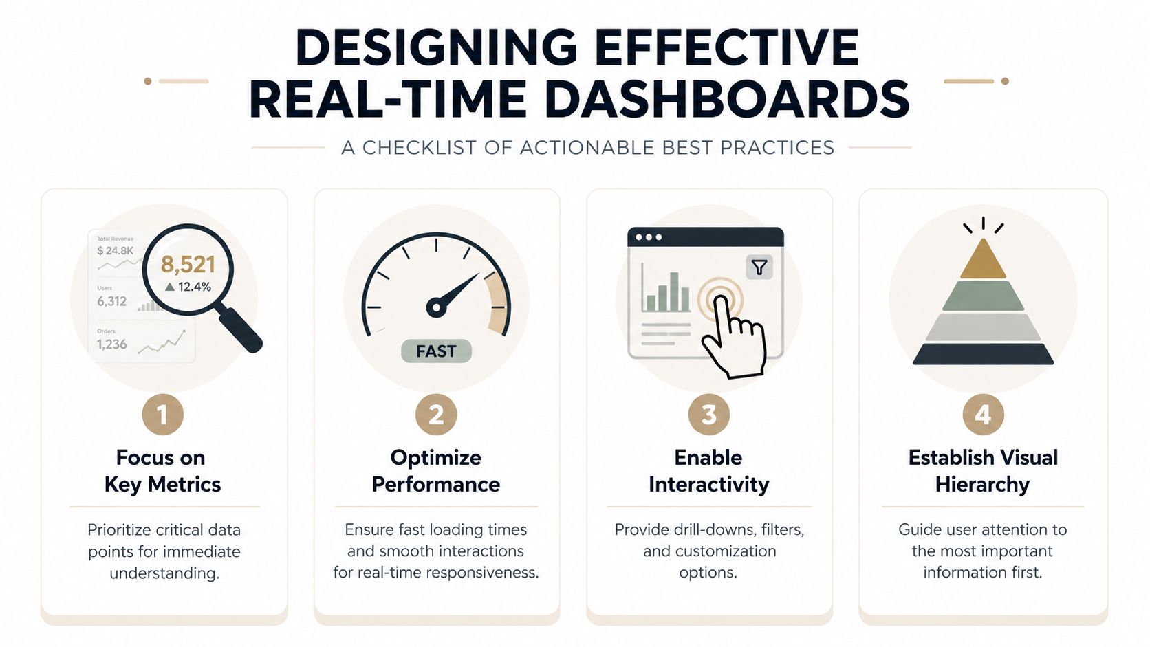
A real-time pipeline can still fail if the screen makes people work too hard. In a sales or presales setting, the dashboard has to help someone read the signal quickly, explain what changed, and decide what to do next. One practical guide recommends keeping the main view to about 5 to 7 core KPIs, with timestamps, thresholds, and alerts visible so freshness and significance are clear at a glance, per Synergy Codes’ best-practice guide.
Keep the screen focused on decision-making
The strongest layouts put the metrics that drive action at the top and move supporting context below them. That hierarchy matters because live data creates pressure to surface everything at once, and that usually makes the dashboard slower to read rather than more useful.
A practical rule works well here. Keep the main view tight, label each metric clearly, and avoid turning the dashboard into a warehouse browser. If a number does not change what a seller, manager, or presales engineer does next, it probably belongs in a drill-down, not the primary screen.
Useful habit: show the metric, the timestamp, and the threshold together so the viewer can judge the signal without hunting for context.
Make freshness and abnormality visible
Freshness labels such as “Updated X min ago” are not decoration. They are trust signals, especially in front of a customer or internal deal team that needs to know whether the numbers still reflect the current situation. Normal ranges, threshold bands, and minimum sample sizes serve the same purpose, because they keep small fluctuations from looking like incidents.
A dashboard that lacks these cues tends to create unnecessary follow-up. A dashboard that includes them helps managers and reps separate a real change in behavior from routine movement inside the expected range.
Protect the interface when event volume rises
High-frequency data does not justify constant redraws. Reducing DOM or canvas updates, downsampling large datasets, and lazy-loading lower-priority widgets keeps the screen usable when the event stream gets busy.
The same idea applies to failure handling. Heartbeats and exponential backoff keep transient network problems from corrupting live state or hammering the server with retries. If the dashboard supports a working team, that kind of resilience matters more than flashy motion.
For teams shaping how a live dashboard appears in an interactive deck or customer-facing experience, Encelade’s data visualization best practices offer a practical reference point.
Activating Live Data for B2B Sales Teams
Real-time dashboards serve two main purposes, operational intelligence and enhanced customer experiences, as Tinybird’s overview explains. For B2B sales and presales, the second purpose usually matters more in the room. Live data turns a pitch from a static claim into something the buyer can verify as it changes.
Why live data changes the sales motion
A prospect reacts differently when they see their own numbers move in front of them. That could mean trial usage, active accounts, campaign performance, implementation milestones, or a live ROI view based on their own source data. The point is not to impress them with motion. It is to make the case feel current and specific.
Real-time dashboards can also be embedded into presentations and customer-facing environments because they support a transparent, interactive narrative for clients. In that setting, live data supports trust. People can ask a question, watch the answer update, and continue without waiting for a follow-up slide.
Use cases that sales teams actually use
A presales consultant can show a live product usage widget during a proof-of-value review. A sales manager can keep an implementation milestone board open during a handoff call. An account executive can walk a procurement team through live ROI signals without exporting a static PDF that is outdated before the meeting ends.
Web-native presentation software helps here because it lets teams keep charts and tables connected to live sources without manual refresh steps. That matters for revenue teams that need to present current numbers inside a deck, not just maintain a reporting page. See how interactive presentation software supports that motion.
Keep the demo honest
Live demos work best when the data quality is clear and the scope is narrow. If a source is delayed, label it. If a number is a rolling window, say so. If the dashboard shows a subset of accounts or a specific time range, make that obvious.
A live presentation wins trust when it shows both the current state and the limits of the data.
That matters for B2B buyers, because they do not just want a story, they want confidence that the story is current enough to act on. A live dashboard supports that confidence better than a screenshot ever will.
Your Next Steps in Real-Time Analytics
The best way to start is not by redesigning everything. Pick one workflow where delay hurts, then define the few metrics that drive a decision. For a sales team, that might be live trial activity, pipeline movement, or implementation progress. For a presales team, it might be the signal that tells the presenter whether to stay on the current narrative or switch to a different proof point.
Then choose the right architecture for that job. If the team needs immediate reaction, favor push-based delivery and a compact interface. If the team only needs periodic visibility, a simpler refresh loop may be enough. The goal is not to make every number live, it’s to make the important number useful.
Finally, design for trust. Show freshness, define the window, keep the KPI count small, and make the dashboard easy to interpret while the conversation is still happening. That’s what turns a real time data dashboard from a technical demo into a business tool.
If your team is ready to put live numbers in front of buyers instead of stale screenshots, Encelade is worth a close look. It helps sales, presales, and revenue teams turn CRM notes, spreadsheets, documents, and live data sources into interactive, web-native presentations with responsive layouts, branding controls, and analytics.