You’re in the meeting where the research is finally ready, the slides are polished, and the room is already drifting. Someone on the leadership team is checking email, the CMO wants the answer before the chart finishes animating, and the deck keeps showing data instead of making a decision. That’s the real test of how to present market research data: not whether the bars are aligned, but whether the audience can move from evidence to action without having to decode the story.
Most research decks fail for the same reason. They behave like archives. They dump exports into slides, hide the takeaway in a caption, and leave executives to build the narrative themselves. The better approach is to treat the deck like a live product, one that combines disciplined findings, clear sequencing, and interactive elements so stakeholders can explore the evidence instead of squinting at a static summary.
Table of Contents
- The Deck That Lost the Room
- Cut the Data Before You Cut the Slides
- Build the Story Arc Before You Touch a Chart
- Choose the Right Chart for Each Question
- Make Findings Interactive Instead of Static
- Assemble the Deck in an AI Presentation Platform
- Ship the Deck and Measure What Happens Next
The Deck That Lost the Room
A research team once walked into a boardroom with more than enough data and too little discipline. Slide after slide, the presentation stacked bar charts, raw survey splits, and labels that fought the numbers for attention. By the time someone asked, “So what should we do next?” the deck had already lost the room.
The failure was editorial. The deck had no clear takeaway per slide, no decision frame at the end, and no separation between findings that mattered and findings that only looked complete. When everything is emphasized, nothing is emphasized.
The better test of how to present market research data is simple: does the room move from evidence to action without decoding the story? If the answer is no, the deck is doing archival work, not decision work.
A research deck should behave like a product the audience can use, not a report they have to decipher. That means ruthless finding selection, narrative sequencing, chart discipline, and interactive moments that let stakeholders explore the data on their own terms. Static slides can still work, but they should earn their place by clarifying the decision, not by filling space.
Practical rule: if a slide needs a long spoken explanation to become useful, the slide is probably carrying too much weight.
Poor presentation does more than bore the room. It weakens the value of the study, because no decision gets made, and the next research request becomes harder to justify. The rest of this workflow moves from raw exports to a deck that earns action: cut the data, build the story, choose charts with intent, make the visuals interactive, assemble the deck in a presentation platform, and then ship it with a feedback loop that shows whether the work mattered.
Cut the Data Before You Cut the Slides
Start by treating the raw export like a longlist, not a final answer. Every datapoint should be ranked by business impact, novelty, and decision relevance, then only the findings that score highest should survive into the deck. Many teams hesitate here, but cutting early makes the final story sharper, because the deck stops competing with itself.
A useful filter is simple: every kept finding has to answer a real question a stakeholder has already asked. That question might be where to allocate budget, which segment to enter, or what risk to mitigate. If the finding doesn’t connect to a decision, it belongs in the appendix or out of the deck entirely.
Triage the findings before design starts
Write the one-sentence takeaway before you open a charting tool. If the takeaway feels vague, or takes three sentences to explain, the insight probably isn’t strong enough to headline. That discipline also makes contradictions easier to spot, because the odd outlier or broken assumption can earn its own slide instead of getting buried in a crowded summary.
- Tag by theme: group findings by customer segment, market, channel, or question family so the story doesn’t jump around.
- Flag contradictions: any result that conflicts with the expected pattern deserves careful review, because it often reveals a richer story than the average result.
- Reserve showstoppers: keep only a small number of headline insights for top placement, then let the supporting findings serve the main point.
The deck becomes more persuasive when something interesting is left out, because the audience can feel the difference between a curated story and a data dump.
A practical presentation guide from the University of Reading’s Statistical Services Centre reinforces the same instinct: numerical results usually belong in tables or graphics rather than buried in the text, and every title should make the “what, where and when” clear as concisely as possible. The same guide recommends showing as few as two significant figures so numbers stay comparable, using row and column percentages or averages when they aid interpretation, and keeping compared values close together, since readers compare adjacent bars far more easily than distant ones. All of that matters in market research presentations, where decision-makers need readable evidence fast.
Build the Story Arc Before You Touch a Chart
A good deck doesn’t start with visuals, it starts with momentum. The story needs four beats, a hook, a tension point, evidence, and a decision-ready close, because executives listen for the path from uncertainty to choice. When that arc is missing, even strong research feels like disconnected observations.
Map the arc on one page first
Use the hook to open with the finding that makes the business problem feel newly urgent. Then use the tension beat to show the gap between what the team believed and what the data says. After that, sequence the prioritized findings as evidence, each tied to a single chart and one takeaway sentence, then close with explicit options and the metric that will prove the bet worked.
This structure is easier to shape on paper than in a slide editor. A one-page outline lets you move findings around before chart design locks the story in place, which saves time and prevents the common mistake of building attractive slides around a weak order. It also makes the close more useful, because the ending stops sounding like a summary and starts sounding like a decision.
Established reporting guidance lines up here. Q Research Software’s reporting workflow moves from the analysis plan to a reduced essence of each analysis, then to charts, then to structured, shared findings. Pointer Pro’s survey-results guidance adds the visual half: bar charts are best for comparing groups, while line graphs are the natural fit for time-series patterns and trends. The pattern to keep is one finding, one chart, one short takeaway, not a wall of raw export.
A deck that follows this arc travels with the audience after the meeting ends. They may forget the exact slide order, but they’ll remember whether the presentation helped them see the issue, weigh the options, and choose a path.
For a useful companion on presentation structure, this guide to storytelling in presentations reinforces why the sequence matters as much as the content.
Choose the Right Chart for Each Question
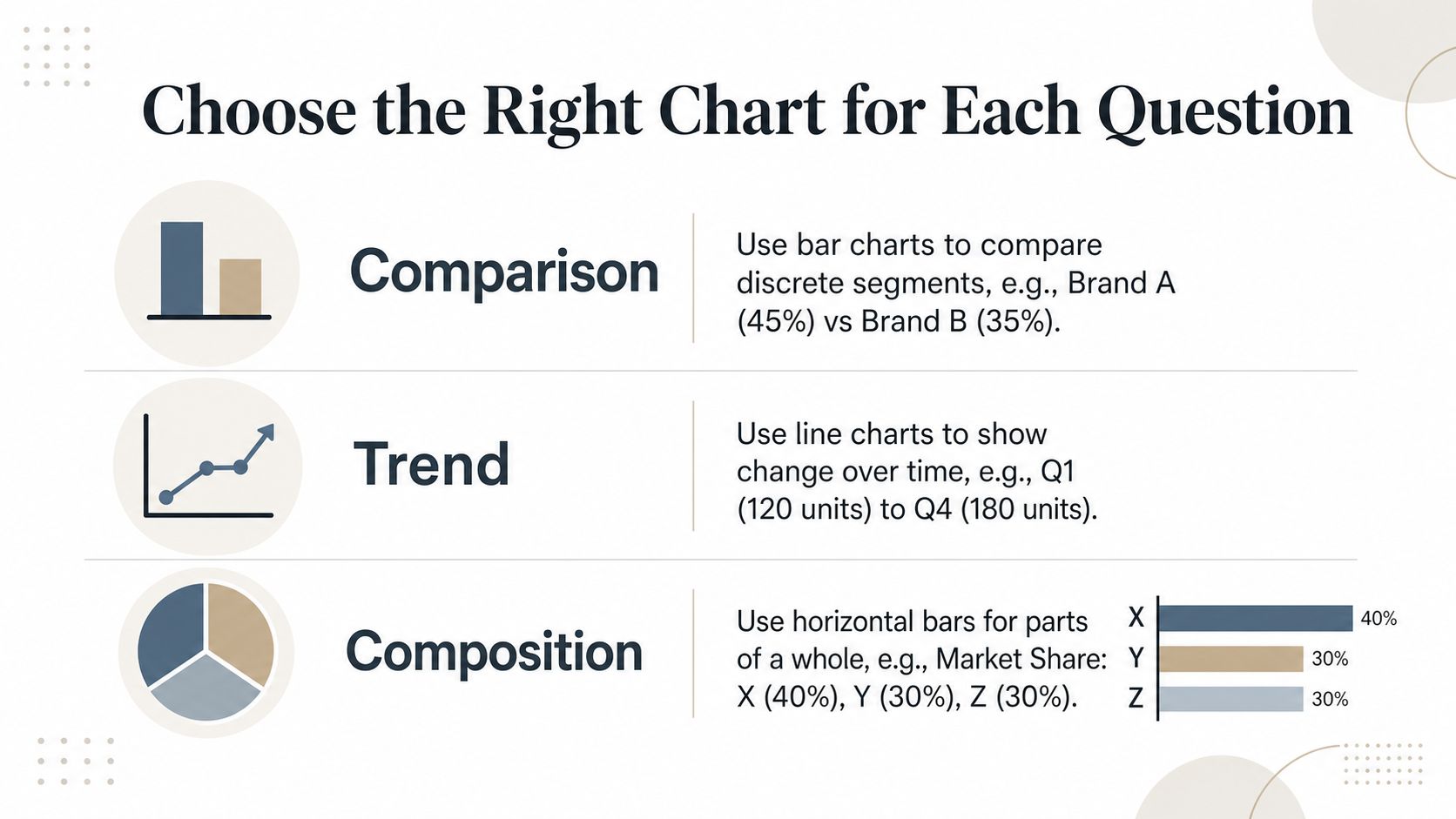
One chart per decision question keeps the deck honest and forces editorial restraint. If the audience needs to compare segments, use a comparison chart. If they need to see change over time, use a trend chart. If they need to understand how a mix is formed, use a composition chart that keeps the structure readable.
Match the form to the decision
Columns work well for comparing discrete segments or a small number of time buckets, especially when values need to sit side by side. Lines are better when the point is motion across time, because direction and inflection show up fast. Horizontal bars help when labels are long and a vertical axis would turn the slide into clutter.
Pie charts still have a place, but only when the parts of the whole are few enough to read at a glance. Scatter plots fit two-variable relationships. Heatmaps are useful when density across two categorical dimensions matters more than individual points. That is also why the guidance in this guide to data visualization best practices stresses layouts that support scanning, since the eye handles structured comparisons more easily when the chart is built for reading.
The one-chart-per-insight rule keeps the deck honest. It also forces editorial restraint, because every extra gridline, second axis, or legend entry has to earn its place against the decision question on the slide.
Practical rule: if the chart can’t be understood in a five-second glance from across the room, simplify it.
Put the takeaway on the canvas, not in a footnote or a hidden caption. The slide should tell the audience what matters before they ask, and the headline should state the insight, not just describe the visual. That is the difference between a slide that informs and a slide that makes someone lean forward.
The chart type also needs to fit the reading mode. A bar chart supports quick rank-order comparisons. A line chart works when movement is the story. A composition view helps when the question is about share, mix, or contribution.
Make Findings Interactive Instead of Static
A static slide asks the room to accept your framing. An interactive deck lets people test it while you are still in the conversation. That matters in market research, where segmentation, comparisons, and context often decide whether the finding feels convincing or shaky.
Let people explore without losing the story
Use widgets that let viewers filter by segment, hover for definitions, toggle time periods, or move from summary to detail. Keep those controls close to the insight they qualify, not buried in an appendix, so the audience can explore during the meeting instead of after it. The default view still has to work on its own, because many stakeholders will never click unless the design gives them a clear reason.
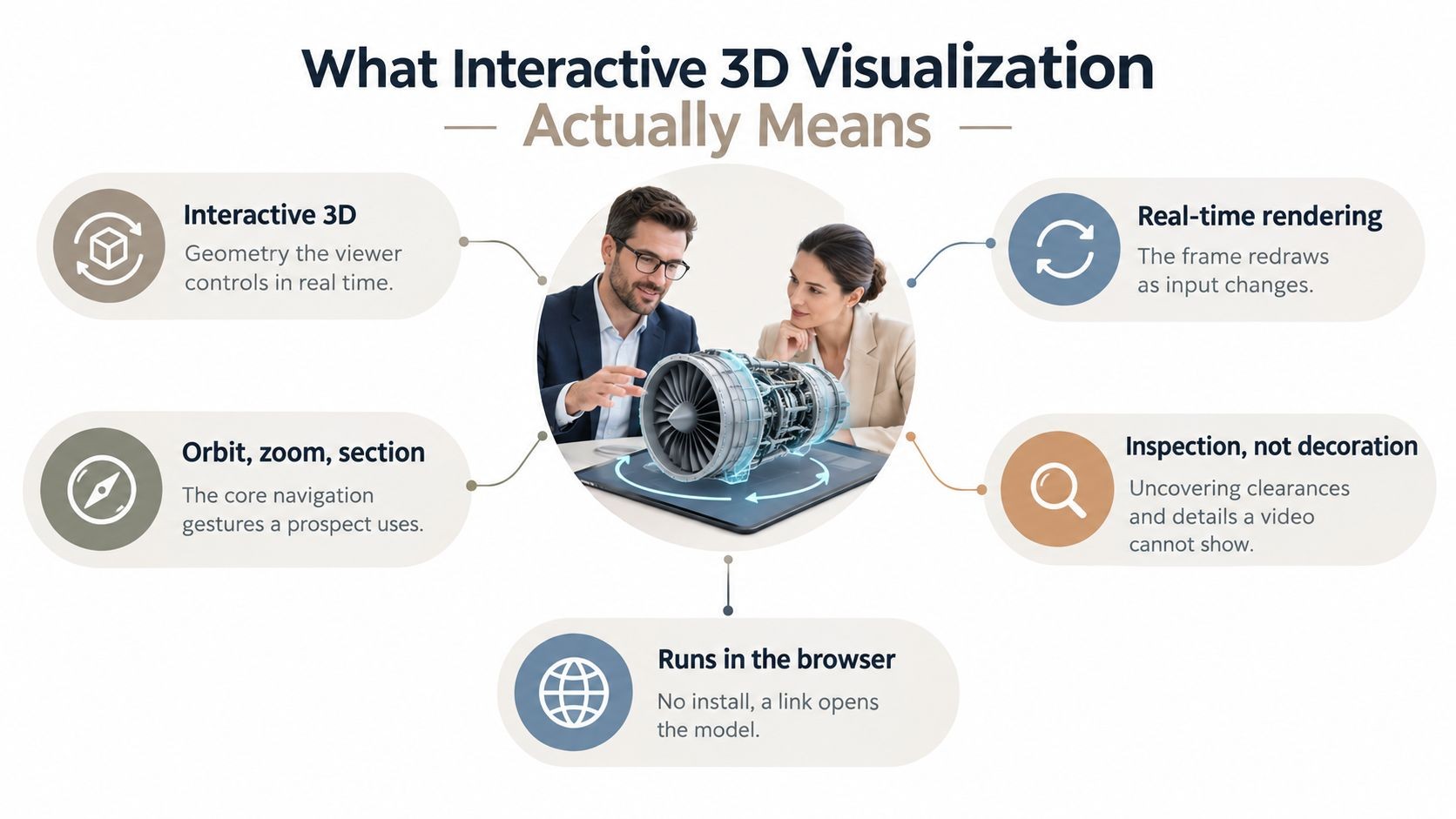
Live data feeds add another layer of trust. If the source sheet or API refreshes, the chart updates without a manual re-export, so quarterly figures stay aligned with the latest source of truth. Native 3D helps when a flat screen hides what you are trying to explain, such as a product concept, a customer journey, or a geographic surface that benefits from rotation and zoom.
Control is the trade-off. Interactivity should deepen the message, not block it, so every widget needs a sensible starting state and a clear prompt. A useful slide says, “Filter by region,” or “Rotate the model,” and then shows why that action matters right away.
A live deck works best when exploration happens in front of the decision-maker, not in a follow-up email.
Encelade is a browser-based presentation platform that supports interactive widgets, live data connections through Google Sheets or APIs, and native 3D scenes, which makes it possible to turn research findings into web-native decks instead of static files. For teams that want a shareable deck with those behaviors built in, it is a relevant piece of the tool stack.
Assemble the Deck in an AI Presentation Platform
A research deck usually falls apart in the handoff from analysis to design. Start with the narrative, then let the platform handle the layout. Write a prompt that names the audience, the decision on the table, the headline finding, and the brand voice. Then load the cleaned dataset, the approved chart set, and the house style tokens so the first draft already reflects the system you want.
Build, review, and lock the system
Check the auto-generated outline against the story arc before you approve any slides. If the tension peaks after the recommendation, reorder the sections while the deck is still flexible. Replace placeholder copy with the annotated takeaways you already wrote, so the slide text stays tied to the evidence instead of the template.
Lock the visual system once the deck starts to settle. Charts should use the same palettes, axis styles, and label sizes across the presentation, otherwise the result feels like a collage of unrelated outputs. That consistency is what makes a research narrative feel credible.
Keep the interactive pieces close to the evidence
Add interactive widgets, live data connections, and native 3D scenes only where they support the point. Use the platform’s component library instead of pasting in external assets, because the goal is a single presentation, not a patchwork of screenshots and embeds. For teams evaluating Encelade’s AI deck generator, the value sits in that same workflow, with structured generation, styling, and shareable output in one place.
Run the deck in present mode and click through every widget, including filters, tooltips, and 3D rotations, before leadership sees it. Then publish a branded share link for the people who decide, and keep a PDF backup for offline readers or compliance-driven teams. The deck is ready only when it can be experienced cleanly in the format the audience will use.
Ship the Deck and Measure What Happens Next
Delivery is where the deck stops being an artifact and starts acting like an instrument. That means you need a pre-flight pass, a distribution plan, and a feedback loop that captures what the audience did with the research after they saw it.
Rehearse the way the room will experience it
Run two rehearsals. The first is a solo pass that times each section and flags any chart that only makes sense after a spoken explanation, because those slides are fragile under pressure. The second is a live peer review with someone outside the project who can test whether the narrative arc still holds when the deck is fresh to them.
Then choose the deliverable format based on the audience’s habits. A tracked PDF with brief margin notes works for executives reading on the train, a live share link works for stakeholders who need comment threads and engagement visibility, and a downloadable data appendix helps analysts verify source tables without cluttering the main presentation.
Prepare for objections before the room raises them
Keep a small set of bridge slides ready for the three hardest objections. You may never need them, but if the room challenges the methodology, the segment split, or the recommendation, having a concise backup avoids dead air and keeps the meeting moving toward a decision. That’s also why the presentation should include explicit methodology details, because a claim is easier to trust when the room can see how the sample was drawn, which population it was meant to represent, and how the analysis was handled. The American Association for Public Opinion Research’s disclosure standards make the same case: disclosing the target population and the sampling method is what lets others interpret the findings and check the conclusions.
After the meeting, review the share-link analytics to see which slides triggered pause-and-discuss behavior. Capture the resulting decisions, follow-ups, and dissenting views in a one-page memo so the next deck starts with context instead of archaeology.
- Rehearse twice: time the solo run, then validate the narrative with an outside reviewer.
- Match the format to the reader: PDF for offline reading, live link for collaboration, appendix for verification.
- Keep bridge slides ready: use them only when the room needs a fast response to a hard objection.
- Review what the audience did: watch the post-share behavior, then record decisions and follow-ups in one memo.
Practical rule: if the deck didn’t change a meeting, it still needs a postmortem.
That loop is what turns market research into decision support. It’s also what makes the next presentation easier to justify, because the last one left behind a clear record of what changed.
If you want to turn market research, CRM notes, spreadsheets, and live data into a shareable deck that people can use, Encelade gives you the interactive presentation layer to do it. Build the narrative once, connect the numbers, and send stakeholders a deck that stays current, explorable, and ready for decisions.