You’ve probably lived this meeting already. The deck is full of pipeline numbers, product screenshots, implementation notes, and a slide with eight charts you were sure would land. You finish, the buyer thanks you, a few people nod, and then the call ends with the familiar line: “We’ll get back to you.”
That outcome usually isn’t a product problem. It’s a presentation problem. Buyers rarely reject a proposal because they saw too little information. They stall because the information never formed a decision story.
That’s why storytelling in presentations matters so much in sales, presales, and revenue work. The job isn’t to display everything you know. The job is to help the room understand who is affected, what’s at risk, why change matters now, and what action should happen next. Static decks often miss that. Interactive, web-native presentations can do it far better, but only if you build them with narrative discipline instead of treating interactivity like decoration.
Why Your Data-Dump Presentation Is Failing
The classic failed presentation doesn’t look failed while you’re building it. It looks thorough. There’s a market slide, an ROI slide, a competitive comparison, a product architecture slide, and enough backup material to survive any objection. Then you present it and discover that completeness isn’t the same thing as persuasion.
The reason is simple. Buyers don’t make decisions from isolated facts. They make decisions from meaning. A chart can prove a point, but it can’t tell the audience why that point matters to their world unless you build context around it.
According to data-storytelling research popularized by Stanford’s Chip Heath, in one Stanford study 63% of an audience remembered the stories in a presentation, while only 5% remembered a single statistic. That’s the cost of a data-dump deck. You may have the right numbers, but the room won’t remember them in a way that changes behavior.
What goes wrong in most business decks
Most weak presentations fail in one of three places:
- They open too wide: The presenter starts with company history, market context, or product breadth before the audience understands the problem.
- They stack proof too early: Charts and feature lists appear before anyone in the room feels the stakes.
- They end with recap instead of decision: The audience gets a summary, not a clear next move.
This shows up constantly in sales engineering. A team walks into a call determined to prove capability. So they dump integrations, architecture diagrams, security details, and reporting screenshots onto the buyer all at once. The content is real. The sequence is wrong.
Practical rule: Data earns trust only after the audience understands why the problem deserves attention.
What buyers actually need from you
A strong presentation answers four questions in order:
- Who is dealing with the problem
- Why the problem matters now
- What evidence proves the problem or opportunity
- What decision logically follows
That order matters more than slide polish.
A spreadsheet is not a story. A dashboard is not a story. Even a compelling metric isn’t a story until you attach it to a person, a consequence, and a choice. That’s the shift that makes storytelling in presentations useful for revenue teams. It’s not theater. It’s decision design.
If your presentations keep ending in “send us the deck” instead of “let’s move forward,” the problem usually isn’t missing information. It’s that the audience never found the thread.
First Find Your Hero and What Is at Stake
Generic audience analysis creates generic presentations. “Know your audience” sounds smart, but it often produces soft personas like decision-maker, operations lead, or end user. That’s not enough to build a deal story that sticks.
You need a specific human anchor. In sales work, that’s the person whose day gets harder if nothing changes and whose credibility improves if the solution works. Call this the Protagonist Stakes Method. Before writing a slide, identify one real person in the account who represents the business tension.

A lot of teams skip this step because they think business buyers only care about company-level outcomes. They don’t. Company outcomes matter, but meetings move when someone in the room sees their own problem clearly inside the story.
The data-abstraction gap
Here’s where many presentations collapse. The deck shows declining adoption, long review cycles, or inconsistent forecast quality, but nobody says who has to live with that reality every day. The audience sees data without a protagonist.
Naming the affected person is one of the easiest, most overlooked upgrades you can make. A specific, named protagonist gives the room someone to attach the stakes to — yet most decks default to a faceless “the customer” instead.
“Operations is struggling” is weak.
“Sarah, the warehouse manager, is manually reconciling exceptions before every shipment cutoff” creates tension instantly.
If your chart has no affected person, it won’t carry emotional weight, no matter how accurate it is.
How to find the right hero in a real account
Don’t invent the protagonist. Pull them from the material you already have:
- CRM notes: Look for the person repeatedly tied to delays, escalations, reporting pain, or approval pressure.
- Discovery transcripts: Listen for phrases like “my team has to” or “I spend too much time.”
- Internal handoff notes: AEs and SDRs often capture who pushed the evaluation forward and who resists change.
- Support history or prior evaluations: These reveal who experiences the friction most directly.
Then define the stakes in plain language. Not abstract business language. Actual consequences.
A good stake statement sounds like this:
- Career risk: “If rollout slips again, she owns the explanation.”
- Operational pain: “His team is still rebuilding reports by hand before leadership reviews.”
- Commercial urgency: “If they can’t prove adoption, budget gets harder to defend.”
How this changes the presentation itself
Once you’ve identified the hero, your choices sharpen. You stop building broad slides for everyone and start sequencing evidence around one decision path.
That means:
| Weak approach | Strong approach |
|---|---|
| “Here are our platform capabilities” | “Here’s what stops Sarah from hitting her target today” |
| “Customers need better visibility” | “The regional ops lead can’t trust the current handoff” |
| “Our product supports automation” | “This removes the manual review step causing late approvals” |
In practice, this is what makes storytelling in presentations persuasive instead of decorative. You’re no longer presenting to a room. You’re helping the room rally around a visible human problem.
Map Your Data to a Compelling Narrative Arc
Once the hero is clear, the next mistake is dumping every data point you’ve collected into the deck. Good presenters don’t show all the evidence. They sequence the evidence so the buyer can follow the logic without doing the narrative work themselves.
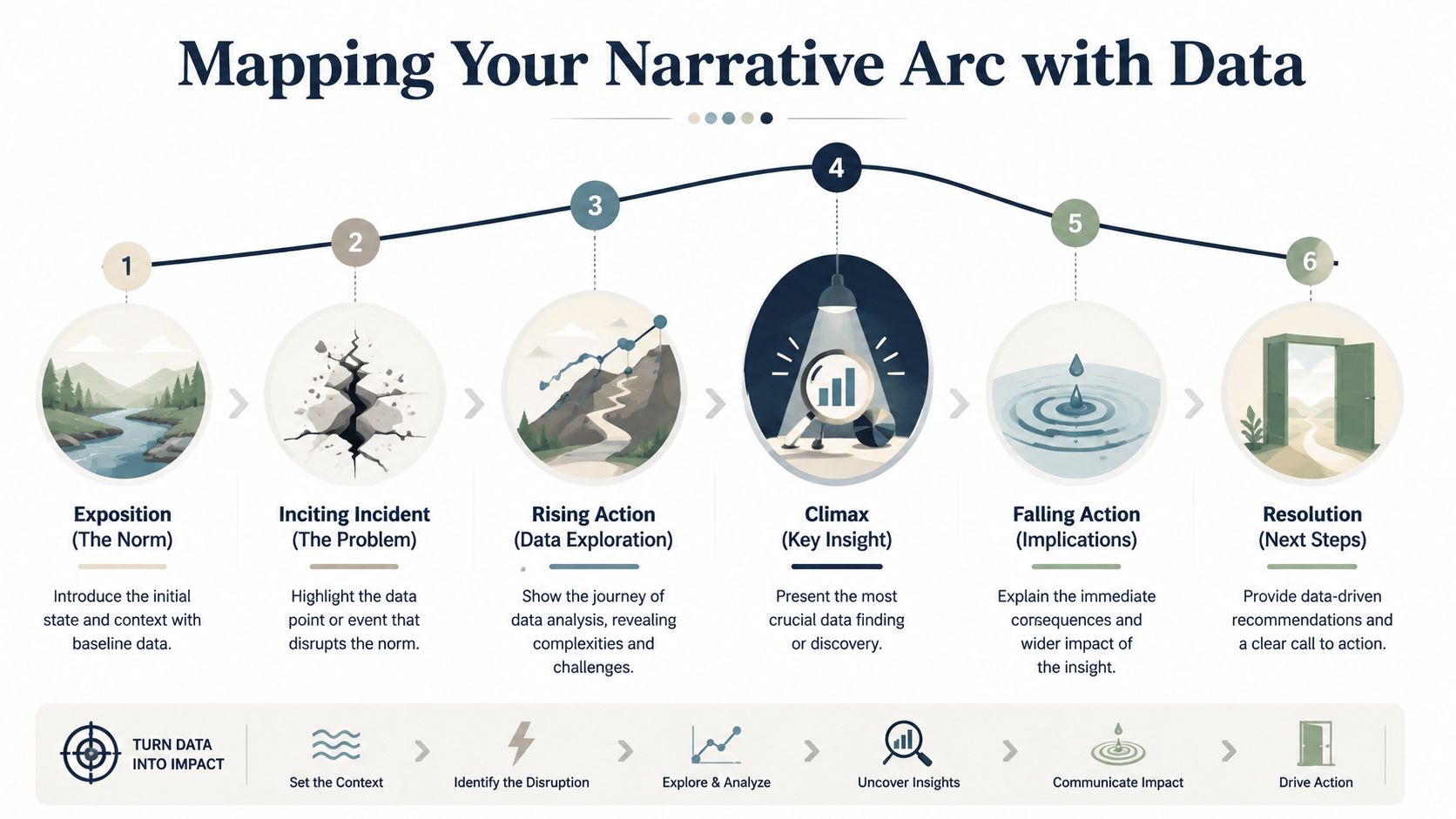
Choose an arc before you choose slides
For sales presentations, three arcs work well because they turn analysis into movement.
| Narrative Arc | Structure | Best For |
|---|---|---|
| Problem, Agitation, Solution | Start with the issue, intensify the cost of staying put, then present the path forward | Competitive deals, urgent pain, rescue narratives |
| What Is vs What Could Be | Contrast the current state with a better operating model | Executive presentations, transformation stories |
| Situation, Complication, Resolution | Establish baseline conditions, reveal what changed, then explain the response | Renewals, expansion, internal business cases |
If your team needs help structuring the deck before content goes in, this guide on building a strong PowerPoint presentation outline is a useful planning reference.
The wrong move is mixing arcs midstream. A deck that starts as a customer pain story and then turns into a random feature walkthrough loses force. Pick one arc and let every chart, screenshot, and demo segment serve it.
Turn raw metrics into a sequence
A useful test is this: can you explain why each data point appears exactly where it appears?
The IxDF example on storytelling in presentations is a good model. It describes a mobile banking app where only 55% of users completed the signup flow — then, after a redesign, completion rates rose by 40%. That sequence works because it creates a before-and-after journey instead of listing metrics in isolation.
Use the same logic in presales:
- Baseline the normal state. Show the current workflow, current conversion path, or current reporting model.
- Introduce the break. Reveal the one number or pattern that proves the current state is failing.
- Build tension with supporting evidence. Add only the data that deepens understanding of the issue. Remove everything that merely proves you did more analysis.
- Land the insight. State the takeaway in one sentence the buyer could repeat internally.
- Resolve with a next-step view. Show how the decision fixes the break and what changes afterward.
Here’s the practical difference. A weak deck says, “Here are six adoption metrics from the last quarter.” A strong deck says, “The workflow looks stable until handoff, where completion drops. That break explains the missed target. Here’s what changed in teams that removed that friction.”
This short talk from people-analytics educator Kerry Hart, How to Tell a Compelling Story with Data, is worth watching: it walks through a simple framework for turning data into a narrative that drives action.
What to cut so the story gets stronger
Most decks improve when you remove slides, not when you add them.
Cut these first:
- Parallel metrics with no decision value: If two charts say the same thing, keep the clearer one.
- Evidence without consequence: A number that doesn’t change the audience’s view of the problem doesn’t belong.
- Feature clusters: Don’t list capabilities unless they resolve a tension already established in the story.
Your best metric isn’t the biggest one. It’s the one that changes the room’s conclusion.
That’s the discipline behind storytelling in presentations. Data still matters. It just needs a plot.
Design Slides That Support the Story Not Replace It
A slide should direct attention, not compete for it. Dense slides force buyers to choose between reading and listening. Once that happens, the presenter loses control of pacing, emphasis, and timing.
Many technically strong teams underperform in this aspect. With comprehensive product knowledge, they attempt to preserve nuance on the canvas. The result is a visual transcript of everything they could say, instead of a visual aid for what they should say.
What dense slides do to a sales conversation
Overloaded slides create three problems fast.
- They flatten priority: If everything is on screen, nothing feels important.
- They invite side quests: Buyers latch onto a stray bullet or a tiny chart label and the narrative drifts.
- They weaken confidence: A cluttered deck makes the presenter look uncertain about what matters most.
In live deals, one idea per slide isn’t a design preference. It’s a control mechanism. It helps the presenter manage sequence, objections, and emotional pace.
A visual should do one of four jobs well: frame a problem, spotlight proof, show change, or support a clear decision. If a slide tries to do all four, it usually does none of them cleanly.
A better visual rule set
The strongest slide design for storytelling in presentations is sparse, deliberate, and easy to scan.
Use this rule set:
- Lead with a point, not a topic: “Completion breaks at handoff” is stronger than “Workflow analysis.”
- Show one dominant element: One chart, one screenshot, one quote-like statement, or one diagram.
- Use reveal logic: Don’t display the full answer before you’ve created the question.
- Make numbers legible at a glance: If the key metric can’t be understood instantly, simplify the view.
- Leave room around the important thing: Negative space is what tells the eye where to land.
A clean background offers benefits that are often overlooked. If you need inspiration, these examples of good backgrounds for Google Slides show how subtle visual treatment can support clarity without stealing focus.
What works better than bullet-heavy slides
Try replacing common slide types with stronger alternatives:
| Weak slide type | Better replacement |
|---|---|
| Agenda slide with long bullets | A short opening statement that frames the buyer’s problem |
| Feature matrix | A decision slide showing which capability solves which blocker |
| Multi-chart dashboard screenshot | A single annotated chart with one takeaway |
| Text-heavy summary | A resolution slide with decision, owner, and next step |
The trade-off is real. You will leave information out of the main flow. That can feel risky, especially for technical sellers. But buyers don’t need every detail at once. They need the right detail at the right moment.
Keep the extra material in appendix slides, backup tabs, or supporting docs. Put the core story in the live path. That separation makes you look sharper, not less prepared.
Weave Interactive Elements into Your Narrative
Static slides are useful for control. Interactive elements are useful for involvement. The problem starts when teams bolt interactivity onto the end of a presentation like a product carnival. The audience sits through the narrative, reaches the conclusion, and then gets a detached demo that resets the emotional arc.
That pattern breaks momentum. The story peaks, then the meeting drops into exploration mode without a clear reason.
Most demos break the story at the worst moment
The strongest use of interactivity isn’t at the end. It’s in the middle, while the stakes are rising.
That’s because timing changes how interactivity lands: a moment of interaction while the stakes are still rising pulls the buyer into the reasoning, where the same widget shown after the conclusion is just a demo bolted onto the end. Engagement in a live sales meeting isn’t a vanity metric — it changes the extent to which the buyer participates in the reasoning.
A cost simulator used while discussing budget pressure feels relevant. The same simulator shown after the recommendation lands feels optional.
Interactivity works when the buyer uses it to discover the problem with you, not after you’ve already solved the story for them.
How to place interaction without losing control
Think of interactive elements as narrative instruments. Each one should have a job tied to a specific moment.
Use them like this:
- Early-stage exploration: Interactive maps, timelines, or account-specific process views help establish context.
- Rising action: Cost calculators, scenario toggles, and live charts let the audience test the consequences of staying put.
- Climax: A focused product interaction proves the turning point. For instance, a live workflow, dashboard state change, or model manipulation can land hard.
- Resolution support: A final interactive checklist or rollout view helps confirm execution readiness.
What doesn’t work is throwing in every available widget because the platform allows it. More motion does not equal more persuasion. Every interaction introduces cognitive load. The buyer has to understand both the business point and the interface behavior. If the interaction doesn’t clarify the point, cut it.
The practical standard for non-linear storytelling
This is a major shift in modern storytelling in presentations. You’re not confined to a linear slide deck, but you still need narrative control. The structure should feel non-linear to the audience only in the sense that they can explore details naturally. The strategic sequence still needs to be deliberate.
A useful test before presenting:
- Can the audience interact without getting lost?
- Does the widget appear before the key insight, not after it?
- Will the interaction sharpen the decision or just entertain the room?
If you’re building more dynamic buyer experiences, this walkthrough on how to make interactive slides shows practical patterns worth borrowing.
The trade-off is that interactive storytelling takes restraint. The presenter has to decide where freedom helps and where it dilutes tension. Done well, interaction turns the buyer from observer into participant. Done poorly, it turns the meeting into software tourism.
Craft a Resolution That Demands Action
A presentation can be memorable and still fail. That happens when the ending explains the situation well but never turns understanding into commitment.
In business presentations, the resolution has one job. It should make the next step feel like the natural outcome of everything the audience just saw. Not an abrupt ask. Not a generic “any questions?” slide. A clear decision path.
The ending should remove ambiguity
Most weak endings fall into one of two traps. They either summarize the deck one more time, or they make an ask so broad that no one owns the next move.
A stronger ending names the action, the owner, and the timeline. It treats the CTA as the resolution of the story, not a separate sales move.
That matches what revenue teams see in practice: buyers respond better when the ending resolves the tension the presentation built and makes the next step obvious. An ending that only recaps leaves the room to decide what to do; an ending that names the action does it for them.
A practical CTA formula for business presentations
Use this structure:
- Restate the conflict in one line. “The handoff gap is where completion breaks and reporting confidence drops.”
- Name the decision. “The next step is to validate the redesigned workflow in a controlled pilot.”
- Assign ownership. “Operations leads the process review, IT confirms data access, and the sponsor approves the pilot scope.”
- Set the immediate timeline. “We align on scope this week and review the pilot plan in the next meeting.”
- Tie the action back to the stakeholder stakes. “That gives the operations lead a cleaner process before the next executive review.”
That ending works because it closes the loop on the protagonist and the problem. It doesn’t just say “buy.” It says, “Here is the logical move that resolves what you now agree is broken.”
CTA templates you can actually use
Here are three patterns that work in live deals:
- For a pilot motion: “If this matches the workflow issue your team wants to fix, the right next step is a pilot focused on this use case, with clear owners and a review date.”
- For executive approval: “If the priority is reducing decision friction, the next move is executive sign-off on the rollout path we’ve outlined today.”
- For technical validation: “If the team agrees the current process is the blocker, the next step is a technical session to validate this architecture against your environment.”
A good CTA doesn’t add pressure. It removes uncertainty.
The final check is simple. If your audience can leave the meeting and repeat the exact next step without opening the deck again, your resolution did its job. If they can only remember that the presentation was informative, it didn’t.
How Encelade builds this framework in
Everything above is the manual version — it’s also how Encelade generates a deck. The planner runs the same steps in order: it pins down the hero and the stakes, picks a narrative arc, sequences the evidence, and shapes each slide around one point. And it shows you every step before it builds, so you’re adjusting a story rather than reverse-engineering one from finished slides.
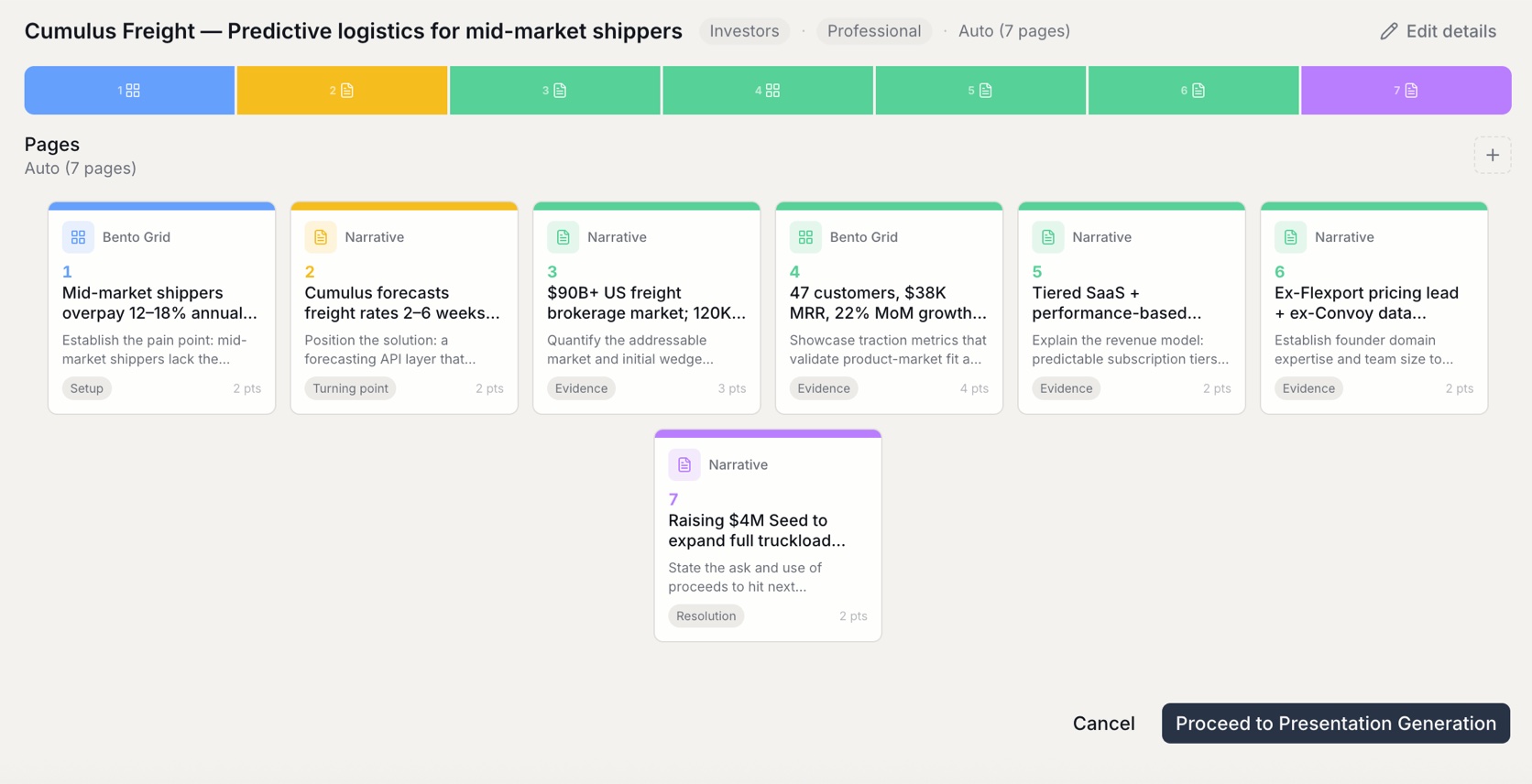
Encelade helps revenue teams turn research, CRM notes, spreadsheets, and product context into interactive, web-native presentations that are easier to personalize and easier to act on. If you want storytelling in presentations that goes beyond static slides, Encelade is built for that workflow.