You finish a deck on Thursday. Product screenshots are current, pricing is right, pipeline numbers look clean. The buyer opens it on Monday, the screenshot is from the wrong release, the forecast is stale, and half the examples could apply to any company in their category.
That’s the fundamental problem behind most searches for how to make interactive slides. It isn’t about adding a poll or making a button clickable. It’s about building a presentation that stays relevant after you send it, adapts to the account in front of you, and helps a buyer explore the parts they care about.
For sales engineers, AEs, enablement teams, and revenue ops, interactive slides work best when they act more like a lightweight product surface than a file. The useful version is web-native, connected to live data, and structured so a buyer can move from overview to proof to implementation without getting lost. That’s how you stop sending static attachments and start delivering guided, current, account-specific experiences.
From Static Slides to Dynamic Experiences
Static slides fail in familiar ways. Someone downloads a file, edits a local copy, forwards the wrong version, and presents numbers that were accurate once but aren’t accurate now. The format itself creates drift.
Interactive decks fix that by changing the delivery model. Instead of a file that gets copied, you share a link. Instead of locking charts and screenshots at export time, you use components that can update, reveal detail on click, and branch to deeper material only when the buyer asks for it.
That shift matters because audience behavior has already moved. Duarte found that 64% of people believe a flexible presentation with two-way interaction is more engaging than a linear one, according to Duarte’s presentation statistics roundup. If your deck still assumes people will sit through a straight line of title slide, agenda, problem, solution, pricing, and Q&A, you’re designing against the way people prefer to engage.
What changes in practice
The old deck is presenter-centered. The new deck is audience-driven.
| Approach | What it looks like | Typical problem |
|---|---|---|
| Static file deck | PPTX or PDF emailed around | Version drift, stale data, generic storytelling |
| Interactive web deck | Link-based presentation with widgets and branching | Requires more planning up front, but stays usable longer |
A web-native presentation behaves more like a micro-site for a single deal. The buyer can open a technical appendix without derailing the core story. A champion can share the same link internally. Your team can update one source instead of chasing attachments.
Practical rule:If a slide contains information that changes often, don’t freeze it into an image unless compliance requires it.
More animations are not what’s needed. Instead, the focus should be on fewer dead screenshots, fewer duplicate files, and fewer generic slides. That’s the useful frame for how to make interactive slides in 2026. Start with the narrative, choose the right interaction model, then connect the deck to the systems that already hold your truth.
Planning Your Interactive Narrative and UX
A strong interactive deck is designed like a product flow. Before you add a single widget, decide what the buyer needs to understand first, what they may want to inspect next, and where they’re likely to push for proof.
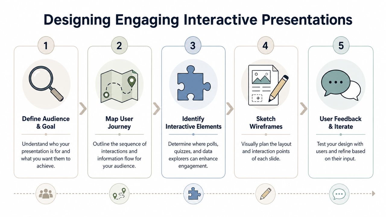
Start with the primary path
The primary path is the route most viewers should take without extra clicks. In a sales deck, that’s usually problem, business impact, solution fit, rollout approach, and next step. In a technical validation deck, it may be architecture, security, data flow, integration points, and implementation plan.
Keep that path short and legible. If every slide contains multiple branches, the experience stops feeling interactive and starts feeling messy.
A simple storyboard works better than a complex one:
- Opening context. Name the account problem in their language.
- Decision frame.Show the criteria they’re likely using to evaluate options.
- Interactive proof point. Let them manipulate, inspect, or drill into something meaningful.
- Implementation depth. Offer detail for technical stakeholders without forcing everyone through it.
- Action slide. Give a clear next move.
Design side paths that earn their place
Side paths should exist for a reason. Good branches answer real buyer questions. Weak branches are just hidden content the presenter didn’t know where to place.
Use branch slides for things like:
- Technical depth for security, APIs, architecture diagrams, or deployment details.
- Commercial exploration for packaging logic, pricing configurators, or rollout options.
- Proof assets such as customer video, implementation plans, or benchmark walkthroughs.
- Persona-specific paths so an executive sees outcomes while an admin sees workflow detail.
Clickable navigation matters most on dense slides. Prezlab’s guidance on interactive presentations notes that using clickable buttons to progressively reveal information on a single slide prevents audiences from reading ahead, while exploration buttons can link to detailed plans without disrupting the main narrative. That’s exactly how to handle layered material. Reveal what supports the current point, then offer an optional branch for the audience that wants more.
One central idea per slide still applies. Interactivity doesn’t rescue a crowded slide. It gives you a cleaner way to stage information.
A few UX rules hold up well in practice:
- Use obvious labels.“See architecture” works better than “Explore.”
- Keep return paths visible. Every branch should have a clear way back.
- Limit hidden depth. If viewers have to click through multiple levels to find an answer, your structure is too deep.
- Favor progressive reveal over stacking text. Don’t make people read the ending before you’ve made the point.
If you’re learning how to make interactive slides, the quality gap becomes apparent. Most weak decks fail before the build step. They don’t have a usable path.
Composing Slides with Interactive Widgets
Widgets are where interactive slides stop being theory. They’re the building blocks that replace static screenshots, overloaded comparison tables, and one-size-fits-all layouts.
Pick widgets by decision, not by novelty
The question isn’t “What can I add?” It’s “What decision does this help the buyer make?”
A few examples:
- Maps work when territory, rollout sequence, or regional ownership matters.
- Filterable charts help when you need to compare scenarios without duplicating slides.
- Device mockupsare useful when screenshots alone won’t explain a workflow across desktop and mobile.
- Code blocks matter for technical audiences that want to inspect payload shape, query structure, or implementation detail.
- Gantt widgets work for onboarding or phased deployment conversations.
That’s where account specificity matters. In Salesforce’s State of the Connected Customer research, 89% of business buyers say they expect companies to understand their unique needs and expectations. Generic content doesn’t just feel lazy. It forces the buyer to translate your story into their environment.
For more examples of useful interactions, this collection of presentation interaction ideas is a solid reference point.
Build one account-specific slide
A practical sales engineering pattern is a single-slide account brief that the rep can use in discovery, recap, and internal handoff.
Here’s what that slide can contain:
| Widget | What it shows | Why it works |
|---|---|---|
| Account map | Regions, business units, or rollout scope | Gives spatial context fast |
| Device mockup | Their likely user workflow | Makes the story concrete |
| Code block | Example payload or API response | Signals technical credibility |
| Expandable notes panel | Risks, dependencies, or assumptions | Keeps the main view clean |
One clean implementation is to start with the account summary at the top, place the workflow mockup in the center, and tuck technical proof behind a “View payload” button. That keeps executives out of the weeds while still giving technical evaluators a path into detail.
Later in the flow, a short product walkthrough helps anchor the layout decisions:
The biggest mistake here is adding interaction where plain text would do. If the buyer only needs one fact, show the fact. If they need to compare options, test assumptions, or inspect implementation detail, use a widget.
One browser-based option is Encelade, which supports widget-based layouts for maps, charts, device mockups, code blocks, and other interactive elements in link-based decks. Used well, that kind of editor lets a team build account-specific slides without hand-redesigning each variation.
The right widget reduces explanation. The wrong widget creates another thing you have to explain.
Binding Live Data and Embedding 3D Assets
Most tutorials stop at navigation and polls. That leaves out the part that matters most in revenue work: keeping data current and making complex products inspectable without leaving the deck.
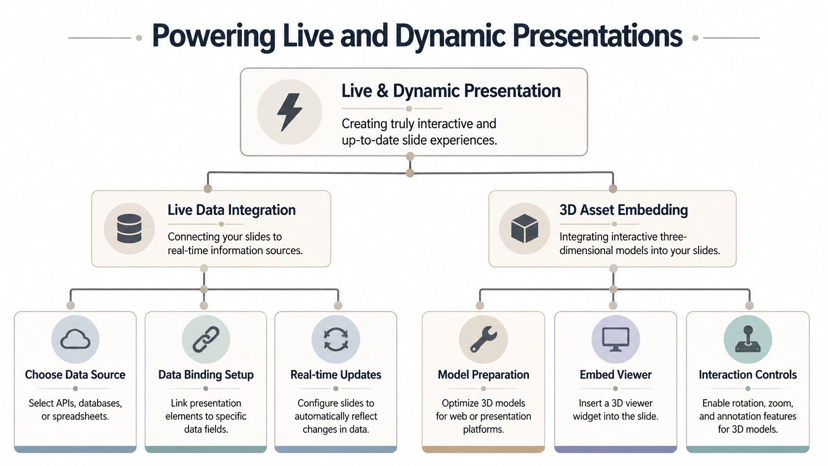
Stale numbers are the hidden cost of static decks. Industry estimates put B2B data decay at roughly 30% a year, so the pipeline figure or forecast you freeze into an image at export time is often wrong within months, as detailed in this analysis of B2B data decay. The fix isn’t a fresher screenshot. It’s a slide that reads from the source.
Connect a slide to live numbers
The most practical live-data pattern is simple. Bind a chart, KPI, or table to a source your team already updates.
Common sources include:
- Google Sheets for forecast models, implementation plans, launch checklists, and scenario tables
- CRM data via REST API for pipeline, account details, opportunity metadata, or usage indicators
- Operational tools where date filters and drill-down matter during the conversation
Visme’s overview of interactive presentations highlights a useful operational point: embedding live dashboards directly into slides lets presenters review real-time numbers, test scenarios, and explore insights on the spot instead of relying on screenshots.
A practical workflow looks like this:
- Choose the field that must stay current. Pipeline stage, adoption trend, open tickets, launch milestone, or seat count.
- Bind a widget to that field. Usually a KPI card, chart, or table.
- Set the view logic. Date range, segment filter, account name, or product line.
- Test for buyer-facing readability. If the data is accurate but hard to read, it still fails.
- Share the live link, not a static export. Otherwise you break the update chain.
If you need implementation detail, the Presentation API documentation shows the kind of programmatic interface teams use to bind content and automate updates.
If a rep has to remember to refresh the deck manually before every call, the process isn’t robust enough.
Add 3D that supports the sale
Native 3D matters in specific situations. It’s useful when the product has physical form, hardware context, spatial layout, or a complex visual structure that static images flatten too much.
Good use cases include:
- Medical or industrial devices that benefit from rotation and zoom
- Retail or environment planning where spatial orientation matters
- Technical product storytelling where layered components need annotation
- Interactive product visualization tied to account-specific configuration
The simplest pattern is to upload a .glb or .gltf model, place it in a 3D viewer widget, and enable rotation and zoom. A Spline scene works similarly when you want a richer web-native interaction.
Keep the controls minimal. A buyer should be able to rotate, zoom, and inspect. They shouldn’t need a tutorial. Add short labels or callouts only where they clarify a decision-relevant feature.
A few trade-offs are worth calling out:
- Use 3D when inspection matters.Don’t add it just to make the deck feel modern.
- Optimize the asset first. Heavy models slow the experience.
- Pair 3D with context. A rotatable object without annotations or narrative can feel like a toy.
- Use it where screenshots fail. Product anatomy, footprint, install orientation, or layered components are good candidates.
When teams ask how to make interactive slides that stay useful after the meeting, live data and embedded 3D are usually the most impactful upgrades. One keeps your facts current. The other makes complex products easier to understand without switching tools.
Automating Deck Generation with APIs and AI
Once the content is modular, connected, and interactive, the next step is to stop rebuilding the same deck for every account.
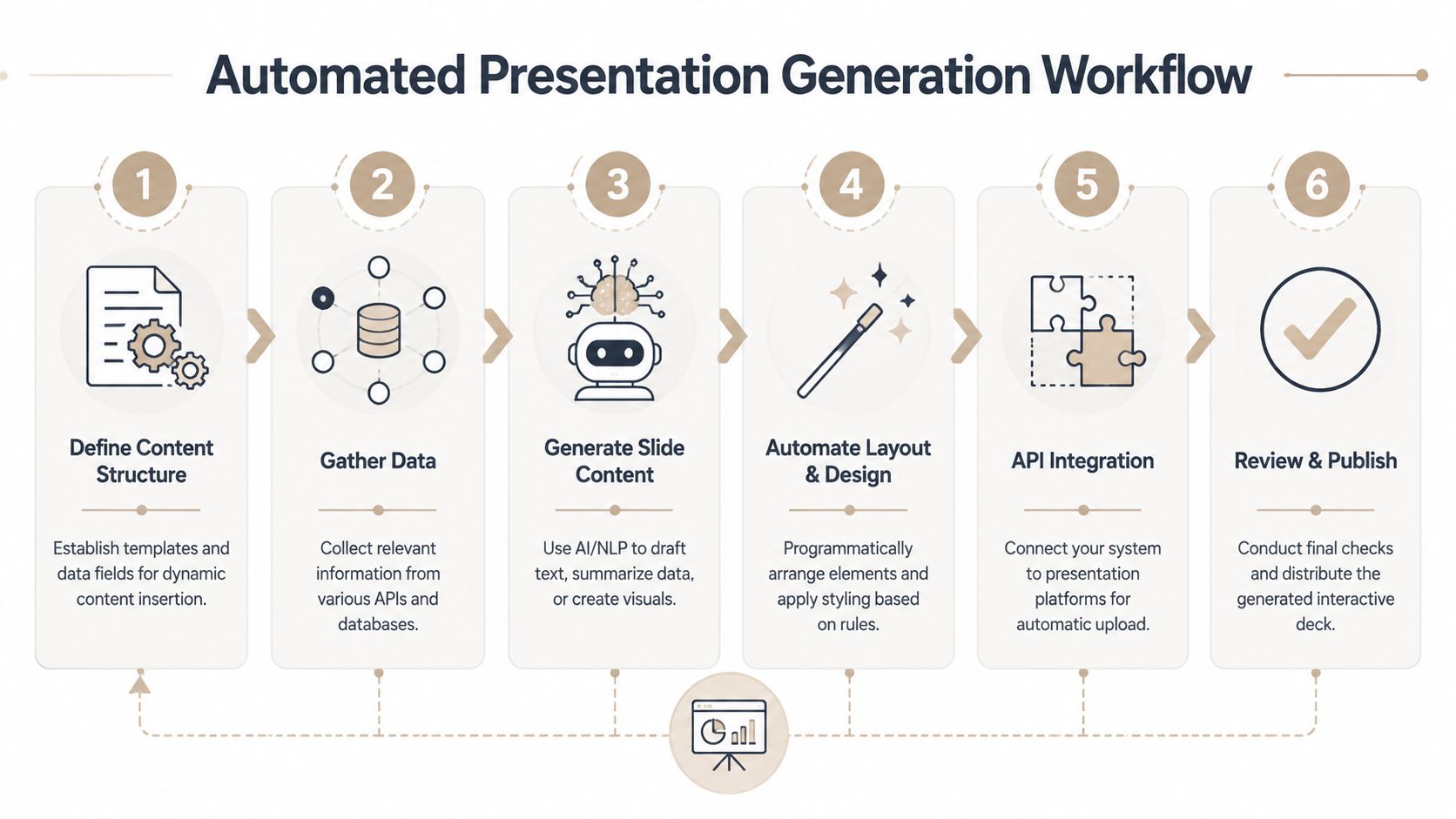
Turn one deck into a system
The shift is from authoring slides manually to generating presentations from structured inputs. Those inputs might be CRM notes, account research, onboarding details, spreadsheet values, or agent output.
| Trigger | Data pulled in | Output |
|---|---|---|
| New opportunity stage change | Account name, pain points, product line, owner notes | Customized discovery or proposal deck |
| Closed won event | Contract details, onboarding scope, timeline | Customer onboarding presentation |
| Expansion motion | Usage context, team adoption, feature gaps | Tailored growth narrative |
One useful example is a closed-won automation. The CRM changes state. A workflow collects account name, plan, implementation owner, key dates, and brand assets. The system generates an onboarding deck with those fields already placed in the right components, then publishes a shareable link for the CSM and implementation team.
That’s where automation becomes more than convenience. It removes the repetitive assembly work that slows down follow-up.
Use AI for speed and APIs for control
The strongest setup combines AI-assisted drafting with programmatic structure. AI can summarize notes, draft account-specific copy, and propose slide outlines. APIs then place content in the right widgets, apply approved branding, and publish a deck consistently.
AI adoption for this work is already mainstream. In Visme’s presentation statistics roundup, 28% of designers report using AI to create stakeholder presentations and 79.4% use it to write content. That aligns with what most revenue teams are trying to fix: the lag between a conversation and a personalized follow-up.
A few design choices make automation workable:
- Template around decisions, not departments. Build one proposal template, not separate decks for every rep.
- Separate content from styling. This makes bulk restyling possible without rewriting slides.
- Use named fields everywhere. Company name, logo, rollout date, owner, environment, and plan details should be injectable, not hardcoded.
- Keep branch logic intentional.Automation can create too much content if you don’t define who each branch is for.
For teams building around agent workflows, this article on generating presentations from AI agent output shows the practical pattern. AI drafts. Systems enrich. The deck generator assembles. The team reviews and shares.
Automation should remove assembly work, not remove judgment. Someone still needs to decide what the buyer should see first.
If you’re serious about how to make interactive slides at scale, this is the threshold. One polished deck helps one meeting. A generation workflow helps every meeting after that.
Sharing, Collaboration, and Export Best Practices
Delivery decides whether the deck stays useful. Teams often spend most of their effort on build quality, then lose the advantage by exporting too early or sharing files that fork into multiple versions.
Use links as the source of truth
A link-based workflow solves problems that file-based sharing creates by default. Everyone opens the same presentation. Edits happen once. Comments stay attached to the live artifact. Analytics remain tied to the shared experience instead of disappearing into inbox attachments.
That matters for several day-to-day reasons:
- Sales reps need a current link.They shouldn’t wonder which version is safe to send.
- Managers need visibility. A shared workspace makes review and approval easier.
- Presales teams need context. Comments and role-based collaboration keep handoffs tighter.
- Buyers need consistency. The champion and the technical evaluator should see the same core story.
A good collaboration model includes shared workspaces, comments, and permissions. That lets a rep request a pricing update, a solutions consultant add technical proof, and enablement lock down the theme without turning deck production into a Slack scavenger hunt.
The analytics side matters too. Link-based delivery gives teams practical feedback such as views and time spent on slides. Used well, that tells you where the buyer slowed down, what they revisited, and which branch content got opened.
Export for the edge cases
PDF and PPTX exports still matter. Some stakeholders need an offline copy. Some procurement or compliance workflows expect a file. Some executives just want a document they can forward internally.
Exporting isn’t the problem. Treating the export as the primary asset is the problem.
A clean operating model looks like this:
- Keep the live link as the source of truth.
- Export PDF for archival or read-only circulation.
- Export PPTX only when the receiving workflow requires it.
- Label exports clearly so nobody mistakes them for the live version.
A few practical habits help:
- Add alt text to images if the presentation may be distributed digitally.
- Use subtle transitions only in live presentations. Heavy effects rarely survive export cleanly.
- Check branch paths before sending so every button still leads somewhere useful.
- Review mobile responsiveness because many buyers open links on phones first.
The final mile is where disciplined teams stand out. They don’t just know how to make interactive slides. They know how to keep those slides current, collaborative, and usable after the meeting ends.
If you want a practical way to build web-native decks with live data, interactive widgets, native 3D, API-based generation, and link-based sharing, Encelade is built for sales, marketing, and revenue teams working through exactly those problems.