You’re ten minutes into the pitch, and the room has gone quiet for the wrong reason. One buyer is scanning email, another is half-listening, and your best slide is still six clicks away. Static decks create that problem every day in B2B sales. They force the buyer to sit still while the seller does all the work.
That format no longer holds up. Prezi’s 2018 State of Presentations research found that 68% of business professionals believe interactive presentations are more memorable than static ones. In sales, memorable matters because buying groups rarely make decisions in the room. They leave, compare, forward, debate, and revisit. If your deck can’t keep working after the meeting, it’s not helping the deal.
The fix isn’t adding gimmicks. It’s building deliberate interaction into the points where buyers usually drift, challenge assumptions, or need to see relevance for themselves. Good presentation interaction ideas give the audience a job to do. Explore this number. Choose this path. Adjust this scenario. Comment on this slide. That shift turns a pitch into a working session.
For revenue teams, that’s the difference between “a guided tour” and “let’s evaluate this together.” The ideas below are built for real sales cycles, not classroom icebreakers. Each one is practical, buyer-facing, and suited to modern interactive platforms.
1. Live Data-Driven Dashboards
A late-stage buyer will forgive plain design faster than stale numbers. If your proposal deck shows old usage data, old benchmark snapshots, or manually pasted pipeline metrics, confidence drops immediately.
That’s why live dashboards are one of the strongest presentation interaction ideas for B2B teams. Instead of asking the prospect to trust a screenshot, you let them inspect current numbers inside the deck itself. In QBRs, renewals, and commercial reviews, that changes the tone from presentation to verification.

Why it works in revenue conversations
In Encelade, this usually means building a slide with Chart and KPI widgets, then connecting them to a sheet or API-fed source. If your team is generating decks programmatically, the Encelade Presentation API lets you wire current metrics into the experience instead of rebuilding slides by hand.
The practical win is simple. Buyers ask better questions when they can manipulate filters, inspect segments, or compare views that matter to their role. A finance stakeholder may care about adoption by business unit. An operations lead may care about time-to-value milestones. One dashboard can support both without duplicating slides.
Practical rule: Show fewer metrics, but make each one explorable.
A few implementation choices matter more than often realized:
- Pre-filter by audience: Build views for executives, operators, and technical reviewers instead of dropping everyone into the same dashboard.
- Test failure states:If a data source breaks, have a fallback state ready so the meeting doesn’t stall.
- Label live fields clearly: Buyers should know what updates automatically and what is a modeled assumption.
To measure success, start with time-on-slide and click activity on the dashboard slide. Then look for a stronger signal in follow-up. If the buyer references a specific live metric in email or asks for a deeper cut of the same data, the interaction did its job.
2. Interactive 3D Product Demos
Some products don’t explain well in screenshots. Hardware, physical systems, industrial tools, and visually dense interfaces all suffer when reduced to static images.
An embedded 3D model fixes that by putting the object in the buyer’s hands, even inside a shared deck. They can rotate, zoom, and inspect the thing you’re selling without leaving the presentation flow.
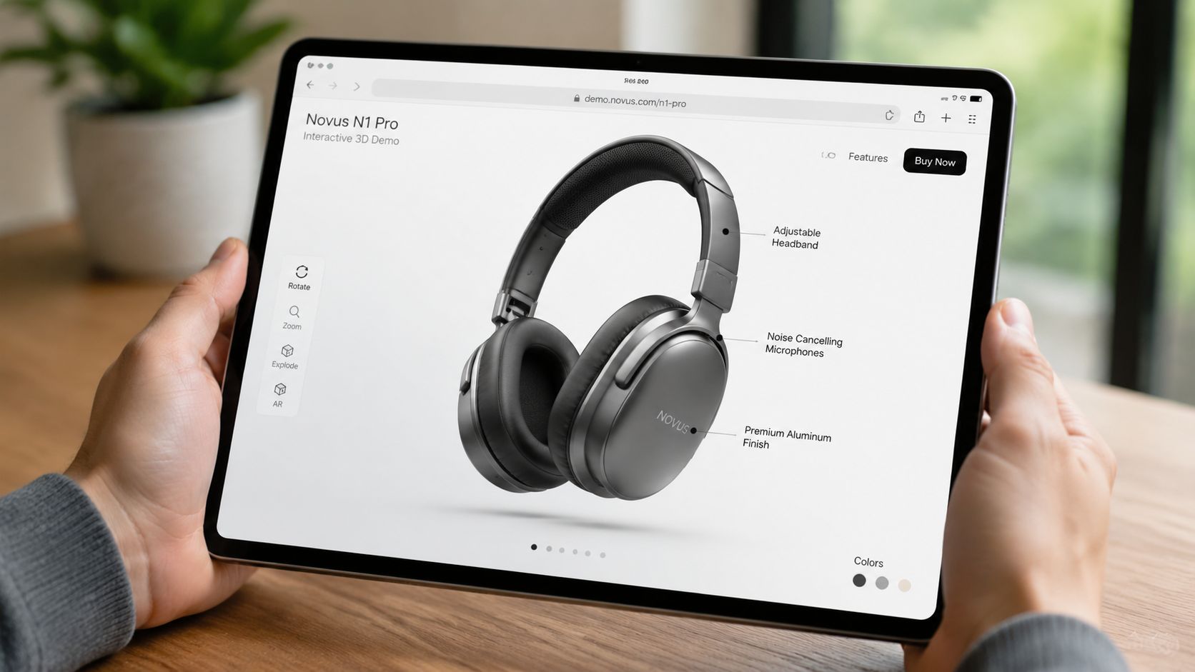
How to keep it useful
The trap is treating 3D as a novelty. A spinning product model with no guidance looks polished for ten seconds, then it turns into dead air. Good 3D interaction needs a reason to exist. Show internal components. Surface installation constraints. Let the buyer inspect the exact part that usually triggers questions.
Encelade supports native 3D models through .glb and .gltf files, as well as Spline scenes. In practice, the best sales use case is a guided free-explore pattern. Start the view at the angle that supports your message, then add hotspots or annotations so the buyer can dig deeper.
What works well:
- Simple default camera position:Don’t make the buyer hunt for orientation.
- Clear hotspots: Use labeled callouts for high-value features.
- Controlled motion: Limit over-rotation if it makes the model harder to understand.
What usually doesn’t work:
- Heavy files that lag on shared calls
- Auto-playing movement that fights the user
- Trying to explain the whole product in one model
For measurement, watch interaction events on the model itself. Rotations, zooms, and hotspot clicks tell you whether the buyer is exploring or merely viewing. In live calls, ask one direct question after the interaction: what stood out, what looked complex, or what raised a concern. The answer often reveals both product interest and objection surface area.
3. AI-Generated Account-Specific Narratives
Most reps don’t lose momentum because they lack content. They lose it because they can’t tailor fast enough. The first meeting comes together with a generic deck, a few manual edits, and a promise to customize later.
That’s a mistake. Personalization works best before the buyer has decided you sound like everyone else.
Where teams get this wrong
AI can help, but only if the inputs are structured. If CRM notes are vague and account research is dumped into a prompt without a narrative frame, the deck comes back polished but shallow. It sounds specific while saying very little.
A better pattern is to feed the system structured account context, buying-role priorities, current pain points, and target outcomes. Then use the Encelade guide to generating presentations from AI agent output as a practical model for turning agent-ready inputs into a usable deck.
The strongest account-specific narratives usually include:
- Role-aware framing: The first slides should read differently for a CFO than for a security lead.
- Account language:Mirror the buyer’s terminology from calls, filings, or internal documents.
- Selective proof:Use only the examples that match the account’s buying motion.
AI should draft the story. A human still has to remove what doesn’t belong.
This matters even more in remote buying. Gartner projected that 80% of B2B sales interactions between suppliers and buyers would occur in digital channels by 2025, which means your deck often needs to persuade people who weren’t on the call. A personalized narrative gives those unseen stakeholders enough context to engage without waiting for another meeting.
Measure this by watching operational speed and audience response. If your team can move from opportunity creation to a customized first meeting faster, and if meeting acceptance improves when personalized decks are part of outreach, the system is helping. Just don’t skip human review. One invented detail can erase the value of every personalized page that follows.
4. Interactive ROI and Pricing Calculators
Buyers don’t trust ROI slides that feel preloaded to support your number. They trust calculators they can challenge.
That’s the point of embedding an ROI or pricing model into the presentation itself. Instead of presenting a finished conclusion, you let the prospect test assumptions using their own team size, volume, workflow inputs, or rollout plan.
What buyers actually want from a calculator
The best calculators don’t try to prove the biggest possible outcome. They help the buyer build an internal case they can defend. In Encelade, that usually means combining Input, Slider, Formula, KPI, and text elements on a single slide so the result updates instantly as the buyer changes variables.
You can also connect this directly to proposal structure. The Encelade proposal structuring guide is useful because a calculator works best when it sits inside a larger commercial narrative, not as a random widget in the middle of the deck.
A few field-tested rules matter here:
- Expose assumptions: If labor savings or adoption rates drive the model, show them.
- Make variables adjustable: Hidden logic creates skepticism.
- Offer an export path: Champions need something they can share internally.
If a buyer changes three inputs and still likes the result, you’ve earned more credibility than a polished ROI slide ever could.
For measurement, look first at who interacts with the calculator and how far they go. A buyer who fills in their own values is doing active evaluation. That’s a stronger qualification signal than a passive deck view. The inputs themselves also sharpen follow-up. If they model a narrow deployment first, your next conversation should start with phased rollout, not enterprise expansion.
5. Embedded Interactive Timelines
Implementation anxiety kills good deals. The product makes sense, the business case is strong, and then the buyer starts imagining delays, internal dependencies, and handoff confusion.
An interactive timeline helps because it turns rollout from an abstract promise into an inspectable plan. Buyers can open phases, review milestones, and understand what happens when.
How to structure timeline interaction
In Encelade, a Gantt-style widget works well for this. The important part isn’t visual polish. It’s how clearly you separate vendor responsibilities, customer responsibilities, and value milestones. Most static timelines over-index on tasks and under-explain what the buyer needs to do.
The strongest version includes scenario paths. Standard rollout. Accelerated rollout. Region-first rollout. That makes the deck adaptable during the call and useful afterward when the champion has to socialize options internally.
Use this structure:
- Phase one: Decision and preparation
- Phase two: Deployment and enablement
- Phase three: Adoption and value checkpoint
A good timeline also helps with pacing inside the meeting. Guidance for presentation design suggests interaction should happen every 8 to 12 minutes to maintain attention. A timeline slide is a natural interaction point because it invites the buyer to ask, “Can we compress this phase?” or “What happens if our IT review slips?”
What doesn’t work is stuffing the timeline with every internal task from your project plan. That creates clutter and increases perceived complexity. Keep the buyer-facing version focused on confidence, accountability, and visible progress.
Measure success less by clicks alone and more by the tone of implementation questions. If buyers move from “this looks hard” to “could we start with this division first,” the timeline is reducing risk.
6. Interactive Choose Your Own Adventure Narratives
Most sales decks are linear because they’re easier to build. Buyers aren’t linear. The CFO wants commercial impact, the end user wants workflow detail, and the security reviewer wants architecture answers now, not twelve slides later.
Branching narratives solve that. A central hub slide lets the audience choose the route that matches their role or concern, and the deck responds in real time.
Keep the branching under control
This format works especially well in discovery, multi-stakeholder demos, and leave-behind decks. It also aligns with how sales presenters are advised to design non-linear navigation. PopComms recommends a hub-and-spoke model for interactive presentations, where a central slide lets the presenter jump into customer-specific branches, demos, or objection paths.
In Encelade, that means building a clear “start here” or “where would you like to go next?” slide using button widgets linked to branch slides. The branch should always return to the hub, or buyers get lost.
The biggest mistake is overbuilding. Too many choices slow the meeting down and make the deck feel like software training.
Use a tight set of paths such as:
- Executive path: Business value, rollout risk, commercial model
- Technical path: Integrations, security, administration
- User path: Workflow, adoption, day-to-day experience
This is also one of the strongest formats for asynchronous review. A stakeholder who joins later can jump directly to their concern instead of scrubbing through an hour of meeting notes.
Measure success by looking at path selection patterns. If one route dominates across accounts, that’s a signal about what buyers really care about. If certain branches never get opened, trim them or move the content elsewhere.
7. Interactive Comparative Analysis
Competitive slides often fail because they look defensive or biased. Buyers see a table with all green checks under your column and stop trusting the frame.
Interactive comparison works better when it lets the prospect define the lens. Instead of forcing one static matrix, give them filters, category toggles, and contextual notes so they can compare based on what they value.
What makes this credible
A useful comparison slide doesn’t try to win every category. It helps the buyer understand trade-offs. If your product is stronger in flexibility but requires more setup, say that clearly. Credibility beats chest-beating every time in a serious evaluation.
In Encelade, a comparison widget or filterable grid can handle this well. Tag features by themes like security, integrations, deployment model, analytics, or admin control. Then let the prospect narrow the view.
Two rules keep this format honest:
- Only include defensible claims:If your team can’t support it in a follow-up call, cut it.
- Annotate nuance: Some differences need tooltips, footnotes, or short explanatory text.
There’s another practical constraint. Interactive design works best when you keep the mechanics simple. Nielsen Norman Group’s research on cognitive load is the right guardrail: minimize the extraneous processing a slide demands. If your comparison slide already includes filters and expandable notes, don’t also add quiz mechanics, layered animations, and complex branching on the same page.
A good comparative analysis slide reveals intent through use. If a buyer filters heavily for compliance, they’re telling you what the next conversation should cover. If they spend time in integration categories, bring the solutions consultant in early. The interaction itself becomes discovery.
8. Mobile-Responsive Delivery
A deck is rarely consumed the way the seller imagines. You present on a laptop. The buyer reopens it on a phone in the parking lot before an internal meeting. A colleague taps through it on a tablet between calls. Another forwards it into a procurement thread where nobody has context.
That’s why responsive delivery isn’t a nice-to-have. It’s part of the sales experience.
Design for the second viewer
Web-native, link-based decks have an obvious advantage here because they can adapt to screen size without relying on a downloaded file. In Encelade, responsive behavior is built into the presentation format, so the practical job is checking layout behavior before you share.
A few habits separate decks that travel well from decks that collapse on mobile:
- Put the point first:Don’t bury the headline under decorative spacing.
- Use touch-friendly controls: Small links and hover-only interactions break on phones.
- Stack content cleanly: Side-by-side layouts often need a mobile-specific order.
Most published guidance on presentation interaction still centers on in-room tactics and overlooks sustained interaction for remote or hybrid review. Revenue teams feel that gap every time a strong live demo turns into a weak forwarded asset.
A responsive deck helps preserve momentum when the presenter is no longer in control. Measure this by comparing completion and interaction patterns across device types. If mobile viewers keep dropping off on the same section, it’s usually a layout problem or a content sequencing problem, not a buyer intent problem.
9. Real-Time Engagement Analytics
Engagement analytics are useful, but they’re easy to misuse. Too many teams treat them like mind-reading. A buyer spent time on one slide, so they must be interested. They skipped another, so they must not care. Real accounts aren’t that clean.
Used well, analytics tell you where to start a better conversation.
Use analytics carefully
Encelade’s built-in analytics can show views, time-on-slide, and interaction signals after you share a deck link. That gives account teams a practical advantage before the next follow-up. Instead of asking broad questions, they can anchor the call in observed behavior.
“I saw your team spent time on the integration section. Let’s start there.”
That’s far more useful than “just checking in.”
Still, there’s a limit to what deck analytics can prove. Attribution is genuinely hard, and tying engagement signals directly to closed revenue remains a known measurement gap. That’s the right lens to keep in mind. Analytics support judgment. They don’t replace it.
What works in practice:
- Use engagement spikes for timing: Reach out while the deck is active in the account.
- Review weak slides across deals: Low engagement can signal confusing structure or weak relevance.
- Pair analytics with call notes: Behavior without context leads to bad assumptions.
The strongest measure here is improved follow-up quality. If your reps enter meetings better prepared, ask sharper questions, and tailor the agenda to what buyers already explored, analytics are earning their place.
10. Collaborative Annotation and Comments
The hardest stage in many deals isn’t the demo. It’s the internal review loop after the demo, when your deck gets forwarded, questions fragment across email, and nobody knows which objection matters most.
Comments inside the deck solve that by giving the buying group one shared place to react, ask, and clarify.
How comments speed decisions
In Encelade, this is a sharing and permissions decision as much as a content decision. Enable comments on the shared presentation, then invite the buying group to leave questions directly on the relevant slide or element. Threaded comments keep context intact, which email rarely does.
This format is particularly useful in committee-led deals where one champion is trying to collect input from finance, security, operations, and end users at once. Instead of asking your champion to relay everything, you create a controlled workspace around the actual proposal.
A few habits make this work better:
- Prompt specific stakeholders: Ask the security lead to comment on the architecture slide, not the deck in general.
- Respond inside the platform: Keep the discussion where the question appeared.
- Use comments to surface blockers early: Repeated questions usually point to missing clarity in the deck.
One operational benefit is attention management. Audience attention falls off without a reset point inside that same 8-to-12-minute window. Comments create those interaction points even after the live meeting ends. The deck keeps asking for action instead of becoming a passive attachment.
Success shows up in shorter review loops and clearer objections. If comments consolidate feedback that would otherwise scatter across meetings and inboxes, the deck is helping the deal move instead of just documenting it.
Top 10 Interactive Presentation Ideas Comparison
| Item | 🔄 Implementation Complexity | ⚡ Resource Requirements | ⭐📊 Expected Outcomes | Ideal Use Cases | 💡 Key Advantages |
|---|---|---|---|---|---|
| Live Data-Driven Dashboards | Medium, requires data connections, auth, and testing. | Moderate, reliable internet, data sources, occasional engineering support. | High ⭐, always-current metrics increase credibility and engagement 📊. | QBRs, renewal conversations, late-stage proposals. | Shows live ROI/usage; reduces manual updates; emphasizes transparency. |
| Interactive 3D Product Demos | Medium–High, 3D model prep, optimization, and embedding. | High, 3D assets, design time, larger file footprints. | High ⭐, creates memorable, tactile product understanding 📊. | Early-stage demos for hardware or visually rich products. | Immersive differentiation; self-service exploration; fewer live demos needed. |
| AI-Generated Account-Specific Narratives | Medium, prompt engineering and API/workflow integration. | Moderate, quality CRM data, AI compute/credits, review process. | High ⭐, personalized decks at scale; faster time-to-first-meeting 📊. | Account-based selling; rapid tailored proposals and follow-ups. | Saves authoring time; ensures account relevance; consistent brand voice. |
| Interactive ROI & Pricing Calculators | Medium, build formulas, inputs, and validation logic. | Moderate, financial models, product pricing data, UX work. | High ⭐, shifts discussion to quantified value and qualification 📊. | Mid-to-late stage budget discussions and champion enablement. | Empowers champions; quantifies value; enables scenario comparisons. |
| Embedded Interactive Timelines | Low–Medium, prepare project data and configure Gantt views. | Low–Moderate, project plans and milestone definitions. | Medium ⭐, reduces perceived implementation risk; clarifies delivery 📊. | Solutioning and proposal stages to de-risk purchase. | Builds execution confidence; sets expectations and responsibilities. |
| Interactive “Choose Your Own Adventure” Narratives | High, significant content branching and UX planning. | High, multiple content paths, authoring effort, testing. | High ⭐, increases engagement and surfaces persona priorities 📊. | Discovery calls, multi-stakeholder leave-behinds. | Personalizes without many decks; qualifies prospects via choices. |
| Interactive Comparative Analysis | Medium, compile competitive data, configure filters. | Moderate, ongoing competitive intelligence and upkeep. | Medium–High ⭐, transparent differentiation; addresses objections 📊. | Competitive evaluations and differentiation conversations. | Data-driven comparisons; reveals which features matter most. |
| Mobile-Responsive Delivery | Low, native feature but requires responsive design checks. | Low–Moderate, design/testing across devices. | High ⭐, reduces friction; increases on-the-go review and completion 📊. | All shared sales assets (always useable). | Ensures professional experience on any device; avoids PDFs/zooming. |
| Real-Time Engagement Analytics | Low, platform-built; needs setup for alerts and reports. | Low, analytics access and team discipline to act on insights. | High ⭐, enables tailored follow-ups and higher conversion rates 📊. | After every share to tailor next engagement and prioritize leads. | Reveals true interests; signals timing for outreach; improves content. |
| Collaborative Annotation & Comments | Low, enable commenting and manage permissions. | Low–Moderate, stakeholder adoption and facilitation effort. | Medium–High ⭐, accelerates committee alignment and surfaces issues 📊. | Multi-stakeholder reviews and internal alignment processes. | Centralizes feedback; documents discussion trail; speeds decisions. |
Start Building Engaging Presentations Today
Static presentations still have a place in internal reporting and one-way updates. They’re a poor fit for complex B2B buying. Sales conversations work better when buyers can inspect assumptions, choose relevant paths, test scenarios, and leave feedback in context. That’s what strong presentation interaction ideas are really about. Not entertainment, not novelty, and not adding widgets for their own sake.
The practical lesson is to start smaller than is generally expected. Don’t rebuild your entire sales deck library in a week. Pick one friction point in the current process and solve that first. If buyers challenge your numbers, add a live dashboard. If they struggle to explain value internally, add a calculator. If multi-threaded deals stall in review, enable comments and collaborative markup. One well-placed interaction usually creates more lift than six decorative ones.
That matters because interaction only works when the flow stays clear. The same principle behind regular audience reset points also makes the larger design lesson obvious. Buyers need moments to engage, but they also need a deck that remains intelligible. In practice, the best sales presentations use a small set of effective mechanics well. They don’t throw every possible interaction onto every slide.
There’s also a broader shift in how these decks get consumed. Revenue teams are no longer building only for the live room. They’re building for remote stakeholders, forwarded links, asynchronous review, and follow-up decisions that happen without the seller present. That’s why web-native, responsive, commentable presentations are becoming more useful than file-based slide attachments in many sales motions. The deck has to keep working after the call ends.
Encelade fits naturally into that workflow because it’s built for interactive, link-based presentations with live data, native 3D, collaboration, and analytics. That combination makes it practical for sales teams that want to move from static slideware to presentations buyers can use.
If you’re deciding where to begin, choose one or two of the ideas above and run them in a live opportunity. Watch how buyers respond. Note which interactions create better questions, better follow-up, and stronger internal sharing. Then standardize what worked. That’s how interactive selling becomes part of the sales motion instead of an isolated experiment.
If you want to turn these ideas into live, shareable decks, Encelade gives sales and revenue teams a way to build interactive presentations with live data, responsive layouts, comments, analytics, and native 3D in a web-based format.