You’re probably doing one of two things right now. You’re staring at a blank PowerPoint file, or you’ve already dumped a pile of screenshots, bullet points, and half-finished thoughts into slides and can feel the deck drifting off course.
That’s usually where good presentations go bad. Not at the design stage. Not in the animation pane. Much earlier, when nobody has decided what the story is, what each slide must do, or how the deck should handle live numbers, product views, and interactive proof without turning into a mess.
A strong PowerPoint presentation outline fixes that. It gives sales teams a fast way to shape the message before they burn time on layouts. It also does something older outlining advice rarely addresses. It creates room for modern presentation elements like live charts, embedded demos, and data widgets, so the outline becomes a working blueprint for a dynamic deck instead of a static script.
Why Your Presentation Fails Before You Open PowerPoint
The blank slide isn’t the main problem. The main problem is opening PowerPoint before the argument is ready.
That mistake is everywhere because PowerPoint is everywhere. An estimated 89% of users worldwide still reach for PowerPoint to build their presentations, and SketchBubble’s roundup counts over 59.7 million Microsoft Office consumer subscribers with access to the tool, according to SketchBubble’s roundup of PowerPoint usage data. When almost everyone starts in the same software, the difference isn’t access to tools. It’s whether the presenter can structure the message better than the next seller, manager, or founder.
Most weak decks share the same pattern. Slide one says too little. Slide four says too much. Somewhere in the middle, the audience loses track of the point. Then the presenter tries to rescue the deck with prettier charts, stronger colors, or a new template.
That rarely works.
The real failure point
A presentation usually fails when nobody answers three questions in plain text first:
- What must the audience believe by the end
- What evidence will move them
- What order makes the case easiest to follow
If you can’t answer those in a document, you won’t answer them with confidence on slides.
Practical rule: Write the outline in text before you build a single slide. If the flow feels muddy in a simple document, the deck won’t save it.
For busy sales teams, this matters even more. You don’t have time for endless revisions after internal review. A text-first outline surfaces the gaps early. It also makes it easier to align with a proposal structure, which is why teams that sell through decks often benefit from a clear proposal structure before they ever touch slides.
Why outlining saves more time than design tweaks
An outline does four jobs at once:
- Clarifies the message: It forces a single point per slide.
- Cuts waste: You spot duplicate slides, weak proof, and missing transitions before design starts.
- Improves handoff: A manager, rep, or designer can review logic quickly without commenting on fonts.
- Keeps the deck sellable: The audience follows the argument instead of decoding clutter.
Teams often think outlining slows them down. In practice, skipping it is what creates the late-night rewrite.
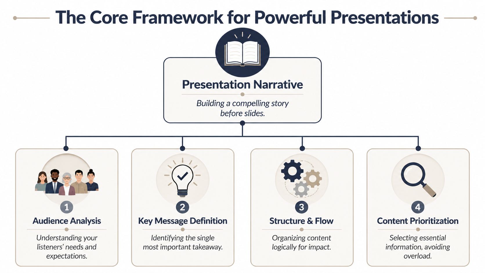
The Core Framework for Any Powerful Presentation
A good PowerPoint presentation outline needs a backbone. Not a theme. Not a template. A backbone.
The simplest version is this. Decide the one outcome you need, shape the story around the audience’s problem, and only then assign support to each point. That’s where traditional presentation discipline still holds up. The strongest decks lean on a dot-dash structure — major ideas carrying the supporting detail beneath them — as described in Pitch’s guide to structuring a presentation. Pair that with the classic 4x4 rule (no more than four bullets per slide, four words per bullet) to keep each slide readable. As a rough rule of thumb, give the problem enough room to land, spend the bulk of your time on the solution, and reserve a clear final stretch for the conclusion and the call to action.
Start with one decision
Before you outline content, define the decision the deck should create.
For a sales pitch, that decision might be “agree to next-step evaluation.” For an executive review, it might be “approve budget” or “support the plan.” For training, it could be “use the new process starting Monday.”
If you can’t state that decision in one sentence, the outline will sprawl.
A useful test is to write this line at the top of your draft:
By the end of this presentation, the audience should be ready to ______.
That blank keeps the deck from drifting into background information that feels smart but doesn’t move the room.
Build the story in dots and dashes
The dots are the major ideas. The dashes are the support under each idea. Think of dots as slide-level arguments and dashes as the evidence, examples, proof points, objections, or transitions that make those arguments credible.
A practical sales example looks like this:
- Problem
- Current process is slow
- Teams update numbers manually
- Buyer sees stale information
- Consequence
- Follow-up loses urgency
- Internal review gets harder
- Solution
- Use a repeatable structure
- Build around current customer context
- Show proof in the flow of the story
- Next step
- Confirm scope
- Assign owners
- Set timeline
This method prevents the most common mistake in business decks. People collect content first, then hope the story appears later. It won’t.
Keep each slide brutally focused
Once the outline is solid, turn each dot into a slide objective. One slide, one job.
That means:
- Use a heading that states the point: Don’t write “Market Overview.” Write the message the audience should take away.
- Limit bullet density: The 4x4 rule exists for a reason. Once a slide gets crowded, the presenter starts reading and the audience starts scanning ahead.
- Treat support as spoken detail: Not every thought belongs on-screen.
A slide should support the conversation, not compete with it.
A simple framework that works under pressure
When a team needs a repeatable format, use this three-part outline:
| Phase | What it must do | What usually goes wrong |
|---|---|---|
| Introduction | Establish the audience problem and why it matters now | Too much company background |
| Main body | Present the solution, evidence, and fit | Random proof with no narrative order |
| Conclusion | Summarize, resolve objections, and ask for action | Weak close or no concrete next step |
A few additional rules make this structure hold:
- Front-load tension: If the audience doesn’t feel the cost of the current state, the solution lands flat.
- Sequence proof carefully: Put the strongest supporting material after the problem is clear, not before.
- Write transitions in the outline: Don’t trust yourself to improvise key handoffs between sections.
The fastest drafting sequence
If you need a working outline quickly, use this order:
- First, write the close: What exactly are you asking for?
- Then define the problem: Why should the audience care now?
- Next, shape the solution path: What are the few points that make your case believable?
- Last, trim hard: Remove anything that doesn’t help the audience make the decision.
That’s the core system. It isn’t flashy, but it works in sales calls, boardrooms, internal reviews, and demos because it forces clarity before design.
Ready-to-Use Outline Templates for Common Scenarios
Templates are most useful when they reflect the actual purpose of the meeting. A sales pitch doesn’t need the same rhythm as a training session. An executive update shouldn’t read like a product demo.
Use the table below as a starting point, then adapt the slide objectives to your audience and deal stage. If your team also maintains reusable deck systems, it helps to pair the outline with a presentation template workflow that keeps recurring slides consistent.
Presentation Outline Templates
| Scenario | Introduction (Slides 1-2 Focus) | Main Body (Slides 3-7 Focus) | Conclusion (Slides 8-10 Focus) |
|---|---|---|---|
| Sales pitch | Customer context, problem framing | Current-state friction, solution fit, proof, implementation view, objection handling | Recap value, confirm next step, decision path |
| Executive update | Business objective, current status | Progress against plan, risks, dependencies, decisions needed, resource impact | Key takeaway, recommendation, owner and timeline |
| Product demo | Use case, user goal | Workflow walkthrough, differentiators, setup realities, integration points, common questions | Business fit, success criteria, next action |
| Team training | Why the change matters, learning target | Process steps, examples, common mistakes, role expectations, practice scenario | Summary, adoption checklist, Q&A |
Sales pitch outline
A sales deck should create urgency without becoming theatrical. Start with the buyer’s current state, not your company history.
A simple flow works well:
- Slide 1: Buyer situation and stakes
- Slide 2: What’s blocking progress now
- Slide 3: The cost of staying with the current process
- Slide 4: The proposed approach
- Slide 5: Why this approach fits this account
- Slide 6: Proof and credibility
- Slide 7: Rollout or onboarding view
- Slide 8: Expected outcome
- Slide 9: Open questions and risks
- Slide 10: Specific next step
The mistake to avoid is dumping all proof onto one slide. Spread proof through the story so each claim earns support where it appears.
Executive update outline
Executives want orientation fast. They need to know what changed, what matters, and where they need to act.
Keep the first two slides direct. One can frame the objective. The next can summarize status in plain language. Then move into decisions, risks, and dependencies without hiding the hard parts in appendix material.
If leadership has to hunt for the actual decision, the outline is doing too much reporting and not enough guiding.
Product demo outline
A product demo outline should protect against feature wandering. The cleanest approach is to outline the user journey, not the interface menu.
For example, don’t write “Dashboard features,” “Admin settings,” and “Analytics tab.” Write “How the user gets started,” “How the team updates live information,” and “How a manager reviews performance.” That keeps the deck tied to outcomes.
Team training outline
Training decks need a slower reveal than sales decks. People are learning, not deciding. That means your outline should include room for examples, common mistakes, and what each role must do after the session.
A practical training structure often includes:
- Purpose: Why the process changed
- Process walk-through: The new sequence in order
- Examples: Good and bad execution
- Role clarity: Who owns which step
- Adoption check: What happens next
The biggest training mistake is trying to turn slides into a manual. Use the deck to teach the flow. Put deep reference material elsewhere.
From Static Outline to Interactive Experience
Traditional outlining advice assumes every slide is static. Text, maybe a chart, maybe an image. That’s no longer enough for many customer-facing decks, especially when a rep needs to show current pipeline figures, product usage trends, technical flows, or a model the buyer can explore.
The fix starts in the outline, not in the editor.
Live data connections in web-native presentations automatically update metrics from sources like Google Sheets and REST APIs. Instead of a snapshot frozen at export time, the deck reflects the latest numbers whenever someone opens it — exactly the gap a static, file-based deck can’t close. You can see how live-sync presentations work on Encelade.
Add placeholders before you build
A common approach involves making a static outline, then bolting on interactive elements later. That creates predictable problems. The presenter forgets where live proof should appear, the designer improvises layout, and accessibility or fallback planning gets skipped.
A better approach is to mark interactive intent directly in the text outline.
Examples:
- [Live Chart: Regional pipeline by segment]
- [Widget: ROI calculator for buyer inputs]
- [Interactive Demo: Product workflow step 3]
- [3D Model: Hardware view with rotation]
- [Live Table: Open opportunities from connected sheet]
These placeholders do two important things. First, they force the author to decide what interaction is for. Second, they distinguish narrative slides from proof slides before anyone starts building.
What a modern outline line item looks like
A static outline entry might read like this:
- Slide 5. Product value
- Faster reporting
- Current customer metrics
- Better executive visibility
That’s too vague for a dynamic deck.
A stronger entry looks like this:
- Slide 5. Current reporting is always up to date
- Buyer pain: static exports go stale quickly
- [Live Chart: connected operating metrics]
- [Speaker note: contrast old exported snapshot with current sync]
- [Fallback: static image version for offline export]
That one line gives the builder everything needed. The message. The proof format. The talk track. The backup plan.
The outline shouldn’t just tell you what to say. It should tell your team what must be alive, clickable, or current on the slide.
Where interactive placeholders help most
This is especially useful in four places:
- During proof moments: A live metric is more convincing when the audience has already heard the problem it resolves.
- In demos: Interactive modules help you avoid oversimplified screenshots.
- For account-specific decks: Connected data lets you tailor the story without rebuilding every slide.
- In technical presentations: Widget placeholders help sales engineers and AEs align on what will be shown.
One caution matters here. Interactivity doesn’t excuse weak structure. A live chart in the wrong place is still the wrong place. The outline has to control timing, context, and speaker intent.
Converting Your Outline into a Deck in Minutes
Once the outline is clean, the build process should be fast. If your team still spends hours dragging boxes, resizing screenshots, and rewriting the same headlines, the bottleneck isn’t creativity. It’s manual assembly.

AI-native presentation tools let teams build decks dramatically faster — Beautiful.ai describes creating a presentation in half the time, or up to 10x faster — by automating manual slide assembly and letting account-specific decks be generated almost immediately after a client call, according to Beautiful.ai’s overview of presentation software categories.
Manual build versus AI-assisted build
The traditional workflow is familiar. A rep gathers notes. Someone opens an old deck. Slides get duplicated, edited, reordered, and reformatted. Then another person cleans up branding and spacing.
That process creates friction at every step:
- Version drift: Different sellers edit different copies.
- Slow follow-up: The deck takes too long to personalize.
- Formatting waste: Teams spend time fixing layout instead of sharpening the pitch.
An AI-assisted workflow changes the sequence. The team prepares a structured outline, feeds it into a generation system, and gets a first draft that already reflects the narrative. From there, they refine messaging, reorder proof, and practice delivery. If you’re working from agent output or structured notes, a workflow that can generate presentations from AI agent output is especially useful.
What to automate and what to keep human
You should automate assembly. You shouldn’t automate judgment.
Keep these human:
- The main argument: Only the presenter can decide what matters most in the room.
- Audience nuance: A procurement review needs different framing than a technical validation call.
- Final slide edits: Headline wording and proof order still need a person who understands the deal.
Use automation for the repetitive work. Theme application, layout generation, first-pass structure, and visual cleanup are exactly the parts that consume time without improving the sales conversation on their own.
A quick product walk-through helps make that difference concrete:
When teams do this well, the payoff isn’t just speed. It’s response quality. Reps can follow up while the call is still fresh, and managers can review the story instead of correcting slide clutter.
Conclusion: The Outline Is Your Strategic Asset
A PowerPoint presentation outline isn’t admin work. It’s the operating plan for the conversation.
When teams skip outlining, they usually pay for it later with bloated slides, unclear asks, and last-minute revisions. When they outline well, the deck gets simpler to build, easier to tailor, and more persuasive in the room. That’s true whether you’re preparing a sales pitch, an executive review, a product demo, or a training session.
The best part is that the same discipline still works as presentation tools evolve. The classic fundamentals remain useful. One message per slide. Clear narrative flow. Deliberate proof. What changes now is the format of that proof. A modern outline can plan for live charts, connected data, embedded interactions, and fallback versions without losing control of the story.
Treat the outline as a strategic asset, not a rough draft. If the outline is sharp, the slides come together faster. The delivery gets tighter. The audience sees a clear case instead of a pile of content.
If your team wants to turn outlines, CRM notes, spreadsheets, and research into interactive, web-native decks without the usual manual slide work, take a look at Encelade. It’s built for revenue teams that need on-brand presentations, live data, and faster follow-up.