You’ve got an hour before a customer review, board update, or late-stage sales call. The story in the deck is solid. The numbers are there. Then you flip through the slides and see the default white background on every page, and the whole thing feels rushed.
That’s the problem with most advice on good backgrounds for Google Slides. It treats backgrounds like decoration when they’re really part of the selling layer. In B2B decks, the right background does three jobs at once. It signals credibility, guides the eye toward the data that matters, and helps dense information feel easier to process.
This isn’t a roundup of random template sites. It’s a practical guide for teams that need persuasive, data-driven decks fast, especially in sales, presales, enablement, and revenue operations. Some options are best when you need a ready-made professional look in minutes. Others are better when you need tighter brand control, cleaner data slides, or assets that can move into more modern web-native platforms. If you’re trying to choose good backgrounds for Google Slides that help a B2B message land, start here.
Table of Contents
- 1. Slidesgo
- 2. SlidesCarnival
- 3. SlidesMania
- 4. Canva
- 5. Envato Elements
- 6. Unsplash
- 7. Haikei
- Top 7 Google Slides Backgrounds Comparison
- From Slides to Strategy: Implementing Your New Background
1. Slidesgo
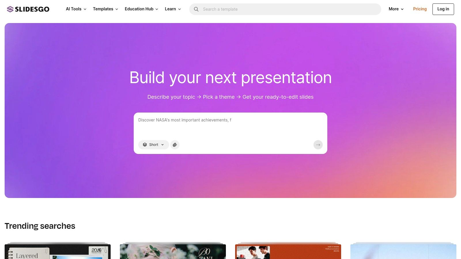
If speed matters most, Slidesgo is usually the quickest way to get from “blank deck” to “this looks deliberate.” Its biggest advantage isn’t originality. It’s the one-click Google Slides theme workflow and the fact that most template sets already pair backgrounds, title slides, section dividers, and content layouts in a way non-designers can use immediately.
That matters when an account executive or sales manager needs a polished deck without touching Figma or rebuilding a theme from scratch. Business, marketing, pitch, and education categories make it easy to narrow the visual style quickly, and the template packs usually carry the look consistently across the whole presentation.
Why Slidesgo works under deadline
Slidesgo is strongest when the team needs coherence more than novelty. You pick a theme, swap colors or hero images, and move into message work. For many internal review decks and first-pass client presentations, that’s enough.
A few trade-offs are worth being honest about:
- Best for non-designers: Slidesgo gets you to an on-brand-enough look quickly, even if nobody on the team knows master slides well.
- Good variety: New templates appear often enough that you can avoid using the same visual style every quarter.
- License friction on free use:Many free assets require a visible credit slide unless you’re on Premium.
Practical rule:If the deck is going to a strategic account or an executive buyer, don’t ship a Slidesgo theme untouched. Change the cover, section backgrounds, and color accents so it doesn’t look like a stock template.
There’s also a broader reason these template platforms matter. A background isn’t cosmetic; it shapes how credible a deck looks before anyone reads a word. In Stanford’s Web Credibility research, 46.1% of people said they judged a site’s credibility at least partly on its overall visual design, including layout, typography, and color. The same instinct applies to slides: a deliberate background signals that the rest of the work is careful too, and Slidesgo is one of the easiest ways to clear that first bar.
That doesn’t mean every Slidesgo deck will outperform a custom build. It does mean looking deliberate is table stakes, the market has moved toward structured visual storytelling, and Slidesgo is one of the easiest entry points.
2. SlidesCarnival
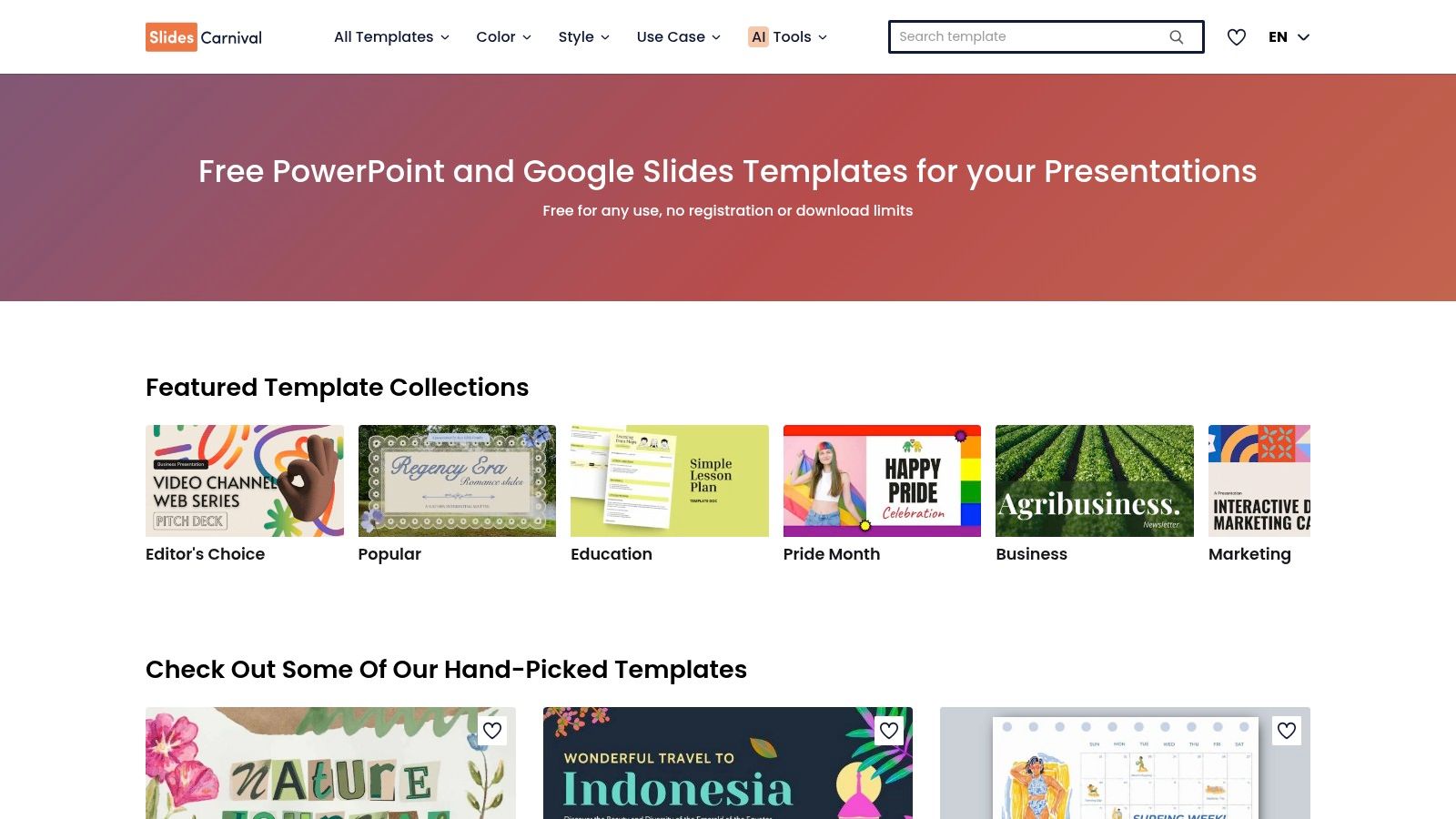
SlidesCarnival is the option I’d recommend when budget is tight and the team still needs backgrounds that look professional in front of customers. The library isn’t as broad as some paid marketplaces, but the templates are clean, practical, and generally better restrained than many “free presentation” sites.
The licensing model is the key distinction. SlidesCarnival templates are free to use commercially with attribution, which makes them useful for startups, internal enablement teams, and anyone building volume without a dedicated design budget. If your organization is comfortable with the credit requirement, it’s one of the strongest no-cost options.
Where SlidesCarnival is strongest
SlidesCarnival tends to work well for B2B decks that need a minimalist foundation. That’s especially true for KPI reviews, product overviews, and narrative-heavy sales stories where the background should support the content rather than compete with it.
One of the better examples is its data-focused Colorful Stats template, which uses charts and graphs as the visual foundation instead of leaving them in blank boxes. That approach is backed by how memory actually works. In John Medina’s Brain Rules, people recall only about 10% of information they hear three days later, but adding a relevant picture pushes recall to roughly 65%. When the background already implies structure, teams stop forcing charts into blank white boxes and start designing the slide around the message.
If you’re building repeatable decks for multiple reps, turn a strong SlidesCarnival theme into a reusable internal system. This guide on how to make a presentation template is a good next step once you’ve found a visual direction.
The downside is familiarity. Some SlidesCarnival themes are common enough that buyers may recognize the look. That’s fixable if you edit the master, replace the title visuals, and align the palette with your brand.
3. SlidesMania
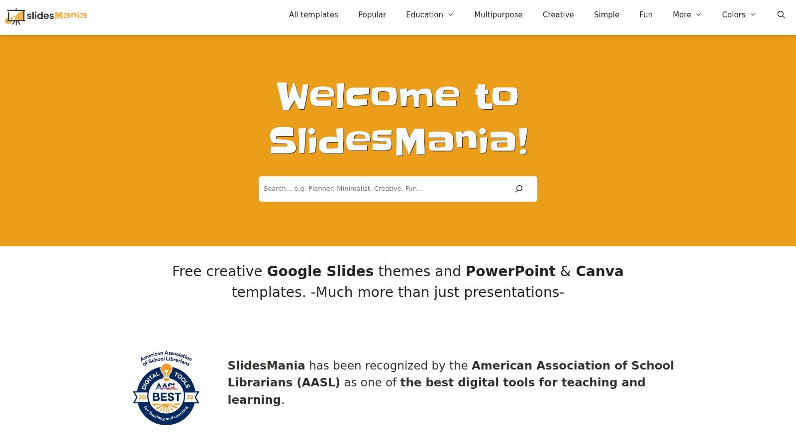
SlidesMania is easy to underestimate because its catalog often feels more practical than flashy. That’s exactly why it works for B2B. Many of its backgrounds stay light, readable, and structurally simple, which makes them useful for analytics slides, screenshots, product demos, and layered commentary.
Some free template sources overload the background with decorative shapes and then leave the presenter fighting for contrast. SlidesMania usually avoids that mistake. You get layouts that leave room for content and enough master-slide guidance to make edits without breaking the whole theme.
Best use case for B2B teams
SlidesMania is a strong pick when charts are doing the heavy lifting. If the presentation contains pipeline movement, territory maps, funnel snapshots, or implementation timelines, a restrained background is usually the better decision.
That’s where color choice matters more than novelty. Soft-toned backgrounds are often the safest route for readable slides. SlideKit notes that pastel and soft-toned backgrounds, including soft pinks, light blues, and pale grays, are the most reliable choice for high-contrast, readable presentation design because they preserve text legibility and reduce strain, especially when illustration elements stay near the edges instead of behind core content.
That principle applies well beyond “cute” deck styles. In sales and enablement decks, pale grays, cool off-whites, and muted blue backgrounds often outperform high-saturation designs because they keep the buyer’s attention on the chart or proof point.
A few practical notes:
- Good for dense content: SlidesMania backgrounds rarely overpower tables or screenshots.
- Easy to adapt: Master and page layout helpers make cleanup manageable.
- Attribution still matters:You need to follow the site’s guidance if you’re using the free templates as provided.
SlidesMania won’t give you the largest library. It will give you backgrounds that are easier to present from.
4. Canva
Canva is less about downloading a finished Google Slides theme and more about manufacturing the exact background your brand needs. That distinction matters. If you’ve already got a messaging framework and you just need branded backdrops, color-consistent dividers, texture layers, and cover treatments, Canva is often faster than hunting through template libraries.
The Brand Kit, font controls, color controls, and quick PNG or JPG export workflow make it practical for teams that live in Google Slides but still want some design control. I see Canva work best when enablement or marketing creates a reusable background system, then the field team drops those assets into a standard slide structure.
What Canva does better than template libraries
Canva shines when you know what the background should do. For example, you may need a subtle gradient for intro slides, a muted pattern for quote slides, and a nearly blank high-contrast background for data pages. Canva lets you create all three as a matched set instead of settling for whatever a template author bundled together.
That’s also where personalization matters. With AI-assisted editing, teams can remove subjects from photos and layer them with brand colors and context for account-specific narratives instead of relying only on premade gradients or textures. The pull toward personalization is well documented: McKinsey’s research found that 71% of consumers expect personalized interactions and 76% get frustrated when they don’t get them. Slide visuals are part of that expectation, and a generic stock background reads as generic effort.
“Custom” doesn’t have to mean complex. A blurred customer-industry image, your brand color overlay, and a clean title lockup often beats an elaborate stock template.
If your team is trying to move beyond static slides, this article on how to make interactive slides is a practical next read. It helps connect visual design choices to presentation behavior, not just appearance.
The main drawback is that Canva’s best workflow advantages tend to sit behind paid plans, and plan details can vary. But for fast brand-matched background creation, it’s one of the most useful tools in the stack.
5. Envato Elements
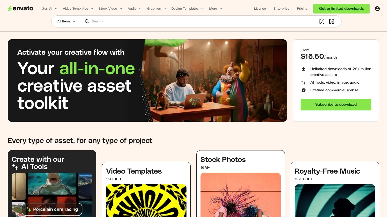
Envato Elements fits teams that produce decks every week and cannot afford to hunt for assets slide by slide. For sales enablement, demand gen, and regional marketing teams, its value is not just volume. It is speed, consistency, and fewer workflow breaks between finding a background, grabbing icons, and pulling supporting visuals for the same story.
That matters in B2B. A background is not decoration. It sets the visual conditions for the message, especially in sales decks where a rep has to move from market context to proof points to pricing without the design changing personality every three slides.
Envato is strongest when a team treats it like a curated supply source. Left wide open, the library creates a predictable problem. Reps search “technology background,” download whatever looks polished in the thumbnail, and end up with shiny gradients or noisy textures that make charts harder to read and screenshots look less credible.
I usually set a few operating rules before anyone downloads anything:
- Use abstract or textured backgrounds on low-information slides: title slides, agenda slides, and section breaks can carry more visual atmosphere.
- Keep proof slides restrained: case study metrics, product screenshots, pricing tables, and charts need quiet backgrounds.
- Approve a small background set by use case: one for opening slides, one for section dividers, one for content-heavy slides, and one fallback neutral option.
- Store selected assets in a shared team folder: that keeps regional decks and account-specific versions from drifting off-brand.
Readability is still the filter that matters most. High-contrast pairings between text and background are what keep titles, labels, and callouts legible, and that discipline carries over directly to sales decks where stakeholders are scanning quickly. If an Envato background weakens headline contrast or competes with chart colors, it fails the job even if it looks expensive.
This is also where modern web-native presentation workflows change the decision. If your team is building more clickable, layered, or personalized decks, backgrounds have to support interaction instead of just filling space. These presentation interaction ideas for sales and marketing decks are a useful benchmark for judging whether an asset will hold up once buttons, hotspots, or embedded proof points are added.
Envato is a strong choice for scale. It is a weaker choice for teams without clear rules. The subscription pays off once someone owns curation and turns a huge library into a small set of backgrounds that help sellers present.
6. Unsplash
Unsplash is still one of the fastest ways to find tasteful photographic backgrounds without spending money or dealing with mandatory attribution. For many B2B decks, that’s enough. A blurred office scene, architectural texture, industrial close-up, or cityscape can add polish without making the deck feel templated.
Photo backgrounds work best when they create mood and context, not when they try to explain the message. If you’re selling infrastructure software, logistics services, fintech, or enterprise platforms, a good image can establish the right tone on a title slide or section opener in seconds.
How to use photo backgrounds without hurting the deck
The trap is obvious once you’ve seen it a few times. A team grabs a sharp, busy photo, drops text directly over it, and suddenly the opening slide looks less credible than the plain white version they were trying to replace.
A few guardrails help:
- Use overlays aggressively: Darken or lighten the photo before placing type.
- Avoid legal ambiguity:Don’t use images with visible logos or clearly identifiable people in commercial decks unless rights are clear.
- Reserve photos for high-level slides: Keep your heavy data and proof slides on cleaner backgrounds.
Background texture can still help if it stays subtle. The reason to keep it subtle is speed of judgment. Google’s research with the University of Basel found that users form an initial “gut feeling” about a page in under 50 milliseconds, well before they read anything, and visual appeal drives that snap judgment. A washed-out, low-intensity background supports that first impression instead of fighting it.
That’s a smart way to use Unsplash assets too. Blur them, wash them out, lower the visual intensity, and let them become atmosphere rather than illustration.
For teams trying to make static visuals feel more participatory, these presentation interaction ideas can help bridge the gap between a polished visual background and a more engaging presentation flow.
Unsplash doesn’t give you a slide system. It gives you raw material. Used carefully, that’s often enough.
7. Haikei
Haikei is my favorite option on this list for teams that want good backgrounds for Google Slides without inheriting the “template marketplace” look. It generates abstract waves, blobs, gradients, and geometric forms that you can export as SVG or PNG. That gives you something cleaner, lighter, and usually more brandable than stock photography.
For data-heavy B2B work, that matters a lot. A subtle abstract background can frame the slide without cluttering the edges, introducing legal issues, or competing with screenshots and charts.
Why abstract SVG backgrounds work so well for data slides
Haikei backgrounds are useful because they stay in the background. You can match your brand palette, control visual density, and keep file quality crisp across displays. SVG export is especially valuable when the same deck may be shown on laptops, conference screens, and large monitors.
They also pair well with modern presentation layers. Static backgrounds increasingly sit behind live widgets, motion, and interactive elements rather than plain text, and that shift tracks with engagement. Mediafly’s 2022 research found that companies using interactive content saw a 94% higher increase in content views than companies relying on static content. The takeaway is consistent: the best backgrounds today are the quiet visual layer that lets interactive content carry the message.
Field note: Haikei is strongest when you need a branded foundation that can survive beyond Google Slides. The same SVG background can move into a web-native presentation environment with far less visual compromise than a busy photo or stock template.
The trade-off is simple. Haikei doesn’t hand you a finished deck. You have to design the background yourself. But if you want originality and cleaner data slides, that extra step is often worth it.
Top 7 Google Slides Backgrounds Comparison
| Item | Implementation complexity | Resource requirements | Expected outcomes | Ideal use cases | Key advantages |
|---|---|---|---|---|---|
| Slidesgo | Low, one-click theme import; basic master edits | Free tier; Premium removes attribution & adds extras | Polished, cohesive presentation layouts | Quick corporate/marketing pitches and templated decks | Fastest path for non-designers; broad template variety |
| SlidesCarnival | Very low, native Google Slides use | 100% free (CC BY 4.0); attribution required | Clean, professional templates suitable for many uses | Budget-conscious teams, education, B2B slides | No paywall; ready for Google Slides |
| SlidesMania | Very low, plug-and-play templates with master helpers | Free with recommended attribution | Readable, presentation-friendly layouts that work with charts | Data demos, analytics presentations, education | Simple, readable designs optimized for clarity |
| Canva | Low–Medium, edit in app then export as image for Slides | Free plan; paid tiers for Brand Kit and advanced features | Brand-matched, customizable backdrops and assets | Consistent branding across multiple decks and teams | Powerful editor, collaboration, and asset management |
| Envato Elements | Medium, browse, download, manage assets and license | Subscription (best value annually) for unlimited downloads | Wide variety of licensable, commercial-ready assets | Teams needing ongoing, diverse visual resources | Large library + commercial license coverage |
| Unsplash | Very low, download high-res photos and drop into slides | Free; no mandatory attribution (standard Unsplash License) | Tasteful photographic backdrops with modern aesthetic | Photo-driven slides, hero images, textured backgrounds | High-quality images at no cost; broad subject coverage |
| Haikei | Low–Medium, generate and customize each background; export SVG/PNG | Free web tool; export controls; design effort per background | Lightweight, scalable abstract backgrounds that keep charts legible | Brand-colored non-photographic slides and small file sizes | SVG exports; unique on-brand abstractions without stock search |
From Slides to Strategy: Implementing Your New Background
Choosing a source is only the first decision. The bigger win comes from how you use the background once it’s inside the deck. In B2B presentations, background quality shows up in comprehension, trust, and pacing. Buyers don’t say, “Great background choice.” They say the deck felt clear, polished, and easy to follow.
Start with contrast and readability. Your background can’t compete with headlines, chart labels, screenshots, or proof points. If a background forces you to add text shadows, heavy boxes, or awkward overlays just to make copy readable, the background is wrong. The cleanest test is simple. Step back from the screen and check whether the message still reads clearly.
Then get image sizing right. Use high-resolution assets, ideally at least 1920x1080, so they don’t break on larger displays. But don’t dump oversized files into every slide. Compress what you can, especially when you’re using photo backgrounds, because large deck files slow collaboration and create version headaches.
Respect licensing every time. Under deadline, teams frequently make avoidable mistakes. Free doesn’t always mean unrestricted, and “commercial use” doesn’t always mean every image is safe in every context. SlidesCarnival and SlidesMania require attention to attribution. Unsplash is flexible, but you still need to avoid trademark and identity issues. Envato is strong when you need a broader commercial asset workflow.
The more interesting shift is what happens after Google Slides. Static backgrounds still matter, but many revenue teams now need decks that update faster, feel more customized, and support interaction during the meeting itself. A custom background from Haikei can become a theme layer inside a web-native tool, where that visual foundation supports live data, interactive widgets, and richer product storytelling instead of just filling space.
That matters because the job isn’t just to make slides prettier. It’s to help the audience process the message faster and trust it sooner. If your team is still patching together decks from white slides, screenshots, and last-minute formatting, better backgrounds are an easy place to improve. If you want the next step after that, move from static slide polish to a presentation system built for live selling.
If your team is outgrowing static decks, Encelade is worth a serious look. It turns research, CRM notes, spreadsheets, and documents into interactive, web-native presentations with live data, native 3D, and branded themes. That means you can keep the visual discipline of strong backgrounds while adding the parts Google Slides can’t handle well, including dynamic widgets, responsive layouts, and account-specific storytelling delivered through a shareable link instead of another file.