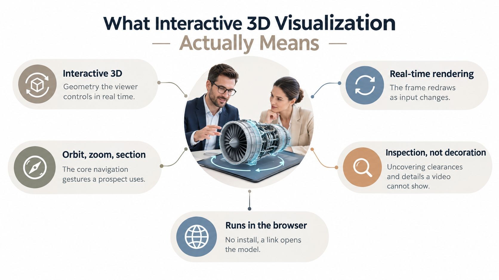
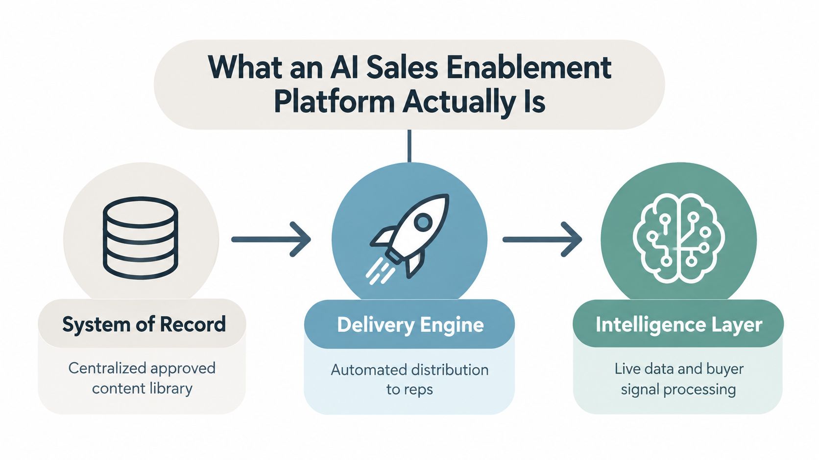
Your next deck probably isn’t being opened in a conference room on a giant screen. It’s being skimmed on a phone between meetings, reviewed on a laptop with ten other tabs open, or pulled up live during a sales call when someone asks, “Can you show me the latest numbers?” That changes what good visualization looks like.
Beyond static slides, data has to work harder. It has to explain itself quickly, survive changing screen sizes, and hold up when the underlying numbers update. A chart that looks fine in PowerPoint can fall apart in a web-native presentation if labels overlap, hover states hide important details, or the audience can’t tell what action to take from the visual.
That’s why data visualization best practices now need a modern business lens. Revenue teams aren’t just reporting performance. They’re using live dashboards in proposals, interactive ROI views in buyer conversations, and account-specific visuals in web-native decks built from CRM notes, spreadsheets, and APIs. The difference between a chart that informs and a chart that moves a deal forward is usually clarity, context, and interaction design.
The good news is that the fundamentals still matter. Choose the right chart. Reduce clutter. Use color carefully. Label what matters. But in interactive presentations, those fundamentals need to translate into responsive layouts, progressive disclosure, and data that doesn’t go stale before the meeting starts.
Table of Contents
- 1. Choose the Right Chart Type for Your Data Story
- 2. Maintain a Clear Visual Hierarchy and Information Architecture
- 3. Use Color Intentionally and Ensure Accessibility
- 4. Minimize Cognitive Load with Data Density and Progressive Disclosure
- 5. Connect Data to Business Context and Decision Outcomes
- 6. Implement Mobile-Responsive Design for Multi-Device Viewing
- 7. Leverage Live Data Connections to Eliminate Manual Updates
- 8. Use Annotation, Labels, and Callouts to Guide Interpretation
- 9. Employ White Space and Negative Space Strategically for Clarity
- 10. Implement Data-Driven A/B Testing and Engagement Iteration
- Top 10 Data Visualization Best Practices Comparison
- From Data Points to Actionable Insights
1. Choose the Right Chart Type for Your Data Story
A sales review goes sideways fast when the chart forces the room to decode the visual before they can debate the decision. I see this often in pipeline meetings. Someone drops a pie chart into a live deck to explain stage conversion, and the conversation stalls on basic interpretation instead of next-quarter risk.
Chart choice sets the pace of the discussion. If the visual fits the question, leaders can move straight to action. If it does not, even accurate data feels muddy.
In web-native presentations, the stakes are higher because the chart is not just a static image. It may be filtering live CRM data, responding to clicks, or updating before a customer call. Revenue teams need chart types that hold up under interaction, not just charts that looked fine in a design review. A funnel can work for stage progression, a line chart for forecast versus actuals, a scatter plot for account value versus engagement, and a map only when territory or regional pattern changes the decision. Tools like Encelade make those choices operational because teams can place live widgets inside the presentation instead of pasting screenshots from BI tools.
Match the chart to the decision
Start with the decision, not the chart gallery. Ask a simple question: what should a VP, account executive, or customer success lead understand within a few seconds?
Use these pairings as a working rule:
- Compare categories: bar charts make ranking, gaps, and outliers easy to spot.
- Show change over time: line charts work best for continuous trends such as bookings by week, win rate by month, or forecast drift across a quarter.
- Show relationship: scatter plots help teams see whether two variables move together, such as product usage and renewal likelihood.
- Show parts of a whole: use stacked bars or bars with totals when precision matters. Pie charts only work in narrow cases with very few categories. If you need a practical rule set, see this guide on when to use a pie chart.
- Show process movement: funnels are useful for stage-based flows, but only if each stage is defined consistently and the audience cares about drop-off between steps.
- Show location: maps earn their space when geography changes the decision, such as territory coverage, regional churn, or logistics constraints.
A chart earns its place when the audience can answer the business question quickly.
One trade-off matters in interactive decks. The chart that explains a point best on a static slide is not always the chart that works best when users click, filter, and drill into segments. For example, a heatmap may look compact, but sales leaders often struggle to compare exact values once they start filtering by team or territory. In those cases, grouped bars or small multiples usually hold up better in a live presentation.
Practical rule: If a stakeholder asks what the chart is showing before they ask what they should do about it, pick a different chart type.
Good chart selection saves explanation time. In business presentations, that time is better spent on pipeline risk, account prioritization, and the decision that follows.
2. Maintain a Clear Visual Hierarchy and Information Architecture
A sales VP opens your live QBR on a laptop, then jumps straight to the pipeline slide from the agenda. They have 20 seconds before the conversation shifts to forecast risk. If the page presents five charts, three callouts, a crowded header, and no obvious takeaway, the meeting slows down while someone explains where to look.
Clear hierarchy fixes that. It tells the audience what matters first, what supports it, and what can wait. In web-native presentations, that structure matters even more because viewers do not move through content in a fixed order. They click tabs, apply filters, expand sections, and skip ahead.
Start with one dominant message per view. Put the main takeaway in the title or immediately beside the lead metric. Then build supporting detail around it. A practical structure usually works in three levels:
- Primary: the decision point, headline metric, or risk that needs attention now
- Secondary: the comparison, segment breakdown, or trend that explains the primary point
- Tertiary: notes, definitions, source context, and methodology details
Placement matters, but so does proportion. Revenue teams often make the mistake of giving every object the same visual weight. The result is a flat page where a renewal risk warning competes with a logo, a timestamp, and two minor KPIs. Use larger type, stronger contrast, and more breathing room for the element that should drive the discussion. Reduce emphasis everywhere else.
I use a simple test in executive decks. If someone lands on the slide cold, they should be able to answer two questions within a few seconds: What is happening, and why should I care?
Interactive decks add another layer of complexity. Filters, tabs, and drill-down controls are useful, but they can also break hierarchy if they sit above the insight and demand attention before the audience understands the point. Keep controls close to the content they change, not at the top of every page by default. In a sales pipeline review, for example, region and segment filters belong next to the pipeline chart, while the headline message stays fixed and visible. That preserves orientation as users explore.
Consistency across pages is what turns hierarchy into information architecture. Titles should appear in the same place. KPI cards should use the same order. Filters should behave the same way from one section to the next. In tools like Encelade, that standardization matters because teams are often generating proposal decks, account reviews, and board updates from live data under time pressure. Shared layout rules keep those assets readable even when the underlying numbers change every day.
Whitespace helps, but the bigger issue is discipline. Every element on the page should have a job. If it does not clarify the decision, support the interpretation, or help the audience interact with the data, remove it.
Strong hierarchy lets a stakeholder find the point before the presenter starts talking.
3. Use Color Intentionally and Ensure Accessibility
A sales VP opens a live QBR on a laptop in a conference room, then pulls up the same deck on a projector with washed-out colors. Half the meaning disappears. The chart relied on subtle hue differences, the labels were too light, and the only signal for risk was red versus green. That is a design failure, not a presentation problem.
Color should do one job at a time. It should group related information, highlight the one series that matters, or signal business status such as on-track, at-risk, or off-target. In interactive business decks, especially ones connected to live CRM or product data, disciplined color use matters even more because filters and refreshed values can change what is on screen from one meeting to the next.
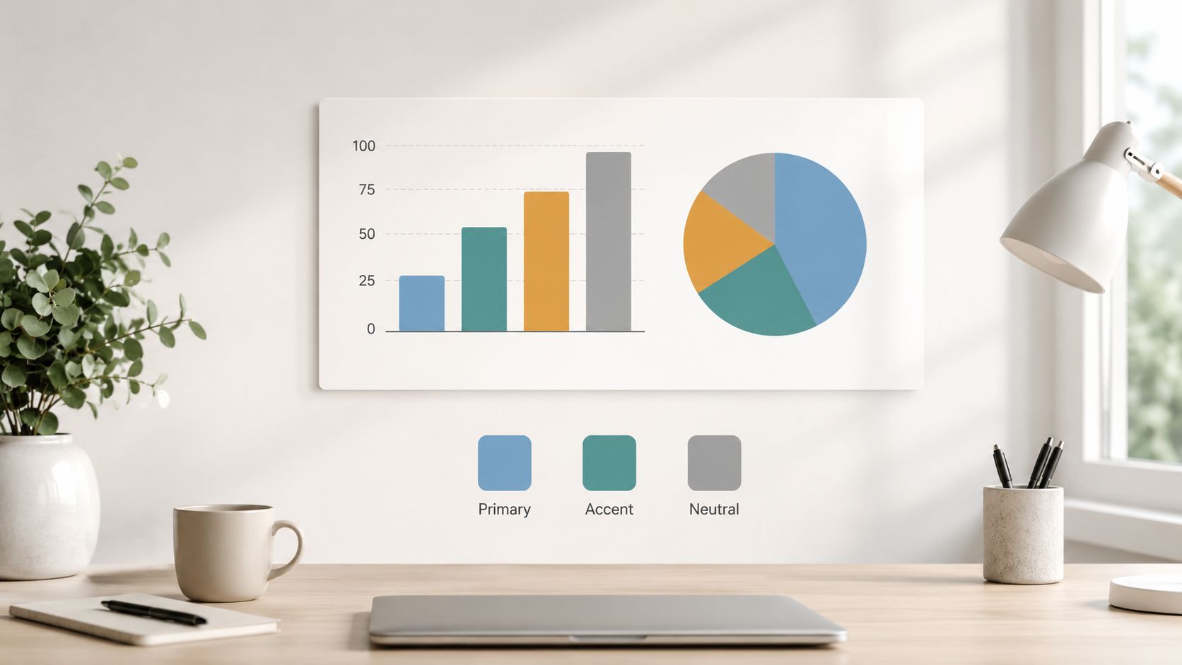
Start with a restrained palette. In practice, one or two accent colors plus neutral grays cover most revenue use cases. Reserve strong color for the data point that needs action. Keep comparison series, prior periods, and benchmarks muted so the audience can find the current issue fast.
For example, in a pipeline coverage view, use a neutral color for total pipeline, a single accent for this quarter’s target segment, and a warning color only for shortfall. If every bar is saturated, nothing stands out. If every metric card uses a different brand color, the deck starts to feel decorative instead of analytical.
A few standards hold up well in production:
- Assign fixed meaning to colors: if orange means risk on one page, it should not mean expansion opportunity on the next.
- Check contrast in real viewing conditions: conference room screens, shared Zoom windows, and mobile devices all expose weak text and low-contrast chart elements.
- Avoid color-only encoding: add direct labels, icons, patterns, or line styles so the chart still works for viewers with color vision deficiencies.
- Use accessible defaults in your theme: tools such as ColorBrewer, the Okabe-Ito palette, Coblis, and Color Oracle help teams test palettes before a customer ever sees the deck.
- Match the palette to the decision: board materials usually need restraint, while sales enablement content may need slightly stronger emphasis for fast scanning.
Web-native presentation tools make this easier to enforce at scale. In Encelade, teams can set a shared theme so account reviews, forecast decks, and proposal visuals all inherit the same palette and status colors. That reduces one of the most common problems in fast-moving revenue organizations: every rep or analyst inventing a new visual language under deadline.
Accessibility is not a compliance box. It is part of comprehension. If a stakeholder cannot distinguish the key signal in a chart within a few seconds, the visual is not ready for an executive review, a customer meeting, or a live interactive presentation.
4. Minimize Cognitive Load with Data Density and Progressive Disclosure
A CRO opens the QBR on a laptop over Zoom. One screen shows twelve charts, three filters, and a legend nobody reads. Two minutes in, the conversation has already drifted from decision-making to basic interpretation. That is a design failure, not an attention problem.
Cognitive load rises fast when a visual asks viewers to scan, compare, remember, and interpret at the same time. In business presentations, especially interactive ones, the job is to reduce those tasks. Show the conclusion first. Let people inspect the evidence only if they need it.
Show the answer first, details second
Good data density is not about squeezing in less information. It is about controlling when each layer appears.
In practice, the first view should answer the operating question on its own. A revenue team might open with “Pipeline risk is concentrated in two enterprise deals closing this quarter.” That statement can sit above a single chart or KPI block. The next interaction can reveal stage movement, owner notes, or product usage signals. After that, the deck can expose methodology, assumptions, and raw inputs for the people who want to pressure-test the conclusion.
That sequence works well in web-native presentations because the deck can respond to the room. A rep in a live customer meeting does not need to show pricing logic unless procurement asks. A VP in forecast review does not need every rep-level detail unless a region misses commit. Static slides force all of that into one frame. Interactive decks let teams pace disclosure to match the conversation.
A simple rule helps here.
If the audience needs multiple clicks to find the takeaway, the summary layer is too thin. If every assumption, segment, and footnote appears at once, the page is carrying too much.
Use a three-layer structure:
- Summary layer: one message, one primary visual, one decision
- Exploration layer: filters, drill-downs, and segment views for follow-up questions
- Audit layer: source detail, definitions, and assumptions for validation
This is also where presentation storytelling and interface design start to overlap. Teams building interactive decks should treat each click as part of the narrative, not just a product feature. Encelade supports that pattern well because live widgets, expandable sections, and connected data let teams keep the main view clean while still giving buyers or executives access to the underlying detail. For a practical framing of that narrative structure, see storytelling in interactive presentations.
The trade-off is real. Too little detail can make the analysis look shallow. Too much detail slows the room down. The right threshold depends on the setting. Board materials need faster top-line comprehension. Sales engineering reviews can tolerate a denser second layer because the audience is prepared to examine assumptions.
The test I use is simple. Can someone explain the point of the page in one sentence after five seconds of looking at it? If not, reduce the number of competing elements or push detail into an on-demand layer. That is how interactive business presentations stay clear without becoming simplistic.
5. Connect Data to Business Context and Decision Outcomes
A CRO opens a pipeline review and sees a clean chart showing win rate down three points. The next question is immediate. Which segment slipped, what does that do to forecast confidence, and what action should the team take this week?
That is the standard your visuals need to meet. Business audiences do not need another accurate chart. They need a chart that shortens the distance between observation and decision.
Start with the decision, then choose the context that makes the metric useful. If churn increased, show whether it is concentrated in high-ACV accounts, new implementations, or one customer tier. If product usage dipped, clarify whether that threatens expansion revenue, renewal timing, or support capacity. The same metric can point to very different actions depending on who is affected and what the business is trying to protect.
In web-native presentations, context can be specific instead of generic. Revenue teams can pull live CRM fields, product signals, and account research into the same view, then tailor the message for the meeting in front of them. That matters in practice. A renewal deck should connect low feature adoption to renewal risk and the success plan. A new business deck should connect slow time-to-value to deal friction and the implementation path.
A simple framework works well:
- State the business question: What decision should this visual support?
- Define the consequence: Does the pattern affect revenue, margin, timing, risk, or team capacity?
- Show the action: What should the viewer approve, investigate, change, or prioritize next?
The difference is obvious in real use. “Usage is down” usually stalls the room. “Usage is down in the admin cohort that drives renewal sponsorship, so the CS team should prioritize executive enablement in the top 20 accounts” gives the team a next move.
Story structure helps here, especially in interactive decks where buyers and executives can click into supporting detail without losing the thread. A problem, implication, and recommended action sequence works well in presentations built for live discussion. For a practical framework, see this guide to storytelling in interactive presentations.
I use one test for business context. If a sales leader, finance partner, or customer success manager cannot answer “So what?” within a few seconds, the visualization is still doing reporting work, not decision support.
Raw metrics inform. Context gets a decision.
6. Implement Mobile-Responsive Design for Multi-Device Viewing
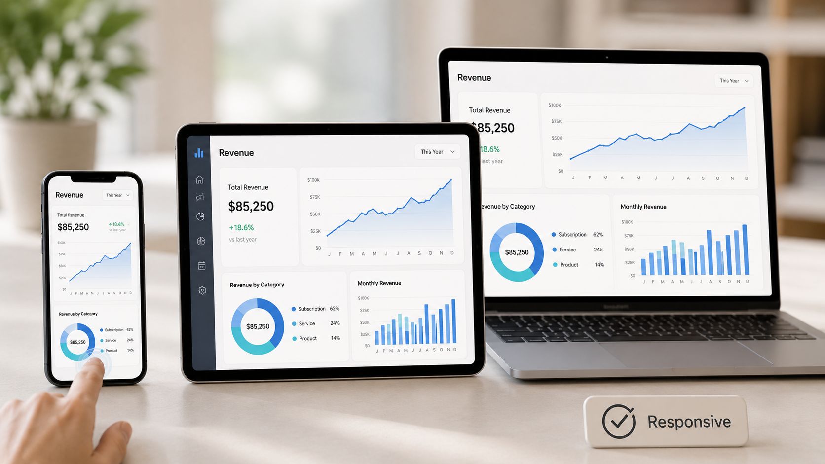
If your chart only works on a large desktop display, it’s fragile. Modern presentations move across devices constantly. A buyer opens the deck on a phone before a meeting, a manager reviews it on a tablet, and an internal stakeholder forwards the same link to someone else who reads it on a laptop. Static slide thinking doesn’t survive that workflow.
Responsive presentation design is different from simple scaling. Smaller screens force choices. Long legends break. Hover-only interactions disappear. Multi-column layouts collapse awkwardly. Dense labels become unreadable.
Design for the phone before the boardroom
A mobile-first mindset helps because it forces prioritization. If the main message can’t survive on a narrow screen, the slide probably contains too much. Teams that start with mobile constraints usually produce cleaner desktop views too.
A few practical adjustments matter:
- Use larger body text: the plan’s 16px minimum for mobile body copy is a sensible implementation target.
- Replace hover dependencies: use tap and click interactions that work across devices.
- Reduce peripheral elements on small screens: remove extra gridlines, repeated legends, and decorative labels first.
- Keep tap targets comfortable: interactive regions should be easy to hit without zooming.
Encelade’s responsive layouts are useful here because the same shareable presentation can adapt across screens without producing separate files. That reduces version drift and removes one of the biggest pains in sales handoffs, where the mobile version often becomes a stale duplicate.
The test is simple. Open the deck on your phone and ask one question: can I understand the point without pinching and zooming?
If the answer is no, redesign it.
7. Leverage Live Data Connections to Eliminate Manual Updates
A sales review goes sideways fast when the CRO asks about pipeline coverage and the slide still shows last Thursday’s export. In revenue presentations, stale numbers do more than look sloppy. They slow decisions, trigger side conversations about data quality, and force teams to explain the deck instead of discussing the business.
Live data connections reduce that risk. Instead of pasting values into a static presentation, teams can connect charts and tables directly to sources like Google Sheets or a REST API so the deck updates with the underlying data. That matters even more in web-native presentations, where the same asset may be used in a board update, a customer review, and an account-specific follow-up within the same week.
Current data keeps the conversation credible
The market keeps moving in this direction. The data visualization market is valued at USD 10.92 billion in 2025 and is forecast to reach USD 18.36 billion by 2030 at a CAGR of 10.95%. But market growth doesn’t automatically translate into decks people trust. The gap usually comes from operating model issues, not charting capability alone. Data ownership is fuzzy. Refresh logic is undocumented. One broken field turns a polished deck into a trust problem.
The practical approach is to connect only the numbers that change often enough to justify automation. Pipeline, forecast category, active customer count, product usage, and renewal risk are common candidates. Brand messaging, narrative framing, and executive commentary should still be reviewed by a person.
A few implementation rules save a lot of cleanup later:
- Start with high-value metrics only: connect the fields that drive discussion, not every number available in the source.
- Match the visual to the data model: stable column names, named ranges, and predictable date formats prevent broken charts.
- Define fallback behavior: show a last updated timestamp, cached values, or a clear error state if the source fails.
- Assign ownership: one person should own the source, the mapping, and the QA check before the deck is shared.
- Test the deck with live changes: update the source and confirm the presentation reflects it the way the audience will see it.
I have found this especially useful in account reviews and proposal walkthroughs, where one presentation framework supports many versions of the same story. Encelade’s live Sheets and API support makes that model workable for interactive, customer-facing decks. If your team is building web-native presentations instead of exporting screenshots into slides, this guide on how to make interactive slides shows how the interaction layer and live data can work together.
8. Use Annotation, Labels, and Callouts to Guide Interpretation
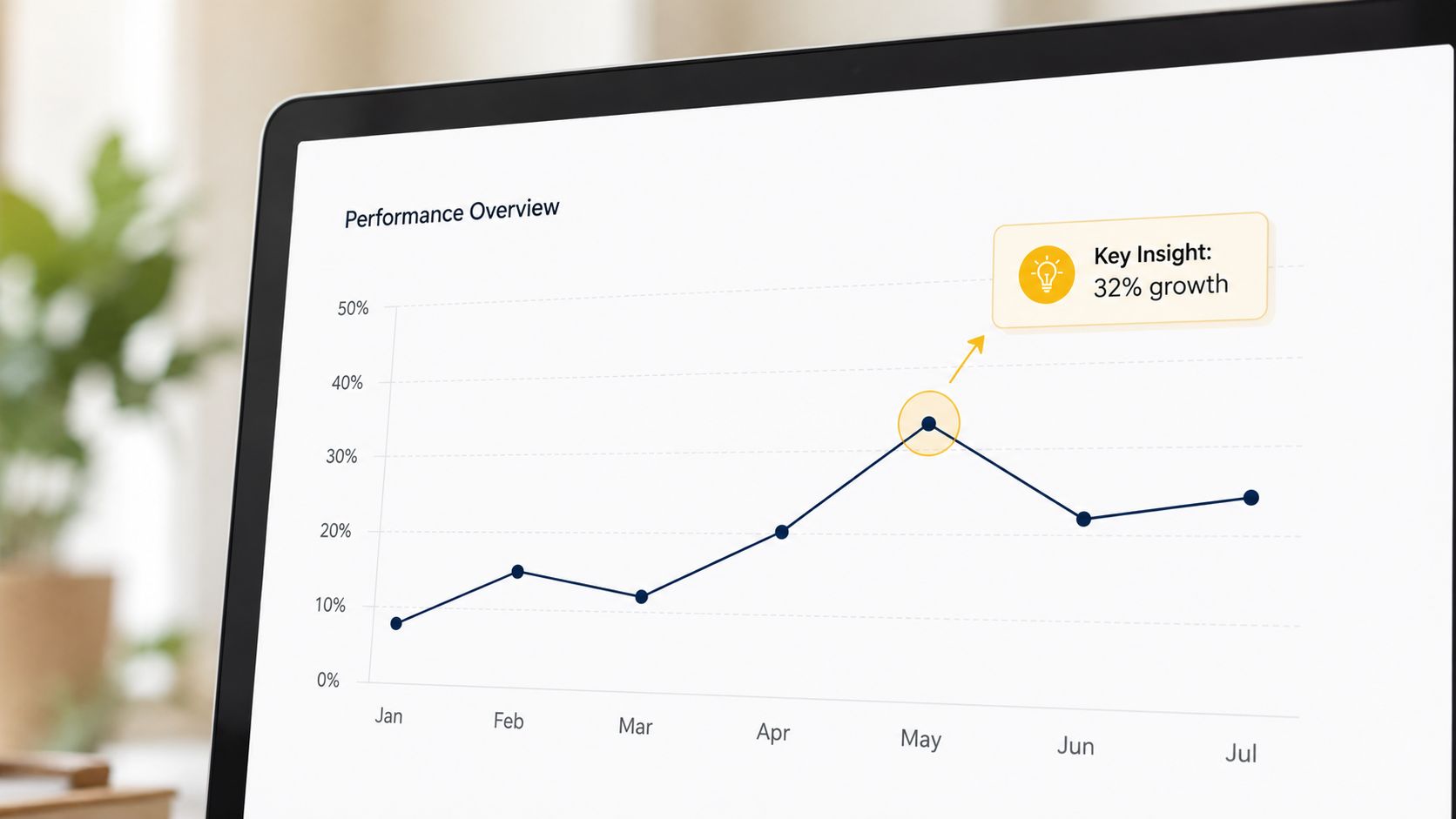
A chart without annotation often asks too much from the audience. People can see the bars or the line, but they still don’t know what they’re supposed to notice. That slows the conversation and creates room for the wrong interpretation.
Annotations fix that. They tell the audience where to look, what changed, and why it matters. In business presentations, that might be a callout on the quarter where conversion dropped, a note beside the region with the strongest expansion opportunity, or a short label that turns a trend line into an action.
Don’t make people guess the takeaway
Direct labeling is usually better than forcing people to bounce between the chart and a legend. The University of Missouri’s data visualization guidance recommends placing value labels directly on bars and also stresses that bar-chart axes should start at zero to avoid misleading comparisons, while gridlines should stay light and minimal in its chart best-practice guide. That combination improves clarity fast.
Use annotations sparingly but decisively:
- Highlight one to three insights per visual: more than that turns annotation into clutter.
- Place the note near the mark: don’t make the eye travel.
- Explain the implication: “renewal risk concentrated in low-adoption accounts” is better than “adoption is lower here.”
- Reveal progressively in live presentations: keep attention where you want it.
A good annotation answers “so what?” before anyone asks.
Encelade’s text flexibility and interactive elements help because annotations can adapt alongside live data. That matters in decks where the underlying metric changes regularly but the story still needs to remain clear.
9. Employ White Space and Negative Space Strategically for Clarity
A sales VP opens a live board deck five minutes before a forecast call. The data is current, the charts are technically correct, and the slide still fails because every inch is crowded. In practice, space is what makes the key number readable at executive speed.
White space is a functional design tool. It separates ideas, sets pacing, and reduces the effort required to scan a screen. In client-facing and revenue presentations, it also changes the tone. A layout with room around the primary chart signals that the team knows what matters and is not hiding the point inside a wall of objects.
This matters even more in web-native presentations than in static slides. Interactive decks can hold more detail behind clicks, hover states, tabs, or drill-down views. That means the default view should stay focused. The first screen needs enough negative space to establish priority, while secondary detail stays available without competing for attention.
Use space to control attention
White space works best when it is deliberate, not leftover. Analysts and revenue teams often add separators, borders, extra legends, and duplicate labels to make a slide feel complete. Those elements usually do the opposite. Spacing can create grouping more effectively than boxes, and distance between components often communicates structure faster than another visual treatment.
A few patterns hold up in real business decks:
- Give the main insight the largest quiet area: if pipeline coverage is the point, let that chart or KPI own the slide.
- Use proximity to show relationships: place related metrics close together and unrelated ones farther apart.
- Reserve margins around high-value numbers: a renewal rate or win-rate delta reads faster when it is not pressed against tables or filters.
- Design the default state first: in interactive decks, keep the opening view sparse, then reveal detail through interaction.
The trade-off is real. Dense screens can feel thorough, especially to internal teams that already know the material. But executive buyers, prospects, and cross-functional stakeholders usually read under time pressure. They do not reward density. They reward clarity.
Encelade and similar web-native tools help here because modular layouts, live components, and interactive containers make it easier to split one overloaded slide into a focused sequence. Instead of forcing a summary chart, segment breakdown, and notes into the same canvas, teams can present the headline first and let the audience open supporting detail only when needed.
Minimal means the layout supports the decision. Every element on screen should either direct attention, provide context, or support action. If it does none of those jobs, remove it and give the important content more room.
10. Implement Data-Driven A/B Testing and Engagement Iteration
Presentation design shouldn’t depend entirely on taste. If your team sends interactive decks, shares proposal links, and reviews engagement analytics, then your visualization choices can be tested like any other part of the revenue process.
That’s a major shift from static slide software. In a web-native environment, you can compare versions, track which slides hold attention, and see whether a chart format or interaction pattern helps people engage with the argument.
Treat presentation design like a revenue system
The best way to improve visualization quality over time is to tie it to observable behavior. Encelade’s engagement analytics for views and time-on-slide make that possible. Instead of arguing about whether a funnel is better than a bar chart, teams can test both in similar decks and review what happened.
The process is simple:
- Set one hypothesis: for example, direct labels will improve comprehension.
- Change one variable at a time: chart type, annotation style, color emphasis, or interaction depth.
- Review business relevance: high attention is useful only if it supports progression, alignment, or follow-up.
- Turn winners into templates: standardize what works so the team benefits, not just one presenter.
There’s also an accessibility dimension to iteration. Keyboard operability is a long-standing accessibility requirement, and Openfield’s guidance stresses that a data visualization should be fully navigable by keyboard for users without a mouse, in its accessibility-focused discussion of interactive data visualization. If your team relies on filters, drill-downs, or hover-heavy charts, that’s not a small design issue. It affects whether part of your audience can use the presentation at all.
Treat the deck as a living system. Test it, learn from it, and improve it the same way you would any other customer-facing workflow.
Top 10 Data Visualization Best Practices Comparison
A revenue leader opens a live deck five minutes before a pipeline review. The chart has to load fast, read clearly on a laptop and phone, and reflect current numbers without a last-minute paste from Excel. That standard changes how these practices should be judged. In web-native presentations, good visualization is not only about design quality. It is about reliability, speed to understanding, and whether the viewer can act on what they see.
| Technique | Implementation Complexity | Resource Requirements | Expected Outcomes | Ideal Use Cases | Key Advantages |
|---|---|---|---|---|---|
| Choose the Right Chart Type for Your Data Story | Medium, requires judgment and some training | Low to Medium, data plus charting components | Clearer patterns; faster audience comprehension | Comparisons, trends, correlations, forecasts | Improves insight clarity; supports live updates |
| Maintain a Clear Visual Hierarchy and Information Architecture | Medium, requires standards and review | Medium, typography, color themes, templates | Faster information scanning; consistent brand feel | Proposals, executive summaries, multi-presenter decks | Reduces search time; supports brand governance |
| Use Color Intentionally and Ensure Accessibility | Medium, needs color theory and testing | Medium, palettes, contrast tools, testing | Inclusive reach; fewer misinterpretations; compliance | Dashboards, scorecards, semantic color coding | Improves accessibility and professional polish |
| Minimize Cognitive Load with Data Density & Progressive Disclosure | Medium to High, design interactions thoughtfully | Medium, interactive components, testing time | Higher engagement; reduced overwhelm; deeper exploration | Live pitches, detailed proposals, layered audiences | Supports multi-level audiences; enables drill-down |
| Connect Data to Business Context and Decision Outcomes | High, needs research and narrative work | High, CRM integrations, modeling, account research | More persuasive stories; faster decisions; higher conversion potential | ABM, ROI proposals, executive decision briefs | Personalizes impact; ties metrics to actions |
| Implement Mobile-Responsive Design for Multi-Device Viewing | Medium, requires responsive layout planning | Medium, device testing, responsive components | Consistent readability; reduced friction across devices | Mobile-first reviews, remote stakeholders, tablets | Ensures access across screens; simplifies versioning |
| Use Live Data Connections to Eliminate Manual Updates | High, setup and maintenance of integrations | High, APIs, Sheets, IT approvals, monitoring | Current metrics; reduced prep time; fewer errors | Pipeline dashboards, forecasts, ROI models | Removes manual updates; increases trust in numbers |
| Use Annotation, Labels, and Callouts to Guide Interpretation | Low to Medium, authoring discipline | Low, annotation tools and style rules | Faster correct interpretation; fewer misunderstandings | Charts needing context, sales highlights, callouts | Directs attention; clarifies “so what” |
| Employ White Space and Negative Space Strategically for Clarity | Low, discipline and layout choices | Low, layout templates and spacing rules | Improved readability; perceived quality; less fatigue | Executive KPI slides, single-metric storytelling | Enhances focus; reduces visual clutter |
| Implement Data-Driven A/B Testing and Engagement Iteration | High, experiment design and analysis | Medium to High, analytics, sample volume, tracking | Evidence-based optimizations; measurable uplift | Testing chart types, interactivity, annotations | Removes guesswork; improves conversion over time |
One practical read on this table: the highest-return items for revenue teams are usually chart selection, hierarchy, context, and live data. They are not always the easiest to implement, but they change decision quality fast. In tools like Encelade, they also compound because a strong chart system can be reused across interactive decks, account plans, QBRs, and executive updates.
From Data Points to Actionable Insights
Strong data visualization doesn’t start with visual flair. It starts with respect for the audience’s time. People need to understand what they’re seeing quickly, trust that the numbers are current, and know what action the information supports. That’s true whether you’re presenting to a CFO, a sales VP, a prospect evaluating your platform, or an internal team deciding where pipeline risk sits.
The most reliable data visualization best practices still come down to a few fundamentals. Match the chart to the question. Build hierarchy so the important point wins immediately. Use color with discipline. Keep density under control. Label what matters. Leave space. Then add the modern layer that static slide culture often misses: responsiveness, interactivity, accessibility, and live data.
That modern layer matters because business presentations no longer live in one room or one moment. They travel by link. They’re opened on phones and laptops. They’re revisited asynchronously. They often need to update without a designer touching them. In that environment, a chart isn’t just a graphic. It’s part of a decision system.
There are also real trade-offs. Interactivity can clarify a story, or it can bury the point if you hide too much behind clicks. Live data improves credibility, but only if the source is governed well. Responsive design broadens access, but it forces ruthless prioritization. Accessibility constraints can feel limiting until you realize they usually produce cleaner, better visuals for everyone.
For revenue teams, the practical payoff is straightforward. Better visualization shortens explanation time, reduces misinterpretation, makes proposals feel more customized, and helps customer-facing decks hold up under scrutiny. It turns data from a passive reporting layer into active sales and decision support.
Start small. Pick one principle and apply it in the next deck. Replace the wrong chart type. Remove two competing focal points from a slide. Add direct labels instead of a legend. Turn one static metric into a live connection. Test the deck on a phone. Those small changes compound because they improve both clarity and trust.
Platforms built for web-native delivery make that compounding easier. Encelade is a good example because it combines interactive widgets, live data connections, responsive layouts, branding controls, and engagement analytics in one workflow. That means teams don’t have to choose between polished design and operational usefulness. They can build presentations that look strong, stay current, and give the audience a clearer path from information to action.
The standard for business presentations has changed. Static slides can still inform. Interactive, well-structured, live-updating presentations can help people decide.
If your team is still rebuilding decks by hand and pasting stale charts into static slides, Encelade is worth a close look. It helps sales, marketing, and revenue teams turn CRM notes, spreadsheets, documents, and research into interactive, web-native presentations with live data, responsive layouts, branding controls, analytics, and developer-friendly generation options.