You’ve probably got a worksheet open right now with a clean set of numbers and an ugly chart beside it. The data is fine. The message is fine. The visual just looks like default Excel.
That’s where a doughnut chart earns its place. In the right situation, it gives a dashboard a cleaner, more modern focal point than a pie chart, especially when you need to show progress, completion, or a simple part-to-whole view. In the wrong situation, it makes comparison harder and turns a good report into a decorative one.
The difference isn’t the chart type alone. It’s how you structure the data, how you format the ring, and whether the chart is the best choice for the question you’re trying to answer.
Beyond the Pie Chart: Your Introduction to Doughnuts
A doughnut chart usually shows up when someone wants the report to look sharper without rebuilding the whole dashboard. That instinct isn’t wrong. A well-made ring chart can highlight a completion rate, a utilization figure, or a simple split in a way that feels lighter than a bar block.
The problem is that Excel makes it easy to insert a doughnut and hard to make a good one. Most first attempts end up with random colors, awkward labels, and a ring that says less than the table beside it. That’s why many analysts stop at “it looks nice” and never get to “it communicates clearly.”
A better approach is to treat the doughnut chart as a special-purpose chart, not a general one. It works best when the question is simple: How much is complete? How much remains? How does one compact metric fit into a dashboard card?
Practical rule: Use a doughnut when you want one strong visual message at a glance, not when you need precise comparison across many categories.
That distinction matters. A single-ring chart can look polished in an executive summary. A progress ring can become the visual anchor of a KPI tile. A multi-ring chart can work for a limited layered comparison if the audience already understands the context.
Used that way, doughnut chart workflows in Excel become much more useful. You stop forcing every dataset into a circle and start using the ring where it is helpful.
How to Create a Single-Ring Doughnut Chart
The single-ring version is the foundation. If the source data is wrong, every formatting tweak later is wasted.
Start with the right data shape
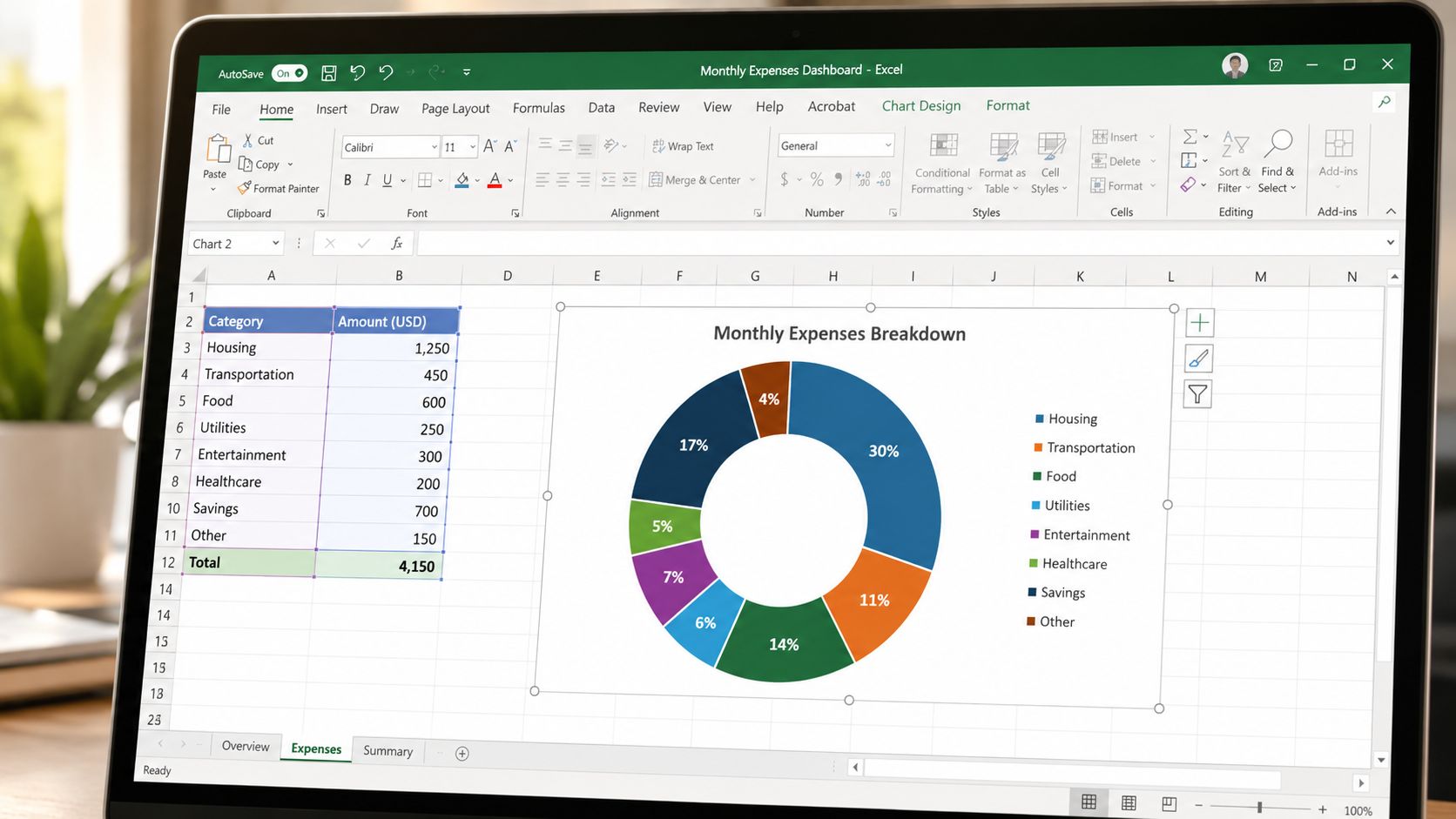
A doughnut chart in Excel only makes sense when the values represent parts of a whole. Excel doesn’t force the numbers to add up to any particular total — it normalizes whatever you give it into proportions of their sum. But for a progress-style ring you want the segments to read as “this part versus the rest,” so you add a remainder that completes the circle. That’s the pattern in this doughnut chart walkthrough: with a base of 100, a 73.98% prevalence is paired with a 26.02% remainder (100 − 73.98). The remainder isn’t an Excel requirement — it’s what makes the ring express completion.
A simple setup looks like this:
| Category | Value |
|---|---|
| Completed | 73.98% |
| Remaining | 26.02% |
If you’re entering counts instead of percentages, make sure they still represent a valid whole in context. The visual message should still be “this part versus the rest.”
Insert the chart the clean way
This is the part junior analysts often rush. Don’t select the whole worksheet block if it includes extra labels, helper notes, or unrelated totals.
Use this sequence:
- Select only the chart data. Pick the category labels and the two numeric cells you want plotted.
- Go to Insert in the Ribbon.
- Choose Doughnut Chart from the pie and doughnut chart group.
- Check the series immediately. If the chart looks scrambled, re-check the selected range.
For a basic doughnut chart build, less is better. Keep the dataset tight and the message obvious.
The most common beginner error isn’t bad formatting. It’s bad source selection.
Clean up the first draft
Excel’s default chart usually needs immediate cleanup. Start with these edits:
- Remove the legend if the chart is obvious from nearby labels.
- Use one accent color for the primary slice.
- Set the remainder slice to a light neutral so the key segment stands out.
- Delete the chart title if the dashboard already provides context.
One more practical constraint matters here: doughnut data should use positive values only — but not because Excel throws an error. It doesn’t. As Excel charting references explain, Excel plots a negative value as its absolute value, so a −20 quietly shows up as a 20-sized slice — more misleading than a visible failure. A zero produces a slice with no size (though its data label can linger). Either way, if a category is zero or negative, don’t force it into the ring. Re-think the visual.
When the base chart is built correctly, everything else gets easier.
Advanced Formatting for Professional Dashboards
A doughnut chart usually earns or loses trust in the formatting stage. On a dashboard, small choices decide whether it reads like a KPI or like clip art.
Format the ring before you touch colors
Start with shape and orientation. Color is the easy part, and it is often the part analysts overwork first.
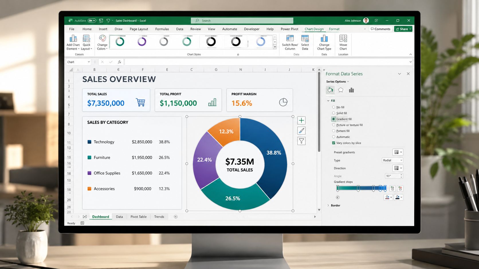
Open Format Data Series and check three settings before anything else:
- Doughnut hole size. Leave enough room for a number, label, or icon in the center, but keep enough ring thickness that the metric still feels substantial.
- Angle of first slice. Rotate the chart so the active segment starts in a consistent place across the dashboard. I usually keep progress charts starting near the top or top-right because that matches how people scan gauges.
- Border line. Remove the default white divider or match the border to the fill color if you want a continuous arc.
Use Doughnut Explosion carefully. A small separation can help if one segment needs emphasis, but in KPI dashboards it often adds visual noise. If the chart is meant to show completion, a clean uninterrupted ring usually looks more professional than a pulled-out slice.
That trade-off matters. Doughnut charts work best when the viewer needs one fast read, such as completion rate, budget used, or share of total. If the audience needs exact comparisons across several categories, formatting cannot fix the chart choice. A bar chart will still be easier to read.
Build a progress-style center label
The strongest dashboard version is a progress doughnut with a live center value. The ring gives context. The number in the middle carries the message.
The practical method is to link a text box to a cell. Excel Campus demonstrates the exact method for linking a text box to a worksheet value in a progress doughnut chart: select the text box, type = in the formula bar, and click the source cell. Once that link is in place, the center label updates with the worksheet.
A clean setup usually looks like this:
- One cell stores the KPI value.
- One helper cell calculates the remainder to 100%.
- The doughnut chart plots only those two numbers.
- The center text box links to the KPI cell, not to a manually typed label.
This is one of the few doughnut chart patterns I recommend regularly because it is honest about what the chart is doing. It is not pretending to compare many categories. It is reinforcing a single status metric.
If you want to push the design further, study how other data visualization software platforms handle KPI cards, chart labels, and interactive dashboard components. Excel can mimic some of those patterns, but only up to a point. Native Excel charts are still mostly static objects. They update with cell values, yet they do not behave like fully interactive dashboard widgets unless you add slicers, controls, or move the work into Power BI or another BI tool.
Here’s a walkthrough if you want to watch the mechanics before rebuilding your own version:
Use rotation and separation carefully
Professional dashboards usually reward restraint.
Keep labels out of the ring unless there are only two segments and both labels are short. Keep the palette tight. Use one emphasis color and one neutral remainder. If the center number already states the KPI, the chart does not need extra decoration to explain itself.
I also standardize the start angle across all doughnut charts in the same dashboard. That one choice makes a workbook feel more controlled, especially when several KPIs sit side by side. Readers should not have to reorient themselves every time they move their eyes.
The final check is simple. Remove anything that does not improve interpretation within a second or two. If a shadow, border, explosion effect, or extra label slows the read, cut it.
Building and Using Multi-Ring Doughnut Charts
A multi-ring doughnut usually gets requested five minutes before a dashboard review.
The ask sounds simple: show target versus actual, add last year for context, keep it compact, and make it look executive-ready. Excel can do that, but only if the comparison is tight and the worksheet is organized from the start. If the message is broader than a paired comparison, use a different chart. A ring chart is already a compromise, and adding another ring increases the reading effort.
Structure the data correctly
Multi-ring charts fail in the sheet before they fail on the canvas.
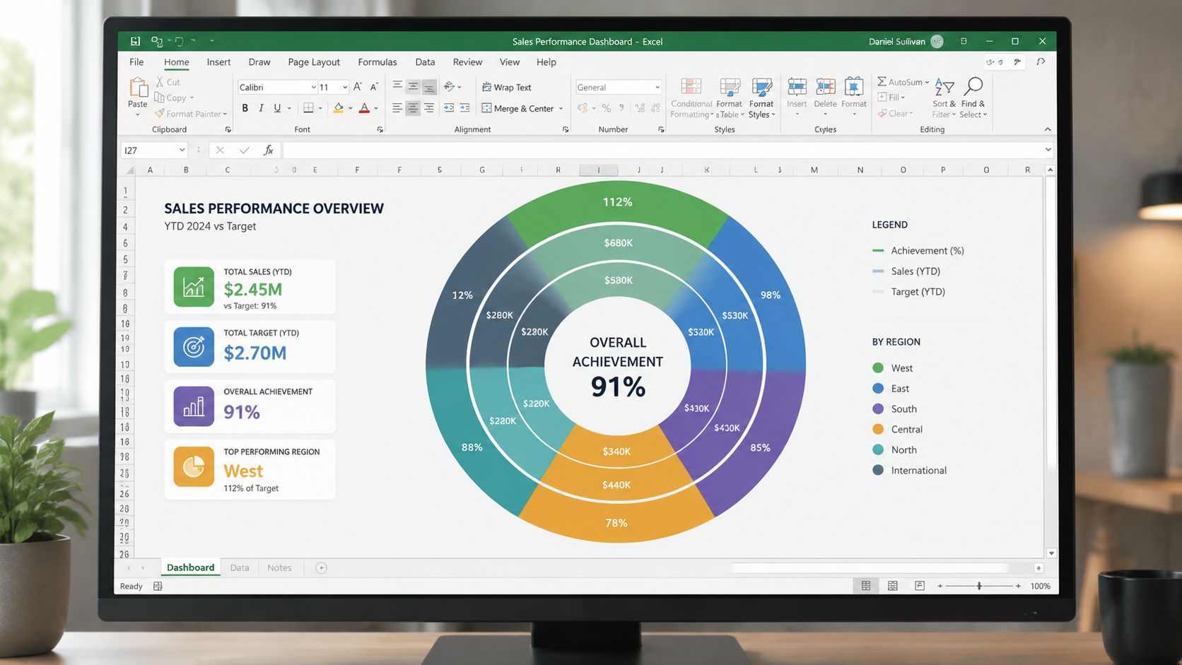
Set up one series per ring, with clear headers and a consistent category order. If the inner ring shows Achieved and Remaining, the outer ring should use the same sequence. Excel is much easier to control when each ring follows the same logic.
A simple layout looks like this:
| Label | Series 1 | Series 2 |
|---|---|---|
| Achieved | value | value |
| Remaining | value | value |
Keep helper cells outside the chart range. Name the series for what they mean, not for where they came from. “Actual” and “Target” are easier to format correctly than “Q3 Calc 2” and “Final Rev.”
Build the rings in a controlled order
Create the first doughnut from the primary comparison, then add the second series. After that, check three things before you touch colors:
- The category order matches across both series.
- The smaller ring represents the secondary comparison you want readers to treat as supporting context.
- The hole size leaves enough center space without making the rings too thin.
That last point matters more than it looks. Thin rings read poorly on laptops and even worse in exported slides.
When a second ring helps
Two rings work best when both answer the same question at different levels. Actual versus remaining inside, target versus remaining outside is a common example. This year inside and last year outside can also work if the audience already knows the metric.
The chart breaks down once each ring means something different. If one ring shows region mix and the other shows profit attainment, readers have to decode the structure before they can interpret the values. At that point, the chart is asking for too much effort.
If you need a quick rule, use a second ring only when the outer ring adds context to the inner ring, not a second story. This matters for the same reason discussed in guidance on when to use a pie chart. Circular charts handle simple part-to-whole messages better than layered comparisons with several competing takeaways.
Format for hierarchy, not decoration
The inner ring usually deserves more visual weight because it is easier to see and often carries the main KPI. Use the stronger color there. Keep the outer ring lighter or more muted so it supports the reading order instead of competing with it.
I also avoid full legends when building multi-ring doughnuts for dashboards. Direct labels, center totals, or short annotations near the chart are usually faster to read. If the chart needs a long legend and a paragraph of explanation, it is the wrong chart.
One more practical limit. Stop at two rings in Excel. Beyond that, the display gets crowded, label placement gets unreliable, and any benefit of compactness disappears. If you need richer interaction, such as hover detail, ring-level filtering, or live drill-down, that is the point where Excel’s static chart object starts to show its limits and a BI tool becomes the better fit.
Common Pitfalls and When to Use a Bar Chart Instead
Doughnut charts look polished, so people forgive their weaknesses for too long. That’s a mistake.
Technical mistakes that break the chart
Some errors are mechanical, not strategic.
Watch for these:
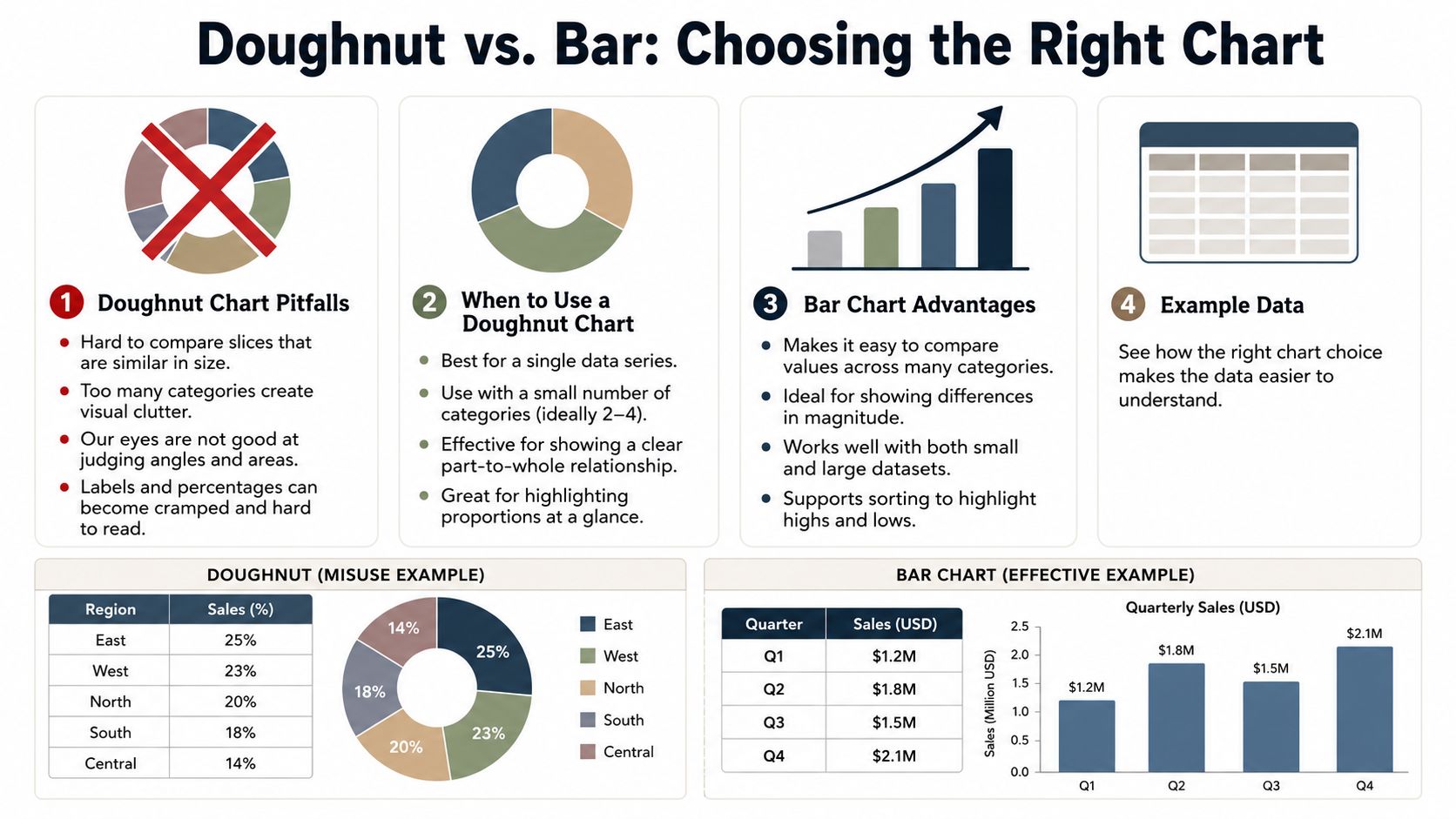
- Zero or negative values. Excel silently plots a negative as its absolute value and renders a zero as an invisible slice.
- Too many slices. The ring becomes a color wheel instead of a chart.
- Poor ordering. Similar segments become harder to distinguish.
- Heavy labels. The chart collapses under its own annotations.
These aren’t minor polish issues. They change whether the chart works at all.
Why bar charts usually win for comparison
The bigger issue is perception. People aren’t very good at comparing circular slices, especially when the values are close.
In her breakdown of double doughnut charts, Amy Esselman makes the case plainly: the limitations of pie charts apply to doughnuts too, and comparing segments across two rings is hard because the pieces sit in different positions. It’s the same reason decades of perception research — going back to Cleveland and McGill — keep finding that people judge the length of a bar more accurately than the angle or area of a slice. When the job is comparison, bars win.
For example, if you’re deciding between category performance visuals, a bar chart is often better than a ring because:
- Lengths beat angles. People judge bars more accurately than arcs.
- Rank is clearer. Sorting categories is easy to see.
- Labels fit naturally. You don’t need to force text around a circle.
If you’re weighing chart choice for part-to-whole work more broadly, this guide on when to use a pie chart is a useful companion because many of the same trade-offs apply.
A quick decision guide
Use this simple test before you insert a doughnut chart:
| If your goal is… | Better chart |
|---|---|
| Show one completion metric | Doughnut |
| Show part versus remainder | Doughnut |
| Compare several categories | Bar chart |
| Compare close values | Bar chart |
| Show layered progress in a compact KPI card | Multi-ring doughnut, cautiously |
A doughnut chart is strongest when the audience should feel the metric first and inspect the detail second.
If the reader needs precise comparison first, pick bars and move on.
Sharing Your Chart and Embracing Live Data
Once the chart looks right, Excel gives you familiar ways to share it. You can paste it into PowerPoint, export the workbook, or capture the chart into a PDF-ready report. That works well enough when the numbers won’t change before the meeting.
The problem is that many charts go stale almost immediately. The chart in your file reflects the workbook at the moment you exported it, not the state of the business a few hours later. That gap matters more as teams move toward always-current dashboards. As this comparison of donut and pie charts points out, dedicated BI tools are built around direct data connections and interactivity — something native Excel charts don’t offer without slicers, add-ins, or moving the work into Power BI.
That’s the practical ceiling of the classic doughnut-chart-in-Excel workflow. It’s good for manual analysis and polished static reporting. It’s less effective when the audience expects dashboards, interaction, and current numbers during the conversation.
If you’re moving from static reporting toward web-native presentations, it’s worth studying how interactive slides change the presentation itself. The chart stops being a screenshot and starts acting like a live component.
If your team is tired of rebuilding static decks every time the numbers change, Encelade is worth a look. It helps sales, marketing, and revenue teams turn spreadsheets, research, and CRM notes into interactive presentations with live data, shareable links, and exports when you still need PDF or PPTX.