You probably have a deck half-built right now.
A few slides look polished. A few are placeholders. The market slide is too broad, the traction slide feels thin, and the ask still sounds like a funding request instead of a milestone plan. You know the story in your head, but the deck doesn’t carry it yet.
That gap is why most founders struggle with how to make a pitch deck. The hard part isn’t choosing a template. It’s building a narrative that works in a live meeting, survives email forwarding, and can adapt for a VC, an angel, a design partner, or your first enterprise buyer. The deck that gets a yes isn’t a static file. It’s a system built around a core story, then tuned with proof, context, and delivery format for the room you’re in.
Laying the Foundation Before You Build a Single Slide
Most pitch problems start before slide one. Founders open Keynote, PowerPoint, or Google Slides too early. They start arranging boxes before they’ve decided who the deck is for, what the meeting needs to achieve, and what single idea the audience should remember.
That sequence produces familiar damage. The investor deck turns into a product tour. The sales deck reads like a fundraising memo. The seed-stage company tries to answer every possible question and ends up making none of the important ones easy to absorb.
Start with the audience, not the template
A VC and an enterprise buyer don’t evaluate the same risk.
A VC asks whether the market is large enough, whether the team can execute, and whether the traction suggests a real wedge. An enterprise buyer asks whether the product solves a current pain, whether the rollout is safe, and whether the vendor will make their team look smart. If you give both audiences the same deck, one of them gets the wrong conversation.
Use a simple audience profile before you draft content:
- Who are they judging? Investor, customer, partner, or internal champion.
- What are they afraid of? Market risk, adoption risk, implementation risk, or team risk.
- What counts as proof for them? Revenue milestones, user growth, case studies, product demo, or references.
- What do they need next? Another meeting, partner approval, a pilot, diligence, or a term sheet discussion.
A deck usually works when it answers the audience’s unspoken objection before they voice it.
If you need a baseline definition before customizing the narrative, this overview of what a pitch deck is is useful context. Then move quickly past the generic template mindset.
Practical rule: Build the first version for the hardest audience to convince. Then simplify or adapt from there.
Define one outcome for the meeting
Too many decks chase five outcomes at once. They want interest, money, advice, intros, customer validation, and hiring support. That makes the ask vague and the story soft.
Pick one primary outcome for the specific meeting. Examples:
- Second meeting: The deck should raise confidence and curiosity, not bury the audience in detail.
- Pilot approval: The deck should focus on pain, implementation path, expected success criteria, and decision process.
- Fundraise progression: The deck should show market opportunity, traction, team strength, and what the capital enables.
When the objective is clear, slide choices get easier. A technical architecture slide may help in customer diligence and hurt in an initial VC meeting. A deep financial model may belong in the appendix and nowhere near the first conversation.
Write the one-sentence takeaway first
Before you build slides, write the sentence you want repeated after the meeting.
Not a slogan. Not a mission statement. A concrete takeaway that ties problem, solution, and proof together. If you can’t write that sentence cleanly, your deck will sprawl.
A workable formula looks like this:
- For [specific audience], we solve [specific problem] with [specific approach], and we’ve proven it through [specific evidence].
That sentence becomes your filter. Every slide should either strengthen it or get removed.
A strong deck also needs a recognizable structure. Founders Network notes that a successful pitch deck often follows the Lean Canvas model, covering Problem, Solution, Market Opportunity, Business Model, Competition, Team, Financial Projections, and Funding Request, and it emphasizes keeping each slide focused on one core idea, as described in Founders Network’s pitch deck guidance.
That doesn’t mean every deck must be rigid. It means investors need a clear path through your logic. If they have to decode what each slide is trying to do, you’ve already increased friction.
Architecting Your Narrative: The 10 Essential Slides
The cleanest decks usually land between 10 and 15 slides, and each slide should be easy to grasp in about 20 seconds — a comprehension benchmark drawn from Astel Ventures data summarized by SketchBubble. That’s a useful constraint because it forces discipline. If a slide needs a tour guide, it probably contains too much.
The point of a 10-slide structure isn’t tradition. It’s compression. You’re creating a sequence that moves the audience from attention to belief to action.
The structure investors recognize
The strongest decks feel inevitable. Slide by slide, the audience understands what hurts, why current approaches fail, why your product is different, and why now is the right time to care.
Here is the practical arc:
- Open with the company and the wedge. Give the audience a fast frame for what you do.
- Show the problem clearly. Make the pain concrete and specific.
- Present the solution. Keep it high-level enough to stay strategic.
- Define the market. Show that the opportunity is real and worth pursuing.
- Explain the product. Help them see how it works without drowning them.
- Show traction. Give them evidence that the story already has momentum.
- Clarify the model. Make the path to value capture legible.
- Position against alternatives. Don’t attack competitors. Clarify your difference.
- Establish team credibility. Explain why this team can win.
- Make the ask. Tie the request to milestones, not just spend.
People don’t fund a pile of information. They fund a line of reasoning they can repeat with confidence.
The 10 essential pitch deck slides
| Slide | Question it Answers | Key Content |
|---|---|---|
| 1. Title and one-liner | What does this company do? | Company name, one-sentence value proposition, clear category framing |
| 2. Problem | What urgent pain exists? | Specific pain point, who has it, why current workflow is broken |
| 3. Solution | Why is your approach better? | Product summary, core mechanism, plain-language benefit |
| 4. Market opportunity | Is this worth building? | TAM, SAM, SOM logic, buyer segment, why this wedge expands |
| 5. Product | What does the product actually do? | Screenshots, workflow, product experience, implementation simplicity |
| 6. Traction | Why should I believe this now? | User growth, revenue milestones, pre-orders, partnerships, adoption signals |
| 7. Business model | How do you make money? | Pricing logic, sales motion, revenue model, who pays and when |
| 8. Competition | Why will you win? | Alternatives, differentiation, strategic position, category choice |
| 9. Team | Why is this team credible? | Relevant experience, founder-market fit, execution ability |
| 10. Ask | What happens next? | Funding request or pilot request, milestone plan, use of proceeds at a high level |
What to cut before you present
Founders usually know what to add. They struggle more with what to remove.
Cut anything that creates drag without improving belief:
- Dense text blocks: If the audience has to read paragraphs, you’ve stopped presenting.
- Feature inventory: Buyers and investors care more about outcomes and differentiation than a laundry list.
- Premature detail: A first meeting rarely needs full technical architecture or line-item financial assumptions.
- Category jargon: If a phrase sounds impressive but doesn’t sharpen understanding, delete it.
- Competitor bashing: It makes you look insecure and distracts from your own thesis.
A useful test is whether each slide has one job. If the slide is trying to prove market size, explain product flow, and justify pricing at the same time, split it or cut it.
When people ask how to make a pitch deck that gets follow-up meetings, this is usually the hidden answer. The deck respects cognitive load. It doesn’t confuse motion with progress.
Weaving Data and Storytelling for Maximum Impact
You are halfway through a partner meeting. The buyer is interested, the investor is polite, and the deck is full of numbers. Then the room stalls because none of the numbers answer the question in their head: why should I believe this company is gaining real traction, not just producing tidy slides?
That is the standard to use here. Data earns attention only when it removes a specific doubt.
Raw metrics don’t persuade on their own
Founders often treat the deck like a compressed data room. They stack market charts, logo walls, growth lines, and survey results on a slide and expect the audience to connect the dots. In a live pitch, that usually fails. The burden stays on the audience, and once they start doing interpretive work, you lose control of the story.
A stronger approach is to assign each metric a job inside the narrative:
- Does it prove the problem is painful enough to create budget?
- Does it show a reachable market, not just a large one?
- Does it show a behavior change, not just interest?
- Does it make the forecast feel tied to reality?
Adobe makes a similar point in sales presentations. Quantified value claims are easier to trust than vague promises, as described in Adobe’s guidance on creating a sales presentation with AI. The same rule applies in fundraising and enterprise sales. Precision signals that the team understands what the customer is buying and how value shows up.
A before-and-after framing often helps.
Before:“Teams struggle with reporting.”
After:“Operations teams still stitch together reporting manually across tools, which delays decision-making and creates avoidable errors.”
The second version earns its place because it identifies the buyer, the broken workflow, and the business consequence. It gives the metric that follows somewhere to land.

If you want a better framework for turning proof into a persuasive sequence, this guide to storytelling in presentations is a useful companion.
How traction earns belief
Traction changes the conversation. Before that slide, people are judging the idea. After it, they are judging the rate of learning, the speed of adoption, and the odds that this turns into a real business.
The strongest traction evidence is hard to dismiss. Revenue from repeat customers. Expansion inside an account. Usage that keeps growing after onboarding. A pilot that converted into a paid rollout. Those signals matter because they show behavior, not hope.
The common mistake is showing activity instead of progress. Ten customer conversations are activity. Three paying design partners with a clear use case and an implementation timeline are progress.
If the company is early, case studies can carry more weight than a thin graph. Keep them disciplined. Name the customer type, the starting problem, what changed during the pilot, and what happened next. A vague logo and a testimonial quote do not do enough work. Two or three specific customer stories, each tied to a measurable outcome or buying signal, usually outperform inflated top-line claims.
A traction slide should make the audience conclude that the market is already responding.
This is also where a dynamic pitching system beats a static deck. The core argument stays the same, but the proof should adapt to the room. A VC may care most about retention, sales efficiency, and expansion potential. An enterprise buyer may care more about implementation speed, risk reduction, and proof from a similar customer. The best decks are built so you can swap in live pipeline data, current pilot results, or audience-specific case studies without rebuilding the narrative from scratch.
Make projections feel grounded
Financial projections become credible when the audience can trace them back to operating assumptions. If they cannot, the model reads like ambition in spreadsheet form.
Start from the first real wedge in the market:
- Define the buyer and use case
- Estimate how many of those buyers are reachable through your current motion
- Tie pricing to how the product is sold and adopted
- Show the assumptions behind conversion, retention, and expansion
That is what TAM, SAM, and SOM are for in a good deck. They are not decorative market labels. They show whether the path from first customer to larger category makes sense.
For a living deck, this matters even more. Projections should not sit in a dead appendix and age out after one meeting. They should connect to current sales data, current pipeline quality, and what the team has learned from recent customer behavior. When the narrative and the numbers update together, the deck stops being a one-time presentation and starts acting like a working decision tool.
Good storytelling gives each number a role. Good data gives the story permission to be believed.
Designing for Engagement and Interactivity
A founder opens a deck in a partner meeting. The product is solid, the market is real, and the room is still slipping away by slide four. It usually is not because the business is weak. It is because the deck makes people work too hard to follow the point.
Design affects judgment fast. Investors and enterprise buyers both use presentation quality as a proxy for operating quality. Cooley GO makes the same point in its pitch deck tips. Sloppy layout, inconsistent visuals, and crowded slides create friction early, before the harder questions even start.

Clarity beats decoration
Strong design makes the argument easier to absorb.
That usually means fewer elements, not more. One idea per slide. A headline that states the takeaway. Proof that can be read in a few seconds. Visual hierarchy that tells the audience where to look first, second, and third.
The fastest improvements are usually straightforward:
- Cut on-slide copy: If a paragraph is doing the talking, the presenter has lost control of the room.
- Use one visual system: Keep type, spacing, chart styles, and icon treatment consistent.
- Remove weak assets: Blurry screenshots, stock illustrations, and mismatched graphics lower confidence.
For teams building browser-based presentations, this guide on how to make interactive slides is a useful reference point.
Interactivity should serve a decision
Interactive elements are helpful when they answer a real question in the room.
In a technical sales conversation, that may mean letting a buyer click through a workflow, inspect a dashboard state, or compare implementation paths without breaking into a separate demo. In an investor meeting, it may mean opening current usage data, a live pipeline view, or cohort cuts that support the claim on the slide. Used well, interactivity turns the deck from a static sequence into a flexible operating tool.
That is the larger shift. A good modern deck is not just designed to present. It is designed to adapt.
Interactive digital presentations can also support polls, surveys, and embedded demos that keep the conversation active, as described in Ingage’s article on interactive digital presentations in lead sales. For B2B teams, that matters because buyers rarely say yes based on narrative alone. They want to test how the product fits their process.
Here’s a short example of what that looks like in motion:
What strong presentation design does in practice
Good design lowers cognitive load. Good interactivity helps the audience engage with the parts that matter to them.
Rekarda’s overview of technology for enhanced presentations points to tools that support live polls, Q&A, and delivery feedback. Those features are useful, but they are not the point by themselves. The test is whether the deck helps the next discussion happen faster. Does the investor get to conviction sooner? Does the buyer get enough context to move to a technical review, pilot, or procurement step?
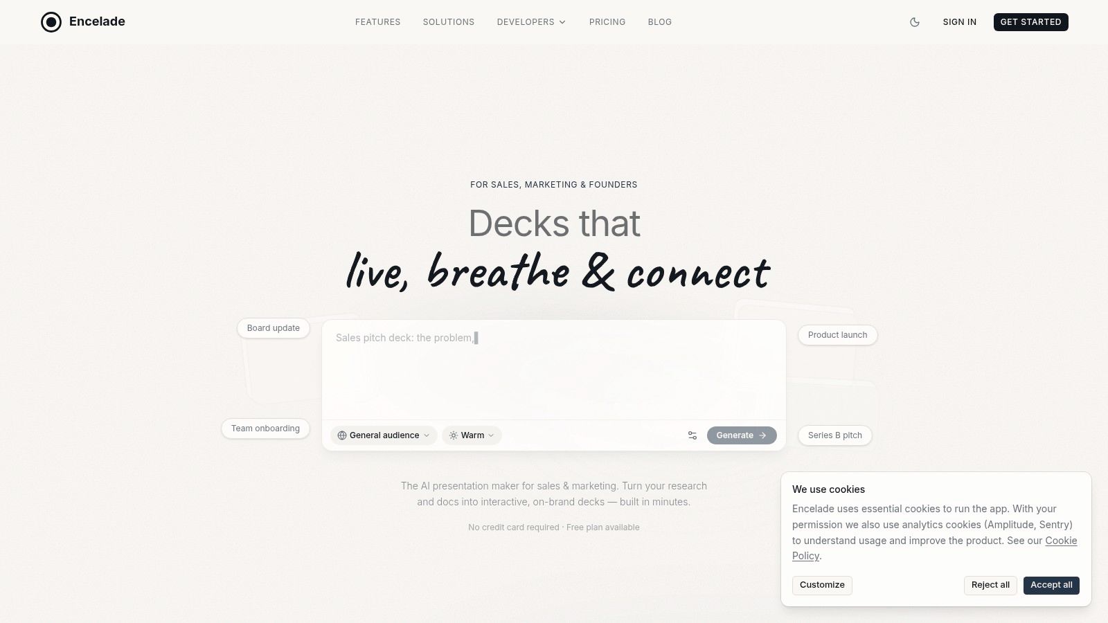
Encelade is one example of this model. Teams can build link-based presentations with interactive widgets, live data, and browser-based sharing. That setup is useful when the same core story needs to hold up in a fundraise, a customer pitch, and an internal review without constant file exports and version drift.
Design should make the next question easier to ask. That is when the deck starts working like a system, not a file.
From Static File to Living Asset: The Modern Pitch Deck
The old model is simple. Build a PDF, attach it to an email, revise it manually, and lose control of which version is circulating.
That model breaks fast. Metrics go stale. Audience needs change. New objections appear. The founder tweaks one copy for a fund, another for an angel, another for a customer, and within weeks nobody knows which story is current.
One core narrative, multiple versions
The modern deck works better as a living asset. One core story. Several audience-specific versions.
Antler explicitly advises founders to create “a number of different pitch decks for different scenarios and conditions” and to treat the deck as a “living document” refined by feedback, as described in Antler’s guide to the pre-seed pitch deck. That’s the right operating model.
A practical versioning system usually includes:
- Investor version: market, traction, team, and milestone-focused ask
- Customer version: pain, workflow, proof, implementation, and commercial next step
- Partner version: strategic overlap, integration logic, and joint value
- Internal version: roadmap, dependencies, and decision support
The mistake is rebuilding each from scratch. Keep the same backbone and adjust proof, sequence, and emphasis for the audience.
Why live data changes pitch operations
Static metrics age badly. If active users, pipeline, revenue, or implementation outcomes change often, manual updates become a tax. Worse, the founder may present outdated numbers and lose credibility.
A live deck solves that operational problem. It connects the presentation to working data sources such as spreadsheets, CRM notes, or APIs, so the presentation reflects the latest state of the business. That matters for founders raising capital over weeks or months, and it matters just as much for B2B teams sending customized decks after every call.
The benefit isn’t only convenience. It’s consistency. One shared asset with current numbers reduces version drift and lowers the chance that a stale PDF keeps circulating after the story has moved on.
Treat every pitch like a feedback loop
The best decks improve because the team treats each meeting as product feedback.
Watch where people interrupt. Note which slide prompts skepticism. Track what gets forwarded internally and what needs explanation every time. If one audience always asks for implementation detail earlier, create a variant that answers it sooner. If investors consistently latch onto one proof point, make it more prominent.
This is the definitive answer to how to make a pitch deck that keeps working after the first draft. Build a system that learns.
A living deck has a few advantages over a file:
- Version control: everyone shares the current story
- Adaptability: you can tune the order and proof for each audience
- Fresh metrics: the most important numbers don’t require manual replacement
- Engagement visibility: link-based delivery can show who viewed the deck and where they spent time
- Faster iteration: feedback from one meeting improves the next one immediately
The founders who treat the deck as an operating asset usually communicate better across the board. Fundraising gets clearer. Sales gets tighter. Internal alignment improves because the team repeats the same core story with audience-specific proof instead of improvising from scratch each time.
If you’re building investor decks, customer pitches, or account-specific presentations, Encelade is worth evaluating as a way to turn a static deck into a web-native, updateable presentation system. It can convert research, CRM notes, spreadsheets, and documents into interactive decks, which is useful when you need one core narrative that can be restyled, updated, and shared across different audiences without rebuilding the story each time.