A pitch deck is a brief presentation, often created using PowerPoint or web-native tools, used to provide your audience with a quick overview of your business plan, product, and vision. In practice, it’s the shortest version of your story that still earns the next conversation.
You’re probably staring at a half-finished deck right now, wondering whether investors, partners, or a big prospective customer will understand what you’re building. That’s the core job of a pitch deck. Not to dump every fact you know onto slides, but to turn a messy business into a clean, convincing narrative that gets a clear result.
Most weak decks fail for the same reason. They confuse information with persuasion. Founders add more slides, more text, and more screenshots because they’re afraid of leaving something out. What works is the opposite. A strong pitch deck is selective. It answers the few questions your audience needs answered right now, then leaves them wanting the deeper discussion.
That matters even more today because decks aren’t just boardroom files anymore. They get forwarded, opened on phones, skimmed between meetings, and compared against other opportunities fast. Static slides can still work, but the standard for clarity and adaptability has moved.
Your Big Idea Needs a Great Story
The founder walks into a conference room with a real product, a real problem, and a real chance to change their company’s future. They also walk in with a common mistake. They think the deck’s job is to explain everything.
It isn’t.
A pitch deck is a visual business story. It helps an investor, partner, or major customer understand what the problem is, why your solution matters, and why this opportunity deserves another meeting. That last part matters most. The deck is rarely the finish line. It’s the tool that gets you to diligence, the product demo, the partner workshop, or the term sheet discussion.
The deck is the translator
Founders usually know too much. That sounds like a strength, but in a pitch it becomes a liability. When you’re deep in the product, every detail feels important. Your audience doesn’t have that context. They need the clean version first.
A useful way to think about a pitch deck is this:
- Your business is complex. Markets, product decisions, pricing, timing, and execution all matter.
- Your deck must feel simple. Not shallow. Simple.
- Your story must create momentum. Each slide should make the next one easier to believe.
That’s why good founders spend more time on order than on decoration. The sequence of ideas matters more than the template.
Practical rule: If your audience understands your business but doesn’t know what to do next, the deck failed.
Static slides are no longer the whole game
The old model was a PowerPoint file attached to an email. That still exists, and sometimes it’s enough. But many teams now pitch in environments where the deck has to work live, asynchronously, and across different stakeholders who care about different things.
That shift has made storytelling even more important. A deck isn’t just a file. It’s a decision tool. If you want to sharpen that skill, this guide on storytelling in presentations is a useful next step because it focuses on how narrative structure changes audience response.
The best decks I’ve seen don’t feel like corporate paperwork. They feel like a sharp explanation of why this company should exist now.
Who Is It for and What Should It Achieve
A pitch deck only works when it’s built for a specific audience and a specific action. If you don’t know who it’s for, the content turns generic fast. If you don’t know what it should achieve, the meeting ends with polite interest and no next step.
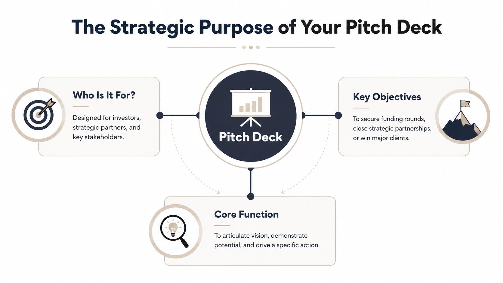
It has two jobs
Most pitch decks serve one of two roles.
First, there’s the teaser deck. This is the version that gets emailed, forwarded, and skimmed. Consider it a movie trailer. It should be short, visual, and easy to grasp without you in the room. Its job is simple. Earn the meeting.
Then there’s the presentation deck. This is the version you use live. It’s comparable to the full film. It can carry more context because your voice fills in the gaps. Its job is to support discussion, handle scrutiny, and move the audience toward a decision.
Those are different assets. Too many teams mash them together and end up with a deck that’s too vague to stand alone and too crowded to present well.
Different audiences care about different proof
A venture investor usually wants to understand market potential, why your timing makes sense, how you’ll grow, and whether your team can execute. A strategic partner often cares more about fit. Will your product integrate cleanly? Does the relationship offer mutual benefit? Will working together solve a problem they already feel?
A major customer is different again. They want relevance, risk reduction, and a clear path to value. They don’t need your origin story. They need to know why buying from you is smarter than doing nothing or choosing a competitor.
A useful filter is to ask: what would make this audience say yes to a second conversation?
Tailor the same core story
The underlying narrative shouldn’t change every time. Your company is still your company. But emphasis should shift.
| Audience | What they want to see | What to downplay |
|---|---|---|
| Investors | Market opportunity, evidence, defensibility, team judgment | Excess implementation detail |
| Strategic partners | Fit, integration logic, mutual upside, strategic relevance | Generic fundraising language |
| Major customers | Business problem, workflow impact, product confidence, rollout path | Broad market theory |
A pitch deck that tries to impress everyone usually persuades no one.
Focus on the action, not the applause
Founders often measure a pitch by how positive the room felt. That’s unreliable. Investors can be warm and pass. Buyers can nod and disappear. The better question is whether the deck produced the next concrete step.
Use that standard instead:
- For fundraising: Did it secure a deeper meeting, diligence request, or partner intro?
- For sales: Did it move the deal into technical review, procurement, or executive alignment?
- For partnerships: Did it trigger a working session around scope and fit?
If the deck doesn’t drive action, it needs revision. A pitch deck is not a brand exercise. It’s an operating tool.
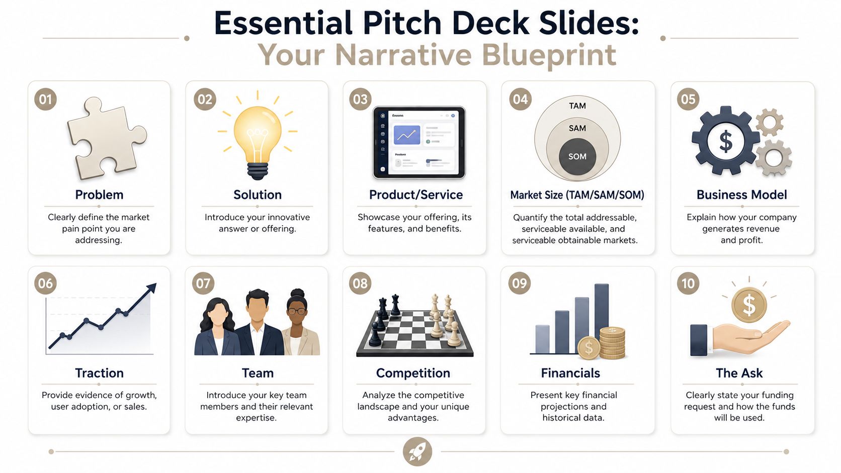
Building the Narrative Slide by Slide
Strong decks usually follow a familiar structure, but the mistake is treating those slides like boxes to tick. The better approach is to treat them like a narrative arc. Each slide answers one question and creates the conditions for the next answer to matter.
Start with pain. End with a decision.
Open with the problem and the change you create
The Problemslide must make the audience feel the pain you’re solving. If they don’t buy the problem, nothing after it lands. Be specific. Show the friction, cost, delay, risk, or missed revenue that exists today.
The Solutionslide must show that you’re not just aware of the problem. You have a clear answer. Keep it high level. This is not the place for every feature.
The Productslide must make the answer tangible. Screenshots, workflow views, architecture snapshots, or a simple product sequence work well here. The audience should be able to say, “I see how this works.”
For teams that need a cleaner slide sequence before they ever design anything, this article on how to master your PowerPoint presentation outline is useful because it forces the structure before the styling.
Here’s a live example of the kind of pitch guidance many founders study when shaping flow and delivery:
Then prove there’s a business here
The Market Sizeslide must answer whether the opportunity is large enough to matter. Most founders get this wrong by making it abstract. Don’t just name a massive market. Show the wedge you can enter.
The Business Modelslide must answer how you make money. If someone can’t understand pricing or revenue logic quickly, confidence drops. Simple beats clever here.
The Go-to-Marketslide must show how you’ll reach buyers. On this slide, you explain whether growth comes from outbound sales, channel partners, self-serve adoption, product-led expansion, founder-led selling, or some combination.
The Tractionslide must provide evidence that the business is moving. Because verified quantitative data isn’t available here, the rule is straightforward. Use real proof in your actual deck, but don’t stretch it. Early customer feedback, pilots, design partners, renewals, product usage patterns, or a strong sales pipeline can all help if they’re accurately presented.
Operator’s test: Every proof point should survive follow-up questions. If it sounds impressive but falls apart under scrutiny, cut it.
Show why you win and why you’re the team to do it
The Competitionslide must prove you understand the market you’re entering. Saying “we have no competitors” is a red flag. If the pain exists, people are already solving it somehow. Your job is to explain why your approach is better, faster, cheaper, easier to adopt, or better aligned with where the market is going.
The Teamslide must answer why this group can execute. Keep it relevant. Prior experience, domain knowledge, technical credibility, and distribution advantage matter. Glamour doesn’t.
The Financials slide must show that you think like an operator, not just a visionary. The exact detail varies by stage, but the audience should leave with a sense that you understand revenue drivers, cost structure, and what has to be true for the business to work.
Finish with a direct ask
The Askslide must tell the audience what you want and what happens next. If you’re fundraising, say what you’re raising and what the capital will enable. If you’re selling, define the decision, pilot, or rollout step you want. If you’re pursuing a partnership, state the structure of the next working session.
A vague ending kills momentum. A precise ending creates it.
Pitch Deck Mistakes to Avoid at All Costs
Most decks don’t fail because the company is weak. They fail because the deck signals sloppy thinking. Experienced investors and buyers spot that fast.
The patterns are predictable, and so are the fixes.
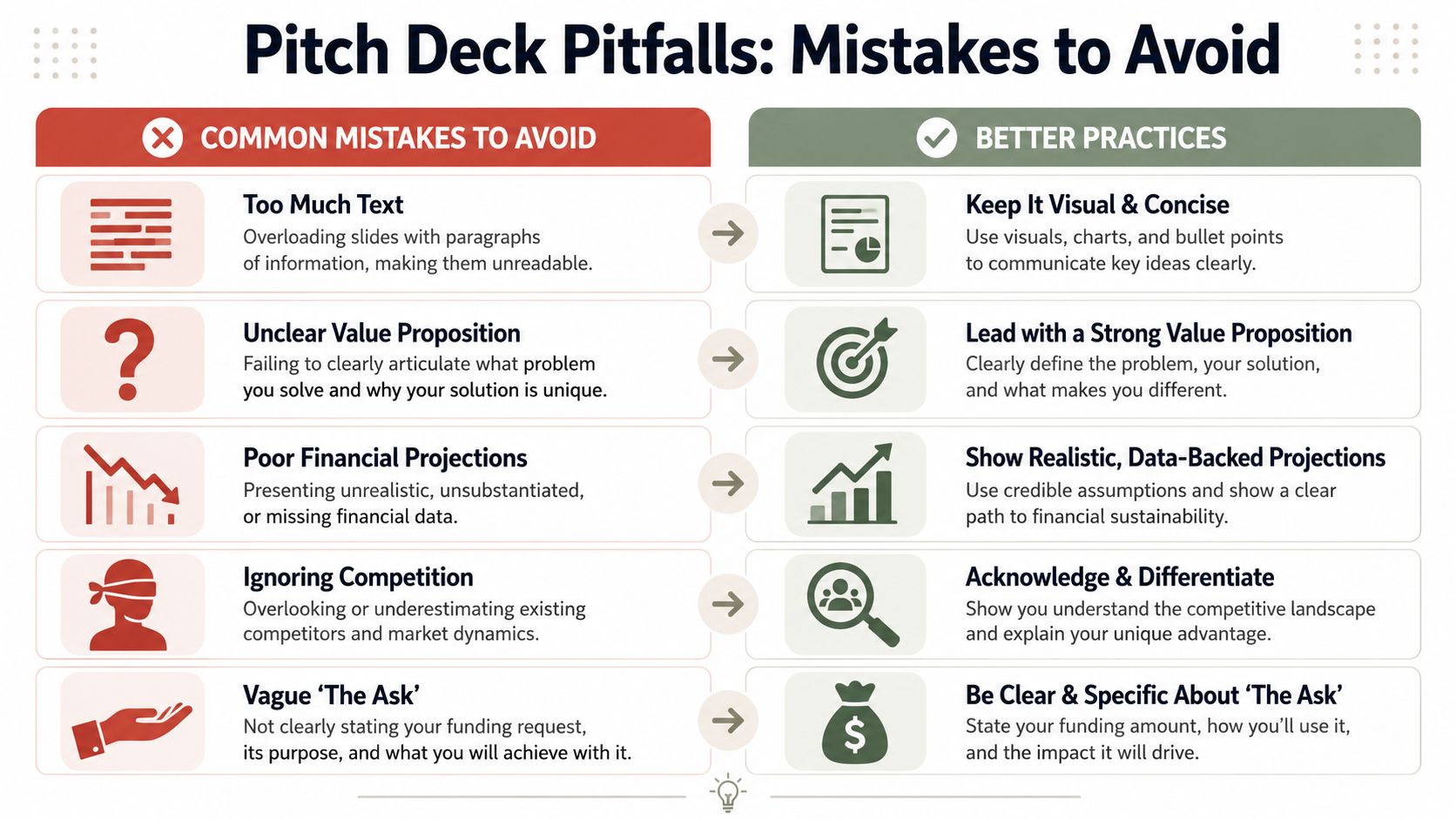
Walls of text kill attention
If a slide looks like a memo, people stop listening and start reading ahead. Then they do neither well.
Fix it by reducing each slide to one core idea, one strong headline, and only the supporting points needed to make that idea credible. If you need to explain nuance, do it out loud or move the detail into an appendix.
Tiny fonts signal panic
Small text usually means you’re trying to force too much into too little space. That tells the audience you haven’t prioritized what matters.
Use fewer words, bigger type, and cleaner layouts. If a slide can’t work without microscopic text, the slide needs rewriting, not resizing.
Unrealistic financials damage trust
Optimism is fine. Fantasy isn’t. When founders show aggressive projections without showing the assumptions behind them, the audience starts discounting everything else too.
The fix is simple. Tie your thinking to believable drivers. Show the logic. Be ready to explain what must happen for your plan to work, where the risks are, and what you’ll learn if reality differs from the model.
Weak financial slides don’t just create doubts about the numbers. They create doubts about judgment.
“We have no competitors” is an amateur mistake
You always have competition. It might be another startup, an incumbent vendor, an internal team, or the customer doing nothing. Ignoring that makes you look naive.
A better approach is to frame the actual alternatives clearly:
- Direct competitors: Who already sells a similar solution.
- Indirect competitors: Who solves the problem in a different way.
- Status quo: What buyers do today if they don’t buy from anyone.
That framing also sharpens your value proposition because it forces you to explain why change is worth the effort.
A vague ask wastes the meeting
Founders often end with something soft like “we’d love to stay in touch.” Sales teams do a version of the same thing with “let us know what you think.” That’s a missed opportunity.
Replace vagueness with a decision-oriented close. Ask for the diligence session. Ask for the technical review. Ask for the pilot kickoff. Ask for the next partner workshop.
Inconsistent design makes the company look smaller
You don’t need fancy visuals, but you do need discipline. Mixed fonts, clashing colors, stretched screenshots, and random alignment issues create friction. The audience reads that as lack of care.
A clean deck usually follows a few simple rules:
- Use one visual system: Keep typography, spacing, and color consistent.
- Make screenshots readable: Crop tightly and highlight what matters.
- Choose one style of chart: Don’t mix visual languages from different tools.
The strongest decks feel coherent before the audience even processes the content.
Why Static Decks Are No Longer Enough
The classic PowerPoint or PDF deck still has a place. It’s portable, familiar, and easy to export. But for many teams, especially those selling complex products or pitching fast-changing businesses, static files now create avoidable problems.
The first problem is outdated information. A metric changes, a pricing model shifts, a pipeline view updates, and suddenly the version in someone’s inbox is already behind. The second problem is version drift. One stakeholder reviews v3, another forwards v6, and the team presents v8. Nobody is looking at the same story anymore.
What modern decks do better
Web-native decks solve a very practical problem. They give teams a single shareable presentation instead of a chain of files. That means fewer attachment issues, cleaner collaboration, and less confusion about which version is current.
They also support interactions that static slides can’t. Dynamic charts, embedded product views, responsive layouts, and live content blocks help the audience explore the message instead of just receiving it. For technical products, native 3D views and interactive widgets can make the product itself clearer than a screenshot ever could.
If you want to see the broader design logic behind this shift, this guide on how to make interactive slides is worth reviewing because it focuses on when interaction adds clarity and when it becomes gimmick.
Live data changes the credibility of the story
A static deck freezes your business at one moment in time. That’s fine for archives. It’s weaker for active fundraising, strategic sales, or board-level updates where fresh information matters.
Modern presentation tools can connect to sources like Google Sheets or APIs so charts and figures stay current without manual rework. That doesn’t mean every deck should become a dashboard. It means the parts of the story that depend on current data no longer have to be maintained by hand every time you present.
That changes behavior inside teams. Instead of rebuilding the same slides repeatedly, they can spend more time refining the argument, tailoring the narrative, and responding to buyer or investor questions.
Static templates don’t adapt well enough
Traditional slide software was built around pages. Modern pitches often need to behave more like products. They get personalized for different accounts, shared by link, viewed on different devices, and updated across multiple stakeholders.
That’s where newer platforms stand out. Tools like Encelade are built for web-native delivery, interactive components, live data connections, browser-based editing, and AI-assisted generation from source material like CRM notes, research, spreadsheets, and documents. For teams working across sales, fundraising, and partnerships, that changes the deck from a design artifact into a living operating asset.
The winning deck in many rooms isn’t the prettiest one. It’s the one that stays accurate, adapts fast, and makes the next step obvious.
Start Building Your Winning Pitch Deck Today
So what is a pitch deck, really? It’s your company’s story compressed into a format that can win attention, build confidence, and trigger action.
The practical version is straightforward. Start with a real problem. Show a credible solution. Make the product understandable. Prove there’s a business behind it. Acknowledge the competition. Show why your team can execute. End with a clear ask.
Before you open PowerPoint, Keynote, or any browser-based tool, do one thing on paper first. Outline your story in roughly ten slides. Write the audience question each slide must answer. If a slide doesn’t answer an important question or move the story forward, cut it.
A simple first draft process
Use this sequence for your first pass:
- Write the headline for each slide first. If the headline is weak, the slide will be weak.
- Limit each slide to one job. Don’t mix problem, product, and traction on the same page.
- Decide the next action before you design the final slide. A strong ending shapes the whole deck.
That approach prevents a common mistake. Teams often open software too early and start polishing slides before the argument itself is solid.
Good decks don’t come from templates alone. They come from judgment. The best modern tools help once that judgment is clear, especially when you need to keep content current, tailor the message for different audiences, and make the deck more interactive than a static file allows.
If you want to turn your outline into a modern, interactive pitch that’s easier to update, personalize, and share, Encelade gives teams a web-native way to build decks from research, CRM notes, spreadsheets, and documents without getting trapped in static slide files.