In film financing, your deck is usually the first thing a financier sees — often before the script. That single fact changes how first-time filmmakers should think about fundraising. Your script still matters. But if your goal is to get a meeting in 2026, your deck is the thing that has to sell the film first.
That’s why a film pitch deck can’t be treated like a rushed PDF you build after the primary work is done. It’s the work that gets the primary work seen. And the strongest decks now do more than summarize a story. They frame the market, show audience logic, present comps clearly, and look polished enough to signal that the production itself will be handled with the same discipline.
A good deck opens the door. A weak one closes it before anyone reaches page one.
Why Your Pitch Deck Is More Important Than Your Script
If you’re raising money, your script usually isn’t the first test. Your deck is.
Investors have spent years reading visual, compressed decision documents, and the presentation world still leans on Guy Kawasaki’s 10/20/30 rule — 10 slides, 20 minutes, and no font smaller than 30 points — as a baseline for clarity and impact. That doesn’t mean every film deck must be identical. It means investors are judging your ability to communicate fast, visually, and without friction.
The deck is the first proof of execution
A script proves you can write. A deck proves you can package.
That distinction matters because financing decisions don’t happen in a vacuum. Producers, financiers, and partners are asking a practical question long before they debate scene work or dialogue: can this filmmaker present a coherent project that feels producible, market-aware, and visually controlled? A sloppy deck tells them the opposite.
Practical rule: If your deck feels confusing, overlong, or visually inconsistent, people assume the production will feel the same way.
Why the industry shifted
Over roughly the past decade, the pitch deck moved from optional to expected in independent and feature-film fundraising. It didn’t replace the older model of verbal pitches and written business plans so much as become expected alongside them, as visual, compressed decision documents migrated from startup and tech culture into film. Investors got used to the format. Film had to adapt.
The timing also makes sense. As distribution fragmented and global audience questions became more important, filmmakers needed a tool that could communicate tone, character, positioning, and commercial potential in minutes instead of pages. The deck became the modern one-sheet for a more complicated business.
What works now is not literary density. It’s selective clarity.
- Strong visual identity: one consistent tone from cover through comps.
- Fast comprehension: a reader should understand the project within moments.
- Immediate commercial framing: not just what the film is, but why this version of it can travel.
What doesn’t work is sending a script and hoping the recipient will “discover” the opportunity on their own. Most won’t. They don’t have time, and they don’t need to.
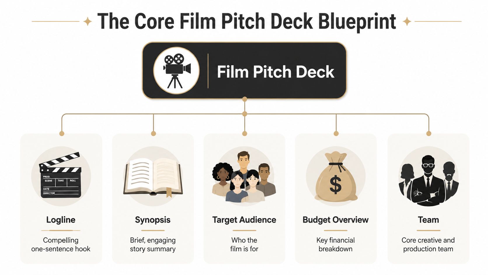
The Core Blueprint for Your Film Pitch Deck
The strongest film pitch decks are built on three core pillars: strong imagery, a clear synopsis, and a future plan, according to the Los Angeles Film School guide to creating your film’s pitch deck. Your reader should feel hooked from the very first page. That should shape the order of your slides. You’re not filling pages. You’re building conviction.
Start with the story spine
Your opening slides need to answer three things quickly. What is the film? Why is it emotionally legible? Why should anyone keep going?
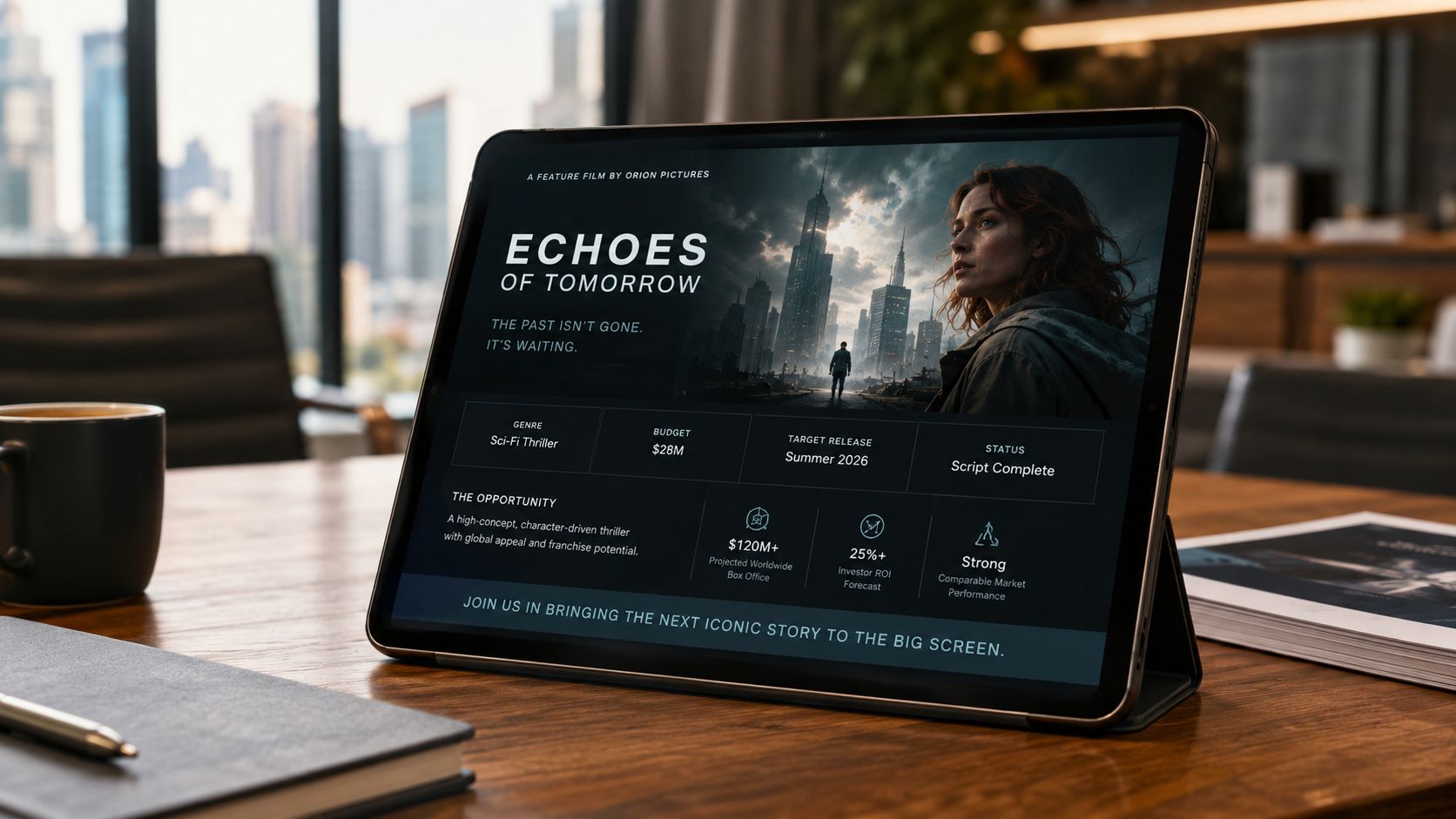
Start with a title page that already conveys genre and tone. If I remove the words, the page should still suggest whether I’m looking at refined horror, a grounded drama, or a commercial thriller. Then hit the logline. Keep it sharp. One or two sentences. No subplots, no backstory dump, no thematic essay.
After that, move into a short synopsis. Not a treatment disguised as a slide. Give the core premise, the protagonist, the pressure, and the shape of the conflict. If you can’t explain the movie cleanly here, the problem isn’t the slide. The problem is story clarity.
For a useful baseline on deck structure in general, this overview of what a pitch deck is helps clarify how presentation logic differs from a script packet.
Build the visual world fast
Mood and tone belong early because investors don’t buy plot alone. They buy the viewing experience.
Use reference imagery, palette, costume, production design, and visual atmosphere to create a stable promise. Many first-timers, however, make a common mistake in this area. They throw in random “inspiration” images they personally like. That weakens the deck. Every image needs a job. It should tell the reader how the film feels, not how broad your Pinterest taste is.
Then add character slides. Focus on the lead characters who drive the story and financing conversation. Give each one a crisp role in the engine of the plot. Avoid writing full biographies nobody asked for.
A character slide should make casting potential easier to imagine, not force the reader to decode a novel.
Essential Film Pitch Deck Slides
| Slide | Purpose | Pro Tip |
|---|---|---|
| Title Page | Establish genre, tone, and professionalism instantly | Use one dominant image, not a collage fighting for attention |
| Logline | Deliver the hook in the fewest words possible | Lead with conflict, not lore |
| Synopsis | Explain the story arc in readable form | Stay concise and front-load the central turn |
| Characters | Clarify who drives the story | Focus on function and emotional tension |
| Mood and Tone | Show what the film will feel like on screen | Keep visual references stylistically consistent |
| Target Audience | Identify who the film is for | Be specific about viewing appeal, not just age |
| Budget Overview | Show that the project has financial discipline | Present ranges or top-line logic cleanly if numbers are still developing |
| Team | Build confidence in execution | Lead with relevant producing, directing, or package credibility |
| Distribution Vision | Show how the film can reach viewers | Match the strategy to genre and scale |
| The Ask | State what you want from the reader | Be direct about whether you want financing, a meeting, attachments, or partners |
Some projects go short and sharp. Others run longer. While startup decks often stay in the 10 to 15 sliderange, film decks and image-heavy lookbooks can run much longer — commonly 20 to 30-plus pages, with some director lookbooks stretching past 70 — when they’re built for production-company review. The right length depends on audience and use case.
What matters is discipline. If a slide doesn’t make the film easier to fund, cut it.
Advanced Slides That Actually Secure Funding
Creative slides get attention. Business slides get the meeting.
That’s where a lot of promising decks fall apart. The filmmaker has tone, mood, character, and even a strong proof-of-concept still. Then the deck reaches market viability and turns vague. “Large audience.” “Strong appeal.” “High potential.” Those phrases don’t help because they ask the investor to do the thinking for you.
The better move is simple. Replace adjectives with evidence. The strongest film pitches lean on concrete indicators — box office from comparable films, ROI on similar projects, audience ratings — instead of vague claims. And the decks that convert rarely skip the business sections: market size and a credible go-to-market or distribution plan carry as much weight as tone and mood.
Use comps to answer risk
Comps are not a list of movies you admire. They are market evidence.
Pick films that help an investor understand likely audience behavior, release logic, and commercial lane. The comp set should make a case. If you’re pitching a contained thriller, don’t compare it to a giant franchise title just because the mood is similar. Compare by buyer logic, not ego.
A useful comps slide usually does four things:
- Shows fit: Why this audience already exists.
- Shows precedent: What similar films proved in the market.
- Shows positioning: Where your film sits creatively and commercially.
- Shows restraint: You understand your lane.
If your project is a documentary, the same principle applies. Use relevant metrics from similar documentaries when available. If your project is narrative, select comps that share audience overlap, release pattern, or thematic category.
Show the path to audience and distribution
The next useful slides answer a producer’s silent question. How does this film get seen?
That means a target audience slide that goes beyond “fans of drama” or “ages 18 to 34.” Give a practical profile. What kind of viewer chooses this film on opening weekend or on a platform thumbnail? What genre promise are they responding to? What emotional payoff are they expecting?
Then include a distribution strategy slide. Don’t pretend certainty where none exists. A preliminary route is enough if it’s credible. You might frame a festival-first plan, a streamer-aware genre release path, or a targeted specialty rollout. The point is to show that you’ve thought past production.
Later in the conversation, motion helps. A short walkthrough can make your financial logic easier to absorb.
What works is a deck that treats funding as a business decision. What fails is asking people to finance “passion” with no structure attached.
Mastering Visual Storytelling and Professional Design
Most filmmakers hear “professional design” and immediately think “expensive designer.” That assumption blocks a lot of good projects before they even start.
However, the underlying issue is different. As the First Draft Film Works guide to creating a film pitch deck puts it, a deck’s visual quality reflects the film’s projected quality — investors quietly ask, “if their presentation is sloppy, how will their film be?” The catch for indie filmmakers is the gap between that expectation and a tiny design budget. But that gap is closing: with today’s AI-assisted layout tools, a filmmaker with little to no budget can still produce an investor-grade deck. The gap is real. It’s just not an excuse to submit something messy.
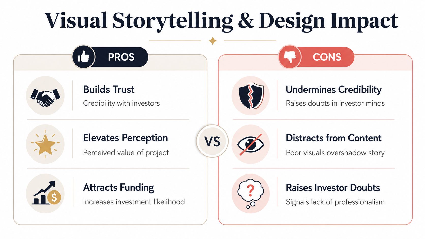
Professional does not mean expensive
You don’t need glossy studio packaging. You need control.
That starts with a small system. Choose one font pairing. Choose one restrained color palette. Decide how images sit on the page. Build one grid and repeat it. Amateur decks often fail because every slide feels like it came from a different project. Inconsistent spacing, random capitalization, low-resolution stills, and paragraphs shoved into corners create doubt before anyone reads a word.
For filmmakers who need a better narrative sense of slide flow, this piece on storytelling in presentations is useful because it focuses on progression and pacing, not just decoration.
What good DIY design looks like
A polished DIY deck usually has fewer elements, not more.
- Limit the palette: two or three colors are enough for most decks.
- Use fewer words: a slide should support your point, not become a wall of text.
- Commit to one image style: still photography, frames, concept art, or archival references. Don’t mix everything.
- Respect negative space: empty space makes a deck feel intentional.
Bad DIY design usually follows the opposite pattern. Too many fonts. Too many references. Too much text over busy images. Too many ideas on a single page.
If your deck needs verbal apology before someone opens it, it isn’t ready.
There’s also a trade-off worth understanding. Raw, handmade authenticity can help certain indie projects. But accidental roughness doesn’t read as authenticity. It reads as unfinished. You can keep the personality of the film while still making the document feel clean, readable, and deliberate.
That’s the standard. Not luxury. Deliberateness.
Leveraging Interactive and Next-Gen Enhancements
Static PDFs still work. They’re also easy to ignore.
If you want your materials remembered, the deck should do more than display information. It should create a small experience of the film. That’s where interactive presentation choices become useful. Not because they’re flashy, but because they reduce friction between curiosity and belief.
Make the deck behave like a film experience
The best upgrades are the ones that deepen immersion quickly.
Embed a sizzle reel or proof-of-concept so the recipient can watch inside the deck instead of hunting through attachments. If you’re selling a world-heavy project, use interactive visual elements that let the viewer inspect a setting, prop, or design object. For sci-fi, fantasy, animation, or elevated genre projects, even a simple rotatable concept model can communicate ambition faster than another paragraph of exposition.
Film is time-based and sensory. A static PDF can suggest that. An interactive deck can demonstrate it.
If you want to explore the mechanics, this guide on how to make interactive slides shows the kinds of interactions that can turn a passive deck into something more memorable.
Why link-based decks beat attachments
Attachments create version problems immediately. You send one file. Then you revise comps, update a team credit, swap a still, or tighten the ask. Now there are multiple versions moving around with no control over which one gets opened.
A link-based deck solves that. You keep one current version live, and every recipient sees the same project state. That’s especially helpful when your materials include evolving market comps, audience notes, or updated package information.
There’s another benefit. Interactive delivery signals that you understand modern presentation behavior. That doesn’t automatically get you financed, but it does position you as someone thinking beyond static paperwork.
Use restraint, though. Interactive elements should make the film easier to grasp. If they distract from the core pitch, they become gimmicks.
Pitching Your Deck and Following Up with Confidence
A deck doesn’t work the same way for every recipient. Most guides push a one-size-fits-all structure, but the strongest filmmakers tailor the pitch. A producer wants a strong commercial frame and market potential, while an artistic grant committee responds better to a Director’s Statement and deeper thematic treatment.
Tailor the same project for different decision-makers
First-time filmmakers often lose momentum. They build one master deck and send it everywhere unchanged.
Don’t do that. Build a base version, then adjust emphasis.
For a producer or financier, put commercial logic earlier. Lead with the hook, comps, audience, package potential, and distribution thinking. Keep the thematic material present but compressed.
For a grant panel, push the director’s vision forward. Let the social, artistic, or cultural value breathe. If the project has community relevance, formal ambition, or festival potential, those points deserve more weight than a commercial market slide.
The project can stay the same while the framing changes. That’s not spin. That’s good producing.
Follow up like a producer, not a hopeful artist
Your outreach email should be short. One paragraph of context, one sentence on why the project fits that recipient, one clean call to action. Then share the deck in the easiest format for them to open.
Links are usually better than files because they reduce friction, avoid attachment issues, and let you keep the material current. If you’re using a presentation platform with engagement analytics, that can also make follow-up smarter. If someone opened the deck and spent time with it, your next message can be more direct. If they never viewed it, your reminder should stay light.
Good follow-up is professional, not needy. Brief note. Clear ask. Reasonable timing. No guilt, no overexplaining, no five-paragraph “just bumping this” message.
A deck gets meetings when the material is clear and the filmmaker behaves like someone ready to make a film, not just dream about one.
If you want a faster way to turn research, comps, spreadsheets, and visual references into a polished, interactive deck, Enceladeis worth a look. It’s built for web-native presentations, which makes it useful for filmmakers who want cleaner design, link-based sharing, and more dynamic pitch materials than a static PDF can offer.