You’re finishing a QBR deck the night before a leadership review. Pipeline is down, renewal risk is up, and one slide still looks wrong. You need a chart for “deal stage mix,” “lead source contribution,” or “regional revenue share,” and the fastest option in PowerPoint or Google Slides is the familiar circle with slices.
That’s where many organizations get stuck. They know pie charts are controversial. They’ve heard designers say never use them. But in real presentations, the question isn’t academic. It’s practical. Will this chart help a sales leader, buyer, or client understand the point in seconds, or will it slow them down?
The right answer isn’t “always use pie charts” or “never use pie charts.” It’s knowing when to use pie chart visuals, when to reject them, and how to make the least-bad version work when a boss or client insists on one. That matters in board updates, forecast reviews, partner pitches, and marketing performance decks where clarity wins attention.
The Pie Chart Dilemma in Your Next Presentation
A sales manager builds a quarterly business review and drops in a pie chart for deal stages. It feels intuitive. Open pipeline is a whole. Stages are parts of that whole. The slide looks familiar, and nobody in the room needs instructions to read a circle.

Then the problems show up. There are too many slices. Several are nearly the same size. Someone asks which stage grew versus last quarter, and now the chart can’t answer the question on the slide. The visual looked safe, but it didn’t support the decision the room needed to make.
That’s the pie chart dilemma in business presentations. The chart is familiar to sellers, executives, and clients. It can feel persuasive because it signals composition fast. But if you use it for the wrong job, it weakens your message and makes the presenter look less rigorous.
Practical rule: A pie chart should earn its place by making one point faster than a bar chart would.
In sales and marketing decks, that one point is usually simple. One region dominates revenue mix. One lead source contributes the biggest share. One customer segment clearly represents most of the base. If that isn’t the story, the pie chart usually becomes decorative rather than useful.
The good news is that the decision is simpler than often assumed. A few hard rules eliminate most bad uses. A few design choices make the acceptable uses much stronger. And when a stakeholder insists on a pie chart anyway, you can still build a version that supports the meeting instead of sabotaging it.
The Unbreakable Rule of Pie Charts
Part to whole is not optional
The first filter is mathematical, not stylistic. A pie chart expresses a part-to-whole relationship, and if the slices sum to anything other than 100 percent, the chart is simply wrong. Its real strength is giving a fast, approximate read of composition — showing at a glance that one segment is unusually large or small — not supporting precise comparisons, as explained in Storytelling With Data’s guidance on what a pie chart is.
That sounds obvious, but many presentation mistakes stem from this.
If you’re showing quota allocation across sales teams, a pie chart can work because the teams are parts of one total budget or one total quota. If you’re showing conversion rates by channel, that usually does notbelong in a pie chart because those percentages don’t necessarily combine into a meaningful whole. If you’re showing “win rate,” “email reply rate,” and “demo attendance rate” in one circle, the chart is invalid even if each number is a percentage.
If the slices don’t represent one complete whole, the chart is wrong before design even enters the conversation.
A budget analogy makes this easy to police. Say your department allocates its full event budget across field marketing, webinars, customer dinners, and partner events. That’s a true whole. Every dollar sits in one category. A pie chart can show the composition. But if you’re comparing spend efficiency, ROI, or growth across those same programs, the pie chart stops being the right instrument because the task is comparison, not composition.
A quick test for sales decks
Before you place a pie chart in a presentation, ask three blunt questions:
- Does every slice belong to the same total? If not, stop.
- Do the slices add up to the complete whole? If not, stop.
- Is the point about share, not precision? If you need exact comparison, use another chart.
This is especially useful in sales reviews. A common mistake is building a pie chart for pipeline by quarter. Quarters are sequential time periods, not slices of one simultaneous whole. Another mistake is using a pie chart for satisfaction categories such as poor, fair, good, and excellent, where the audience needs to read order and progression.
The best pie charts answer a threshold question fast. Is one group more than half? Do the top two categories account for most of the total?
That’s why a pie chart can occasionally help in an executive deck. It gives a quick “how much of the whole” read. It is not a precise comparison tool. The moment the room needs exact ranking, trends, or movement, switch charts.
When a Pie Chart Is Your Strongest Choice
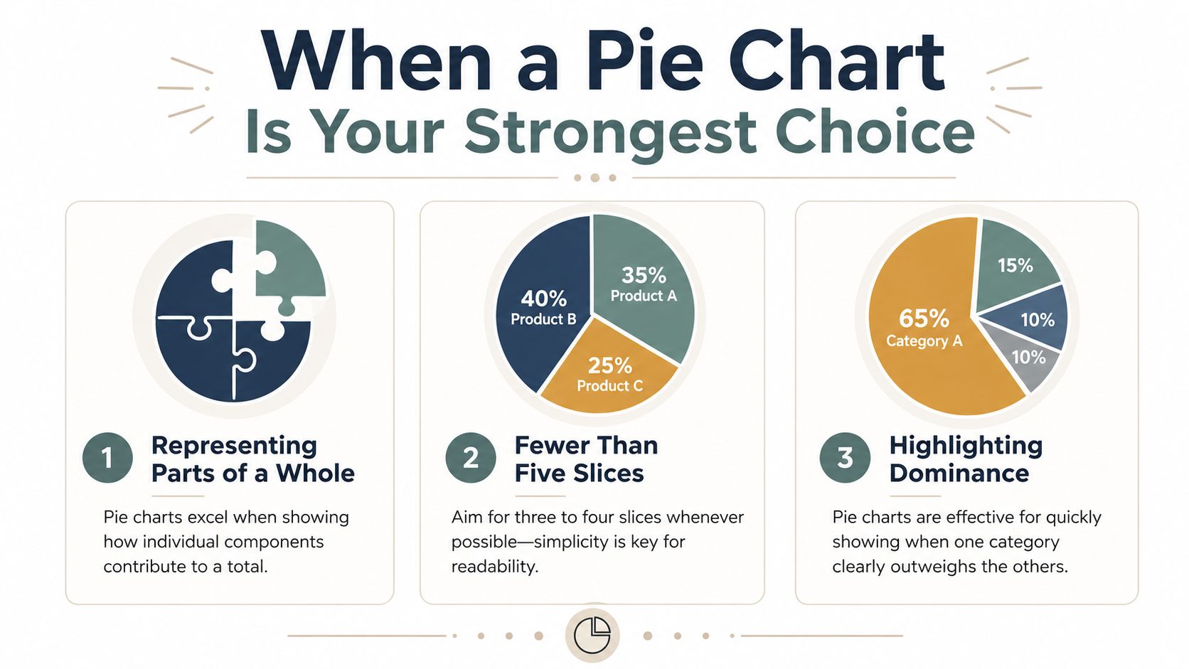
The conditions that make it work
A pie chart works best under tight constraints. Pie charts get hard to read once they carry more than five slices, so the practical guidance is to keep the count low and group the smaller slices into a single ‘Other’ category, according to the European Data Visualisation Guide on pie charts.
That single guideline eliminates a lot of clutter. In practice, the strongest pie charts in B2B decks usually have even fewer categories. They present a simple composition story, not a taxonomy.
Use this checklist when deciding when to use pie chart visuals:
- Small category count: Keep it to five slices or fewer. If the data has many small contributors, combine them into Others.
- One dominant message: Use the chart when one category, or a small set of categories, clearly stands out.
- Single moment in time: Keep the chart anchored to one snapshot, such as current quarter source mix or current customer segment share.
- Direct labeling: Put values or percentages on the slices so the audience doesn’t have to bounce between chart and legend.
- Sorted emphasis: Order the categories so the largest segment is easiest to find first.
If you’re building a deck for a prospect or leadership team, think of the pie chart as a headline visual, not the evidence table. It should support a message like “Enterprise accounts drive most expansion revenue” or “Partner-sourced deals now make up the largest share of pipeline.” If the chart can’t support a sentence that short, it’s probably the wrong chart.
For teams shaping investor or customer-facing storytelling, the structure of the slide matters as much as the chart. A strong pitch deck structure for B2B presentations usually gives each slide one clear takeaway. Pie charts only work when they fit that discipline.
A market share example that earns its place
Consider a market share slide in a competitive review. Your company has the largest share, one close competitor follows, and the remaining market is fragmented across smaller players. Here, the audience likely wants a fast read on dominance and fragmentation, not a precise ranking of every minor competitor.
A pie chart can succeed because it answers the executive question quickly. Who leads, and how concentrated is the market?
What makes that slide work is restraint:
- the number of slices stays low
- the leader is visually obvious
- smaller firms are grouped if needed
- the chart sits beside a plain-language takeaway, not by itself
That is standard. Use a pie chart when it simplifies the meeting. Don’t use it when it forces the room to do math with their eyes.
Common Pie Chart Mistakes That Weaken Your Message
The rogues gallery
Bad pie charts aren’t just ugly. They actively interfere with decision-making. The classic research on graphical perception — Cleveland and McGill’s 1984 study — found that people read length and position, the basis of a bar chart, far more accurately than the angles and areas a pie chart asks them to compare. (Cleveland & McGill, 1984.) Add 3D effects or exploded slices and it gets worse: tilting distorts the very angles the reader is trying to judge, and pulling a wedge away adds visual noise without adding information — the kind of chart junk warned against in the FusionCharts review of pie chart types and usage.
That shows up in real sales decks in predictable ways.
- Too many slices: Teams try to show every lead source, every product line, or every segment in one circle. The audience sees confetti, not insight.
- 3D formatting: Tilted pies make front slices look larger and back slices look smaller. That’s decoration at the expense of honesty.
- Exploded slices: Pulling one wedge away from the chart rarely clarifies the story. It usually adds noise and exaggerates importance.
- Legend-only labeling: When labels live in a separate box, viewers spend the meeting matching colors instead of reading the message.
- Multiple pie charts on one slide: Comparing region mix across several circles is slow and frustrating because the audience has to compare angles repeatedly.
A pie chart already asks the audience to judge area and angle. Don’t make the task harder with effects, clutter, or side-by-side comparisons.
These mistakes are common because presentation software makes them easy. One click adds depth, shadow, and dramatic separation. None of those features improves comprehension.
What to do instead inside the same slide
If you’re forced to keep the pie chart, strip it down and tighten the message.
Start by removing all chart junk. Use flat design. Label slices directly. Keep colors simple and reserve one accent color for the segment you want the room to notice. If the chart still feels busy, that’s not a styling issue. It’s a sign the data needs a different format.
A practical fix is to pair the chart with a takeaway sentence and a supporting note. Good presentation storytelling does that well. The chart shows the shape of the data, and the narrative tells the audience what decision to make from it. A guide to storytelling in presentations for business teams can help structure that pairing so the chart supports the point instead of competing with it.
Here’s a simple rewrite pattern for a sales slide:
| Weak slide title | Strong slide title |
|---|---|
| Pipeline by Source | Partner and inbound sources make up the largest share of current pipeline |
The chart might stay the same. The slide becomes stronger because the audience now knows what to look for. That’s often the difference between a decorative visual and a persuasive one.
Smarter Alternatives to the Pie Chart
Choose the chart by decision task
The fastest way to improve a deck is to choose the chart based on the decision the audience needs to make. Pie charts break down when the task is comparison, trend reading, or ordered interpretation. Pie charts aren’t the right fit for ordinal categories like satisfaction scales, for data that changes over time, or for sets that mix positive and negative numbers; in those cases a stacked bar, line, or column chart communicates the pattern far more reliably, as outlined in the Depict Data Studio pie and donut chart guidelines.
That gives you a useful operating rule for B2B decks:
- If you need to compare categories precisely, use a bar chart.
- If you need to show composition across time, use a stacked bar chart.
- If you need to show movement over periods, use a line chart.
- If you need to show nested composition, use a treemap.
A sales leader comparing rep performance should not look at a pie chart. Bars make ranking obvious. A marketing director reviewing channel mix by quarter should not look at four separate pies. A stacked bar chart reveals how the mix changes over time with much less effort. A finance or RevOps leader reviewing budget allocation across departments and sub-projects will usually get more value from a treemap than from a pie chart because the hierarchy matters.
Chart Selection Guide: Pie Chart vs. Alternatives
| Goal | Best Chart | B2B Example |
|---|---|---|
| Show a simple share of one total | Pie chart | Current quarter revenue split by region when one region clearly dominates |
| Compare category sizes precisely | Bar chart | Pipeline created by SDR team, AE team, partners, and marketing |
| Show mix changes over time | Stacked bar chart | Lead source composition by quarter |
| Show a trend across periods | Line chart | Monthly bookings or conversion rate over time |
| Show nested part-to-whole structure | Treemap | Annual budget split by department and initiative |
Two judgment calls help in practice.
First, ask whether the audience needs a quick impression or a precise read. Pie charts are for impression. Bars are for precision.
Second, ask whether time or order matters. The moment your categories have a sequence, the circle starts fighting the story. Sales stages, satisfaction levels, monthly cohorts, and before-versus-after comparisons all read better on a linear axis.
If your audience has to compare small differences, don’t make them do it with wedges.
That’s why strong presenters treat pie charts as a niche tool, not a default. The point isn’t to be purist. The point is to make the slide easier to understand in the room.
Upgrading Your Charts for Modern Presentations
Sometimes the key question isn’t when to use pie chart visuals. It’s what to do when a senior stakeholder wants one anyway.
That’s where modern presentation tools help. While ‘avoid pie charts’ is a useful beginner rule, it’s unhelpful in real-world scenarios where stakeholders demand it. The recommendation is to use them with 3 or fewer categories or group slices to make it a viable ‘visual compliment’ to a KPI rather than a standalone analysis tool, as argued in SQLBI’s practical take on using pie charts.
Interactive, web-native charts solve several old problems at once. Hover states can reveal exact values without cluttering the visual. Live data connections can keep CRM and spreadsheet numbers current before the meeting. Responsive layouts can make one chart work on a laptop in the boardroom and on a phone after the call. If you’re working with dynamic decks, interactive slide design patterns for modern presentations make a pie chart less of a dead-end screenshot and more of a useful interface element.
That’s the smart compromise. Keep the pie chart small, simple, and tied to one KPI. Let interaction carry the detail that static slides used to cram into labels and legends.
If your team builds sales, marketing, or revenue decks that need live charts, interactive widgets, and cleaner data storytelling, Encelade is worth a look. It turns CRM notes, spreadsheets, and research into web-native presentations that are easier to update, easier to share, and much easier to read than static slide exports.