Your team probably has a common problem right now. Revenue data lives in the CRM, campaign data sits in ad platforms, product usage comes from a warehouse, and the final story still gets built in a spreadsheet or a slide deck five minutes before the meeting. Everyone has data. Few teams have a clean way to turn it into something decision-makers will use.
That’s why choosing the best data visualization software isn’t really about finding the most famous dashboard tool. It’s about finding the tool that matches the job in front of you. A board pack needs clarity and trust. A sales demo needs live context. An operations dashboard needs refresh speed and alerting. A product analytics view needs embedding and control.
The market keeps growing because this problem is getting bigger, not smaller. The data visualization market is valued at USD 10.92 billion in 2025 and is forecast to reach USD 18.36 billion by 2030 at a CAGR of 10.95%. That projection tracks with what teams are doing on the ground. They’re moving from static reporting toward interactive, real-time analytics.
Some tools on this list are classic BI platforms. Others are web-native products that work better for customer-facing storytelling, embedded analytics, or developer-led workflows. That mix matters because the best data visualization software for an analyst isn’t always the best choice for a sales engineer, rev ops lead, or founder pitching a strategic account.
1. Encelade
Encelade is the outlier on this list, and that’s exactly why it belongs here. Most data visualization tools are built for internal dashboards. Encelade is built for the moment when you need to turn messy inputs into a customer-facing, web-native story that still feels alive after you send the link.
For sales, marketing, presales, and revenue teams, that’s a real gap. Static slides break fast. Someone updates the spreadsheet, the deck goes stale, and the version in the buyer’s inbox is already wrong. Encelade fixes that by combining AI-assisted deck creation, interactive widgets, live data, and browser-based sharing in one workflow.
Why Encelade stands out
The product is designed around interactive presentations rather than dashboard-first BI. It turns research, CRM notes, spreadsheets, and documents into on-brand decks in minutes. Those decks are link-based, not locked inside a file attachment, which cuts down on version drift and makes collaboration easier.
Its widget library is unusually broad. You get charts, maps, globes, device mockups, Gantt views, code blocks, and native 3D support for .glb, .gltf, and Spline scenes. If your team sells technical products, hardware, infrastructure, or anything that benefits from visual walkthroughs, that matters more than another standard bar chart.
Practical rule: If your output is going to a customer, prospect, or executive audience, a live interactive deck often lands better than a traditional BI dashboard.
The live data angle is also strong. Google Sheets connections, REST API support, and real-time sync help keep proposal numbers and account context current. For teams building automated workflows, Encelade also offers a Presentation API and MCP tooling, so you can generate decks from code or agents instead of rebuilding them manually.
Where it works best
This tool is strongest when speed and presentation quality both matter. I’d put it high on the list for account-based sales, presales demos, partner pitches, board-style briefings, and marketing narratives where data needs to feel dynamic instead of pasted in.
A few trade-offs are worth knowing up front:
- Best fit for browser-first teams: Encelade shines when your team is happy working and sharing in the browser.
- Usage needs monitoring: The pricing model is credit-based, so heavy production teams should track usage closely.
- Enterprise buying takes a conversation: Custom enterprise pricing, white-label output, SSO/SAML, multi-tenant API support, SLA, and dedicated support are available, but you’ll need a sales discussion.
The paid structure is concrete, which I appreciate. There’s a free Starter plan with 150 credits and 1 deck. Paid tiers include Builder at $15/mo ($12/mo billed annually) with 500 credits, Pro at $49/mo ($39.20/mo annually) with 2,000 credits plus brand themes and API access, Team at $99/mo ($79.20/mo annually) with 4,000 pooled credits and collaboration features, plus custom Enterprise plans. Annual billing saves about 20%, and paid plans include a 14-day trial with no credit card required. You can explore the platform on the Encelade website and see how its approach differs from standard slide tools in this guide to interactive slides.
2. Tableau (Salesforce)
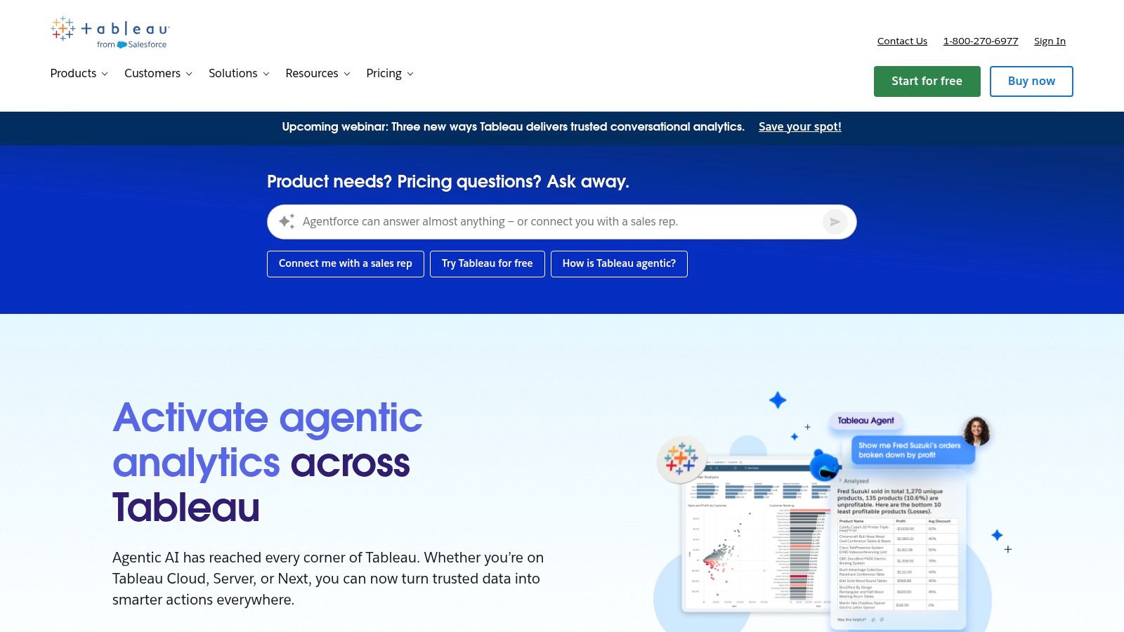
Tableau is still the tool I’d point to when the job is deep visual analysis. It remains the gold standard for complex visual analytics, especially in larger organizations that need rich dashboards, flexible exploration, and a mature sharing model.
That reputation isn’t just brand momentum. Tableau is noted for enterprise-grade visual analytics with over 200 native data connectors in a comparative overview of popular data visualization tools. In practice, that broad connectivity reduces friction when teams need to pull from mixed systems instead of a neatly standardized stack.
Best for analytical depth
Tableau works well when analysts need room to think. Desktop authoring is still powerful, Tableau Cloud and Server cover different deployment needs, and Tableau Prep helps clean data before it hits the dashboard layer. Governance is mature enough for large rollouts, especially when multiple business units share the same environment.
What I like most is how much control experienced analysts get without forcing every user into code-heavy workflows. What I like less is the licensing complexity. Creator, Explorer, Viewer, Server, Cloud, bundle options. It’s manageable, but buyers should expect some packaging friction.
Tableau is excellent when people need to ask a second and third question after the first chart loads.
If your team’s challenge is less about analysis and more about persuading an audience, Tableau can still help, but it often needs a stronger narrative wrapper. That’s where presentation discipline matters as much as dashboard quality. This piece on storytelling in presentations is useful for teams that build strong analysis but struggle to make it land in meetings.
You can explore product details on the Tableau website.
3. Microsoft Power BI
A familiar scenario: the executive team wants one dashboard in Teams, finance still lives in Excel, sales wants live pipeline reporting from Dynamics, and IT does not want another disconnected analytics stack. Power BI tends to win in that environment because it fits the systems many companies already run.
Best for Microsoft-centric teams
Power BI is usually the pragmatic choice, not the flashy one. It works especially well when the buying decision is tied to Microsoft 365, Azure, Fabric, Excel, or Dynamics. Adoption is often faster because users already know part of the interface, and administrators can manage identity, permissions, and governance inside tools they already support.
I have seen that familiarity cut both ways. Teams can publish a basic dashboard quickly, then run into trouble once the project needs a clean semantic model, row-level security, refresh reliability, deployment workflows, and a licensing plan that still makes sense a year later. Power BI is approachable at the surface and fairly demanding underneath.
For this list, Power BI stands out less for visual novelty and more for operational fit:
- Strong embedding options: Power BI supports web embedding and application integration well enough for many customer-facing and internal portal use cases.
- Good API and live-data support: It connects to a wide range of data sources and works well in environments where dashboards need frequent refreshes or ties into Microsoft data services.
- Useful for reporting-heavy teams: Paginated reports still matter in finance, compliance, and operations, where people need repeatable outputs, not just interactive charts.
- Less differentiated for advanced visual formats: If your shortlist includes modern web-native platforms built for product embeds, highly customized front-end experiences, or 3D visualization, Power BI is usually not the first tool I would test.
That last point matters in this article. Power BI is a strong BI platform, but revenue teams evaluating embedded analytics, live product telemetry, or web-native customer dashboards should test it against newer platforms instead of assuming the enterprise default is the best fit.
The biggest trade-off is complexity disguised as convenience. DAX is powerful, but it has a learning curve. Capacity licensing can be the right move for broad distribution, but teams often overbuy or choose too early. Governance is solid once it is set up well, yet poor workspace structure can turn a promising rollout into a cleanup project.
Power BI remains one of the safest choices for organizations that want broad coverage across self-service dashboards, operational reporting, Microsoft integration, and enterprise administration. Buyers who need more design freedom, lighter-weight embedding, or specialized visual experiences should be more selective. You can review options on the Microsoft Power BI website.
4. Qlik Cloud Analytics (Qlik Sense)
Qlik Sense is the tool I usually recommend when teams want to explore data without getting trapped in a rigid drill path. Its associative engine still feels different from the way many BI tools handle filtering and discovery.
That difference matters when users don’t know exactly what they’re looking for yet. Instead of following a linear dashboard journey, they can move through connected data and uncover relationships more naturally. That’s useful in commercial analysis, supply chain work, and any environment with blended datasets that don’t behave neatly.
Best for associative exploration
Qlik Cloud Analytics combines that exploration model with enterprise features that serious teams need. Governance is mature, SaaS deployment is straightforward, and APIs support embedding and automation. It also leans into augmented analytics and AutoML integrations, which helps when business users want guidance without waiting on analysts for every new question.
Where teams stumble is usually in the data model. Qlik rewards thoughtful setup. If you rush implementation, users can end up with confusing associations or performance issues that feel mysterious until someone with experience steps in.
Here’s the practical trade-off:
- Great for discovery: Qlik is strong when users need to move across large, heterogeneous datasets quickly.
- Less intuitive at first: New users often need help understanding how the associative model behaves.
- Commercial packaging varies: Pricing and subscription structure usually require a direct buying conversation.
Qlik is a serious option for enterprises that want more than standard dashboard consumption. You can dig into deployment and product specifics on the Qlik Cloud Analytics website.
5. Looker (Google Cloud)
Looker is a different kind of investment. You don’t choose it because it’s the fastest way to throw charts on a screen. You choose it because metric consistency matters enough that you’re willing to model definitions properly.
That semantic-layer-first approach is Looker’s real advantage. LookML gives data teams a central place to define business logic so teams aren’t arguing over what pipeline, active customer, or gross margin means in different dashboards. For large companies, that clarity is often worth the extra setup effort.
Best for governed metrics
Looker is particularly good when analytics is part of the product or customer experience, not just internal reporting. Its embedded analytics capabilities and API access are strong, and developer tooling is much better than many classic BI tools.
The flip side is obvious. Looker usually needs active data team involvement. If your organization doesn’t have the patience or skills to maintain a semantic model, it can feel heavy.
A well-run Looker environment reduces KPI debates. A poorly maintained one just centralizes confusion.
I’d shortlist Looker for companies already deep in Google Cloud, teams building governed self-service analytics, and product groups embedding data experiences into applications. Smaller business teams that just need rapid dashboarding often get value faster elsewhere.
You can review the platform on the Looker website.
6. Grafana
Grafana is what I’d use when the question is, “What’s happening right now?” It’s one of the best tools for live operational visibility, especially across infrastructure, observability, IoT, and telemetry-heavy environments.
That focus gives Grafana a very different personality from standard BI software. It’s less about polished board reporting and more about dashboards that operators, engineers, and technical teams watch throughout the day. When alerts, time-series panels, and fast refresh matter, Grafana is hard to beat.
Best for live operational visibility
The plugin ecosystem is a major strength. Teams can connect databases, cloud services, and observability systems without forcing everything into one narrow pipeline. Grafana Cloud also gives organizations a managed path if they don’t want to self-host.
The limitation is straightforward. Grafana can do some BI-style work, but that isn’t where it feels most natural. If your stakeholders want governed business metrics, pixel-perfect executive reporting, and semantic modeling, you’ll feel the edges quickly.
Yellowfin’s enterprise visualization feature overview highlights real-time interactive exploration, high performance, embedded analytics, AI-driven insights, and self-service BI as core platform capabilities. Grafana aligns strongly with real-time aspects and performance elements shown in that picture.
Use Grafana when operations speed matters more than presentation polish. The Grafana website covers both self-hosted and managed options.
7. Apache Superset
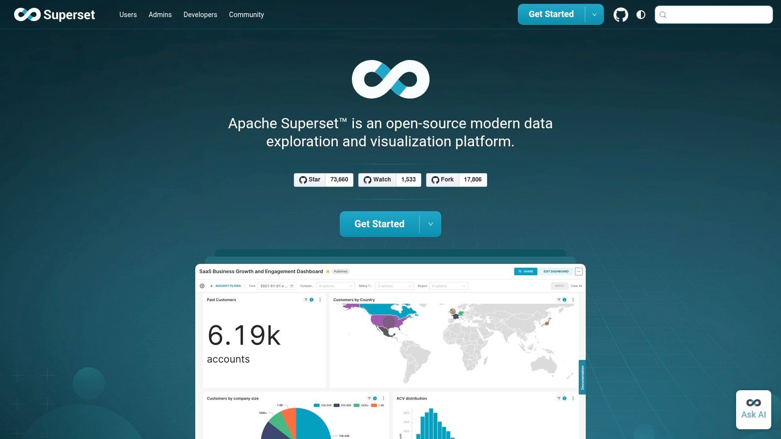
Apache Superset has become a serious option for teams that want modern dashboarding without accepting vendor lock-in. It’s open source, warehouse-friendly, and flexible enough for data teams that are comfortable owning more of the stack.
What makes Superset appealing is the balance. Business users can use the no-code chart builder. Technical users can drop into the SQL IDE. That split works well in companies where analytics maturity is growing but not uniform across every team.
Best for warehouse-first open source teams
Superset connects directly to many SQL engines, which fits modern analytics stacks well. If your data already lives in a warehouse and your team wants dashboards close to that layer, Superset can be a very practical choice.
Its limits are mostly operational. You’re taking on more responsibility for hosting, upgrades, security, and scaling than you would with a polished commercial suite. That’s fine if your data platform team has the appetite. It’s less fine if everyone expects SaaS convenience with open source economics.
A few practical notes:
- Good for control: Teams can customize and extend the platform through plugins.
- Good for SQL-centric workflows: Analysts who live in the warehouse adapt quickly.
- Less turnkey for enterprises: Commercial BI suites still win on out-of-the-box support, services, and packaged admin features.
If you value flexibility and don’t mind doing some of the heavy lifting, check the Apache Superset website.
8. Metabase
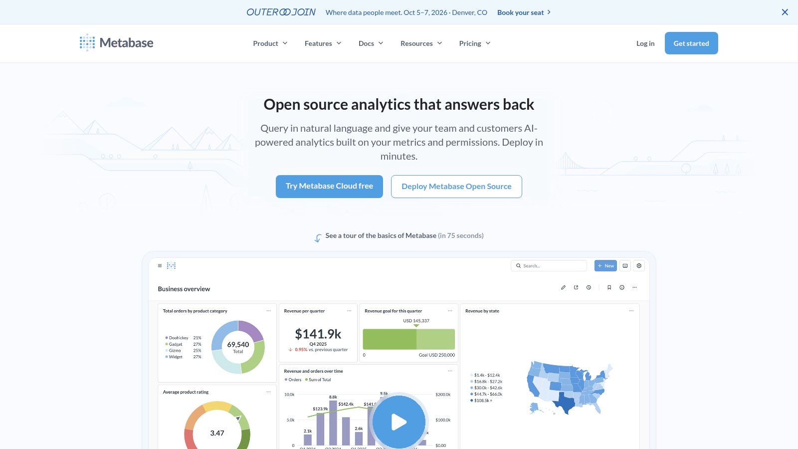
Metabase is one of the easiest tools on this list to get running and useful. That alone gives it a strong place in any best data visualization software shortlist, especially for smaller teams or internal business groups that need answers quickly.
The experience is intentionally simple. Users can ask questions in plain language, use a visual query builder, and turn results into dashboards without much setup. For teams trying to move beyond spreadsheet reporting without jumping straight into enterprise BI complexity, that’s a comfortable step.
Best for fast self-service BI
Metabase works well in startups, product teams, internal ops, and companies that want lightweight analytics with room to grow. The managed cloud option also removes some of the operational burden for teams that don’t want to self-host.
Its biggest weakness is governance depth. You can do embedding and row-level permissions, but advanced semantic modeling, enterprise administration, and large-scale governance are stronger in tools like Looker or Tableau.
I like Metabase when the team says, “We need useful dashboards this week, not a six-month platform program.” I’m more cautious when the organization already knows it needs complex governance, heavy customization, or broad enterprise standardization.
You can explore the product on the Metabase website.
9. Datawrapper
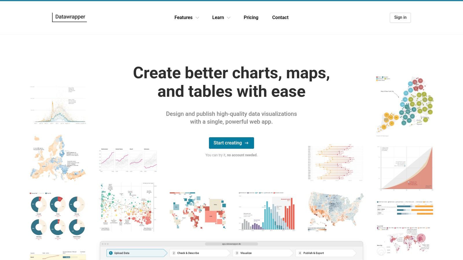
Datawrapper is the cleanest answer when your priority is publishing a chart that looks right immediately. Newsrooms like it for a reason. The defaults are good, the embeds are responsive, and you don’t need to fight the tool to get something polished.
This is not a full BI platform, and that’s part of its appeal. Datawrapper doesn’t try to own your entire analytics workflow. It focuses on charts, maps, and tables that are fast to build and easy to publish.
Best for polished published charts
If you create public-facing visuals, campaign reports, thought leadership graphics, or executive-ready charts for documents and web pages, Datawrapper is a strong specialist tool. It’s especially good for teams that care about typography, layout, and accessibility but don’t want to hand-build graphics in a design tool.
The trade-off is scope. There’s no semantic layer, no deep modeling, and no serious ETL story here. Datawrapper is best considered a finish layer that sits beside the rest of the data stack, not a replacement for it.
Clean defaults save more time than feature depth when the job is publishing, not exploring.
For communications, media, policy teams, and marketers, that trade is often worth it. You can review plans and features on the Datawrapper website.
10. Plotly (Dash / Plotly Studio)
Plotly belongs on this list because some teams don’t need a dashboard tool. They need a custom analytical application. That’s where Dash and the broader Plotly ecosystem stand out.
For Python, R, and JavaScript-heavy teams, Plotly offers a route to highly interactive data experiences without forcing everything into a drag-and-drop BI mold. If you want bespoke interfaces, domain-specific controls, or app-like workflows around data, this is one of the best options available.
Best for custom analytical apps
Dash is the core strength here. It lets developers build full-stack analytic web apps with interactive visual components. Plotly Studio adds a more browser-based layer for analysis and publishing, which broadens the appeal beyond pure code-first workflows.
The trade-off is clear. Advanced use requires developer skills. That’s a feature for engineering-led teams and a barrier for business users who just want to build dashboards on their own.
A few situations where Plotly makes sense:
- Developer-led analytics products: Strong fit for embedded apps and client-facing analytical tools.
- Scientific and technical workflows: Python and R integration are major advantages.
- Teams that need custom chart logic: You get more freedom than most BI suites allow.
If your charts need clear communication, not just interactivity, basic chart choice still matters. This short guide on when to use a pie chart is a helpful reminder that even flexible tooling can’t fix weak visual decisions.
For product details and deployment options, visit the Plotly website.
Top 10 Data Visualization Tools Comparison
| Solution | Core features (✨) | UX / Quality (★) | Pricing / Value (💰) | Target audience (👥) | Unique selling point (🏆) |
|---|---|---|---|---|---|
| Encelade 🏆 | AI-driven web-native decks; 50+ widgets; native 3D; live Sheets & REST APIs; Presentation API ✨ | ★★★★ | 💰 Free Starter; Builder $15/mo ($12 annually); Pro $49/mo ($39.20 annually); Team $99/mo ($79.20 annually); Enterprise custom | 👥 Sales, marketing & revenue teams | 🏆 One-prompt bulk restyling + link-based live, interactive demos |
| Tableau (Salesforce) | Rich visual authoring, governed data models, Tableau Prep ✨ | ★★★★★ | 💰 Enterprise pricing; can scale costly for viewers | 👥 Enterprise BI teams & analysts | Scalable governance and expansive ecosystem |
| Microsoft Power BI | DAX modeling, broad connectors, Fabric/Copilot integration ✨ | ★★★★ | 💰 Competitive within Microsoft 365; flexible licensing modes | 👥 MS-stack organizations | Tight Microsoft integration and strong price/performance |
| Qlik Cloud Analytics | Associative engine, augmented analytics, AutoML ✨ | ★★★★ | 💰 Capacity/user models; custom quotes | 👥 Enterprises needing fast associative exploration | Fast, flexible exploration across blended data |
| Looker (Google Cloud) | LookML semantic layer, embedded analytics, strong admin ✨ | ★★★★ | 💰 Custom enterprise pricing | 👥 Data-mature organizations & platform teams | Single source of truth for governed metrics |
| Grafana | Time-series dashboards, extensive plugins, alerting ✨ | ★★★★ | 💰 Open-core; Grafana Cloud tiers; usage-based add-ons | 👥 DevOps, SRE, engineering teams | Best for live operational telemetry and alerts |
| Apache Superset | No-code chart builder + SQL IDE, plugin extensibility ✨ | ★★★★ | 💰 Open-source (no license fees) | 👥 Tech-savvy teams with engineering resources | Extensible, warehouse-centric open-source BI |
| Metabase | Plain-language questions, visual query builder, Metabot ✨ | ★★★★ | 💰 Open-source core; paid tiers for enterprise features | 👥 Startups & SMBs wanting fast time-to-value | Very quick self-serve analytics for non-technical users |
| Datawrapper | Responsive charts/maps, design & accessibility defaults ✨ | ★★★★ | 💰 Free-to-start; paid for white-label & exports | 👥 Journalists, marketers, content creators | Rapid publication-quality visuals and embeds |
| Plotly (Dash / Studio) | Dash apps, Plotly Studio, Python/R/JS integration ✨ | ★★★★ | 💰 Developer-focused; cloud/enterprise plans & seat/credit features | 👥 Data scientists & developers | Max flexibility for custom interactive analytic apps |
Turn Your Data into Your Biggest Asset
A sales leader opens Monday pipeline review in one tab, a product team checks service health in another, and marketing needs a clean chart for a board update by noon. Those are all data visualization problems, but they do not call for the same software. Teams waste time when they treat every platform as a generic dashboard tool and ignore how the work is delivered.
Start with the output you need and the system that has to own it. Enterprise BI tools such as Power BI, Tableau, Qlik, and Looker are built for governed reporting, shared metrics, and broad internal adoption. Web-native platforms such as Encelade solve a different problem. They are better suited to customer-facing presentations, live embeds, API-driven updates, and interactive storytelling that has to work in a browser, not just inside an analyst workflow.
That distinction matters in implementation.
If the primary requirement is embedded analytics inside a product, public sharing, or live data pulled into a revenue workflow, a feature checklist built around classic dashboarding will miss the point. Web embedding, API access, branding control, and even 3D support can matter more than the number of default chart types. For revenue teams, those details affect whether a visual gets used in a deal cycle or dies in an internal workspace.
Technical ownership matters too. Metabase and Datawrapper are easier to hand to non-technical teams. Looker and Superset usually need stronger data modeling discipline. Plotly pays off when developers want full control over the app experience. Grafana is often the right call for operational monitoring because alerting and live telemetry are core to the product, not an afterthought.
I also separate internal analysis from external communication because the failure modes are different. An internal BI rollout usually breaks on governance, metric definitions, or adoption. A customer-facing analytics project usually breaks on embedding friction, stale data, slow publishing, or poor presentation quality. Mature teams often use more than one tool because reporting, monitoring, publishing, and persuasion are different jobs with different constraints.
Earlier in the article, the enterprise leaders were already covered. That is useful context, but market share alone should not drive the decision. A specialist tool can deliver more value if your bottleneck is shipping live visuals into websites, sales decks, or client portals without waiting on a BI team to rebuild everything.
Pick one use case with clear business impact. Put a live dashboard in front of an operations team that currently waits for weekly reporting. Replace one static deck with a web-native presentation connected to live data. Test one embedded view inside a customer workflow and see whether people return to it.
That is usually how data becomes an asset. One visible win, then a second system that fits the next job, instead of one oversized platform forced into every role.
If your team needs more than static charts, Enceladeis worth a close look. It’s built for sales, marketing, and revenue teams that need to turn research, CRM notes, spreadsheets, and documents into interactive, web-native decks with live data, native 3D, API generation, and on-brand sharing.