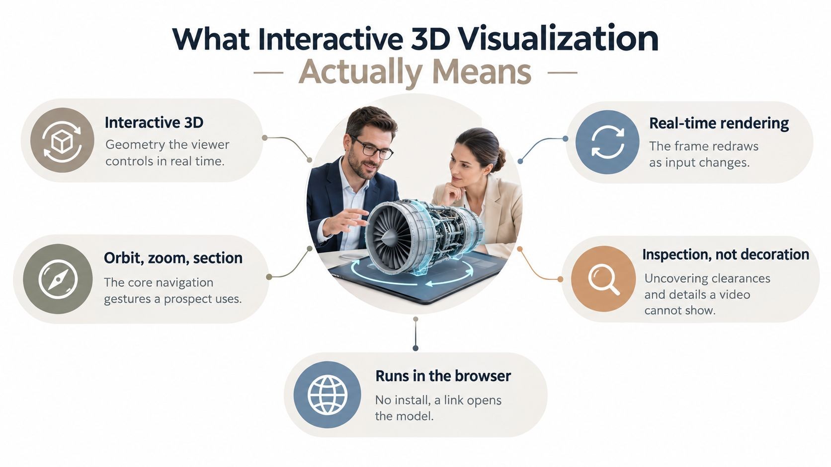
Investors don’t give you long to make your case. A widely cited DocSend study found they spent an average of just 3 minutes and 44 seconds on a pitch deck (TechCrunch, 2015), and separate analysis from Storydoc found that 82% of investors who reach slide 4 read the whole deck (pitch deck statistics). Either way, the first few slides are the real hurdle, so the strongest traction and market proof have to land early, not buried near the end of a long file. That reality changes how to create a pitch deck for B2B, because the deck isn’t a brochure. It’s a decision tool that has to earn attention, build confidence, and move a buyer or investor toward the next conversation fast.
The decks that work usually do three things well. They state the problem clearly, show proof without making people hunt for it, and keep the narrative tight enough that a busy reviewer can scan it in one pass. If you want the deck to do more than sit in a folder, you need to build it like a live revenue asset, with current metrics, audience-specific messaging, and a delivery format that doesn’t fall apart the moment someone shares it.

Why Most B2B Pitch Decks Lose Attention in Under Four Minutes
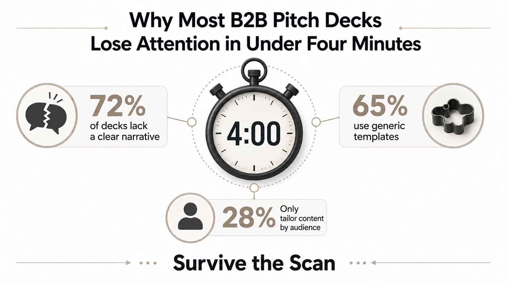
The first mistake is treating the deck like a document people read cover to cover. They don’t. They scan for a reason to care, a reason to believe, and a reason to keep going, often inside the first few slides. That’s why the opening has to work harder than the rest of the file, especially in B2B where buyers and investors are weighing fit, urgency, and proof at the same time.
Practical rule: Put the most defensible proof early. If the audience misses it on slide 8, you’ve already lost the scan.
The second mistake is stuffing the deck with explanation instead of evidence. Dense tables, long paragraphs, and a dozen minor metrics slow the reader down and dilute the point. The better pattern is one clear headline metric, a small number of supporting signals, and a visual that can be understood without narration. That’s also where interactive presentation formats can help, especially if you’re trying to present evolving data instead of a static screenshot. For teams exploring richer presentation methods, interactive presentation ideas can be useful as a reference point.
What the first scan is really looking for
Buyers and investors are trying to answer a short list of questions quickly. Does this solve a painful problem, is there proof it works, and is the opportunity large enough to justify another meeting? If the deck doesn’t make those answers obvious, attention drifts.
The best B2B decks feel simple because they’re engineered for speed. They front-load the point, keep the visuals clean, and avoid making the audience work to connect the dots.
Define Your Audience, Objective, and Tailoring Strategy
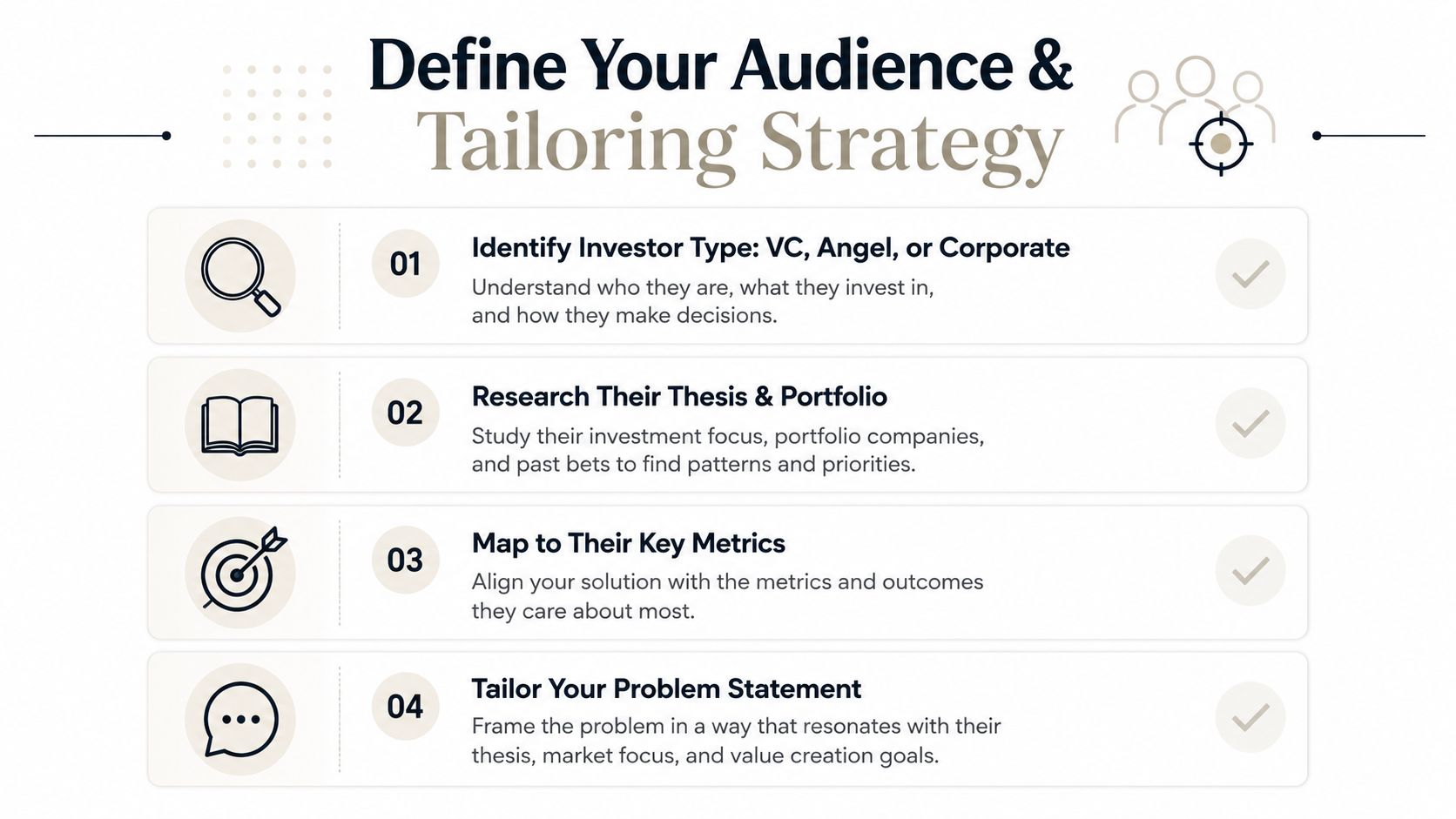
A generic deck usually fails before design even enters the picture. The company may have a good story, but it’s trying to tell the same story to everyone, and that’s exactly where relevance drops. A seed fund, a strategic investor, and a sector-focused micro-VC are not looking for the same evidence, so the deck needs an audience objective before a slide exists.
Start by naming the primary audience in one sentence. Then write the outcome you want from that audience, such as a follow-up meeting, partner intro, diligence review, or shortlist placement. That single sentence becomes the filter for every slide, because it tells you what to emphasize and what to leave for the appendix.
Research the thesis before you draft
The fastest way to make the deck sharper is to research the investor’s portfolio, thesis, and stage preference before writing headlines. A generic guide will tell you to include the usual sequence, but that’s not enough when the core issue is fit. An investor-facing customization guide explicitly recommends looking at portfolio and thesis, then adding a “Why You” slide, which is the kind of detail that generic template advice usually misses (customizing pitch deck for different investor types).
Build a short audience brief with these fields:
- Audience type: VC, angel, strategic, or sector fund.
- Likely priority: Speed, margin, category ownership, integration fit, or downside protection.
- Proof that matters: Traction, retention, technical depth, or commercial motion.
- Message angle: Why this company, why now, and why this team.
Research the investor first, then write the slide. If the thesis doesn’t match, no amount of polish fixes the mismatch.
The output of this step is not a deck. It’s a decision about what kind of deck you’re making. That’s how you avoid building a polished 12-slide presentation that feels competent but forgettable to the wrong audience.
Structure Your Narrative and Map the Essential Slides
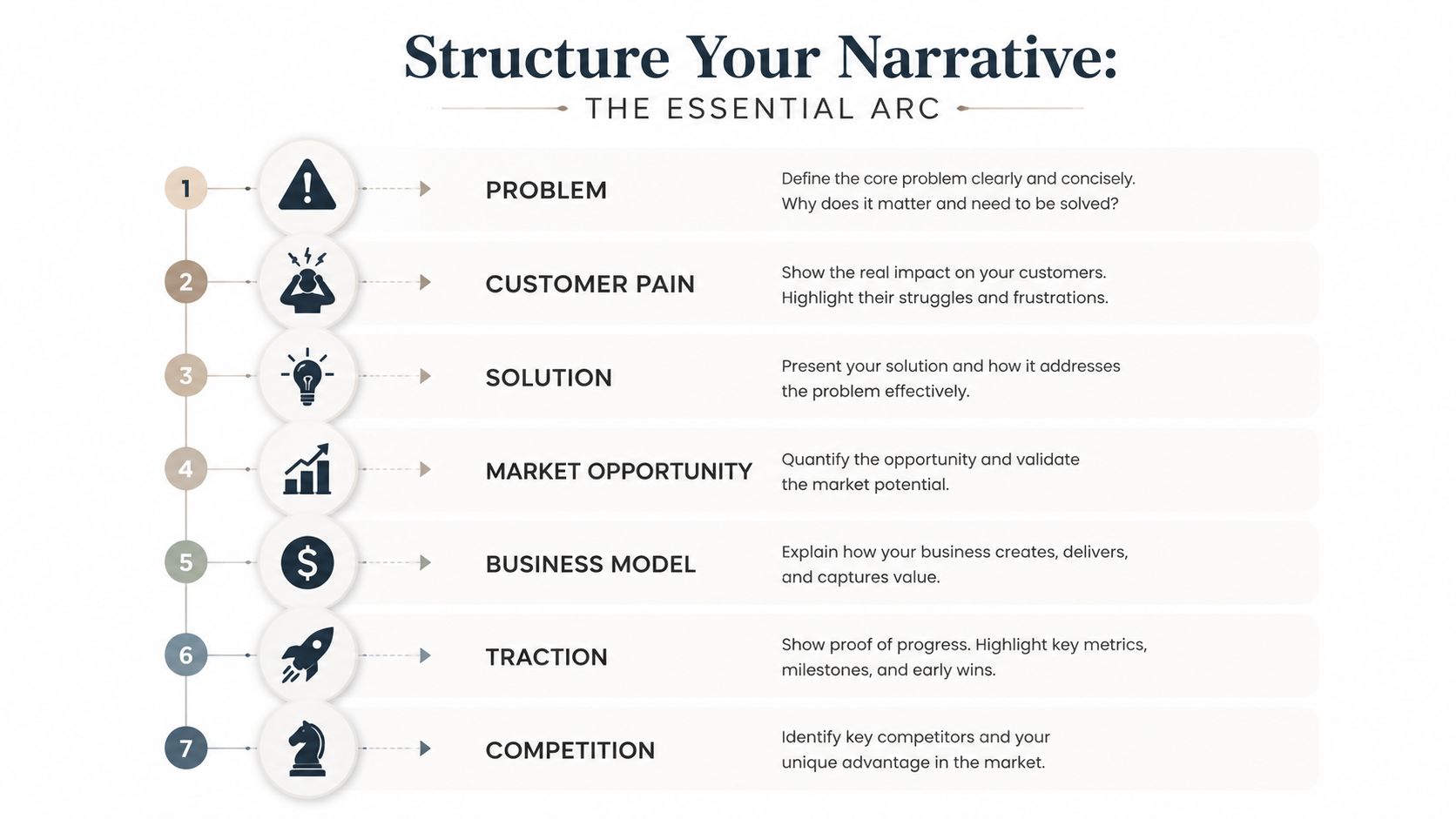
A deck that holds attention in a three-minute scan follows a clear sequence. Start with the problem and customer pain, then move through the solution, market opportunity, business model, traction, competition, team, and ask. That order gives the audience a clean path through the opportunity before they start testing the details. A solid pitch narrative guide walks through those same building blocks, and it adds a useful nuance: lead with your strongest material rather than forcing a rigid order, whether you are building for investor review or shortlist placement (essential guide to crafting an effective investor pitch deck).
The cover slide needs discipline, not decoration. India’s official startup guidance says slide 1 should include the company name and logo, contact details such as city, email, and mobile, plus a one-line description of the concept, product, or service (pitch deck guidelines). That is a practical baseline anywhere, because if someone cannot identify the company and understand what it does in seconds, the rest of the deck starts from a weak position.
Give each slide one job
Slides break down when they try to do too much. A problem slide should create urgency. A solution slide should show relief. A traction slide should prove movement. An ask slide should make the next step obvious.
A practical slide map looks like this:
- Cover. Company, logo, contact details, one-line concept.
- Problem. What is broken and why it matters now.
- Customer pain. Who feels the pain most and how often.
- Solution. What you built and why it is different.
- Market opportunity. Where the upside sits.
- Business model. How the company makes money.
- Traction. The proof that momentum is real.
- Competition. Why this approach wins.
- Team. Why this group can execute.
- Ask. What you need and what it enables.
A live deck usually stays in the 10 to 12 slide range for conversation, while a fuller diligence version can expand to 20 to 30 slides. That split keeps the version you present lean while preserving the backup material people will ask for later. The structure stays familiar, but the emphasis shifts depending on the audience, which is often the difference between a deck that gets skimmed and one that gets discussed.
The same framework can also work for a case-study style presentation when the audience already knows the category. In that format, the sequence matters less than the proof and the narrative logic. For a closer look at that format, see case study presentation format.
Wireframe Content and Bring It to Life with Interactive Data

Once the story is mapped, the work starts. Wireframing forces discipline because every slide has to earn its place with a headline, a proof point, and a visual. Teams often skip that step and jump straight into polish, which produces nice-looking slides that do not carry the argument.
A web-native presentation tool changes the job. Static screenshots become a poor fit once you want the deck to reflect live numbers, account-specific context, or product behavior. A live deck can pull in data from Google Sheets or a REST API. It can draw on a library of 50+ widgets for charts, maps, globes, device mockups, code blocks, and Gantt views, and it supports native 3D through .glb/.gltf models and Spline embeds. It can also be restyled in bulk with themes and custom branding, which matters when you need one account-specific version after another without rebuilding each file from scratch. If you’re building with a web-native presentation tool, interactive slide techniques belong at this stage, because they let the deck behave like a working revenue asset instead of a frozen file.
Wireframe before you design
Start by sketching the slide sequence in plain text. Write the headline first, because the headline forces the point. Then choose the visual that proves it, not the other way around.
For metrics slides, use a simple rule. If the point is trend, show a trendline. If the point is relationship, show a comparison. If the point is product behavior, show a device mockup or interactive widget. That keeps you from pasting a dashboard screenshot into the deck and mistaking it for insight.
Practical rule: If the chart does not change the decision, cut it.
For early-stage companies, keep the metric set small. The guidance for pitch metrics is to highlight only your 2 to 3 best metrics instead of crowding the slide, and for seed-stage software that usually means MRR or ARR, month-over-month growth (a figure around 20% is a common example), retention, CAC, and LTV (how to present metrics in pitch). A deck gets stronger when each number has a job instead of just filling space.
Live syncing also matters. When the deck is connected to current data, the team does not have to rewrite slides every time a number changes. That keeps the story current and lowers the risk of sending an out-of-date file to a buyer or investor.
Polish Design, Rehearse Delivery, and Nail Brand Consistency
Design doesn’t rescue a weak story, but sloppy design absolutely weakens a strong one. A good deck uses visual consistency to make the content feel controlled, and the control signal matters when someone is deciding whether your team can execute. Fonts, spacing, color, and layout should look intentional across the full deck, not like they were assembled by three different people on different timelines.
The tension is simple. You want brevity, but you also want richer proof, interactive product views, and maybe a live prototype. That’s why the deck has to be presented well, not just built well. Figma’s pitch-deck guidance explicitly encourages embedding prototypes and using data, while also noting that investors may spend only two to five minutes reviewing a deck (pitch deck examples). In that environment, every extra second spent hunting through clutter works against you.
Rehearse like a live walkthrough
A polished deck should support the speaker, not compete with them. Presenter notes help with pacing, but the difference comes from rehearsal. The goal is to make the narrative sound natural enough that you’re not reading the slide title out loud like a script.
Use a pre-flight check before any live send or meeting:
- Brand consistency: Typography, spacing, and color follow the same system.
- Responsive behavior: Slides still work on smaller screens.
- Notes quality: Presenter notes support delivery without sounding scripted.
- Interactive elements: Prototypes, widgets, or 3D pieces load cleanly.
- Collaboration hygiene: Comments and roles are resolved before sharing.
If the deck is supposed to feel interactive, then the delivery has to feel interactive too. That means less monologue, more discussion, and a deck that can adapt when someone asks for detail. It also means you should know which slide is doing the heavy lifting and which one is just there to support the conversation.
Share, Export, Measure, and Your Final Checklist to Launch
A deck becomes a revenue asset when it can be shared, measured, and reused without version chaos. Web-native links solve a lot of that problem because the audience sees one current version instead of a trail of attachments. That matters when the same deck is moving between sales, marketing, and leadership, or when an investor sends it onward to a partner.
Keep export options for the situations where they still make sense. PDF and PPTX are useful for offline sharing, archive needs, and stakeholder environments that still expect files. But the main operating version should stay link-based so the content can be updated centrally and tracked after it leaves the editor.
The final checklist is simple, and it’s worth running every time:
- Cover slide complete: Company name, logo, contact details, one-line concept.
- Narrative fit: The story matches the audience objective.
- Metrics current: Live data is connected or verified.
- Brand QA passed: Layout, typography, and color are consistent.
- Responsive test passed: It works on different screens.
- Permissions set: The right people can view it.
- Analytics enabled: You can see when a prospect opens the deck, so follow-up is timed to real interest.
That last point matters because follow-up gets better when you know a prospect actually opened the deck. If someone opened the link twice but never replied, your next message can reflect that. The deck doesn’t end at send, it keeps working after the link is opened.
If you want a faster way to build pitch decks that stay current, look and feel on-brand, and can be shared as a live link instead of a stale file, Encelade gives sales and revenue teams a browser-based way to turn research, metrics, and assets into interactive presentations. It’s a web-native deck workflow built to support your next investor or B2B pitch.