Most experts recommend 10 to 15 slides for a 15-minute presentation. That’s the right starting point, but not the whole answer, because the best slide count depends on whether you’re pitching, training, demoing, or leading a discussion.
If you’re staring at a deck the night before a customer meeting, this is usually the core problem. You don’t just want a number. You want to know whether you’re about to rush, bore people, or run out of time before the part that truly matters.
That’s why advice online feels inconsistent. One guide says 15 slides. Another says 10. Someone else says you can move faster and use far more. All of those can be right in the right setting. A sales pitch to a buying committee doesn’t work like a training session. A live product demo doesn’t behave like a board update. And once you add Q&A, live data, or a browser-based walkthrough, static slide math starts to break down.
What wins isn’t compliance with a magic number. It’s pacing, narrative control, and making each visual earn its place.
You Have 15 Minutes to Make an Impact
A 15-minute slot feels generous until the clock starts. Then you realize you need to open strong, explain the problem, show the solution, answer the obvious objection, and leave enough room to ask for the next meeting.
That’s why the usual baseline exists. The one slide per minute rule gives you a clean starting point, and for a 15-minute presentation that points to 15 slides. Many presentation coaches suggest treating that as a ceiling and aiming for a slightly tighter 10 to 15 slides, which keeps you concise and stops the audience from drowning in detail. Prezent, for one, builds its timing guidance on that one-slide-per-minute rule.

That number matters less than often assumed.
A weak 10-slide deck still loses if every slide is crowded, repetitive, or out of sequence. A strong 14-slide deck can feel effortless if each screen advances the story and gives the speaker room to breathe. In practice, pacing beats raw slide count every time.
Practical rule: Build for the audience’s attention span, not your content backlog.
For sales teams, that means stripping the deck to the moments that move the deal forward. Buyers don’t need your entire company history. They need to understand the problem, see a credible path to value, and know what happens next.
Use slide count as a planning constraint, not a design objective. If you’re still asking how many slides in a 15 minute presentation, the better question is this: how many distinct ideas can your audience absorb without feeling rushed? That’s the number that tends to win.
The Two Schools of Thought on Slide Count
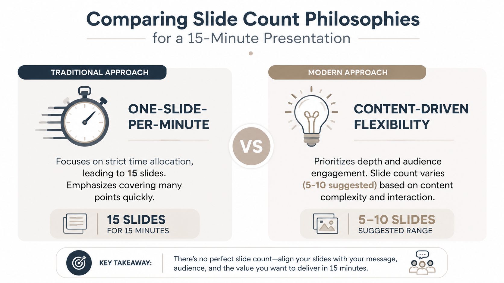
The confusion comes from two legitimate philosophies. They solve different problems.
The one-slide-per-minute camp
This is the classic rule frequently heard initially. If you have 15 minutes, plan roughly 15 slides. It works because it’s simple. Teams can estimate timing fast, avoid giant content dumps, and keep a steady rhythm.
This approach is usually strongest in informational settings. Training sessions, internal updates, and straightforward status reviews often benefit from predictable movement. The audience expects progression. The presenter needs a structure that keeps things on track.
The strength of this model is control. The weakness is that people turn it into a quota. Once that happens, weak slides stay in the deck because the presenter is trying to hit a number instead of clarify a point.
The fewer-deeper camp
The other school says fewer slides, more substance. This philosophy is why Guy Kawasaki’s 10-20-30 rule gets so much attention. The rule sets a maximum of 10 slides, a presentation length under 20 minutes, and a minimum font size of 30 points, as outlined in this breakdown of ideal slide counts and minimalist presentation rules.
That approach fits investor pitches and high-stakes sales conversations because it forces discipline. Instead of spreading your message across too many screens, you stay with the important points long enough for people to understand them.
Later in the presentation, it helps to see the pacing principle in action.
A useful discipline follows from this: protect each slide’s dwell time. Keep a 15-minute talk near 10 to 15 slides and every slide gets roughly a minute or more on screen — enough for the audience to read the headline, absorb the visual, and hear your point. Cram in many more and dwell time drops below the threshold where ideas actually stick.
Fewer slides don’t make a deck better by themselves. They make weak prioritization harder to hide.
How to choose between them
Don’t choose based on internet opinion. Choose based on what the room needs.
| Situation | Better fit | Why |
|---|---|---|
| Internal training or process walkthrough | One slide per minute | You need orderly progression and clear signposts |
| Investor pitch or executive sales meeting | Fewer, deeper | You need focus, room for discussion, and stronger recall |
| Technical explanation with visuals | Depends on complexity | Some concepts need quick sequences, others need slower discussion |
A practical way to decide is to ask one question. Are you trying to cover material, or are you trying to land a small number of critical points?
If you need coverage, a higher slide count can work. If you need conviction, fewer slides usually perform better.
How to Structure Your 15-Minute Narrative
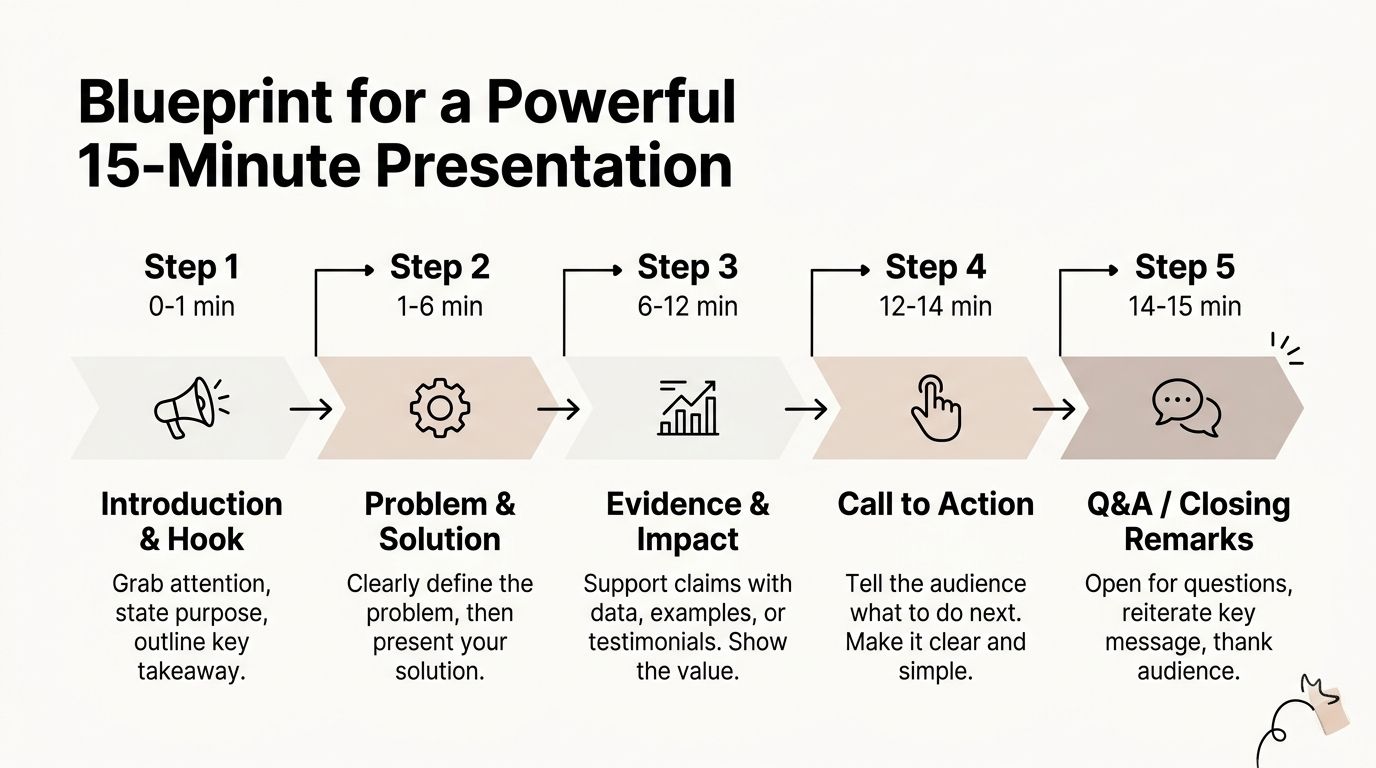
The best decks aren’t built by counting slides first. They’re built by sequencing attention. For a 15-minute talk, think in three parts: open cleanly, move through the core argument, then close with a next step.
Opening slides that do real work
Your first slides should orient the room fast. In most business settings, that means a brief opening, a sharp framing of the problem, and a clear statement of what the audience should be listening for.
Don’t waste this section on branding filler. A title slide is fine, but it should transition quickly into the business issue, buyer pain, or decision context. If the audience doesn’t know why this matters by the opening minute, the rest of the deck has to work much harder.
The middle where deals are won
The body of the presentation should carry the argument. For most presenters, that means a sequence built around a few major points, not a long chain of minor ones. If you want help tightening that arc, this guide on storytelling in presentations is useful because it pushes you to think about narrative flow instead of slide inventory.
The most practical design rule here is one idea per slide. Presentation coach David JP Phillips popularized a useful rule of thumb: the brain can comfortably interpret about 6 elements on a slide, and going past that sharply raises cognitive load (by his estimate, roughly 500%). The principle is summarized in this overview of presentation cognition and slide complexity. That’s why dense slides fail even when the presenter knows the material cold.
A sales team should translate that into plain execution:
- One claim: each slide should answer one question or support one decision.
- One visual center: don’t make the audience choose between a chart, bullets, and a screenshot at the same time.
- One takeaway line: if the slide needs a paragraph to explain itself, it’s doing too much.
The audience should never be decoding your slide while you’re already talking about the next one.
A close that tells people what to do next
The final slides should summarize the commercial logic and make the next move obvious. In a deal setting, that’s usually the recommendation, the implementation path, or the ask.
Good closings don’t introduce a brand-new argument. They tighten the one you’ve already made. If people leave remembering only the last screen, make sure it points to action.
Sample Agendas for Different Presentation Types
The easiest way to answer how many slides in a 15 minute presentation is to look at the kind of meeting you’re running. A sales pitch, an internal update, and a conference talk all use the same clock very differently.
Many teams stumble at this juncture. They reuse one deck style across every format, then wonder why one audience is engaged and another is checking email.
For a cleaner starting point, build the agenda before the slides. A solid outline usually solves half the deck problem before design even starts. If your team needs that discipline, this article on mastering your PowerPoint presentation outline is a strong place to start.
15-Minute Presentation Agenda Examples
| Phase | Sales Pitch (12 Slides) | Internal Update (10 Slides) | Conference Talk (14 Slides) |
|---|---|---|---|
| Opening | Title, agenda, customer problem | Title, purpose, recap | Hook, agenda, thesis |
| Early narrative | Current pain, stakes | What changed since last update | Why this topic matters now |
| Core section | Solution overview, product flow, proof | Key results, blockers | Main argument point one |
| Deeper support | Objections, rollout, pricing or commercial fit | Decisions needed, ownership | Main argument point two, supporting evidence |
| Closing | Next steps, call to action | Next steps, asks | Conclusion, takeaway, audience prompt |
A few practical patterns show up in that table.
In a sales pitch, the deck needs enough room for a persuasive arc. You have to connect problem, solution, proof, and next step without sounding scripted. That often makes 12 slides feel more balanced than either 8 or 15.
In an internal update, people already know the context. You don’t need as much scene-setting, so 10 slides can be enough if each one answers a clear operational question.
In a conference talk, pace matters differently. You often need more visual transitions to keep the room engaged, so 14 slides can work well if the screens stay light and the speaker owns the details.
Planning for Demos, Q&A, and Other Wildcards
Static slide advice breaks the moment the audience starts talking back. That’s not a flaw. It’s real presenting.
If your meeting includes stakeholder questions, a product walkthrough, or a live data pull from a CRM, you shouldn’t treat 15 minutes as 15 minutes of straight content. You need room for friction, curiosity, and technical lag.
What to cut when the room gets interactive
The most practical rule here is reduction, not addition. If part of the session is interactive, trim your planned slide count before you rehearse — cutting even 10 to 15 percent of your slides gives questions and demos room to breathe. That instinct lines up with Adobe Express’s slide-count guidance, which stresses keeping to one idea per slide and letting complex, discussion-heavy slides take the time they need.
That advice matters in real sales situations because Q&A rarely arrives at the end in a neat little package. It lands in the middle. A prospect interrupts on pricing. A technical evaluator asks how the integration works. A VP wants to drill into adoption risk. If the deck is packed edge to edge, those moments force you to rush the slides that matter most.
Use a simple edit test:
- Keep slides that change the audience’s decision.
- Condense slides that repeat an earlier point in a different format.
- Drop anything you can say out loud without visual support.
Why live demos change slide math
A demo isn’t just another slide. It changes the rhythm of the room.
When you leave a static screen and start showing a real workflow, people stop consuming and start exploring. They ask questions differently. They notice details. They want to click, compare, and test assumptions. That means a presentation with a live walkthrough needs fewer planned transitions, because one interactive segment can absorb the time that several static slides would have filled.
If the room is engaging with the product, don’t drag them back into deck mode too quickly.
Experienced sales engineers outperform overprepared presenters. They treat the deck as a guide rail, not a script.
Beyond Static Slides with Interactive Presentations
The old question was how many slides fit into 15 minutes. The more useful question now is how many meaningful interaction points fit into 15 minutes.
From slide count to interactive moments
Traditional tools assume a slide is a static frame. You advance, talk, advance again. That model still works, but it doesn’t describe what many modern revenue teams need to do. They need to show live numbers, open product states, display embedded charts, or walk through a browser-based proof point without flattening everything into screenshots.
That changes the planning model. The 10/20/30 rule still helps because it caps the deck at its most critical content slides plus an intro and a conclusion — Storyfiner’s breakdown frames it as roughly 8 main points bookended that way. Stretch the same logic to a 15-minute talk and you land around 10 to 12 slides. But in practice, one interactive screen can carry more weight than several static ones.
If you’re designing this kind of experience, it helps to study what makes interactive slides work. The goal isn’t novelty. The goal is to let the audience inspect the thing that matters instead of watching you summarize it.
What this changes for modern sales teams
For a sales team, that means fewer throwaway slides and more deliberate moments. One screen might hold a live chart, a product mockup, or a connected dashboard that supports a deeper conversation. The presentation becomes less linear and more responsive.
That doesn’t make slide count irrelevant. It makes slide count secondary. You still need a disciplined structure, but you’re no longer judging quality by how many times the presenter clicks “next.”
When teams adopt this mindset, their presentations usually get sharper. They stop asking how to fill 15 minutes. They start asking which moments deserve the room’s full attention.
Encelade helps revenue teams build interactive, web-native presentations from CRM notes, spreadsheets, research, and docs without getting trapped in static deck workflows. If your team needs faster deck creation, live data, embedded product experiences, and link-based sharing that stays current, take a look at Encelade.