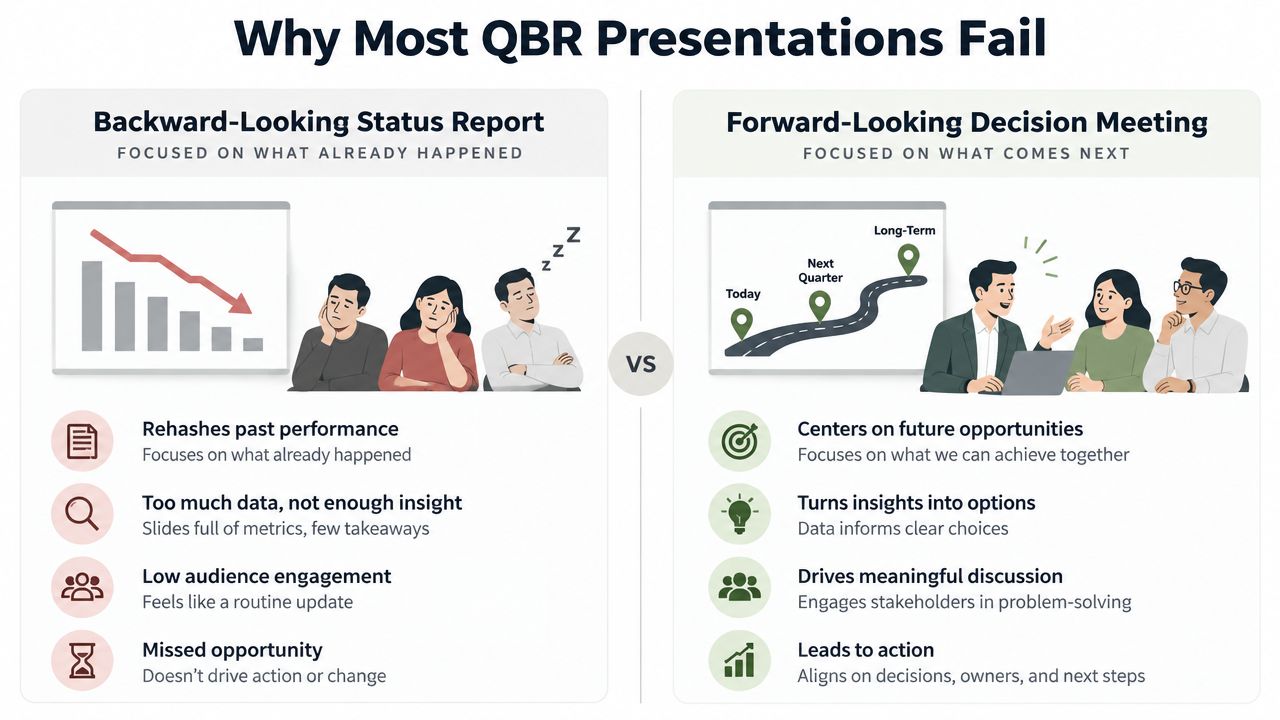
Most financial reporting template tools build from the wrong place. They start from fonts, colors, and section titles, hoping leadership will trust the output. In actuality, a report will only ever be used when the definitions, numbers, and narrative are controlled precisely enough that there is no need to rehash them in the meeting.
A usable financial reporting template is a decision artifact first and a formatting exercise second. If the template doesn't make the executive question obvious, standardize how the answer is calculated, and force a clear explanation when results move, it becomes another file nobody believes. That's why governance, version control, and metric logic matter more than decoration, and why the most useful templates are usually less flashy than the ones people admire on first glance. The report has to stay traceable cycle after cycle, not just the first time. The discipline that drives version control for documents is the same discipline that drives the report to stay traceable, cycle after cycle.
Table of Contents
- Why Most Financial Reporting Templates Fail Before They Ship
- Building the Template Backward from the Decision Agenda
- Choosing the Statements, KPIs, and Headline Metrics That Belong Inside
- Designing Layouts So Variance and Commentary Cannot Be Ignored
- Wiring the Template to Live Data and Interactive Widgets
- Tailoring One Core Template for Boards, Lenders, and Sales Teams
- Exporting, Sharing, and Rolling the Template Out Across the Team
Why Most Financial Reporting Templates Fail Before They Ship
Although templates may appear aesthetically pleasing, they tend to crumble under the pressure of their first real interrogation by management. When templates fail to answer their questions, management is forced to dive into the template, engage in a side conversation, and argue over the definition of the metrics. The templates often fail because they weren't built to support the decisions they were intended to aid.
Three repeated failures
The first repeated failure is inconsistent KPI definitions across teams. When one team calculates margin one way and the other team uses a different denominator, a reconciliation ends up being the only outcome of the monthly meeting, which should be a decision meeting. The second repeated failure is the absence of variance commentary. The template fails to inform the reader why certain movements occurred. The third is unclear ownership. No one has accountability to refresh data, sign off on the data, or validate the data.
Practical rule: if a metric has two meanings, it will be interpreted that way.
Governance and version control shouldn't be like housekeeping because they are central template features. They ensure the credibility of reporting when numbers are reviewed by finance, operations, and the executive team. A template that changes formulas, periods, or presentation rules from cycle to cycle is quickly perceived to be unreliable, even if the data supporting it is valid. The best board and management reporting formats stay concise, show current-period versus prior-period comparisons, and explain variances because this is the structure that leaders use to make decisions.
What leadership is buying
Leadership isn't buying a document. It is buying confidence that the report will reflect a stable logic chain from source data to the boardroom narrative. If the template does not support this chain, every meeting will be an audit, in effect, of the template.
The reason that the success criterion is simple, even if the build is not, is that a template must be trusted enough that leaders can act on it without re-questioning the numbers. From this point on, "nice-to-have" design options will no longer take precedence and workflow will be focused on consistency, traceability, and discipline of sign-off.
Building the Template Backward from the Decision Agenda
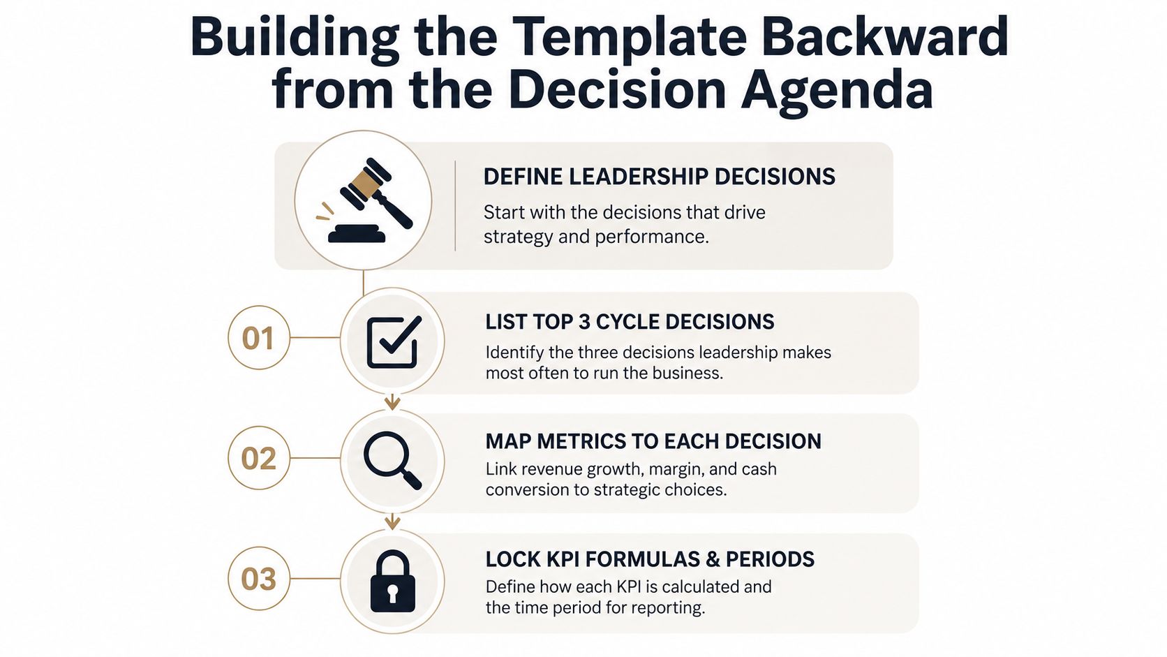
The cleanest way to build a financial reporting template is to start with the questions leadership must answer each cycle and work backward into metrics, definitions, and layout. This requires a degree of discipline because there is a strong desire to build out sections first. However, this requires that you define the decisions first, because every line item in the final report should be justified as helping someone take the next steps.
Each metric gets its own decision question
For decision questions, use complete sentences. For example, instead of "pipeline coverage" try "do we have enough qualified pipeline to support next month's revenue target?" Keeping a decision question action-oriented and outcome-focused helps keep the metric tied to the same.
The same goes for threshold-setting. Where do you draw the line between an acceptable result and one that requires attention? Thresholds define results and actions that are tied to your traffic light system. If you don't have pre-agreed upon definitions for your traffic light system, the signals will lose their meaning.
Lock your metric logic
Standardize metrics and define exceptions before designing templates. Things to lock down are thresholds, reporting periods, and formulas. This ensures that the order you follow is logical and everyone knows what to expect.
- Define the leadership questions. The questions your executives need to answer will be the basis for the metrics you set.
- Link each question to a metric or group of metrics. A cluster of related metrics works as well.
- Lock KPI formulas and periods. Freeze the calculation logic for each metric so you can compare the same metrics every month.
This means pipeline coverage, gross margin, and cash conversion should be aligned to the choices the team must make for the monthly revenue operations review. Coverage on pipelines impacts booking risk, gross margin impacts deal quality and pricing pressure, and cash conversion indicates whether growth converts to liquidity. The template need not spell these relationships out every time, but definition sheets accompanying the template should do this.
The best template provides a metric definition sheet and not just a worksheet with numbers.
This definition sheet is a reference for subsequent calculations, comments, and final attestations. It encourages finance and operations to use a common lexicon when something new happens, thereby reducing the ad hoc work attributed to the end of the month.
Choosing the Statements, KPIs, and Headline Metrics That Belong Inside
Selecting the right statements, KPIs, and headline metrics that go into a useful report is a key consideration for management. A useful report is not a dumping ground for all metrics. A useful report is a consolidated, structured work product. The metrics on the report should be hierarchical with the detailed metrics in the appendices and a concise executive report. The most common mistake is to put everything on the front page with no hierarchy and to sacrifice all impact metrics.
The core content map
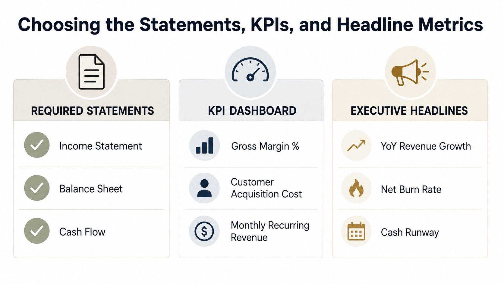
The core content map should include at a minimum an income statement (P&L) with budget variance analysis, a balance sheet with key changes highlighted, a cash flow summary, a KPI dashboard, accounts receivable aging, and a short narrative summary. This compares with the monthly accounting pack which includes the three core statements and reports on accounts receivable and payable, a monthly financial report, and a snapshot of KPIs in Workday's overview of accounting reports.
As a simple rule of thumb, we aim for a dashboard with only 5 to 8 metrics, along with an executive summary with 3 to 5 headline KPIs, using traffic light indicators to facilitate quick review, and limited to 1 to 3 action items where an owner's decision is required. These metrics aren't rigid rules, but rather serve as guide rails. Each level of reporting serves a different layer of the organization. The executive group uses the headline metrics to orient quickly, and the supporting statements help finance and functional leaders understand why and where the numbers changed. The narrative, if done well, should eliminate meetings by providing sufficient context for numbers.
Thinking in terms of layers in KPIs
The KPI layer should be narrow enough to provide actionable information, but broad enough to cover the primary levers of the business. In the context of a monthly report, the KPI layer is often no more than a handful of metrics that track performance against cash flow and growth as well as operational and economic efficiency. The staple metrics, gross profit margin, working capital, EBITDA, and net income are likely candidates, and reporting guidelines also emphasize that they should be built into the report with locked formulas and time references so that comparisons are meaningful.
A clear ownership model is necessary here. One person owns the source pull, another validates the numbers, and a third approves the final draft. That's not bureaucracy, that's what prevents a reoccurring report from turning into an argument over which spreadsheet is "more right."
Why audience mapping matters
Different readers require varying levels of granular detail. The board requires a summary. Managers require an explanation of the steps. Finance requires full traceability and reconciliation. If the template doesn't separate the required details, everyone will receive too much or too little detail.
The best content map identifies each section, explains the sourcing, and states the consumer. This exercise determines whether the report deserves its presence. The same occurs when reporting extensively, where designing an annual report is mostly an exercise in deciding what to omit.
Designing Layouts So Variance and Commentary Cannot Be Ignored
A well designed report actually requires the least amount of work by the reader. It compiles the most salient components by organizing contents such that the movement is highlighted. Effective report design does this before a reader has to scroll, click, or respond to a query.
Make numbers easier on the eye than paragraphs
Setting numbers to the right and truncating decimals reduces clutter. Current-versus-previous columns enable direct comparison without requiring an extra mental step. A simple design is preferred over an explanation-intensive design, as executives read for decision-making purposes, not style. The same argument is applicable to data visualization best practices, i.e., explaining the variance and keeping the visual structure simple.
A one-page executive summary is effective when it maintains discipline. The design should include KPI tiles at the top, a single trend chart, and a short narrative block. Dense tables should be placed below the summary or behind the summary layer. When the first screen is overloaded, commentary is skipped and the report becomes a collection of screenshots.
Build commentary into the submission process
The template should not allow a submission without an explanation for the movements that crossed the line. It can be as simple as a commentary field along each flagged variance, but the process should make the reason unavoidable. If commentary happens after the numbers are sent, it's usually late and brief.
Practical rule: if a movement is significant enough to highlight, it's significant enough to explain in the same workflow.
Layout and governance intersect here. A good visual structure makes the exception obvious, and a controlled submission process makes the explanation mandatory. Combined, they eliminate the gap between what has changed and what is important to the leadership.
Keep the page honest
Color should support meaning, not replace it. Traffic-light signals work only if the underlying thresholds are stable, and the page stays simple enough that variance stands out immediately. Right-aligned figures, clear labels, a restrained chart choice, and short commentary fields are usually enough.
The best audit is the quickest. If users fail to identify what has changed, can't easily compare it to the prior period, and can't find the reason within 10 minutes, the design needs improvement.
Wiring the Template to Live Data and Interactive Widgets
Dynamic reporting harnesses the potential of live data to drive better operational decision-making. Traditionally, teams are left to their own devices when reporting, often resulting in stale reports and misaligned reporting cycles. Align reporting to the data source, and enable your teams to query data as it is needed in a repeatable and reliable fashion.
Choose the right source path
Simply put, if reports rely on spreadsheets, and your teams are able to manage the datasets in spreadsheets, and your reporting logic is spreadsheet friendly, keep the data in Google Sheets. Otherwise, API data integrations should be your go-to.
When considering how to build a real-time reporting dashboard, the Google Sheets app serves as an excellent data modeling and integration tool for relevant systems. Its REST interface lends itself well to automation, and reduces the reporting drift related to manual copy and pasting of data.
Replace static assets with interactive components
Static images frame data in a particular way. Interactive widgets empower end users to interact with the data and remove the barrier of a content summary. Maps, device mockups, code blocks, and similar widgets surface context that a screenshot fails to capture, and offer something for both ends of an audience spectrum; executives interested in the big picture, and operators, interested in the numerous details.
This is what practical architecture looks like. The sheet or API lives at the bottom and serves as the single source of truth. Validation logic is applied to the incoming data. The reporting layer produces KPI tiles, charts, and narrative blocks. The sharing layer provides a mobile, link-based report. This stack maintains data freshness and eliminates the need to rebuild the same file in each cycle.
Consider the source options
| Source | Best for | Update cadence | Skill required |
|---|---|---|---|
| Google Sheets | Controlled finance-owned inputs with simple refresh paths | Manual or scheduled | Low to moderate |
| REST API | System-generated data with live operational metrics | Near real-time or scheduled | Moderate to high |
| File export from ERP | Occasional archives with closed reporting packs | Periodic | Low |
When selecting a data source, consideration is given to the path of the source and the risk of stale data, as well as the team's capacity to maintain the report. If reporting requires manual maintenance, the design of the report is incomplete.
Tailoring One Core Template for Boards, Lenders, and Sales Teams
Finding a single core template to meet the reporting needs of boards, lenders, and sales teams may seem efficient, but since each of these groups will have specific reporting requirements, it is better to implement a modular approach. Using a single core data layer can support the preparation of the board deck, lender packet, operational dashboards, and customer summary reports without the need to perform repetitive calculations and narrative constructions.
What each audience needs specifically
The board wants to see brief, headline metrics, an explanation for variances, and what those variances mean for the organization. Lenders are focused on whether the pack allows for a thorough covenant review and if it shows consistency and comparability across sections. The sales team needs real-time information on performance and operational visibility that helps them understand why revenue is changing as it relates to pipeline activity.
The point is not to change the facts for each audience. It's to provide differing perspectives on the same fact. A template that allows for flexibility in modules allows the pack to be easily adaptable to both audience and delivery platform. It is more practical than keeping separate decks for each audience.
A simple stakeholder matrix
| Audience | Show | Hide or compress | Delivery preference |
|---|---|---|---|
| The board | Key performance indicators | Raw supporting detail | Short deck or web link |
| Lender | Well crafted packs with key variations | Embellished pictures | Export pack |
| Sales team | Operating metrics | In depth detail | Mobile friendly dashboards |
The matrix should help with your version control. It also aligns the report with how each audience member consumes the information. Boards consume for decisions, lenders consume for consistency, and sales team management is about speed and clarity.
Why delivery format changes behavior
Mobile-friendly formatting and live-formatted options change behavior because they lower friction when reading a report. A report presented live on a webpage opens more often than a report sent as a file attachment. Webpage formatting is easier to read between meetings. This is especially helpful when a report has to be updated to support multiple work streams, as opposed to updates that duplicate report maintenance.
The best way to counteract stakeholder sprawl is to implement modular design. One source of truth and countless views with no duplicate logic.
Exporting, Sharing, and Rolling the Template Out Across the Team
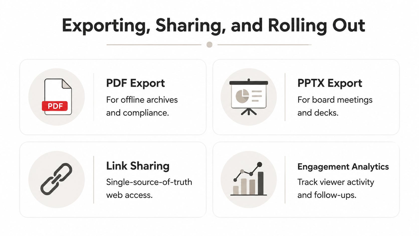
A good template is put to the test when rolled out to the team. The rollout is determined by the export options. Not every audience is going to agree to the same delivery method, and not every workflow is going to be entirely interactive. For the compliance of book out and archival purposes, the file formats of PDFs and PPTXs still offer utility. Links offer the best way to share and maintain a report, as they minimize the likelihood of a report being out of date.
Rollout moves that actually stick
The rollout should start with the KPI definitions locked down, a single audience pilot, variance commentary feedback, and then, finally, the complete reporting cycle. Definition drift is best surfaced this way.
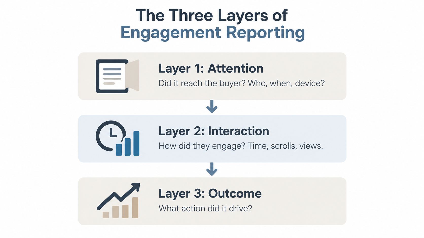
Use engagement analytics to see what gets read and what gets ignored. If a section never gets attention, it may need to move, compress, or disappear. If leaders keep spending time on a particular page, that's a signal to preserve or strengthen it.
Practical rule: the most useful template makes data provenance visible, flags unusual items, and standardizes adjustments, so management can trust the numbers rather than just read them.
FAQ
How do you address messy source data? Work it out prior to insertion into the template, tie the values to the supporting statements, and indicate one-off values to make the report comparative over time. The Hospital Financial Analysis Template, published by the Milbank Memorial Fund in April 2024, captures this discipline in published templates. It instructs users that data spanning more than two fiscal years must be consolidated manually after extraction, that totals should align with the key figures on the audited financial statements, and to anticipate one-off events, including restructuring and significant grants, which also impact results.
How do you address formula drift? Lock formulas, maintain version control, and maintain consistency across cycles. That's the only way to ensure consistency.
When is a template due for retirement? When it no longer supports the decisions the leadership needs, or data architecture has changed enough that the structure would create more friction than value. When that happens, maintain the core that still works, and build around the new structure and goals.
Are you searching for a financial reporting template that leaders will actually use? Try Encelade. It transforms static reporting into live, governed, web-based decision-making tools, where modular reporting and controlled sharing eliminate version drift by providing a single source of truth. Book 30 minutes here to see it on a real report.