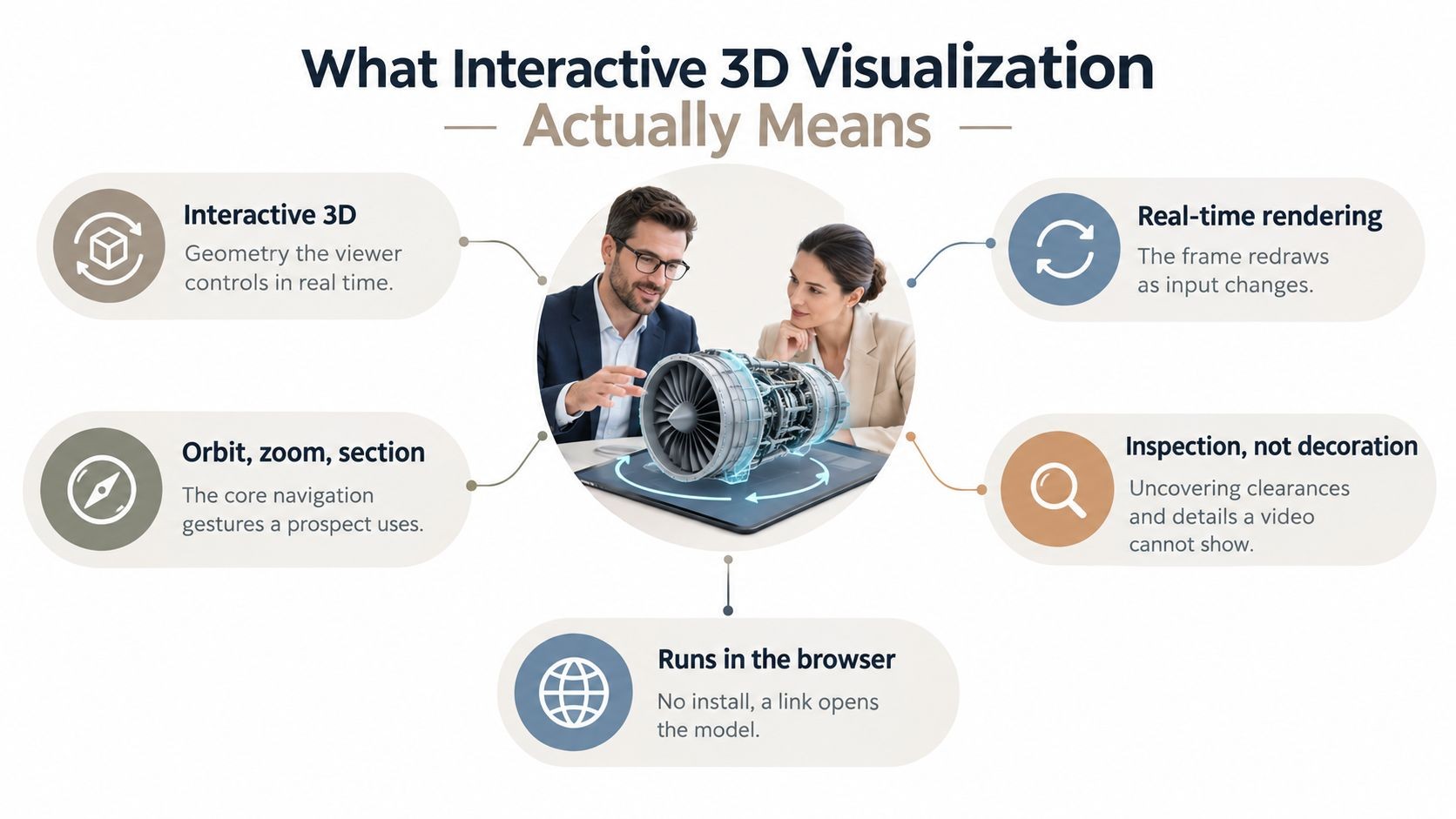
The surprising part of annual report work isn’t the design. It’s that many teams still treat the report like a filing package when the format itself has already changed. The annual report design field is shifting from static PDFs to interactive, web-based microsites, and 2026 is projected to accelerate the adoption of “experiential reporting” where reports behave more like immersive websites than documents, according to The Ink’s annual report design trends for 2026.
That shift matters because a static PDF can look polished and still fail at the one job stakeholders care about most: helping them find, understand, and act on the information quickly. If you’re learning how to design annual report content for the first time, the winning approach isn’t “make it prettier.” It’s to build a report that tells a clear story, presents evidence cleanly, and works as a digital experience across screens.
Table of Contents
- Define Your Report’s Mission and Narrative
- Gather and Verify Your Core Content
- Mastering Visual Storytelling and Brand Integrity
- Elevate Your Report with Interactivity and Live Data
- Choose Your Distribution and Delivery Strategy
- Beyond the Launch: Your Annual Report Action Plan
Define Your Report’s Mission and Narrative
The typical starting point is content requests. Strong teams start with intent.
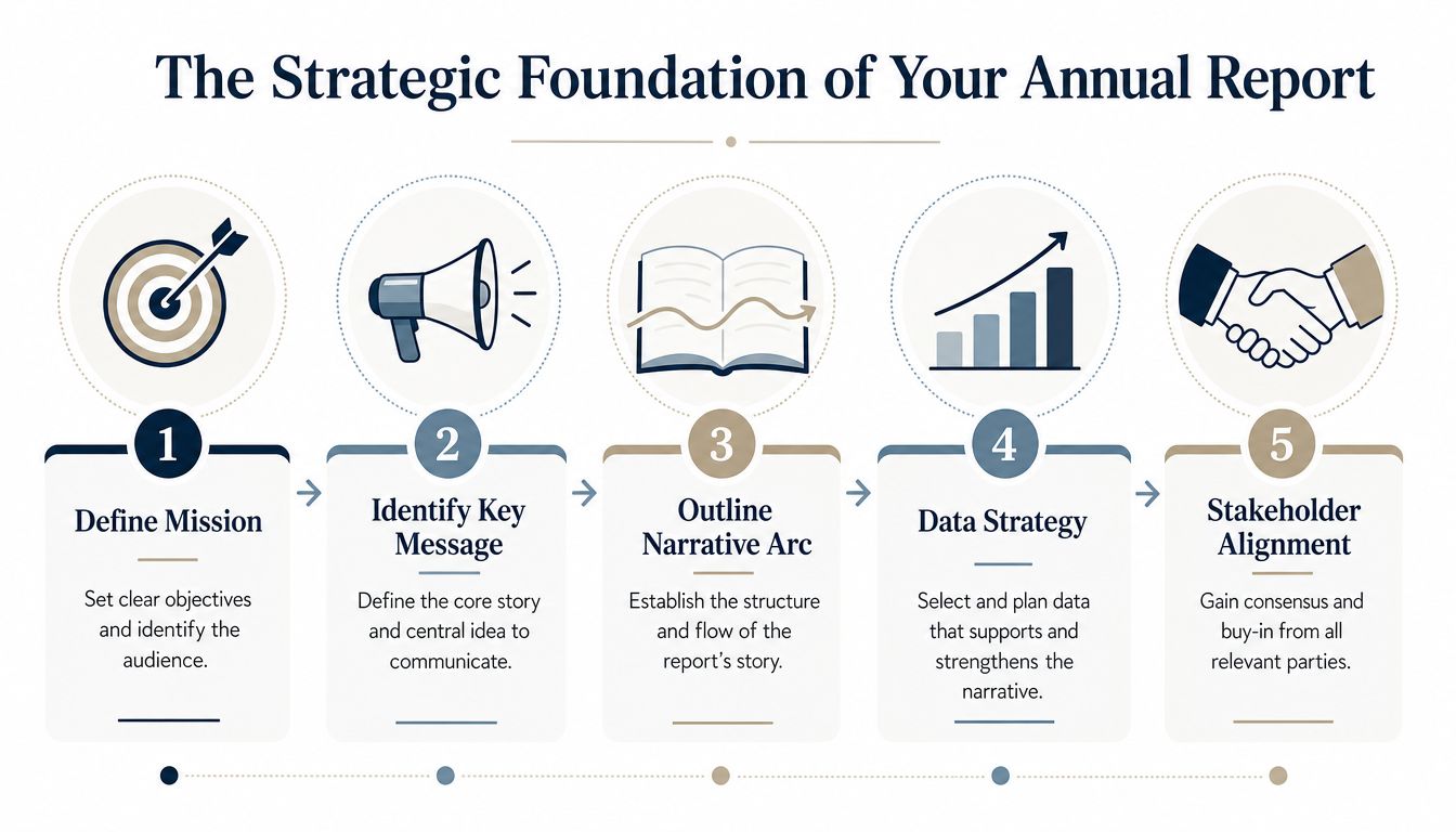
If you want to design annual report assets that people read, define a single North Star goal before anyone opens PowerPoint, Figma, or a layout tool. That goal might be reassuring investors, reinforcing credibility with partners, helping employees understand progress, or giving prospective hires a sharper picture of the company. What it can’t be is “everything for everyone.”
Start with one decision
A useful annual report begins with a clear purpose. As JDJ Creative’s guidance on annual reports notes, successful annual report design requires a clear purpose, whether to inform stakeholders, support decision-making, or reinforce credibility, and it works best when teams prioritize the most important messages instead of giving every metric equal weight.
That principle sounds obvious, but it gets ignored constantly. Finance wants completeness. HR wants culture visibility. Sustainability wants ESG depth. Leadership wants optimism. The report gets thicker, not better.
Use this decision sequence early:
- Choose the primary audience. Name the first reader you need to satisfy.
- Define the action. What should that reader think, feel, or do after reading?
- Set the central message. Distill the year into one sharp line of meaning.
- List supporting proof. Pull only the evidence that strengthens that message.
- Cut what doesn’t serve the story. Save secondary material for appendices or linked extras.
Practical rule: If a chart doesn’t help the reader understand progress, risk, or direction, it doesn’t belong in the main narrative.
Teams that need help sharpening the story usually benefit from studying how presentation narratives work in shorter formats first. The same thinking applies to reports, especially when you’re building a digital experience around a storyline. A good reference is this guide to storytelling in presentations.
Build a narrative that carries the data
Readers don’t remember a report because it had a lot of information. They remember it because the report helped them make sense of the year.
A durable structure is simple:
| Report stage | What belongs there | What to avoid |
|---|---|---|
| Beginning | Year highlights, context, goals, major challenges | Dropping readers into raw tables |
| Middle | Performance, initiatives, growth, operational proof | Unrelated metric collections |
| End | Risks, lessons, future outlook, next priorities | A vague ending with no direction |
That sequence follows a common best-practice narrative flow: year highlights first, then performance, growth, challenges, and future outlook.
The report isn’t a warehouse for data. It’s a guided interpretation of what mattered.
A marketing team working on its first major report should also define audience personas in plain language. Investors may want performance clarity and future direction. Employees may look for momentum, leadership confidence, and evidence that strategy turned into action. Partners often care about reliability, scale, and execution. Those audiences can all live in one report, but only if one narrative spine holds them together.
Gather and Verify Your Core Content
Annual report projects often fail long before design review, typically when the source material is not agreed upon.
That problem gets more expensive in a web-native report. A static PDF can hide a few inconsistencies. An interactive report cannot. If a KPI appears in a homepage summary, an animated chart, a filterable data table, and a downloadable appendix, one unresolved number multiplies into four correction jobs, four approval loops, and four opportunities to lose trust.
Start with a controlled content system, not a layout file.
Create a single source of truth
Build one master document that holds every approved claim, figure, definition, and asset reference in one place. For a marketing team handling its first major annual report, this is the difference between a manageable workflow and a month of version confusion. The document should be plain enough for finance, legal, leadership, and communications to work in together. It should also be structured enough that designers and developers can turn it into web modules without rewriting it from scratch.
Keep copy tight. Short blocks are easier to approve, easier to scan, and easier to reuse across responsive layouts, interactive cards, and mobile views.
Your master document should include:
- Financial content with approved figures, labels, reporting periods, and a named finance owner
- Leadership narrative including the CEO letter, board message, and approved forward-looking language
- Operational highlights such as launches, milestones, program results, or strategic initiatives
- People and culture material covering hiring, development, recognition, and workplace initiatives
- ESG and governance content including definitions, scope notes, and approved terminology
- Proof assets such as quotes, captions, photography references, chart notes, footnotes, and source citations
Ownership matters.
Each line item needs one person responsible for accuracy, one person responsible for approval, and one current version. Without that structure, teams end up trying to reconcile conflicting drafts inside the design phase. Design can improve clarity. It cannot settle internal disagreement.
Edit for modular use before you design
Annual reports for the web need content that can flex across formats. The same performance story may appear as a scannable summary on desktop, a tap-through card on mobile, and a live chart connected to updated metrics later. That only works if the underlying copy is modular, specific, and clean.
Use this editorial filter before any design or development starts:
- Replace broad summary paragraphs with answer blocks. Each section should answer one question clearly.
- Break long explanations into modules. A short overview, a supporting statistic, and a visual usually outperform one dense text block.
- Standardize labels early. Decide once how terms like revenue, impact, stakeholder, customer, or audience will appear.
- Flag weak claims. If a statement cannot be supported, qualify it or remove it.
- Resolve approvals in one place. Side comments in email and chat create shadow versions fast.
- Prepare data for visual use. Structure tables and labels so they can feed charts, dashboards, and other interactive elements cleanly. These data visualization best practices are useful when you are shaping source data before design begins.
A simple working table keeps the project honest.
| Content type | Owner | Approval status | Design-ready test |
|---|---|---|---|
| Financial statements | Finance | Approved | Numbers, labels, and periods will not change |
| Executive summary | Leadership and comms | Approved | Tone matches the report mission |
| ESG or impact narrative | ESG lead and legal if needed | Approved | Claims are defined and supportable |
| Photography and captions | Brand and comms | Approved | Usage rights and context are clear |
Teams often want to start page design early because it feels like progress. In practice, early layout with unstable content creates rework. Every revised paragraph changes spacing, hierarchy, chart sizing, and sometimes the interaction model itself. In a digital report, that can also affect analytics tagging, CMS fields, and QA.
Locking content does not slow the project. It protects the schedule and makes the final report stronger.
The strongest annual reports are built from verified content that is ready to perform in more than one format. That is the standard now. The report still needs to satisfy compliance requirements, but it should also support search, engagement tracking, stakeholder segmentation, and future updates without a full redesign.
Mastering Visual Storytelling and Brand Integrity
Visual storytelling is where annual reports either become useful or become decorative. The problem isn’t that teams use charts. It’s that they use charts without deciding what each chart is supposed to do.
If you want to design annual report pages that people can scan confidently, every visual needs a job: show change, compare options, mark progress, reveal concentration, or explain sequence. Anything else is ornament.
Choose visuals by job, not by decoration
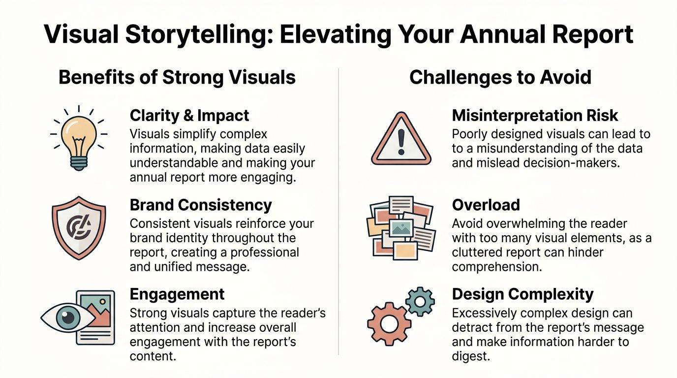
Transform Consulting Group’s design benchmarks identify a common failure: overwhelming readers with dense graph walls. Their recommended correction is to turn statistics into visual stories using progress bars, thermometers, heat maps, and timeline graphics, while maintaining a clear typography hierarchy with large bold main headers, medium bold section headers, and body text at a minimum 11pt size.
That advice maps directly to day-to-day design choices:
| If your message is… | Use this | Don’t use this |
|---|---|---|
| Change over time | Line chart or timeline | A crowded table |
| Comparison across categories | Bar chart | A pie chart with too many slices |
| Progress toward a target | Progress bar or thermometer | A generic KPI tile with no context |
| Geographic spread or concentration | Map or heat map | A paragraph describing locations |
| Sequence of milestones | Timeline graphic | Bullets buried in body copy |
The key is restraint. One strong visual paired with a short interpretation often beats four small charts fighting for attention on the same page.
For teams refining chart selection and layout logic, this piece on data visualization best practices is a useful companion.
Protect hierarchy, readability, and trust
A report can look premium and still be hard to read. That’s usually a hierarchy problem, not a color problem.
Start with type. Main section headers should clearly signal movement through the story. Subheads should help scanners find meaning fast. Body text needs enough size and spacing that nobody has to work to read it. If the report feels crowded, remove elements before shrinking text.
Then check brand integrity. In this area, many first-time teams overcorrect. They try to insert every brand color, every motif, and every campaign device into one report. The result often looks like a seasonal marketing asset instead of a durable corporate communication piece.
Use brand systems selectively:
- Color should organize, not merely decorate.
- Icons should clarify categories, not fill empty space.
- Photography should support authenticity, not compete with the data.
- White space should direct attention, not feel like unfinished layout.
Strong report design makes the next question obvious. Weak design makes the reader hunt for it.
Accessibility also belongs in the design review, not as a final compliance pass. Check contrast choices. Make sure chart distinctions don’t rely only on color. Use meaningful alt text in digital versions. Keep labels and navigation screen-reader friendly. A report that excludes part of the audience isn’t polished. It’s incomplete.
Elevate Your Report with Interactivity and Live Data
A modern annual report should work like a digital product, not a document archive. If your primary version still traps readers in linear pages, fixed screenshots, and static tables, you are leaving attention and insight on the table.
The stronger model is web-native. Readers should be able to jump to the part that matters, open supporting detail on demand, and inspect current performance without losing the thread of the story. That shift changes the report from a filing requirement into a communication asset your team can measure, update, and improve.
What changes when the report becomes web-native
Interactivity works best when it serves reader intent. Different audiences need different levels of depth, and a good digital report respects that instead of forcing everyone through the same sequence.
A board member may go straight to governance and risk. An investor may want trendlines and segment performance. A partner may only need highlights, proof points, and outlook. Good interaction design supports all three paths without bloating the main narrative.
Useful patterns include:
- Clickable section navigation for topic-based and audience-based entry points
- Expandable charts that reveal notes, drivers, and historical context only when needed
- Filterable maps and timelines for geographic reach, milestones, or operating footprint
- Embedded media for leadership commentary, product explanation, or short strategy recaps
- Interactive widgets tied to approved data sources for metrics that benefit from current values
Teams often like the idea of interactivity but struggle with execution. A practical guide for planning these behaviours in a presentation-style format is our post on creating interactive slides.
Where live data helps and where restraint matters
Live data earns its place when freshness changes the usefulness of the information. That usually applies to metrics such as reach, participation, market activity, operational status, or other indicators that continue to move after publication.
It does not belong everywhere.
Annual highlights, leadership framing, strategic interpretation, and year-end commentary should remain stable. They need editorial control and a clear point of view. By contrast, supporting evidence can update on a controlled basis if the source is approved and the context stays clear.
A simple operating model helps:
| Layer | Best use | Stability |
|---|---|---|
| Core narrative layer | Annual highlights, CEO framing, strategic interpretation | Stable |
| Live evidence layer | Updated dashboards, widgets, dynamic supporting metrics | Controlled updates |
The trade-off is governance. Once a chart pulls from a live source, someone on the team owns validation, labeling, refresh rules, fallback states, and accessibility. I usually advise marketing teams to decide this early, because live reporting fails for predictable reasons: unclear ownership, weak annotation, and numbers that update faster than the narrative around them.
This is a helpful example of interactive pacing in practice:
The best digital annual reports stay editorial. Interaction should help readers inspect the story, compare evidence, and find relevance faster. It should never turn the report into a gadget.
Choose Your Distribution and Delivery Strategy
Distribution decides whether your annual report gets read, shared, and measured, or filed.
A strong report can still underperform if the delivery format creates friction for readers or extra work for your team. I advise teams to make this choice early, because format affects approval flow, accessibility, analytics, and how quickly communications can respond after launch.
PDF still has a role
PDF remains useful for archive copies, print production, board packs, and any context where a fixed version is required. It also gives legal, finance, and leadership teams a stable snapshot they can reference without worrying that a chart, label, or supporting figure changed after review.
That matters. Some stakeholders want a record. Others want an experience.
PDF starts to weaken once the report needs to travel widely. Email attachments create version confusion, mobile reading is clumsy, and there is little visibility into what people read. It also limits the report to a document mindset when the stronger option is often a web-native communication asset that can support interaction, selective updates, and measurable engagement.
Why link-based delivery should lead
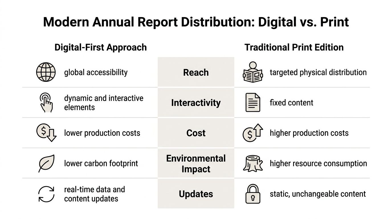
A web-native report gives the team one controlled version to distribute across investor relations, media outreach, recruitment, partner communication, and internal channels. It works better on phones, supports clearer navigation, and allows approved teams to refine specific sections without replacing the entire asset.
It also changes what distribution means. Instead of sending a file and hoping it gets opened, you publish a destination you can track. You can see which sections attract attention, where readers drop off, and which charts or messages deserve a second life in follow-up campaigns. That turns distribution into a feedback system, not a one-time send.
As noted earlier, the market has shifted toward digital-first annual reports for exactly these reasons: better access across devices, richer storytelling formats, and stronger control over the reader experience.
The trade-off is operational discipline. A live report needs clear permissions, hosting decisions, QA checks, redirect rules, and a named owner for post-launch updates. Without that structure, teams gain flexibility but lose consistency.
A practical comparison looks like this:
| Delivery mode | Best for | Main limitation |
|---|---|---|
| PDF export | Archive, print, formal fixed distribution | Static and difficult to measure |
| Web-native link | Engagement, accessibility, updates, interactive exploration | Needs stronger governance and publishing workflow |
For most marketing teams, the strongest setup is hybrid:
- Primary experience through a secure web link
- Secondary PDF export for archive, print, and formal attachment use
- Modular excerpts adapted into investor emails, internal updates, leadership decks, and social distribution
That model respects compliance needs while treating the annual report as a living digital asset. The PDF remains the record. The link handles the primary communication.

Beyond the Launch: Your Annual Report Action Plan
Publishing the report isn’t the finish line. It’s the moment the asset starts working.
The best annual reports keep producing value after launch because teams reuse the material, observe what resonates, and feed those insights back into communications, investor relations, and the next reporting cycle.
Turn the report into a content system
Every strong report contains a year’s worth of reusable assets. Don’t leave them buried in one long experience.
Pull out the most useful components and redeploy them:
- Leadership excerpts for investor updates, partner letters, or recruiting pages
- Single charts or graphics for social posts, board summaries, or internal town halls
- Operational timelines for sales enablement, case-study context, or media briefings
- ESG or culture sections for employer brand and stakeholder communications
This works best when the original report was built modularly. Short text blocks, clear chart ownership, and reusable graphic components make repurposing easy.
Use engagement signals to improve the next cycle
The biggest advantage of web-native delivery shows up after launch. You can learn from actual behavior.
According to Encelade’s write-up on white-label presentation platforms, web-native presentation platforms surface engagement through view counts and time-on-slide analytics, replacing static file sharing with measurable interaction data that helps teams decide what to follow up on. For annual reports, those same signals can reveal which sections readers revisit, where they slow down, and what content gets skipped.
That gives communication teams a better post-launch routine:
- Review engagement patterns. Identify the sections drawing attention.
- Compare high-interest topics with stakeholder priorities. Look for mismatch and overlap.
- Support follow-up conversations. Investor relations, leadership, and marketing can all use the signal.
- Note weak sections. Low engagement may indicate poor placement, weak framing, or low relevance.
- Document lessons immediately. Don’t wait until next year’s kickoff.
The annual report should create feedback, not just exposure.
When teams treat reporting this way, the project stops being a yearly compliance sprint and becomes part of a broader communication system. That’s the upgrade. Not just a nicer layout, but a smarter asset with a longer working life.
If your team wants to move from static decks and file attachments to interactive, link-based reporting, Encelade is built for that shift. It helps teams turn documents, spreadsheets, and research into web-native presentations with live data, interactive widgets, analytics, and export options for PDF or PPTX when a fixed format is still needed.