Most published RFP response examples are still teaching teams to produce a cleaner document. That advice is behind the buying process buyers use now.
Evaluators rarely read a proposal from page one to the end. They scan for proof, compare vendors side by side, and jump straight to implementation risk, pricing logic, security detail, or customer evidence. A static PDF can still meet submission requirements, but it often makes your best material harder to find and harder to score.
Strong responses are built for that review behavior. The job is not to add motion or visual flair for its own sake. The job is to help a procurement lead, technical reviewer, and executive sponsor reach the right answer faster, with less guesswork and fewer follow-up calls.
That is why the strongest rfp response examples now look less like document templates and more like guided decision tools. Live dashboards can show current performance evidence. Interactive architecture views can make a complex solution easier to validate. Timeline components can expose dependencies and ownership instead of hiding them in a flat image. Scenario-based pricing can answer the question every buyer asks anyway: what changes if scope, volume, or rollout timing changes?
I have seen proposals improve when teams stop asking, “How do we format this section?” and start asking, “What does this reviewer need to believe, and what proof will help them confirm it quickly?” That shift changes the structure, the content, and the medium.
The seven examples in this guide focus on practical components you can build with modern proposal tools such as Encelade. They are meant to help sales, solutions, and proposal teams create responses that are easier to evaluate, easier to trust, and easier to defend internally. If you need the foundation first, start with this guide on how to structure a proposal for real buyer review workflows.
1. Executive Summary with Live Data Dashboard
A static executive summary usually fails for one reason. The numbers age faster than the deal cycle. If you’re selling a platform, a consulting engagement, or a managed service, stale metrics create doubt before the evaluator reaches your technical section.
A stronger version opens with a live dashboard tied to approved sources like your CRM, BI tool, or a governed Google Sheet. Instead of pasting screenshots, show current implementation success metrics, support performance, customer outcomes, or delivery benchmarks that refresh automatically. For a SaaS vendor, that might mean churn reduction examples and deployment timelines. For a consulting firm, it might mean recent project delivery cadence and client satisfaction trends.
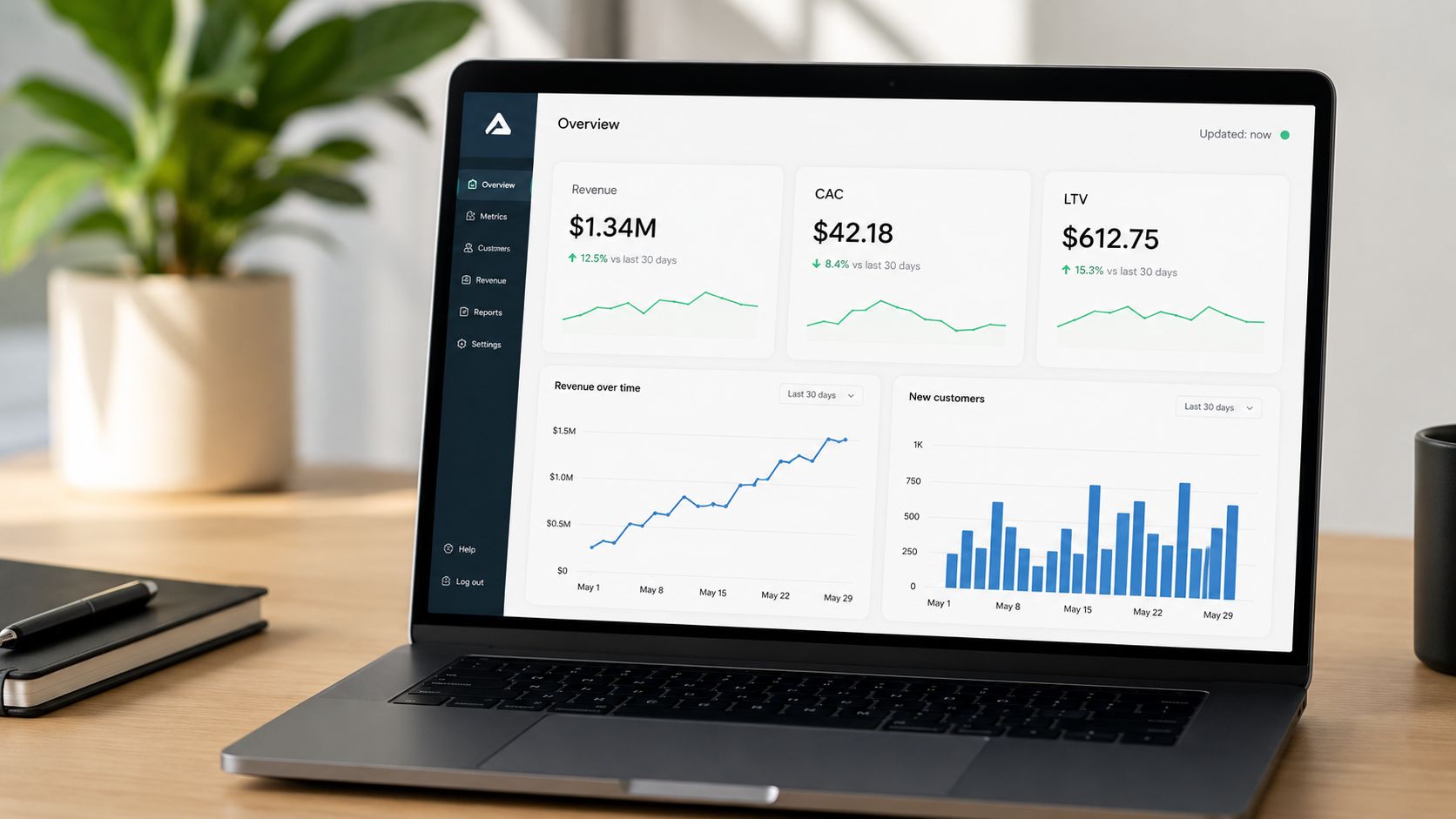
Lead with current proof
The first screen should answer three questions fast. Why are you credible, why are you relevant, and why now. A layered dashboard does that better than a wall of narrative because executives can read the summary first, then drill down only if they need supporting detail.
This format also lines up with how evaluators behave. Procurement guidance often overvalues completeness and undervalues scan speed, yet many buyers review proposal stacks quickly. Stronger proposal structure matters because readers don’t move top to bottom anymore. If you need a practical framework for that flow, this guide on how to structure a proposal for skimming and decision flow is worth applying directly to your executive summary.
Practical rule: Put your best evidence in the first screen, not on page 27.
How to keep it persuasive
The dashboard only works if you control scope. Teams lose the plot when they dump every KPI they have into the response.
- Choose high-signal metrics:Pick the few measures that directly support the buyer’s stated goals.
- Show data freshness:Add the source label and refresh timestamp so reviewers know the numbers weren’t pasted months ago.
- Use visual hierarchy: Give executives a summary layer first, then reveal detail only when clicked.
- Test every connection: Broken charts kill confidence faster than plain text ever will.
A live executive summary works especially well in Encelade because you can combine charts, callouts, and responsive layouts in a shareable link, while still exporting to PDF or PPTX when the procurement process requires a conventional file.
2. Account-Specific Solution Architecture with 3D Product Models
Most architecture sections are accurate and forgettable. They show boxes, arrows, and labels that look like they came from an internal wiki. That may satisfy technical completeness, but it rarely helps a mixed evaluation team understand how your solution fits their world.
Interactive 3D changes that when the solution has spatial, layered, or ecosystem complexity. Hardware vendors can show how components fit on a production line. Cloud providers can map tenant separation and data movement. IoT vendors can let evaluators zoom through a device ecosystem instead of decoding a flat image.
Where 3D actually helps
The best use case isn’t novelty. It’s clarification. If you’re selling warehouse automation, imaging equipment, industrial software, or a platform with multiple data flows, a native .glb or .gltf model can explain the deployment faster than six static diagrams.
I’ve seen this work especially well when a vendor has to explain handoffs between customer-owned systems and vendor-managed systems. A rotatable model with annotations makes ownership boundaries obvious. That’s hard to do in a screenshot.
3D should reduce explanation time. If it needs a voiceover to make sense, it’s the wrong asset.
What to include in the response
Keep the model simple enough to load fast and annotated enough to tell a story without a presenter in the room. A strong architecture module usually includes:
- Environment view:Show the prospect’s actual operating context, not a generic product render.
- Integration markers: Label APIs, data exchanges, user roles, and security boundaries directly in the visual.
- Fallback assets: Add a static image and text summary for low-bandwidth reviews or restrictive portals.
- Benefit labels: Tie each major visual component to an operational outcome, not just a technical name.
Manufacturing software teams can use this to show a digital twin of a factory layout. Logistics providers can map routing logic across regions. Enterprise platform vendors can combine 3D with standard architecture diagrams so both technical and non-technical stakeholders stay oriented.
Encelade is especially useful here because it supports native 3D and Spline embeds in-browser, so the buyer can rotate and inspect the model without plugins.
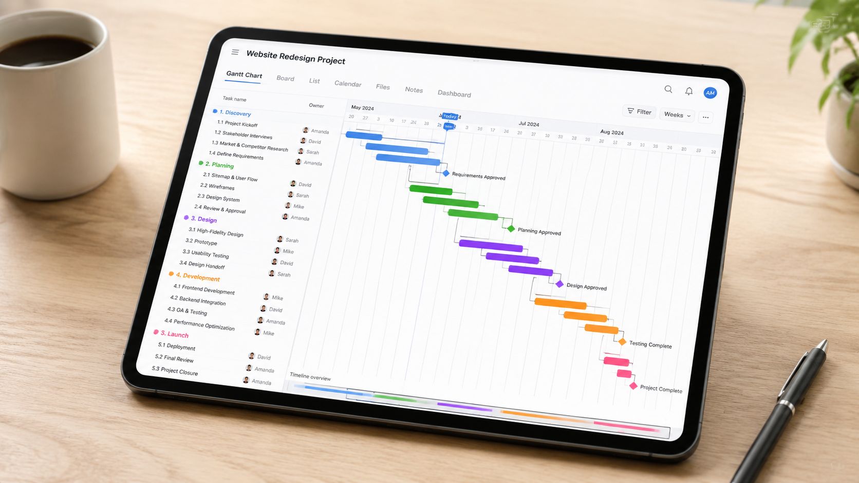
3. Implementation Timeline with Automated Gantt Charts
Static timelines look polished in a PDF. They also create avoidable risk. If the schedule in the proposal is disconnected from the plan your delivery team will run, evaluators are looking at sales theater, not an implementation approach.
The stronger move is to publish an automated Gantt chart tied to the same baseline used by project managers and solution architects. That changes the timeline from a design element into a working part of the response. In tools like Encelade, that also means the buyer can interact with the schedule instead of guessing what sits behind a compressed graphic.
Why static timelines break trust
A pasted timeline usually removes the exact details the buyer cares about during evaluation. Dependencies disappear. Customer actions get buried inside vendor phases. Approval cycles get shortened or omitted because the team wants the chart to look fast.
That approach backfires.
Evaluators use the timeline to judge delivery maturity, not just project length. They want to see whether your team understands procurement delays, security reviews, data migration risk, training windows, and the points where customer participation can slow or accelerate progress. An interactive Gantt chart makes those assumptions visible.
It also surfaces trade-offs early. If you compress testing to hit an aggressive go-live date, the buyer should be able to see that. If a faster rollout depends on the customer assigning a dedicated admin by week two, label that dependency clearly. Honest plans score better than optimistic ones that collapse in transition.
How to make the chart useful in an RFP response
Good proposal timelines are edited for evaluators, not exported straight from the PM system. The goal is clarity with enough depth to withstand scrutiny.
- Separate ownership clearly: Use color and labels to distinguish vendor tasks, customer tasks, and shared checkpoints.
- Expose dependencies: Let reviewers expand phases and inspect what must finish before migration, testing, or training can begin.
- Highlight decision points: Make approval gates, UAT, cutover, and go-live easy to spot.
- Offer two levels of detail: Include an executive summary view for scoring teams and a workstream view for delivery reviewers.
- Keep assumptions visible: Note required customer inputs, review windows, and known schedule risks directly in the chart.
I usually recommend one more layer. Add brief annotations that explain why a phase exists, not just what it is. “Sandbox configuration” is a task name. “Sandbox configuration to validate role permissions before migration” tells the evaluator you have done this before.
For teams building interactive proposals, this timeline module pairs well with a case study template that converts, especially when you want to show that your proposed schedule matches a rollout pattern you’ve already executed successfully.
The internal benefit is just as important. Shared timeline data forces proposal managers, sales engineers, and delivery leads to work from the same plan. That reduces the handoff problems that show up after award, when the customer compares your kickoff schedule to the promise in the response.
4. Customer Success Case Study with Comparison Charts
A generic case study rarely helps you win an RFP. Evaluators are scoring for fit, risk, and proof. If they have to translate your reference story into their own environment, you have added work at the exact moment you should be removing doubt.
The stronger approach is to treat the case study as scored evidence. Start with a customer situation that closely matches the buyer’s constraints. Then show the operational gap, the intervention, and the result in a format the reviewer can scan in seconds. Good comparison charts do that better than a long testimonial ever will.
Make the proof easy to map to the requirement
Pick the case study based on what the buyer is worried about, not on which logo looks best in the proposal.
If the RFP is heavy on implementation risk, use a reference story with ugly realities included: legacy systems, limited internal bandwidth, change management resistance, or a fixed cutover window. If security review is likely to slow the deal, show the customer example where your team cleared architecture concerns and still hit the deployment target. If adoption is the primary issue, lead with usage, training completion, process compliance, or whatever metric the customer genuinely cared about.
That selection step matters more than teams admit. I have seen strong references score poorly because the story proved the wrong thing.
Build comparison charts that answer evaluator questions fast
The chart should do more than decorate the page. It should let the reviewer compare the customer’s starting point to the outcome, and connect both to the requirement being scored.
Interactive proposal tools make that much easier than a static appendix. A reviewer can filter by industry, company size, deployment model, or use case and land on the closest match without flipping through backup slides. Teams looking for better interactive presentation patterns for buyer-facing proof can apply the same approach here.
Use a simple structure:
- Match the case to the buyer profile: Default to the closest peer by industry, scale, or operating model.
- Compare before and after clearly: Show baseline conditions, what changed, and the business outcome in side-by-side form.
- Tie each result to a requirement: Label outcomes against the RFP criteria so the evaluator does not have to infer relevance.
- Include friction points: Note delays, data issues, training gaps, or stakeholder concerns and how the team addressed them.
- Keep claims auditable: Use approved customer language and verified results only.
A strong case study also shows judgment. Not every success story needs the biggest ROI number. Sometimes the better proof is a smaller account with the same constraints as the prospect, because it answers the buyer’s real objection more directly.
If your team needs a sharper format, this case study template that converts skeptical buyers is a practical pattern to borrow.
5. Pricing and ROI Calculator with Customizable Scenarios
Static pricing tables answer procurement’s questions. They don’t always answer the buying committee’s. Finance wants assumptions, the business sponsor wants value, and the operational lead wants to know what happens if rollout scope changes.
An interactive pricing and ROI calculator handles all three. Instead of showing one fixed commercial story, it lets the buyer adjust key inputs like deployment size, service levels, implementation phases, or user count and immediately see the impact. That turns pricing into a decision tool rather than a final-page reveal.
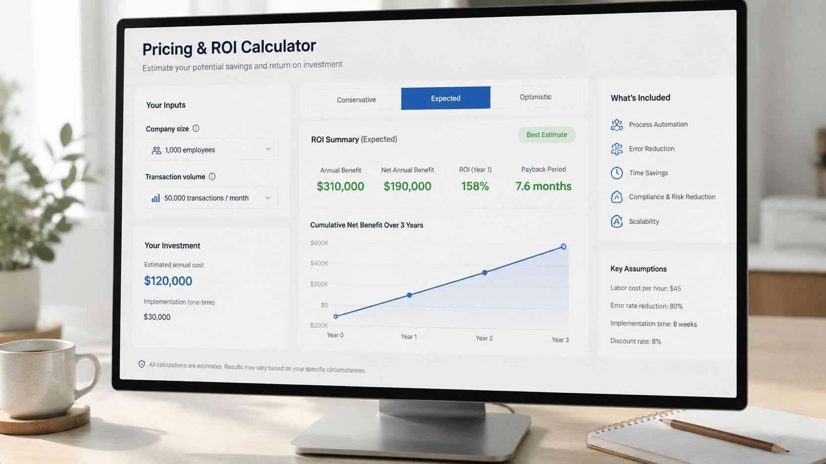
Turn pricing into a decision tool
This works especially well in enterprise software and consulting bids where the scope can expand after discovery. A buyer can compare phased rollout against full deployment, or model different support options without waiting for a revised PDF.
The most effective calculators are conservative. They don’t assume perfect adoption or ideal timelines. They also explain where each assumption comes from. If a team can’t defend the logic under scrutiny, the widget becomes a liability.
Buyers don’t reject calculators because they’re interactive. They reject calculators that feel engineered to make every scenario look amazing.
What makes the calculator credible
The calculator should expose assumptions, not hide them. It should also feel like part of the proposal, not a separate finance spreadsheet awkwardly embedded into a deck.
- Use sensible defaults:Pre-populate fields based on company size or stated scope so users don’t start from zero.
- Include scenario comparisons: Let reviewers view baseline, conservative, and expansion cases side by side.
- Explain the math: Add an assumptions note or linked methodology so finance can audit the logic.
- Track what buyers explore: If the platform supports analytics, use that behavior to guide follow-up conversations.
If you’re designing a more interactive commercial section, these presentation interaction ideas for buyer engagement are directly applicable to pricing modules.
6. Technical Architecture Review with Code Block Widgets
Technical reviewers decide fast. If the architecture section reads like marketing copy, they assume the implementation will be harder than the proposal suggests.
Interactive code blocks solve a practical problem that static PDFs never handle well. They let an architect verify how the product behaves without hunting through appendices, screenshots, and follow-up emails. That matters in complex bids, especially for API platforms, developer tools, security products, and enterprise software with layered integration requirements.
Why technical buyers reject vague claims
Technical teams are not looking for more adjectives. They are looking for evidence they can inspect.
A response loses credibility when it says “enterprise-grade integration” but never shows an endpoint, authentication method, rate limit behavior, or failure response. The evaluator is left to guess how much has been built. In my experience, that guess usually becomes a risk flag.
The strongest technical sections answer a simple question: what would implementation look like in this environment?
For an API product, that often includes a real request and response example, the auth pattern, webhook payload structure, and a sample error object. For infrastructure or cloud software, it usually means deployment diagrams, configuration snippets, supported topologies, and a direct mapping from stated requirements to controls.
What interactive code widgets should actually do
The widget should help the reviewer test your thinking, not admire your formatting.
A useful module usually includes:
- A runnable or inspectable code sample: Show a representative integration path, not a toy example with no business context.
- Tabs for key technical views: API call, response schema, auth flow, webhook event, infrastructure config, or SDK example.
- Requirement-level annotation: Label the snippet so the buyer can see which RFP question or security requirement it answers.
- Expandable detail: Let architects go deeper without forcing procurement or executive reviewers through pages of implementation detail.
- Inline caveats: Call out version dependencies, setup assumptions, and known limits in the same place as the example.
That last point matters. Strong proposals do not hide trade-offs. If SSO requires a higher plan, if a data export endpoint is asynchronous, or if a private deployment changes the setup sequence, say so next to the artifact. Technical evaluators trust a response more when it acknowledges constraints early.
How to package technical depth without overwhelming the reader
Good technical architecture sections are layered. The first screen should explain the proposed architecture in plain language. The next layer should let an engineer inspect the proof.
A practical structure looks like this:
- Start with a short architecture summary tied to the buyer’s environment.
- Show the primary integration path or deployment model.
- Add code block widgets for the parts reviewers are most likely to challenge.
- Place security, scale, and operational notes beside the relevant artifact.
- Include edge cases, not just the happy path.
That final step separates polished proposals from credible ones. A polished example shows a successful API call. A credible example also shows expired token handling, retry logic, webhook signature verification, or partial failure behavior. Buyers know production systems break at the edges. Your proposal should prove you know that too.
One useful pattern is a proof matrix beside the architecture review. Each claim links to a concrete artifact: code sample, diagram, config snippet, control mapping, or test output. Reviewers can score the response faster because they do not have to translate broad claims into technical evidence themselves.
7. Competitive Positioning Matrix with Interactive Filtering
Competitive matrices fail for a simple reason. They are usually written to win an argument, not to help a buying team make a decision.
A useful matrix does something harder. It lets evaluators test your position against their own priorities. That means the rows come from the RFP, the filters reflect how different stakeholders score risk, and the evidence behind each claim is visible without forcing reviewers to hunt through appendices.
For example, an analytics buyer may want to sort by real-time ingestion, connector coverage, governance controls, and implementation effort. A PMO buyer may care more about admin overhead, mobile experience, configuration limits, and adoption risk. One static table cannot serve both groups well. An interactive matrix can.
Build the matrix from the buyer’s decision model
Start with the stated evaluation criteria, then add the sub-criteria that usually decide the deal. I have seen teams lose credibility by comparing on broad labels like “innovation” or “ease of use” while the RFP scoring sheet asked about SSO support, data residency, auditability, and onboarding time.
The better approach is plain:
- Use requirement-led rows:Mirror the buyer’s language wherever possible.
- Let reviewers filter by role: Procurement, IT, security, and business sponsors rarely weight the same items the same way.
- Show evidence beside the score: Link each rating to a demo clip, configuration note, certification, customer example, or product artifact.
- Include trade-offs in the matrix itself: If a feature requires a higher-tier plan, services work, or a longer setup path, say so in the relevant cell.
- Timestamp the comparison: Competitive claims age fast, and stale matrices are easy to dismiss.
That last point matters more than teams expect. A matrix that admits limits and dates its assumptions reads like sales engineering. A matrix that scores your product highest in every row reads like marketing.
Buyers trust a matrix more when they can see how the score was earned.
Make filtering useful for the evaluator
Interactive filtering should reduce review time, not add novelty.
Good filters usually include deployment model, required integrations, compliance needs, user volume, region, and must-have capabilities. In Encelade, those filters can drive what the reviewer sees first, while still preserving a compliant static export for procurement. That is the practical advantage over old PDF examples. The response becomes a working decision tool, not a frozen snapshot.
Scoring logic also needs to be explicit. If “native support” scores higher than “supported through partner” or “possible with custom services,” define that in a short methodology note. If rollout effort affects the score, state what assumptions were used. Evaluators will challenge the score anyway. It is better to answer the objection before it is raised.
Keep the tone balanced
A strong competitive matrix does not avoid competitor strengths. It names them, contains them, and explains the trade-off.
If a competitor has broader out-of-the-box templates, say that. Then show where your approach is stronger, such as governance depth, implementation flexibility, or lower admin burden after launch. That kind of comparison helps the evaluator defend their recommendation internally because it sounds like a fair assessment instead of a vendor script.
The goal is not to prove that every alternative is weak. The goal is to show that your fit is stronger against the requirements that govern the purchase.
7-Point RFP Response Comparison
| Item | Implementation Complexity 🔄 | Resource Requirements ⚡ | Expected Outcomes 📊 | Ideal Use Cases 💡 | Key Advantages ⭐ |
|---|---|---|---|---|---|
| Executive Summary with Live Data Dashboard | Medium–High, API/data mapping and widget embedding | Moderate, BI/CRM access, developer & analyst time | Real-time credibility; higher engagement; fewer follow-ups | B2B SaaS, consulting, enterprise proposals focused on metrics | Demonstrates up-to-date performance and differentiates from static proposals |
| Account-Specific Solution Architecture with 3D Product Models | High, 3D asset creation and interactive integration | High, 3D designers, front-end dev, higher bandwidth | Memorable visualization; reduces spatial/complexity misunderstandings | Hardware, IoT, manufacturing, logistics, spatially complex solutions | Differentiates visually and aligns technical & business stakeholders |
| Implementation Timeline with Automated Gantt Charts | Medium, PM tool integration and dependency modelling | Moderate, PM system access, integration work, template setup | More realistic schedules; reduces post-sale surprises and disputes | Implementation-heavy projects, SaaS onboarding, system integrations | Clarifies timeline, dependencies and resource accountability |
| Customer Success Case Study with Comparison Charts | Medium, data curation, permissioning, and filtering logic | Moderate, customer data access, analytics, legal approvals | Quantified proof of outcomes; stronger purchase justification | Enterprise software, services with measurable ROI, industry-specific buys | Combines social proof with measurable, drillable results |
| Pricing and ROI Calculator with Customizable Scenarios | Medium–High, modeling logic, validation, and export features | High, finance inputs, custom widget dev, ongoing accuracy checks | Transparent, personalized ROI; speeds internal justification | Cost-sensitive procurements, large deals, subscription pricing debates | Moves pricing to self-service, helps buyers justify investment |
| Technical Architecture Review with Code Block Widgets | Medium, docs embedding and upkeep to reflect product changes | Moderate, engineering time, security/compliance artifacts | Early technical buy-in; fewer technical review cycles | API-first platforms, developer-centric products, integration projects | Demonstrates engineering rigor and reduces integration risk |
| Competitive Positioning Matrix with Interactive Filtering | Medium, sourcing objective data and building weighting/filter logic | Moderate, market research, analyst sources, UI development | Clearer vendor comparison; helps prospect prioritize trade-offs | Evaluations with multiple vendors or strategic selection processes | Provides transparent, customizable comparisons grounded in evidence |
Convert Examples into Winning, Interactive Proposals
Static RFP examples are useful for one thing. They show what proposal teams used to submit. They do not show how strong teams now help evaluators review, validate, and share a recommendation inside a buying committee.
The pattern across the examples in this article is practical: reduce review effort, increase trust, and make the buyer’s internal case easier to carry. That is the standard. A polished PDF can still lose if an executive sponsor cannot verify current results, a security lead cannot inspect the technical detail quickly, or procurement cannot test pricing scenarios without another round of emails.
Interactive proposal components solve those review problems directly. A live executive summary keeps business context current. An account-specific architecture view helps technical stakeholders understand fit without translating generic diagrams. An automated timeline exposes delivery assumptions early, which is useful because unrealistic implementation plans often get caught late and damage credibility. A pricing calculator lets finance and procurement test scenarios on their own, and that changes the conversation from price defense to business justification.
Compliance still sits underneath all of it.
Teams sometimes treat compliance as the boring appendix work and save the “real persuasion” for the narrative sections. That is a mistake. Interactive content works best when every strong claim maps cleanly to a requirement, a proof point, or an approved artifact. If an evaluator has to hunt for coverage, the proposal is harder to score no matter how good the design looks. The interactive layer should make validation faster, not introduce another thing to decipher.
There is a trade-off, and experienced proposal teams feel it quickly. Dynamic proposals expose weak source data. If CRM fields are stale, customer metrics have not been approved for reuse, or product visuals lag behind the current release, a web-native response will reveal those gaps faster than a PDF. I see that as a healthy constraint. It forces better content governance, clearer ownership, and tighter review cycles across sales, product, legal, and security.
Start with one component that changes buyer behavior. In practice, the best first move is usually the executive summary or the pricing section because those are read by the widest group of stakeholders. Build that piece with governed data, test how evaluators use it, then expand into architecture, implementation, and technical validation. That is how proposal teams move from collecting RFP response examples to building responses that win.
Encelade helps revenue teams turn static proposal content into interactive, web-native presentations with live data, native 3D, code blocks, Gantt charts, and governed branding. If your current RFP process still ends in a heavy PDF, Encelade gives you a practical way to build proposals that are easier to review, easier to personalize, and far harder to ignore.