You're probably staring at a stale spreadsheet, a half-finished template, and an investor meeting on Friday that won't move. The numbers on your last draft are already outdated, the story feels too broad, and every extra hour spent polishing the wrong thing makes the deck less useful, not more. A strong presentation for investors isn't a brochure. It's a decision document that earns the next conversation.
Most guides provide the answer to the wrong question first. They tell you the number of slides for the deck, and then the meaning of those slides, and the two answers become interrelated in a way that the standard advice leaves out. Slide decks presented in a room and slide decks presented to an audience to be scrolled through alone are different documents and have different ways of failing. This guide presents the structure and the method and the design, in the order that these decisions actually occur.
Table of Contents
- 2026 Investor Decks
- Define Your Audience and Pick a Purpose-Appropriate Structure
- Slide-by-Slide Blueprint from Problem to Ask
- Metrics and Visualizations Investors Trust
- Narrative Arc and Design Discipline
- Rehearse the Room and Pre-Mortem the Q&A
- Create and Present Interactive Presentations with Encelade
2026 Investor Decks
There's a reason founders open their decks on Tuesday mornings instead of Fridays. There are missing slides, too many for the founders' own good. Investors can tell. They expect a deck structured to answer the question “Why should I keep talking to you?” The answer lives in a deck made to earn a seat at the next meeting.
2026 Investor Deck Best Practices
There's no need for a wordy deck to explain the basics of the company. In fact, the opposite is true. Presentations should be as concise as possible. The average investor presentation puts it plainly: “Aim for a concise presentation with a limited number of slides. A general rule of thumb is to have no more than 10-15 slides for a typical investor PowerPoint presentation.” That number is the one you'll see repeated almost everywhere, and it's worth understanding before you decide whether it applies to you.
What goes inside is less contested. J.P. Morgan's guide on how to build a successful pitch deck lays down nine steps: define the problem, introduce the product, present the market, explain your team, show product traction, acknowledge competition, describe your business model, present the work necessary to reach company milestones, and ask for funding. Notably, the guide declines to prescribe a slide count — “Some people will say 10 slides, some will say 12. Research what is normal and decide for yourself which you prefer.”
Practical rule: if a slide doesn't change the investor's next action, it belongs in the appendix or it doesn't belong at all.
Investor decks are read in a flash, and usually alone
One of the vital statistics of investor decks is how quickly they are reviewed. In 2015, DocSend published research conducted with Harvard Business School's Tom Eisenmann that surveyed 200 startups that raised roughly $360 million. According to the research, investors spent on average 3 minutes, 44 seconds reviewing a deck. And in the years since 2015, attention has shortened even further. As documented in DocSend's Live Startup Indexhas tracked weekly averages closer to two and a half minutes through recent years.
Three minutes isn't a reading budget. It's a scanning budget, and that's why the shortest, best decks feel more like financial vehicles than marketing materials. A good deck shows the problem, shows the progress, and tells you what the team is asking for. For more information on what the slide deck is and how to use it, see the pitch deck overview.
Define Your Audience and Pick a Purpose-Appropriate Structure
The deck that is pitched to an angel is not the same deck that is pitched to a late-stage growth lead. The wrong one will waste everyone's time as it will answer a question the room isn't interested in. The right one will make the investor feel like you already know how they think.
Tailor the Deck to the Investor's Thesis
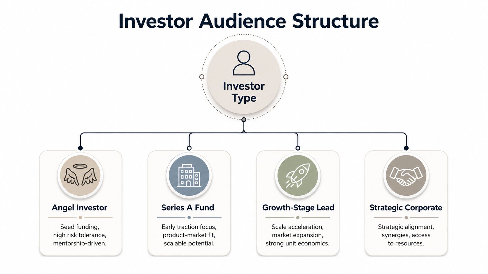
Consider the type of investor you are pitching to, then consider what evidence they will most need to prove their hypothesis correct. Most angels will need to see the earliest signs of demand, the founders' POV, the problem, and why the idea is novel. Later-stage VCs and other growth investors will need to see a clearer path to scale, the financials, and the metrics. Lastly, corporate investors will care about the idea, and the distribution and product fit, most of all.
Stage shifts the length too. Visible VC's investment presentation guide suggests keeping slides between 8 and 10 for pre-seed, 10 to 12 for seed, 12 to 15 for Series A, and 15 to 20 for Series B. However, they call the investment deck a “narrative designed to earn a second meeting, not close an investment on its own.”
Knowing which of those you're walking into is homework, not instinct. Practitioner guidance collected in LinkedIn's notes on structuring investor presentations is clear about it: “Do your homework on investors. Research their portfolio, investment thesis, and recent deals.” Johns Hopkins Technology Ventures says the same in its investment presentation guide. They recommend that founders conduct as thorough a review of the prospective investors as possible, including a review of their portfolio. Do that before you decide which evidence leads.
The presentation deck and the deck sent in advance are two different documents
Here's where the standard advice breaks down. Nearly every guide converges on 10 to 15 slides, but the largest body of outcome data points the other way. In its research on what VCs want to see in a seed deck, DocSend found: “We've found that building a 19-20 page deck with the following sections is the best way to catch the attention of busy investors.” That is roughly double the number most articles recommend, from the one source measuring decks that actually raised money.
Both might be right because they could be describing different things. A deck that you narrate can be sparse. You are the narrator. You might carry an image and a number, but you provide the argument. A deck that you email has no narrator. Each claim must stand alone, without a narrator to answer the obvious questions. Stripping that deck to 10 slides doesn't make it faster to skim, it becomes more ambiguous and leads to the “let's circle back” email.
Practical rule: build the email version first and then cut it down for the meeting. Going the other way will create a deck with missing voice.
This means including two different cuts of the story. The narrative structure, the numbers, and the ask stay the same. The emailed version adds the context you would otherwise say out loud.
Choose what gets the main deck and what gets the appendix
The core should be the lean version. Anything that doesn't support the core should be in an appendix. Visible VC advises: “Keep a lean 10 to 12-slide main deck and move supporting detail to the appendix” — citing cohort analyses, detailed financial assumptions, product roadmaps, and customer logos as items to append. The Johns Hopkins guide treats an appendix as a standard component, characterizing it as structured responses to likely detailed questions.
Sequoia's Aaref Hilaly, in his piece on how to present to investors, recommends a maximum of three slides to address what's changed, what you do, and fast facts. Only 20 minutes should be dedicated to delivering the slides to ensure ample time for discussion. Decisions are made in the discussions, and slides that consume discussion time work against you.
Whenever adding a slide is proposed, three questions should be asked:
- Does this change the decision? If not, cut it.
- Does this help the investor understand the business faster? If yes, keep it.
- Would this slide be better in the follow-up or appendices? If yes, move it out of the main narrative.
Slide-by-Slide Blueprint from Problem to Ask
Most weak decks fail due to slide order not matching the investor's decision process. A typical founder introduces the company in excruciating detail, buries the traction, and then asks for money. The strongest decks move in the opposite direction. They start with the problem and the evidence, then earn the right to discuss scale, economics, and the raise.
The first slides need to illustrate market demand, not just hopeful ambition
Finding the right first slide is crucial. Good first slides will reveal a problem to the audience and exemplify the market demand that already exists. The LinkedIn Practitioner Guidance is straightforward — “Start with the problem, not the technology.” They are also just as direct with the next step: “Provide tangible evidence of demand, such as pilot programs, a growing waitlist, or early revenue. Quantifiable metrics like MRR and low churn are more valuable than broad claims.”
That ordering reduces story risk, because the investor sees evidence before projection. A market slide should stay specific enough to size the opportunity without pretending to a precision you don't have. The solution slide should show how the product changes the economics or the workflow. Business model and go-to-market then show whether the company can turn interest into repeatable growth.
Investors appreciate a well-organized slide deck that explains how the business operates. They will skip over slides that simply show why the founder believes the business will be a success.
Slides should each have one message
Traction, competition, and team slides should show market responsiveness, market alternatives, and plan execution respectively. The base below has two major changes from the J.P. Morgan nine component model. First, the ask is combined with the milestones and timeline. Second, business model and financial slides are added as separate sections because of the significant focus and concern with those areas during the investment process.
| Slide | Single message | Decision it supports |
|---|---|---|
| Problem | Pain is real and urgent | Is this worth addressing? |
| Solution | Product alters outcome | Does this solve it simply? |
| Market | Opportunity is big enough | Is the potential significant? |
| Business model | Company can capture value | Can this be profitable? |
| Go-to-market | There's a realistic path to acquisition | Does it get customers? |
| Traction | Business demand exists | Is there evidence this works? |
| Competition | Company has a real edge | Why this over the options? |
| Team | Has the ability to execute | Can this team win? |
| Financials | Forecast makes sense | Is it a sound plan? |
| Ask | Raise tied to milestones | What if they invest? |
The ask slide should be explicit. Investors need the raise amount, the use of proceeds, and the milestone path tied together in one place. That's where the deck stops being narrative and becomes a financing document.
Metrics and Visualizations Investors Trust
For good reason, numbers can break an otherwise solid deck. A founder can build excitement for a market and a product that feels inevitable. But if the numbers are poorly done, investors will disregard everything in the presentation. It's about clarity. Those numbers ought to be designed in such a way that they can't be misread.
Put the operational metrics on the slide, not in the speaker notes
Zebra BI's guidance outlines the financial sets investors wish to see: revenue, profit margins, working capital, the debt position, and cash flow, as well as customer acquisition cost, lifetime value, and churn rate. Which of those metrics depends on the business. J.P. Morgan provides an example: in the direct-to-consumer business, LTV vs. CAC matter, while in the B2B software business, MRR or ARR matter. Each business has its own set of metrics.
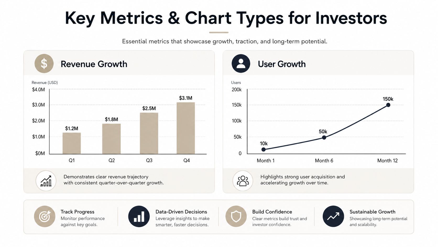
The claim ought to determine the chart type. With funding a big focus, expected revenue should be shown on a clean trend line or bar chart. Customer retention should be shown on a line chart or cohort chart. Burn and cash on hand should be shown in a simple cash picture, not a pretty dashboard. If a chart needs more than a few seconds to explain, the chart has done its job poorly.
Avoid the metric traps that trigger skepticism
Progress metrics that seem busy actually carry little value. Things that produce motion like vanity MAU, blended revenue, and projected logos create movement but carry no weight, and are easily spotted by investors. Metrics should provide a clear connection to customer demand and cash flow economics, with the underlying assumptions made clear.
When a chart may be ambiguous, add a benchmark line and a footnote with a clear label. This keeps your data auditable rather than promotional. For chart structure and reading order, these data visualization practices will help ensure your slides and points remain clear.
- Show the base metric first. Place base metrics at the top of a slide to increase visibility and hierarchy.
- Use one chart per claim. Don't stack unrelated data into one visual.
- Annotate assumptions. If a projection depends on a specific value, make sure you identify that value.
- Keep the chart honest. Don't manipulate data to show a false sense of progress.
On forecasts, resist the urge to invent a horizon because it sounds rigorous. Johns Hopkins frames the forward view as a 24-month action plan plus a financial forecast and use of funds, which is a more honest scope for an early-stage company than a five-year model nobody in the room believes.
Narrative Arc and Design Discipline
A deck gets read because the sequence makes sense. It gets remembered because it commits to one visual language and does not dilute it with variety for its own sake. That sounds basic, yet plenty of investor files still look like three different people assembled them at different times with no shared template.
Build the story spine before polishing the visuals
When building a presentation, focus on the story first and the images second. The typical structure is problem, tension, resolution and therefore should be built in that order. LinkedIn recommends a balance, devoting 60–80% of the deck to factual historical results rather than speculative projections.
A slide should have one idea or one image. Johns Hopkins states that presentations should be “SIMPLE, CLEAR, and CONCISE,” should “present one idea or image per slide,” and should include “high quality (at least 150 DPI) graphics and photographs.” Following this advice would yield a presentation in which slides would have large text (at least 20pt), complementary fonts used in a limited manner (preferably two), and would be sans-serif.
Different document types result in different word counts, so it is important to know which document you are writing in order to know how many words to include. Public-company investor relations guidelines from MarketClimber state that slides should average no more than 50 to 60 words, while startup pitch deck guidelines are more restrictive.
SketchBubble's pitch deck recommendations suggest no more than six words per line and 20 to 25 words per slide. Aim for the tighter end on a presented deck; the emailed version can carry more, since it has to answer questions you won't be there to field.
Practical rule: if a slide requires a full paragraph to achieve understanding, it is probably two slides' worth of work.
Use design to reduce friction, not to decorate
Don't waste effort on heavy visual effects that will never improve credibility. Things that improve credibility? Brand-consistent typography, aligned spacing, and one visual language. Headers, axis labels, and data points should be legible. Busy transitions, mismatched fonts, and inconsistent icon styles make a deck feel unfinished even when the underlying business is strong.
These three tells will downgrade a file fast:
- Random typography. It signals no system behind the work.
- Mixed chart styles. It makes comparisons harder to trust.
- Crowded slides. It forces the investor to hunt for the point.
A deck-wide restyling pass helps non-designers clean this up quickly: just recolor, retype the headings, and rebalance the layout. When you're revising after investor feedback, the biggest issue is usually a lack of consistency, not the content.
Rehearse the Room and Pre-Mortem the Q&A
A strong deck is really a test of your mental fortitude. The investors listen for an answer, but they're also listening for whether you maintain your composure when the questions get sharper. Rehearsal should look less like memorization and more like a simulation.
Run the meeting before the meeting
Run through the meeting as a stand-and-deliver. Walk through the deck as you would in the meeting to identify which sections you stumble on, over-explain, or lose track with. Once you have finished your run, make a recording to check for pacing issues, unnecessary words, and slides that take too long to explain. These are the areas that will cause problems when the presentation is done live.
The final pass should be a pre-mortem facilitated by a partner. This should include the questions asked in diligence such as on market size, defensibility, and exit path. The goal is not to memorize the answers but rather fill in the gaps that will have the biggest impact.
Investors are more forgiving of less than perfect slides than slides that are impossible to defend.
Make the deck and its slides answer the hard questions
Easily executable decks are able to keep detailed slides and supporting information outside of the presentation slides or accessible via embedded slides. This ensures that questions don't derail the presentation or force you to go through supporting files. The investor gets the answer and the pacing survives.
A rehearsal scorecard establishes honesty in a team:
- Are we capable of answering each question in 60 seconds?
- Do we know the location of the tough question?
- Are we able to show supporting data without disrupting the flow of the pitch?
- Does the deck end by naming a specific next step?
That last point is a slide, not an intention. The LinkedIn guidance recommends ending with an immediate next step scoped to the next 24 to 48 hours, and the example it gives is concrete: “By Friday, confirm the partner meeting date and three references you want to call.” A closing slide that names a dated action does more work than one that says thank you.
Create and Present Interactive Presentations with Encelade
Traditional slide decks become obsolete as your results begin to change. Because a deck can be presented online and edited between meetings, it is far easier to adapt. If you have ever sent the same deck to an angel investment group and your lead VC has opened an outdated version, you know the value of an interactive deck.
Linked data instead of copy/pasted data
A good build flow requires you to create the structure and then add the metrics. Encelade makes research, notes from your CRM, spreadsheets, documents and other data in CSV, XLSX, DOCX, PDF, PPTX, or data that you've simply pasted a link to, all viewable and easily editable in your web browser. It also allows you to connect charts to Google Sheets, Notion, Salesforce, Stripe, HubSpot, Google Analytics, and Amplitude. A data-connected Google Sheet will re-sync while you're working on your deck, and the other connections will refresh on demand. A deck published while the data is synced will show the latest values, and although it's much better than having to retype values into a static file, versions of that file will always be compared.
The platform also supports interactive widgets, native 3D, and link-based sharing, which changes how a product proof point gets shown. Instead of dropping in screenshots, you can embed maps, device mockups, charts, code blocks, ROI calculators, or a 3D model investors can rotate and inspect in the browser.
Practical rule: if the proof point can move, rotate, or update, don't flatten it into a screenshot unless you have to.
Make your fundraising deck measurable
Encelade's Presentation API can generate decks programmatically from code or agent output. This is a great tool when investor materials are based on CRM data, research, or recurring board input. The same method can be used for web-native delivery, where decks can be shared as tracking links instead of static files.
The process is simple:
- Outline the round. The pitch builder kicks in and adds an investor deck structure — problem and opportunity, market size, solution, competitive landscape, and more.
- Link the data. Use the related data instead of simply pasting it.
- Provide interactive evidence. Let them see the product, or in a good case, the model.
- Restyle and refine. Finalize your visual guide to the deck and then focus on slide-level details.
- Track engagement. Most plans have the ability to show how long each slide is in view.
That last signal is worth more than it looks. If every investor stalls on the same slide, you don't have a design problem, you have an argument that isn't landing — and you find out before the next meeting instead of after the round.
Presentations that have access to data, metrics, and notes are best presented on the web instead of a file that ages the moment it is pulled. Encelade does just that. If this is the biggest gap in raising money, book 30 minutes here and we can walk through it on a real deck.