82% of proposals sent within 1 hour are read, but that falls to 48% after 24 hours and 26% after 48 hours according to Storydoc’s 2026 proposal statistics roundup. That single data point changes how you should think about a proposal presentation template.
Many teams still treat the template like a design asset. Pick a cover, swap the logo, update pricing, export a PDF, move on. That’s not how buyers review proposals anymore. They open them from email on mobile, forward them internally, skim them alone, come back later during procurement, and sometimes expect a live walkthrough after they’ve already formed an opinion.
A useful proposal presentation template isn’t just a set of slides. It’s a decision system. It has to move fast, personalize without slowing the rep down, work as a link and as a file, support simple interactivity where it helps, and give the team enough governance that the deck doesn’t drift off-brand by the third deal cycle.
There’s also a scale reality behind this. Structured presentation formats have become a mainstream category of business content rather than a niche design exercise, and revenue teams increasingly rely on reusable, editable formats instead of one-off decks. That shift matters because it makes the template — not the individual proposal — the unit of production, which is exactly why the template’s structure deserves more attention than its cover art.
Table of Contents
- Why Most Proposal Presentation Templates Fail to Convert
- Anatomy of a High Converting Proposal Presentation Template
- Personalizing Your Template Without Rebuilding Every Deck
- Adding Interactivity and Live Data That Actually Helps Buyers Decide
- Branding Governance Sharing and Analytics for Scale
- Launch Checklist and Next Steps for Your Proposal Template
Why Most Proposal Presentation Templates Fail to Convert
Teams lose deals here in a predictable way. An analysis of 2.6 million proposals found that 5-page proposals close roughly 50% of the time, while 30-page proposals drop to about 35%, as summarized in Prospeo’s sales proposal analysis. The lesson isn’t that the template is decorative. It’s that the choices you standardize — length, sequence, and what you cut — move the close rate enough to treat the template as a revenue system, not a formatting shortcut.
Poor conversion usually comes from a bad assumption about how proposals get reviewed. The deck is built for the live meeting, but the evaluation happens later across email, mobile, forwarded links, procurement threads, and internal recap calls. A champion skims the summary on a phone. A finance reviewer jumps straight to commercial terms. An executive opens the file for 90 seconds and decides whether the deal deserves attention.
A static, linear deck handles that badly. It forces every stakeholder through the same path, even though each one is trying to answer a different question.
I have seen this failure pattern often. Teams add 15 to 20 slides of company history, delivery process, org charts, and methodology before the buyer’s problem is even named. The rep feels prepared. The buyer feels delayed.
Static decks fail in multi-stakeholder review
Proposal templates often assume one presenter, one meeting, and one sequence. Real buying groups do not behave that way.
A usable proposal presentation template needs layers. The core story should stand on its own for an async reader. Supporting detail should be easy to open when it helps the decision and easy to ignore when it does not. That is where interactive elements can help, but only if they reduce effort for the buyer. A pricing calculator, expandable scope table, short explainer video, or live implementation timeline can work well. A carousel, animation-heavy product tour, or widget that hides basic facts usually hurts comprehension.
Practical rule: Add interactivity only when it helps a buyer answer a real approval question faster.
Many templates optimize for completeness instead of decision-making
The common failure is not lack of effort. It is misdirected effort.
Teams pack the deck with information that proves they worked hard: founder story, marketecture, delivery philosophy, every feature category, every case study, every legal caveat. Very little of that helps a buyer decide whether the solution fits the problem, the budget, the timeline, and the buying risk.
The same analysis recommends keeping proposals short — ideally under five pages, and no more than three to seven unless an RFP demands more — because longer proposals correlate with lower close rates, as noted earlier. Shorter does not mean thinner. It means the main path is controlled, while detail sits behind links, appendix sections, or live data views when the deal needs them.
A failing template usually shows the same symptoms:
- Vendor-first opening: early slides explain who you are before they explain what the buyer needs to solve
- Document-style summary: the executive summary reads like copied prose instead of a decision brief
- Generic proof: references and case studies appear, but they do not match the buyer’s industry, use case, or buying risk
- Hidden commercials: pricing, scope, assumptions, or next steps arrive too late
- One-mode delivery: the proposal works in a live walkthrough but breaks as a shared link or forwarded file
- No governance: reps paste in old screenshots, outdated pricing language, or off-brand slides because the template has no controls
That last point matters more now. Once proposals include live pricing tables, embedded demos, ROI widgets, or analytics, the template stops being a design file and becomes a governed content system. Without rules for what stays fixed, what can be personalized, and what data can render live, teams create inconsistency at exactly the stage where buyers want confidence.
The alternative is straightforward. Keep the main narrative simple. Add interactive or live elements only for high-friction questions. Govern the reusable parts so reps can personalize fast without inventing a new deck every time.
Modern template catalogs reflect that shift. Providers now describe statistics templates in modular, editable terms such as seven editable slides and 100% editable elements, which shows how presentation templates have moved toward reusable, fast-customization formats rather than static files, as seen in SlideModel’s statistics template catalog.
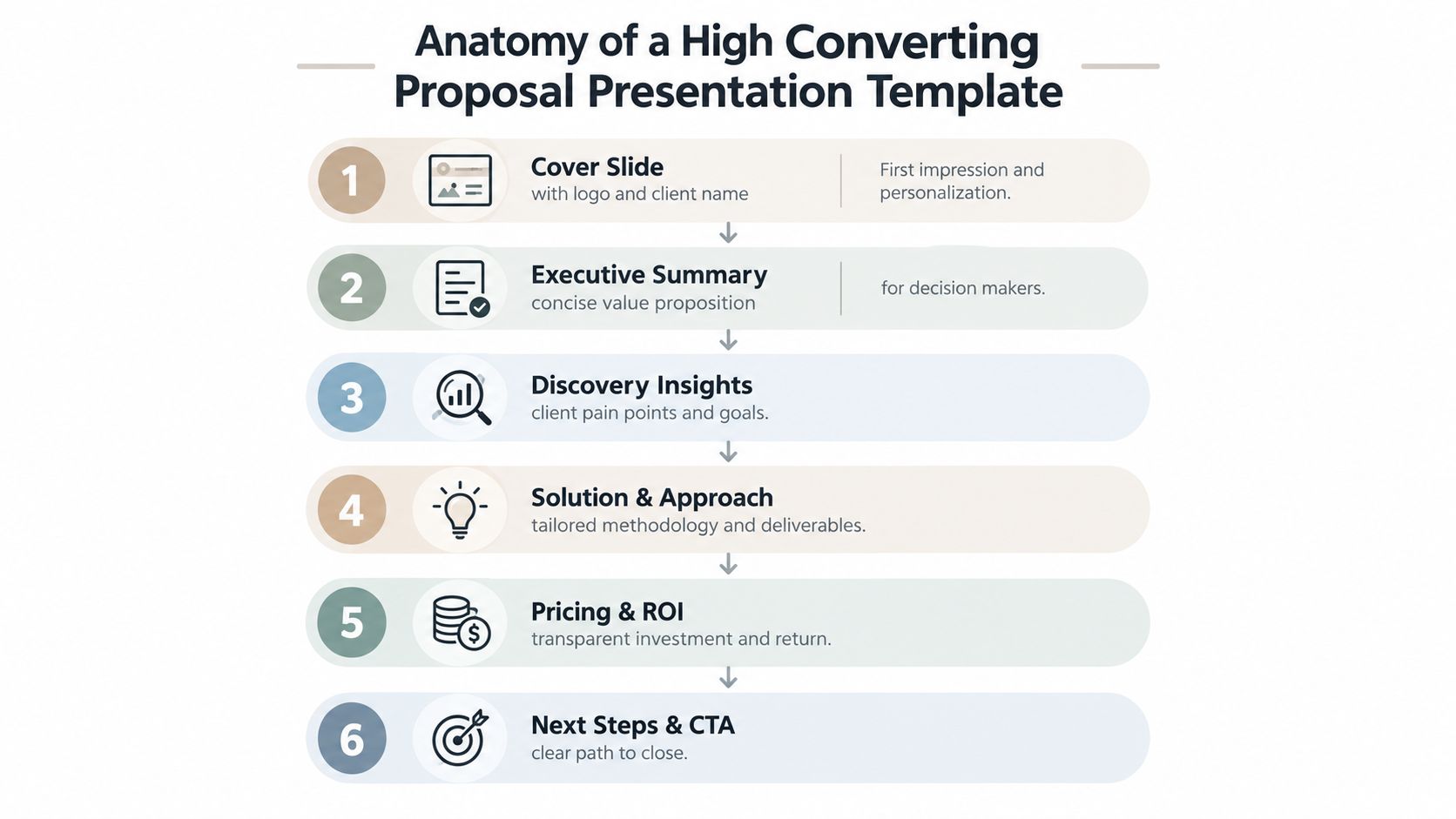
Anatomy of a High Converting Proposal Presentation Template
Proposal readers decide fast. Storydoc’s reader analysis found that 82% of people who reach slide 4 go on to complete the deck, according to the same proposal statistics roundup. That lines up with what I see in deal reviews. The early slides set the buying frame. If they are generic, the rest of the deck has to recover ground it usually never gets back.
The better way to review a template is to check its decision flow. Design matters, but sequence matters more. A strong proposal deck moves a buyer from context, to confidence, to commitment across live presentation, shared link, and forwarded file. That means each section needs a clear job. It also means choosing where interactive elements help and where a plain slide is easier to absorb.
The opening slides need to carry the deal
The first three slides do more selling than the next ten.
Use them to answer the buyer’s immediate questions in order:
- Why am I looking at this? Start with a cover slide that names the client, the initiative, and the business outcome. Skip the slogan. Use a title that makes the proposal feel account-specific from the first glance.
- What are you recommending? Put the recommendation on the executive summary slide, not five slides later. Include the problem, proposed approach, commercial shape, and the decision you want the buyer to make.
- Why this approach now? Show the current-state friction, cost of delay, or operating constraint that makes your recommendation sensible.
Teams waste prime real estate. “About us,” agenda slides, and capability overviews belong later, in the appendix, or nowhere at all unless the account has already raised vendor-risk concerns.
The middle of the deck should resolve buying risk
A proposal template converts when each block answers a buying question cleanly. If a slide cannot be tied to a decision, it is usually filler.
| Buyer question | Slide block that answers it | What belongs there |
|---|---|---|
| Do you understand our situation? | Discovery insights | Pain points, goals, dependencies, stakeholder context |
| What are you proposing? | Solution and approach | Scope, method, rollout, owners, timeline |
| Can your team deliver this? | Team and proof | Relevant experience, similar deployments, customer evidence |
| What will this cost and how will it work? | Pricing and terms | Investment model, assumptions, inclusions, exclusions |
| What do you need from us to move? | CTA and next steps | Approval path, procurement steps, kickoff timing, required inputs |
For teams building or fixing their core structure, this guide on how to structure a proposal is a solid reference for mapping content blocks to buyer questions.
Use interactivity with intent
Interactive proposals can improve comprehension, but only when they remove friction. I add live elements in three cases.
Use a pricing configurator when the buyer is comparing package options. Use an ROI widget when the purchase needs internal justification. Use a short embedded video when stakeholders will review the proposal asynchronously and need a concise walkthrough from the account team.
Keep the slide static when the answer needs to be skimmed in seconds. Discovery summary, implementation plan, and commercial assumptions usually work better as clean, readable slides than as clickable experiences. More motion does not mean more clarity.
Short decks work when the missing detail is still accessible
A compact deck is fine. An incomplete one is not.
The template should carry the main story in a small number of slides, then connect to supporting material as needed. That can include linked case studies, a technical appendix, a live scope table, or a recorded overview for stakeholders who missed the meeting. In practice, the proposal works best as a controlled system: core slides for the main decision, optional modules for deeper review, and governed data blocks for pricing, timelines, and proof points that change often.
Use a simple review standard before sending:
- Cut slides that repeat information better handled elsewhere.
- Keep slides that answer a known objection or approval question.
- Move dense detail into appendix slides or linked assets.
- Check that every interactive element has a clear reason to exist.
The anatomy is simple. Context. Recommendation. Problem. Solution. Proof. Commercials. Next step. What raises win rates is not originality. It is discipline in what appears, what stays governed, and what the buyer can understand without a presenter in the room.
Personalizing Your Template Without Rebuilding Every Deck
Proposal teams usually lose time in one of two places. They either send a barely edited standard deck that feels generic, or they let every rep rebuild the story slide by slide. Both hurt conversion. One hurts relevance. The other kills speed and governance.
The fix is a modular template with controlled points of personalization.
Personalization belongs in a few high-impact places
Buyers do not score your proposal on how many slides mention their company name. They look for signs that you understood their situation, matched the recommendation to it, and reduced approval risk.
Focus customization where it changes the buying decision:
- Executive summary: Rewrite it for the account. Use the actual buying trigger, target outcome, success metric, and known objections.
- Problem framing: Mirror the buyer’s language from discovery. If they talk about renewal risk, slow onboarding, or margin pressure, use those terms.
- Solution slide: Adjust scope, rollout order, owners, and dependencies to fit their operating reality.
- Proof section: Swap in proof that matches industry, use case, deal size, or deployment model.
- Pricing page: Present options in the format that buyer can review quickly, whether that is package tiers, phased rollout, or business case by team.
A proposal should feel account-specific without turning into custom art direction. That is the balance.
Build modules with rules
Teams that scale proposal output well do not manage one giant master deck. They manage a governed system of reusable modules, approved proof points, and data blocks that can be updated without reworking every slide.
A practical template usually breaks down like this:
| Module | Keep fixed | Customize every time |
|---|---|---|
| Cover | Brand system, layout | Client name, proposal title, date |
| Executive summary | Slide format | Problem, recommendation, commercial angle |
| Discovery | Visual style | Research findings, pains, goals |
| Solution | Core offer structure | Deliverables, sequence, owners |
| Proof | Testimonial format | Case study choice, customer logos, outcomes |
| Pricing | Table structure | Package, assumptions, options |
| CTA | Approval layout | Start date, stakeholder action, next step |
This matters for more than efficiency. A modular system lets you keep sensitive elements governed. Pricing logic, legal language, proof claims, and implementation assumptions should come from controlled blocks, not free-typed slides. That reduces errors and makes live updates possible later if you choose to add synced tables, approval tracking, or analytics.
Avoid cosmetic personalization
Cosmetic personalization is easy to spot. Swapping the logo, changing the cover title, and adding one sentence about the client’s market while leaving the executive summary, scope, proof, and pricing logic identical is not real customization. It signals low effort to any buyer who reads proposals often.
Useful personalization reduces uncertainty.
A proposal statistics roundup found that personalized proposals close at a 68% higher rate than template-only proposals, and proposals that show pricing on the first page win 26% more often, according to Agiled’s proposal statistics roundup (compiling PandaDoc data). The practical takeaway is straightforward. Personalize the parts that help a buyer justify the decision internally.
That usually means stronger proof, clearer commercial framing, and sharper problem definition. It rarely means adding more slides.
Match the level of personalization to the deal
A small expansion deal does not need the same treatment as a competitive enterprise bid.
For lower-complexity deals, update the executive summary, proof, and pricing assumptions, then send a clean static deck. For multi-stakeholder deals, go further. Add stakeholder-specific proof, a phased rollout view, and a commercial option set tied to procurement constraints. If the numbers or rollout assumptions may change during review, this is the point where an interactive pricing table or linked scope sheet can help. If the buyer only needs a document to circulate, keep it simple and exportable.
That trade-off matters. More customization is not automatically better. More moving parts create more room for inconsistency, stale data, and approval friction.
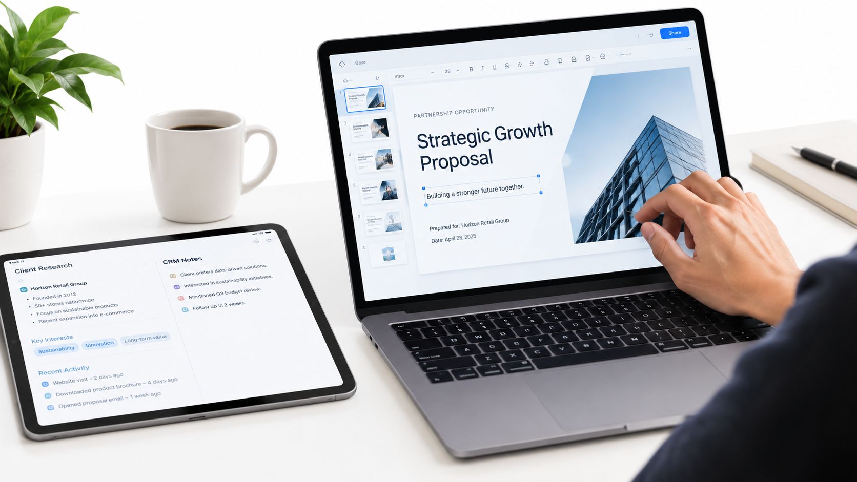
Use CRM notes, call transcripts, and mutual action plans to sharpen the recommendation. Do not dump them onto the slide.
A workable workflow is simple. Lock the template structure. Define which modules are fixed, which are editable, and which pull from governed data. Then review the finished deck with one hard question: does this proposal reflect how this account will buy, or did you just decorate the standard version?
Adding Interactivity and Live Data That Actually Helps Buyers Decide
Buyers rarely need more motion. They need less uncertainty.
That is the standard I use for interactive proposal elements. If a widget, video, or live chart helps a buyer validate scope, pressure test assumptions, or share a clearer recommendation internally, it earns its place. If it adds clicks without improving the decision, it lowers the quality of the proposal.
Static decks still do a lot of work well. Interactive proposals help in a narrower set of situations, usually in multi-stakeholder deals where pricing, rollout assumptions, or performance data may change during review. The better framing is not deck versus microsite. It is whether the proposal needs to behave like a governed system across live presentation, async review, forwarded links, and exportable files.
Use static when the decision is already narrow
A plain PDF or slide deck often wins because it is easy to circulate and hard to break.
Keep the proposal static when:
- Pricing and scope are settled: No one needs to test scenarios or compare changing assumptions.
- The file will be forwarded widely: Procurement, legal, finance, and executive reviewers often want something exportable.
- The story still needs agreement: If the buyer has not aligned on the problem, interactive elements add noise.
- Your team cannot govern the data source: A stale live widget hurts trust more than a static chart ever will.
Static slides are often the higher-converting choice because they reduce friction.
Add interactivity where buyers need to inspect, not just read
Interactive elements work best when the buyer has a real decision task. They need to compare package options, review current usage data, understand rollout by region, or see a workflow that screenshots flatten too much.
Useful formats include:
- ROI or pricing calculators: Good for proposals with multiple commercial paths or variable seat, usage, or services assumptions.
- Live charts tied to governed data: Useful when the buyer will question freshness and your team can control the source.
- Embedded video clips: Strong for product flows, implementation overviews, or executive summaries the buyer may watch asynchronously.
- Interactive rollout views: Helpful when timing, geography, dependencies, or team ownership shape the buying decision.
I would not add all four to the same proposal. One or two well-chosen interactive elements usually outperform a feature-heavy deck.
For teams building web-native proposals, platforms such as Encelade’s interactive slide workflow support widgets, live Sheets or API-fed data, and responsive link sharing while still allowing PDF or PPTX exports when a buyer needs a static copy.
Apply a simple filter before you add anything
Use three checks.
- Will this help the buyer answer a real approval question? If it does not help someone defend budget, timeline, risk, or expected return, cut it.
- Can your team keep it current without manual cleanup? Live data only helps when ownership is clear and the source is reliable.
- Does it fail gracefully? Every interactive proposal needs a strong fallback. Exports, screenshots, and summary callouts should still carry the argument.
One more trade-off matters. Interactivity changes how proposals are consumed. A CFO may open the PDF. A champion may share the live link. A solutions lead may watch the embedded demo. That is why the proposal template should be designed as an omnichannel system with governed modules, not just a sequence of slides.
If an interactive element needs a seller on the call to explain why it exists, remove it.
Good proposal interactivity feels quiet. Buyers get clearer answers, faster, and the proposal stays trustworthy whether they view it live, alone, or forwarded inside the account.
Branding Governance Sharing and Analytics for Scale
Once the template works on one deal, the next problem starts. How do you stop ten reps from turning it into ten different decks?
A proposal presentation template only scales when the team can control branding, share one current version, and learn from buyer engagement instead of guessing.

Brand governance should be light, not bureaucratic
Overgoverned templates create workarounds. Undergoverned templates create chaos. The middle ground is a theme-based system with locked essentials and flexible modules.
What usually needs control:
- Typography and color: These should come from a shared theme, not manual slide edits.
- Core layouts: Cover, executive summary, pricing, and CTA should stay structurally consistent.
- Approved proof assets: Testimonials, logos, and case modules should come from a current library.
- Export behavior: Teams need a standard for when to send a link, a PDF, or a PPTX.
What should remain flexible is the buyer story. Reps need room to change copy, sequence supporting examples, and tune commercial framing without rebuilding the visual system.
Sharing should eliminate version drift
File attachments create the usual mess. “Final” becomes “final-v3-clientedits-revised.” A buyer opens the wrong copy. Internal reviewers comment on an outdated export. Nobody knows what the prospect saw.
Link-based sharing solves most of that because everyone works from one current version. Exports still matter for offline review, compliance, or formal submission, but they should be fallback formats, not the operating model.
If you’re documenting that workflow, this overview of proposal automation for revenue teams is a useful reference for connecting generation, brand control, and distribution.
Analytics should drive follow-up, not vanity reporting
Proposal analytics are only useful if they change what the seller does next.
The most practical signals are:
| Signal | What it tells you | What to do next |
|---|---|---|
| Views opened | The proposal got attention | Follow up while interest is active |
| Time on pricing | Commercial review is happening | Prepare pricing clarification or options |
| Drop-off before proof | The narrative isn’t establishing trust early enough | Tighten the opening and move proof sooner |
| Repeated visits | Internal circulation or active evaluation | Ask who else is reviewing and what they need |
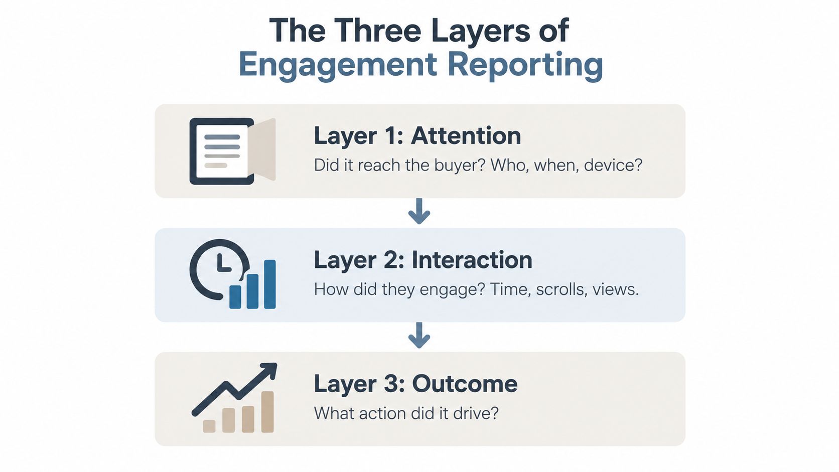
Follow-up speed matters here. Proposals sent within 24 hours of a prospect’s inquiry are about twice as likely to close, according to Agiled’s proposal statistics roundup, and Storydoc’s reading data shows the odds a proposal even gets opened fall from 82% in the first hour to 48% after a day. Speed isn’t a nicety; it is most of the follow-up advantage.
The point of analytics isn’t to admire engagement. It’s to know when to call, what to clarify, and which slide is losing the room.
A scalable proposal system is operationally boring in the best way. The template stays on-brand. The current version is easy to share. The team can see what buyers engaged with. And managers can improve the template with evidence instead of taste debates.
Launch Checklist and Next Steps for Your Proposal Template
A proposal presentation template is ready when it helps the team send faster, personalize intelligently, and follow up with confidence. If it still requires a rep to rewrite half the deck or manually refresh every number before sending, it’s not ready.
Start with a hard launch checklist.
Validate the template before rolling it out
Use this checklist on one live deal before you push it across the team:
- Structure check: The first three slides make the case quickly and clearly.
- Length check: The main deck stays tight, with extra detail moved to appendix or linked assets.
- Personalization check: Executive summary, discovery, proof, and pricing can be updated without layout surgery.
- Interactivity check: Every live widget, video, or calculator has a clear job and a fallback version.
- Brand check: Themes, proof assets, and pricing formats are standardized.
- Sharing check: Link-based review works cleanly, and export options are available when needed.
- Analytics check: The team can see views and engagement in a way that informs follow-up.
Avoid the common failure modes
Most proposal systems don’t break because of design. They break because the workflow around them is sloppy.
Watch for these issues:
- Delayed sends: Interest decays fast if the proposal arrives a day late.
- Overbuilt first versions: Reps keep polishing instead of shipping the decision-ready draft.
- Generic proof: Testimonials and examples don’t match the account context.
- Unclear CTA: The deck ends politely instead of asking for a concrete next step.
- No iteration loop: Teams keep reusing the same template without reviewing what buyers engage with.
Visual quality still matters. One report says visually designed proposals with images, cover pages, or video convert 82% better than plain-text proposals, according to Better Proposals’ proposal report. But that doesn’t mean adding visual weight everywhere. It means using presentation format to improve clarity and momentum.
Pilot it on a live opportunity this week
Don’t wait for a perfect master template. Build the system around a real deal, test it under time pressure, and fix what creates friction.
The strongest next move is simple. Pick one active opportunity. Send the proposal fast. Watch how the buyer engages. Then adjust the template based on actual review behavior, not internal opinions.
That’s how a proposal presentation template becomes a working revenue asset instead of another pretty file in the content library.
Encelade gives revenue teams a practical way to build this kind of proposal system. It turns research, CRM notes, spreadsheets, and documents into web-native decks with interactive widgets, live data, brand controls, link sharing, and PDF or PPTX exports when buyers need them. If you’re rebuilding proposal decks by hand or fighting version drift across the team, visit Encelade.