You’re probably here because a real opportunity is in play. A prospect asked for a company overview before the next meeting. An investor wants a deck by tomorrow. A procurement team needs a profile before they’ll even review your proposal. Then someone opens the current file and finds a dated PDF, generic copy, missing compliance details, and a leadership section that says almost nothing.
That’s where most companies lose momentum.
A strong corporate profile template isn’t just a document to “have on hand.” It’s the fastest way to explain who you are, why you’re credible, what you sell, and why a buyer, partner, or investor should keep moving. The problem is that most advice still treats the profile like a static brochure. That’s outdated. The teams getting better results now build profiles that work well as clean static documents and can also evolve into interactive, data-driven presentations for live selling in 2026.
What Is a Corporate Profile and Why It Matters
A corporate profile is your company’s first serious proof of competence. It combines the job of a handshake, a credentials file, and a positioning statement. When it’s done well, it helps a buyer understand your business quickly and gives them enough confidence to keep the conversation going.
When it’s weak, the damage is immediate. Buyers assume the company is immature, inconsistent, or hard to evaluate. That reaction often has less to do with your actual capability and more to do with how poorly the information is packaged.
Most guidance on a corporate profile template still centers on static sections like mission, history, and team — the exact structure laid out in Indeed’s business profile template guidance — while ignoring account-specific context and live metrics for B2B sales decks. That gap matters because modern buyers don’t just want a polished summary. They want relevance.
Think of it as a business passport
A good profile opens doors. It helps you pass the first screen with:
- Enterprise buyers who need a quick vendor overview
- Investors who want operational clarity, not marketing fluff
- Partners who need to assess fit fast
- Candidates who are deciding whether your company looks credible
A weak profile does the opposite. It creates extra work for the reader, and readers rarely volunteer for extra work.
Practical rule: If your corporate profile template forces a prospect to ask basic questions about what you do, who runs the company, or how to contact you, it’s not doing its job.
What the document must achieve
A useful profile has three jobs.
First, it establishes trust fast. That means clear leadership identity, a grounded company story, and enough operational detail to show this is a real business.
Second, it gives the reader a clean narrative. They shouldn’t have to piece together your value from scattered slides, outdated screenshots, and vague claims.
Third, it needs to support action. A profile that looks good but doesn’t help sales, due diligence, or qualification is just branded furniture.
That’s why I treat the corporate profile as a working commercial asset, not a design exercise. If your team also builds proposals or stakeholder decks, the thinking behind a strong business case template for decision-making is useful here too. The same principle applies. Structure drives confidence.
The Anatomy of a Winning Corporate Profile
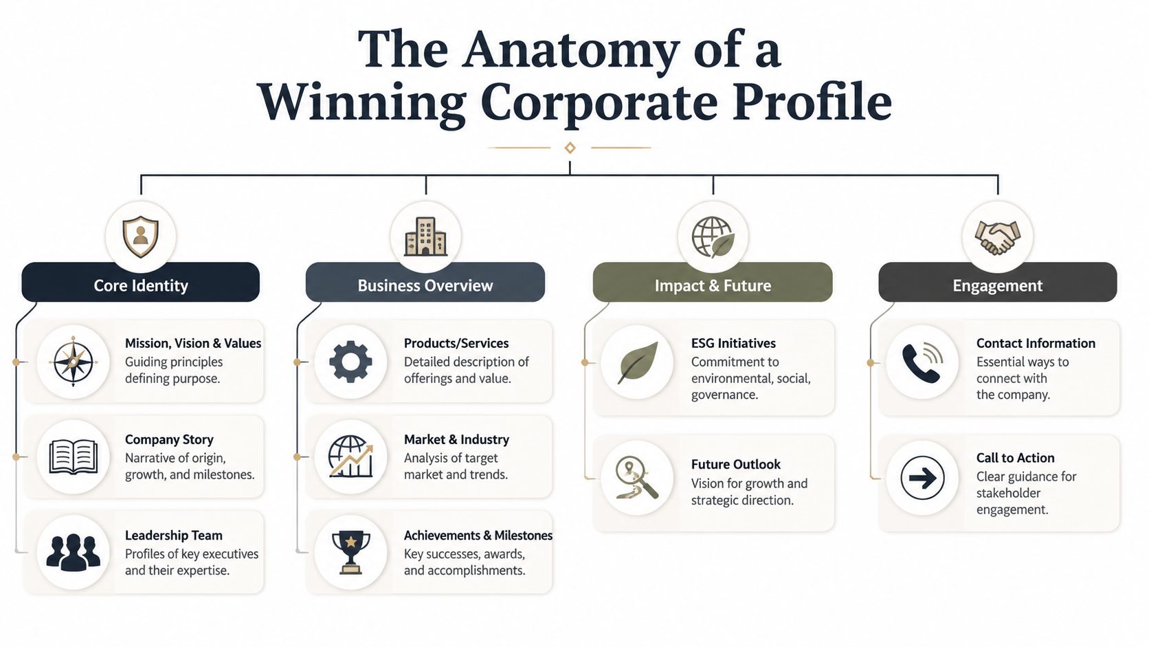
The best corporate profiles are complete without being bloated. They answer the right questions in the right order. They also avoid a common mistake. They don’t dump information equally. They emphasize the parts that reduce risk for the reader.
Core identity sections
Start with the sections that explain what the company is and why it exists.
- Mission, vision, and values. Keep this tight. One short statement for each is enough. If this section runs long, it usually means the company hasn’t clarified its positioning.
- Company story. Give readers a narrative they can retain. When did the company start, what problem did it set out to solve, and what changed as it grew? This isn’t autobiography. It’s context.
- Leadership team. This section carries more weight than most companies realize. A technically optimized corporate profile template should align with Google’s E-E-A-T principles by embedding human faces and explicit expertise credentials to strengthen trustworthiness, as explained in Anjit VS company profile examples. In practice, that means names, roles, relevant experience, and a clear reason each leader matters.
Buyers trust people before they trust slogans.
Business overview sections
Once identity is clear, move into commercial substance.
| Section | What it needs to do |
|---|---|
| Products or services | Explain the offer in plain language, then connect it to the buyer problem it solves |
| Target market | Show who you serve best and where you fit |
| Industry context | Help readers understand your category, without turning the profile into a market report |
| Business model and operations | Clarify how the company makes money and how it delivers value |
The business model and operations section is often missing, and that’s a mistake. Investors, partners, and procurement teams all use it to judge whether your company is understandable and viable. If you only describe features or capabilities, you leave out the commercial engine.
Proof, governance, and action
A profile also needs the sections that close credibility gaps.
- Milestones and achievements. Use this to show progress, not vanity. Product launches, expansion moments, certifications, or major client categories work better than generic praise.
- Legal and company information. This belongs in the main document, not hidden in an appendix. Include the company name, headquarters, registration details where relevant, and the operating footprint.
- ESG or responsibility information. Only include this if it’s real and material. Empty claims weaken trust.
- Contact and CTA. End with the exact next step you want the reader to take.
The sequence that works
The strongest order is usually:
- Identity
- Story
- Leadership
- Offer
- Market
- Operating model
- Milestones
- Legal information
- Contact and CTA
That sequence mirrors how a serious reader evaluates risk. They want to know who you are, whether you’re credible, whether the business makes sense, and how to proceed.
Writing and Designing for Maximum Impact
Most corporate profiles fail in two places. The writing sounds like every other company in the category, and the design looks inconsistent enough to raise doubts about the business itself.
You don’t need clever language. You need precise language. Buyers respond to clarity because clarity signals operational discipline.
Write like an operator, not a brochure
Replace broad claims with specifics. Instead of “we deliver effective solutions,” say what you do, for whom, and what changes after implementation. The same rule applies to your company story. “Founded to transform the industry” says nothing. A sharper version explains the market gap that pushed the company to launch.
Use this filter when reviewing every section:
- Can a new reader understand this in one pass?
- Does this sentence explain a real capability?
- Would a buyer repeat this back correctly after reading it?
If the answer is no, rewrite it.
A simple fix is to make each section answer a real stakeholder question. The team section answers “who’s behind this company?” The services section answers “what exactly do they provide?” The business model answers “how do they operate?”
Design for trust, not decoration
Visual consistency matters because readers use it as a proxy for professionalism. A high-performance corporate profile template should use the same fonts and font sizes for headers and body text, kept consistent with the rest of your brand, according to TemplateLab’s company profile guidance.
That sounds basic, but it affects everything. If header sizes jump around, colors vary by page, and image treatment changes from section to section, the profile feels assembled rather than managed.
Use a simple design system:
- Typography rule: one heading family, one body family, one scale
- Color rule: one primary brand color, one accent, neutrals for the rest
- Layout rule: repeat margin, image, and caption logic consistently
- Image rule: use real leadership photos, office images, product visuals, or diagrams. Drop generic stock photos unless they add actual context
For charts, timelines, and comparative visuals, good presentation design follows the same standards used in strong data visualization best practices for business storytelling. The visual should reduce friction, not create interpretation work.
Editorial note: The cleanest corporate profiles feel restrained. They don’t fight for attention on every page.
The CTA is not optional
End with a real next action. Give the reader a website, email, direct contact, or meeting path. Don’t make them search LinkedIn, scan an email signature, or ask your sales rep for the basics.
A strong CTA does one thing well. It removes hesitation.
Downloadable Corporate Profile Templates for 2026
Most people searching for a corporate profile template don’t want theory first. They want a starting point they can use today, then improve. That’s reasonable. The trick is choosing a template that matches your business model instead of forcing every company into the same layout.
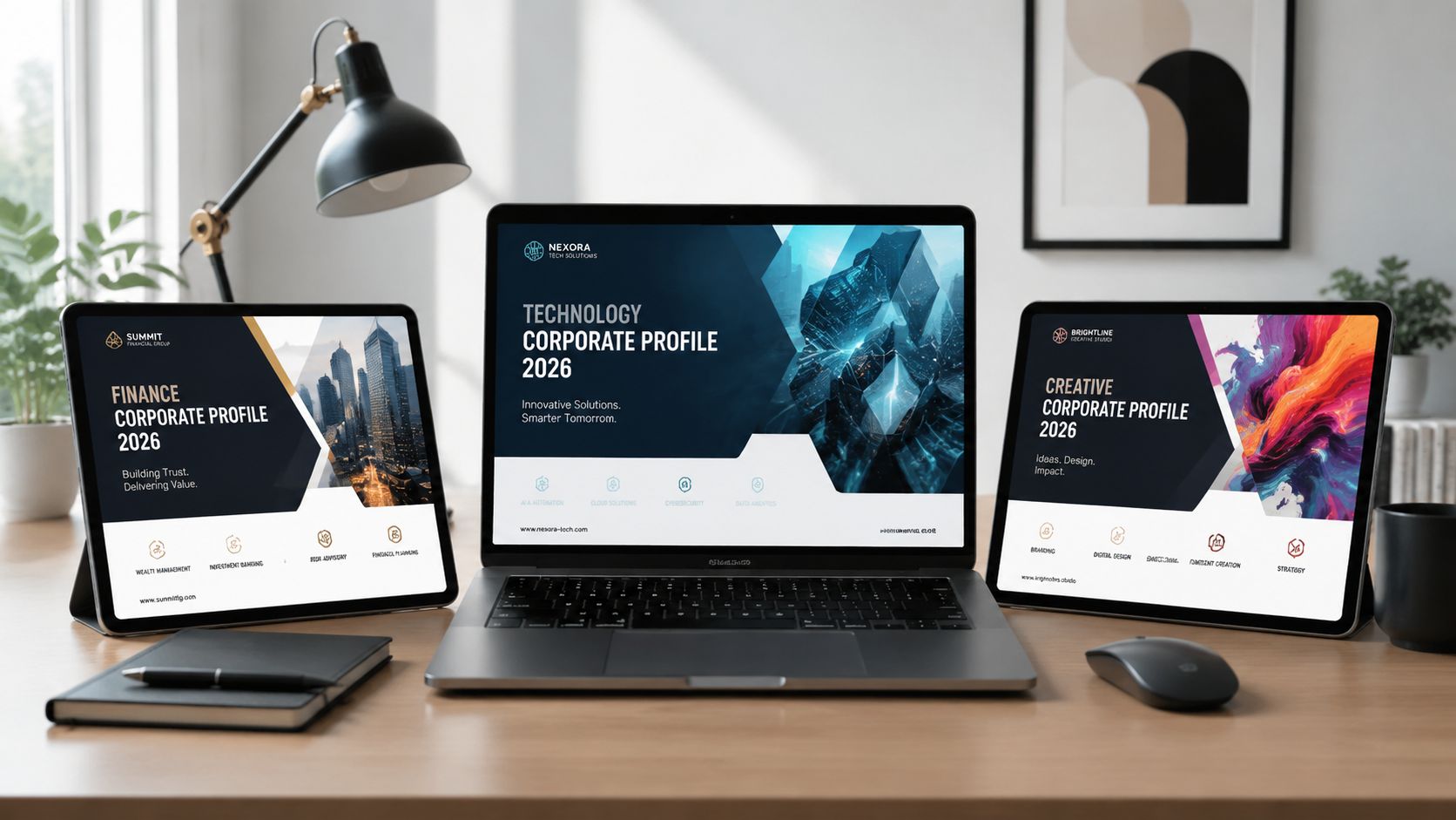
Template one for startups raising early credibility
This version should be lean. Keep it focused on the problem, the founder story, the market need, the product summary, and the near-term roadmap. Early-stage companies usually hurt themselves by pretending they’re larger than they are.
Use this if you need:
- Investor conversations with a concise operating story
- Partnership outreach where speed matters
- Early enterprise intros that require basic company context
The tone should be confident but grounded. Don’t overload it with decorative pages.
Template two for established B2B service firms
This is the most practical format for consultancies, agencies, software services companies, and managed service providers. It needs a clear business overview, service categories, target industries, delivery model, leadership bios, legal details, and a strong contact section.
This template works because B2B buyers usually evaluate risk through structure. They want to see how the firm operates, not just what it claims.
A useful section order looks like this:
| Page group | Purpose |
|---|---|
| Company overview | Establish who you are and where you fit |
| Service lines | Clarify the offer without jargon |
| Team and expertise | Reduce perceived delivery risk |
| Track record and milestones | Show maturity and momentum |
| Operational and legal details | Support qualification and procurement |
A practical walkthrough can help when you’re adapting one of these formats into a presentation. This example is useful for seeing how a profile-style deck can be framed visually:
Template three for creative and brand-led firms
Creative agencies, architecture studios, production companies, and design consultancies need a more visual version. The mistake here is turning the profile into a portfolio. A portfolio shows work. A corporate profile explains the business behind the work.
Build this template around narrative case snapshots, founder or leadership identity, creative philosophy, capabilities, industries served, and client engagement model. Keep copy short and let imagery carry more of the story, but don’t skip the company fundamentals.
The right template saves time. The right structure wins trust.
Real-World Corporate Profile Examples Analyzed
A good way to judge a corporate profile template is to look at how it performs in different business contexts. The layouts below are fictionalized, but the situations are common and the design choices are realistic.
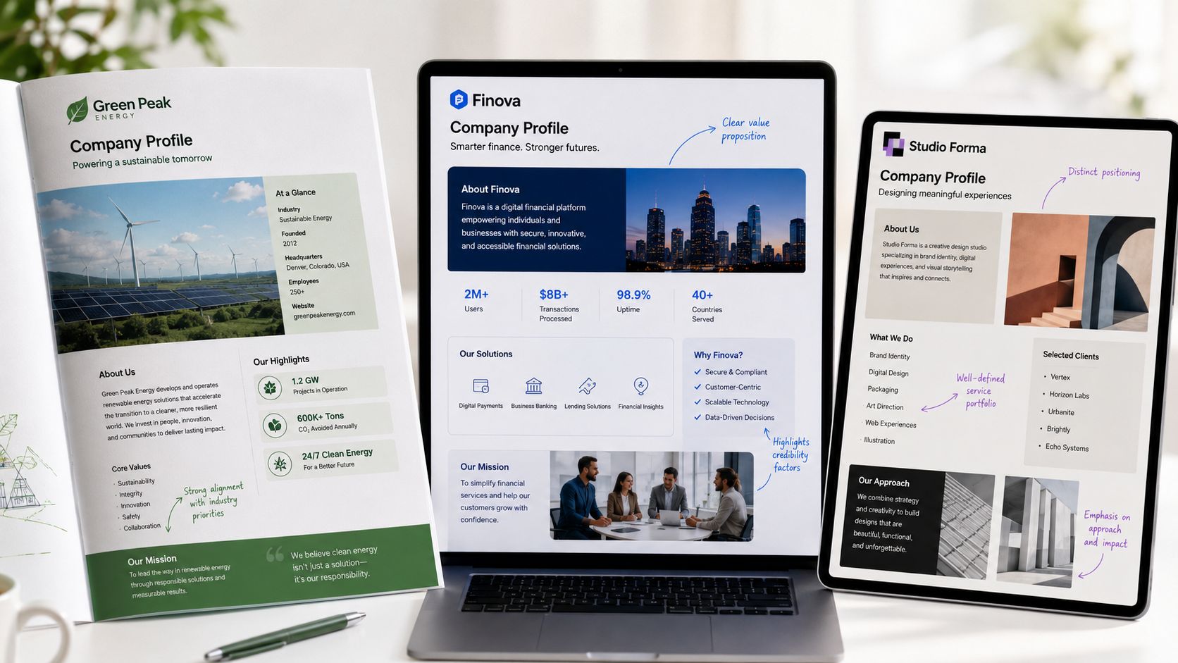
Example one: B2B software vendor
This company sells workflow software to mid-market operations teams. Its profile opens with a simple company summary, then moves straight into a timeline of product development, category focus, and leadership backgrounds.
Why it works:
- The opening is specific. It says who the company serves and what problem it addresses.
- The timeline creates coherence. Readers can see the company’s progression without reading dense paragraphs.
- Leadership bios are tied to expertise. Each executive profile explains relevant operating or technical experience.
What doesn’t work in weaker software profiles is the temptation to lead with feature grids. Buyers first need to trust the company. Product depth comes after that.
Example two: industrial manufacturer
This profile belongs to a company selling components into regulated supply chains. The document is less brand-heavy and more operational. It gives clear product categories, manufacturing capabilities, compliance information, locations, and contact paths for procurement teams.
That profile succeeds because it respects the reader’s intent. Procurement doesn’t want a manifesto. It wants legitimacy, traceability, and clean access to the facts needed for vendor review.
A serious corporate profile meets the reader where they are. It doesn’t force every audience through the same story.
The strongest part of this example is the legal and company information block. It isn’t buried. It’s visible and easy to verify.
Example three: creative agency
This agency profile takes a different route. It opens with positioning and visual identity, then uses selected project snapshots to support its capability claims. The team page is compact, and the contact section is prominent.
What it gets right:
- It balances style with business clarity.
- It avoids turning every page into an ad.
- It gives enough operational detail to reassure a brand client that the agency can deliver.
What would improve it is a clearer business model section. Many creative firms explain their taste but not their working method. Buyers need both.
The shared pattern across good examples
Across all three, the same principle holds. Effective profiles reduce uncertainty. They don’t try to impress with volume. They organize evidence so a buyer, investor, or partner can move toward a decision with less friction.
From Static Document to Interactive Experience
Static PDFs still have a place. Some buyers want an attachment. Some internal teams need a file for archives. Some procurement flows still expect offline formats. But if your corporate profile exists only as a static document, it’s already behind how modern B2B teams present.
That shift is measurable. Interactive content earns roughly twice the engagement of static content, according to HubSpot’s roundup of interactive content research (citing DemandGen Report). A corporate profile that only exists as a fixed PDF leaves that advantage on the table. That changes what a strong profile needs to do.
Where static profiles break down
The problems are practical, not philosophical.
A PDF goes stale quickly. Revenue figures, customer counts, regional coverage, implementation timelines, and product visuals all change. Every update creates another version, another resend, and another opportunity for mismatch between what sales says live and what the document shows.
Static files also limit how you tell the story. A map is just a picture. A product model is just a screenshot. A timeline is fixed. The reader can’t explore, and your team can’t tailor the experience by audience without making another copy.
What a modern profile can do instead
An interactive version turns the same core structure into something more useful:
- Live metrics can sync from Google Sheets or APIs instead of being manually replaced
- Interactive maps and charts can give stakeholders more context without bloating the layout
- Native 3D or embedded scenes can help technical buyers understand products more clearly
- Link-based sharing keeps everyone on the same version
This is the missing layer in most corporate profile template advice. The template shouldn’t only help you fill in sections. It should give you a path to turn those sections into a responsive sales asset.
If your team is exploring that shift, this guide on making interactive slides for business presentations is a practical reference for thinking beyond file-based decks.
Working rule: Keep the profile’s core narrative stable, then make the proof layer dynamic.
A better way to think about the file
Don’t choose between static and interactive. Build for both.
Start with a clean master structure that exports well to PDF. Then create a web-native version that supports current data, richer product visuals, and audience-specific tailoring. The same corporate profile template can underpin both formats if the content model is sound.
That’s the significant upgrade. You stop treating the profile as a one-time document and start using it as a living commercial system.
Turn Your Profile into a Revenue-Driving Asset
A corporate profile should help close the gap between interest and action. If it only summarizes your business, it’s underperforming. If it helps qualify buyers, support due diligence, strengthen procurement confidence, and move live sales conversations forward, then it’s doing real work.
That shift starts with the basics. Get the structure right. Make sure the leadership, business model, legal details, offer, milestones, and CTA are all present and useful. Then make the writing sharper and the design more disciplined.
What strong teams do differently
They treat the profile as an operational asset.
They review it when messaging changes. They update it when leadership changes. They adapt it for audience type. They don’t leave it in a shared folder for two years and hope nobody notices.
The next improvement is format. Sales reps already lose most of the week to non-selling work — only about 34% of their time goes to actual selling, with the rest spent on admin, meetings, and searching for information, per Salesforce’s State of Sales data compiled by SuperOffice. Manually refreshing figures across profiles and decks adds to that load. Interactive presentations that sync live figures from Google Sheets or REST APIs keep the numbers current without another manual pass. That matters because outdated numbers don’t just look sloppy. They create doubt.
The practical standard for 2026
A high-impact corporate profile template should now do four things well:
- Explain the company clearly
- Prove credibility quickly
- Adapt to different stakeholder needs
- Stay current without heavy manual work
That’s how a profile stops being a formality and starts supporting revenue.
If your current version is static, generic, and hard to maintain, don’t start by polishing the cover page. Rebuild the content architecture. Tighten the message. Add the sections serious buyers need. Then move the profile into a format your team can keep current and use in live conversations.
Final takeaway: The best corporate profile isn’t the prettiest one. It’s the one that helps the next stakeholder say yes faster.
Encelade is a strong next step if you want your corporate profile to do more than sit as a PDF in someone’s inbox. It helps sales, marketing, and revenue teams turn research, spreadsheets, CRM notes, and documents into interactive, web-native presentations with live data, branded layouts, and richer storytelling elements. If your team wants a corporate profile that stays current and works harder in real deals, it gives you a format built for exactly that.