The best comparison chart isn’t the one with the most features. It’s the one that removes a specific buying uncertainty before the next sales conversation. A buyer deciding between CRM platforms needs a capability answer, a finance stakeholder needs a value path, and an IT leader needs confidence that the preferred option will fit the existing stack.
The eight examples below cover side-by-side feature comparisons, pricing decisions, market positioning, segment fit, value realization, implementation risk, business outcomes, and ecosystem compatibility. For each one you’ll find the buyer question it answers, the decision stage where it belongs, how to structure it, where it tends to go wrong, and how to build it in Encelade with the layer that fits: a Table, the Pricing layer, a Quadrant chart, a Harvey Ball Table, an ROI Calculator, a Gantt, Statistics cards, or a Logo wall.
Start with the question, not the chart. Omni’s data visualization guidance puts the rule simply: when the question is about change over time, use a line chart, and when it’s about ranking or comparing categories, use a sorted bar chart. The same logic runs through every format below.
Comparison charts are older than slide software. For more than a century, atlas publishers printed comparative views of the world’s mountain heights and river lengths, with some of the earliest examples appearing in Europe toward the end of the 18th century, according to the David Rumsey Map Collection. Charles Smith’s comparative view of the world’s principal mountains, published in London in 1816, is an early example in that collection. The job hasn’t changed: put the options on one scale so the reader sees the difference without doing the arithmetic.
Table of Contents
- 1. Product Feature Comparison Matrix
- 2. Pricing Tier Comparison Chart
- 3. Competitive Landscape Scatter Plot
- 4. Customer Segment Needs vs. Solution Fit Matrix
- 5. ROI and Value Realization Timeline Comparison
- 6. Implementation Approach and Timeline Comparison
- 7. Success Metrics and KPI Achievement Comparison
- 8. Integration and Ecosystem Compatibility Matrix
- Comparison of 8 Chart Types
- Turn the Best Comparison Format Into a Sales Asset
1. Product Feature Comparison Matrix
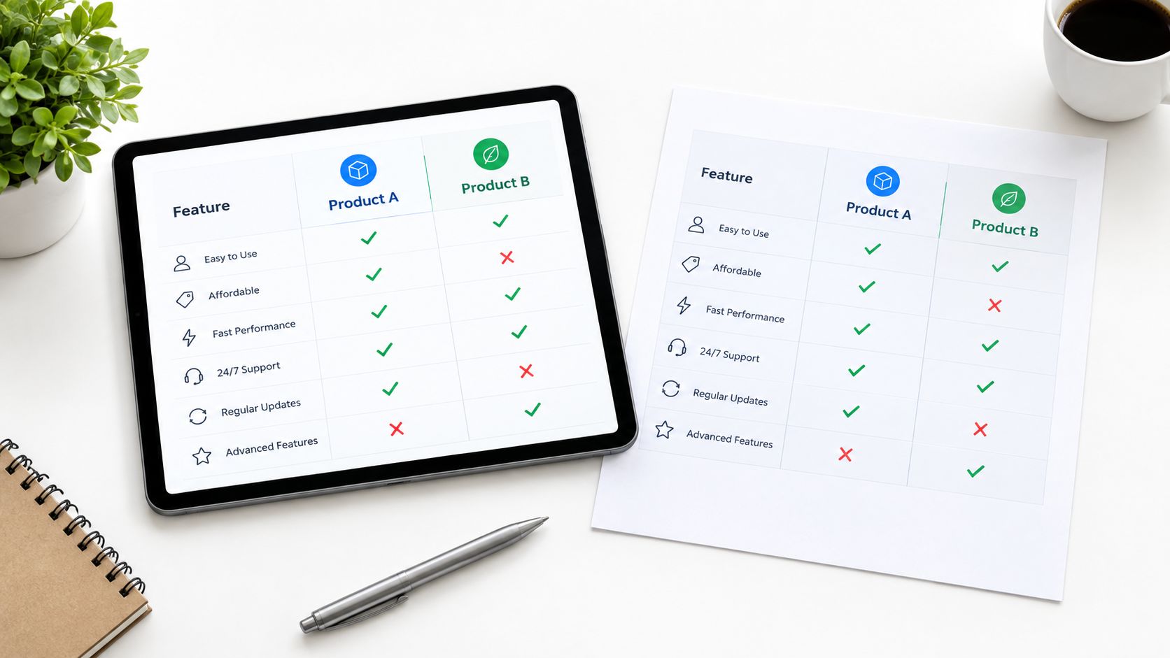
A product feature matrix answers a direct buyer question: Which option covers the capabilities our team considers essential? It works best during consideration, when prospects have already defined their problem and are testing vendors against a common set of requirements.
The structure is simple. Put the decision criteria in rows and the products or services in columns. Use checkmarks, crosses, tier labels, or short explanations, but apply the same visual language throughout. A Salesforce versus HubSpot CRM comparison, an AWS versus Azure versus Google Cloud capability view, or a SaaS upgrade-path matrix can all use this structure.
The risk is false precision. A checkmark may suggest that two vendors offer equivalent functionality when one provides a basic version and the other supports a deeper workflow. Replace bare symbols with labels such as native, available through integration, limited, or requires configuration. When the real question is how deep the support goes, a Harvey ball, a circle filled in quarter steps from empty to full, shows depth at a glance where a checkmark can’t.
Practical rule: Put must-have capabilities first. If a feature doesn’t affect the buying decision, move it to a detail page or remove it.
Build it in Encelade: add a Table layer and choose the Comparison style. It treats the second column as yours and tints it in your theme’s accent color, and it colors the text of any cell that holds only ✓ or “Yes” green (your accent color in your own column), ✗ or “No” red, and “Partial,” “Limited,” or “N/A” grey, so a row of verdicts reads at a glance. Paste a range from a spreadsheet to fill it in one step. For depth ratings, use a Harvey Ball Table instead: rows and columns carry your labels, each cell is a ball, and you can highlight one row or one column.
Make the matrix useful in a sales conversation
Organize rows around buyer priorities, not your product taxonomy. An enterprise security team may care about permissions, auditability, and deployment controls, while an executive may care about adoption, reporting, and time to value. The same product can therefore require different matrices for different audiences. Duplicate the page for each audience and put its priorities in the top rows rather than building a second deck.
Use color sparingly. The Comparison style already sets your column apart, so any extra highlight should mark a meaningful difference, not turn every advantage into a promotional badge. Start from discovery: the requirements the buyer raised should be the first rows they see. If a partner needs the same comparison in its own look, switch the deck’s Theme. Themes restyle every page at once, and the Table follows the theme’s colors, so nothing needs rebuilding.
Keep the first view short. Put the three or four differences that matter to this buyer on a summary page as side-by-side cards, then put the full Table on the next page. Links inside table cells stay clickable in the shared deck on desktop and tablet, so each claim can point to its evidence: a documentation page, a security note, or a case study. A Button set to “Go to a slide” lets the presenter jump from the summary to the detail only when the buyer asks for it. That keeps the chart persuasive without making it feel evasive.
2. Pricing Tier Comparison Chart
Pricing comparisons answer Which package fits our budget, use case, and expected level of support? They belong near qualification and commercial evaluation, when the prospect needs enough context to select a viable path without starting another round of email exchanges.
A useful chart compares more than price. Show the package name, intended user, included capabilities, limits, support model, and upgrade trigger. Slack’s Free, Pro, Business+, and Enterprise+ plans illustrate how tiers can serve different operating needs, and HubSpot’s plan comparisons make the relationship between access and package explicit.
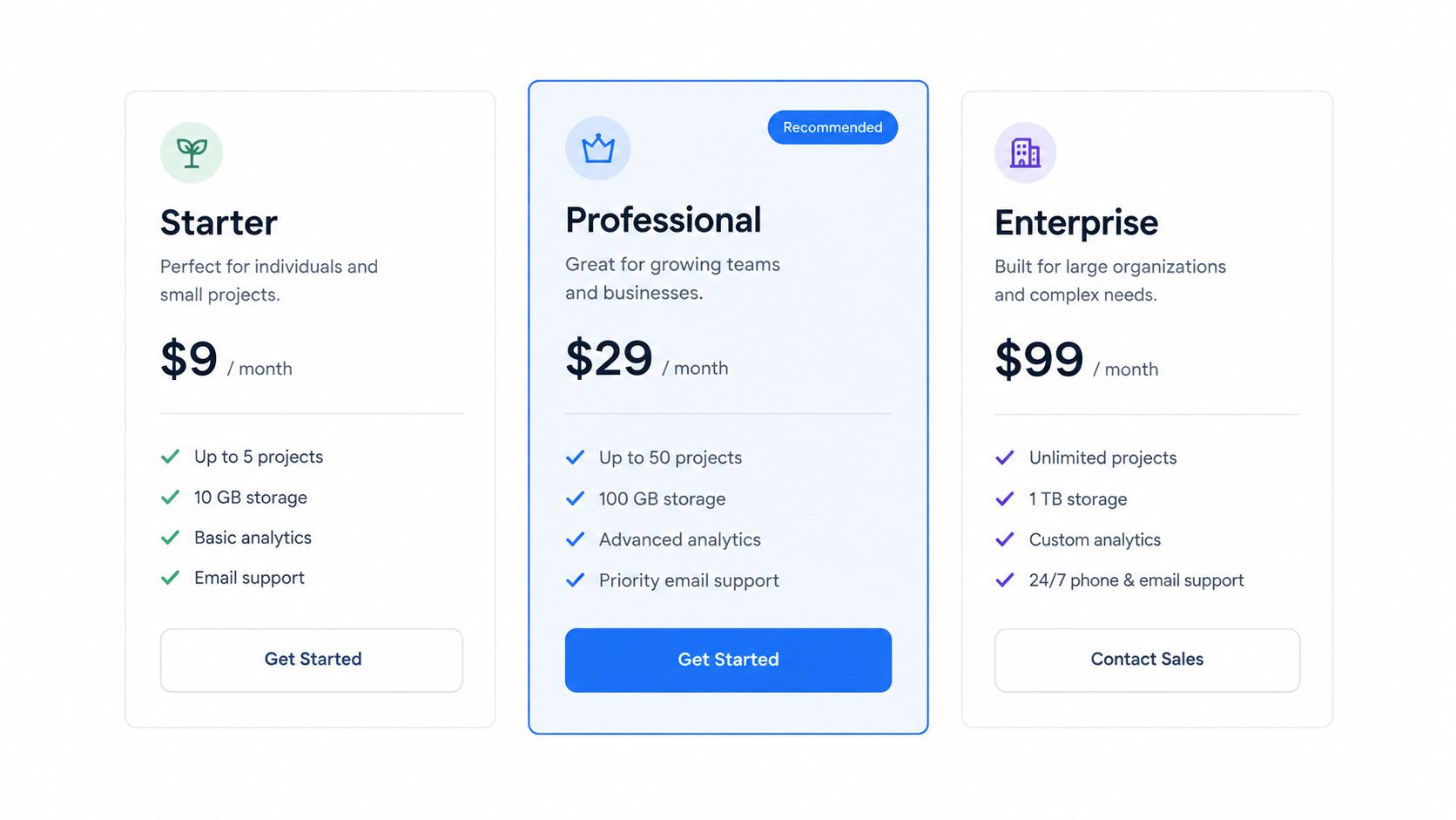
Build it in Encelade: the Pricing layer places up to four plans side by side. Each plan gets a name, an optional eyebrow badge above it, a price with a suffix such as “/ user / month,” a feature list where every line can carry a short supporting note, a button with its own link, and an accent color. Prices are free text, so an enterprise tier can simply read “Custom.” For Encelade’s own current plans, point prospects to the Encelade pricing page rather than copying figures that may change.
Guide without manipulating
Highlighting a recommended tier helps buyers orient themselves, but the recommendation needs a reason. In the Pricing layer, Highlight plan fills one card with the accent color, and the plan’s eyebrow adds a visible badge above its name, such as “Recommended” or “Most popular.” Keep the badge to a word or three and make the reason the plan’s first feature line: best fit for a distributed sales team or for organizations that need shared governance, not merely best value. A buyer should understand why the tier is relevant before accepting the anchor.
Create persona-specific versions. A startup may care about affordability and rapid setup, while an enterprise evaluation group may focus on permissions, support, and governance. Show the two or three plans that fit this buyer rather than every plan you sell. Showing every plan to every audience creates noise and can make a straightforward purchase appear more complicated than it is.
A pricing chart also works well next to a calculator. Encelade’s ROI Calculator takes number or slider inputs, such as seats, usage, or hours saved, and turns them into results with formulas you write. Buyers can move the sliders in the shared deck and watch the results update. Keep the assumptions visible in a text card beside it, especially if the result is an ROI estimate. A calculator that hides its inputs damages trust faster than a plain pricing slide.
Match the chart to the decision stage
At first contact, use a compact overview with the main differentiators. During evaluation, add feature detail and a scenario-based recommendation. Near proposal, move from tiers to a quote. The Pricing quote layer lists line items with a discount and tax, and any item you mark optional becomes a checkbox the buyer can switch on or off while the total updates. Set it beside the implementation scope, the responsibilities on each side, and the next commercial action.
The presentation risk is outdated information. Pricing copied into attachments goes stale the day it changes. An Encelade deck is shared as a link, so correcting a price in the deck corrects it for everyone who has the link, and each plan’s button can open your live pricing page for the final word.
3. Competitive Landscape Scatter Plot
A scatter plot answers a positioning question: How does each option trade cost, capability, speed, or complexity? It belongs in strategic evaluation, especially when a buyer has shortlisted several vendors but still lacks a clear mental model of the market.
Place competitors on two axes that reflect the buyer’s priorities. Price versus capability can help infrastructure buyers understand trade-offs. Ease of use versus advanced functionality may suit a product-led software discussion. Time to value versus total cost of ownership can give a revenue team a more commercially relevant frame than a generic feature list.
Quadrant visuals such as the Gartner Magic Quadrant or Forrester Wave are familiar examples, but familiarity creates a risk. Buyers may assume the axes have an objective meaning when your team has defined them internally. State what each axis measures, identify the evidence behind each placement, and distinguish sourced findings from your own interpretation.
Neutral language earns more credibility than an oversized claim. Position your solution clearly, then show where another vendor may be a better fit.
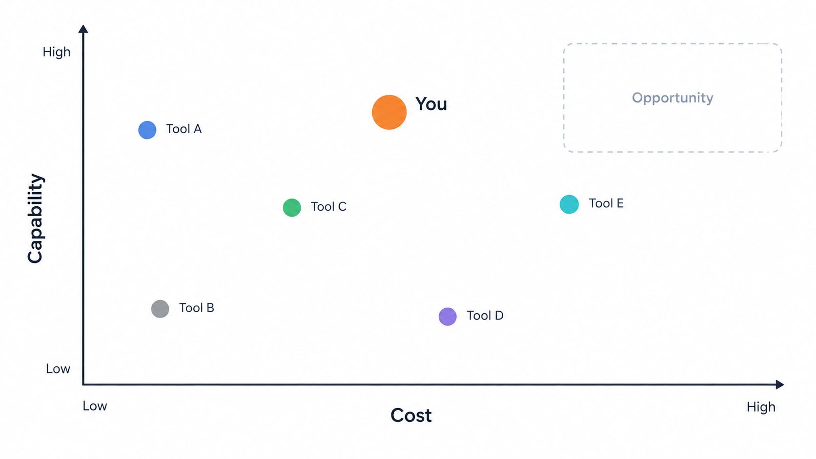
Build it in Encelade: use the Chart layer’s Quadrant type, found under More in the chart picker. Each row of data becomes a point with its name drawn beside it. You name the four quadrants and the ends of each axis, and Point Annotations attach a short note to any point, which is a good home for the source behind a placement. A row named “Our company” or “Your company” is emphasized automatically. The plain Scatter type can’t place a named row on two scored axes, so keep it for unlabeled numeric data and use Quadrant for a labeled landscape.
Build a defensible position
Don’t place your product in the most attractive quadrant because it looks good. Define the scoring method, date the evidence, and explain whether the position reflects public documentation, customer research, analyst work, or internal assessment. If the chart uses third-party research, link to the specific report or methodology instead of relying on an analyst logo as decoration.
Use separate views for different buyer groups. SMB buyers may prioritize implementation speed and administration effort, while enterprise buyers may prioritize governance and extensibility. One universal plot often hides the criteria that determine the purchase, so duplicate the page and re-score the points on each group’s two criteria.
Add a short explanation beside the chart so the viewer doesn’t have to infer your conclusion. For the story around it, see this guide to competitive analysis presentations. The next action could be a persona-specific benchmark, a technical validation, or a guided demo focused on the gap the buyer cares about.
4. Customer Segment Needs vs. Solution Fit Matrix
This format changes the comparison from Which vendor has more features? to Which solution fits our situation? Rows represent customer segments, while columns represent capabilities, pain points, or desired outcomes. Each cell shows the strength of the fit.
For example, a data platform may map value across data engineering, analytics, machine learning, and business intelligence teams. A sales enablement platform may compare fit for small agencies, mid-market organizations, and enterprise creative teams. A vertical SaaS provider can show how its workflows address industry-specific needs more directly than a horizontal tool.
The matrix is most useful during discovery and account planning. Marketing can use it to refine ideal customer profiles and messaging. Sales leaders can use it to decide which opportunities deserve specialist support. Reps can use it to prepare questions before a call rather than presenting a generic capability list.
Build it in Encelade: the Harvey Ball Table is made for this. Label the rows with segments and the columns with needs, then set each ball from empty to full in quarter steps. Highlight the row for the prospect’s segment so the buyer finds their situation first, or highlight one column to follow a single need across every segment.
Tie fit to commercial relevance
Base segment definitions on customer interviews and win-loss analysis. If a segment is defined only by company size, the chart may miss the operational condition that actually predicts fit, such as regulatory complexity, fragmented data, or a need for multi-team governance.
Add commercial context carefully. Deal velocity and annual contract value belong beside the matrix, on a Statistics card or in a note, rather than inside it, and revenue potential shouldn’t override poor product fit. A large opportunity that requires unsupported workflows shouldn’t be presented as a strong match.
A fit matrix should help a rep qualify out as confidently as it helps them qualify in.
Create a version for each priority segment. A personalized prospect deck can highlight that account’s row and lead with the outcomes relevant to it, while an internal playbook can add discovery questions and the evidence for each rating.
The presentation risk is overgeneralization. A full ball needs a reason, such as an available workflow, a validated use case, or a documented integration. Harvey balls carry no text, so keep the reasons one step away: a Table on the next page with one line per rating, each linked to its evidence, keeps the main visual easy to scan.
5. ROI and Value Realization Timeline Comparison
An ROI timeline answers When will this investment produce operational or financial value, and what has to happen first? It works late in evaluation, when a champion must explain the purchase to finance, operations, or an executive sponsor.
A side-by-side timeline can compare deployment, early adoption, process improvement, and later value realization, and it can show how implementation activities support outcomes. For example, the chart may connect configuration, training, and data migration to the point at which a team expects better reporting or more efficient workflows.
The evidence standard must be high. Base projections on validated customer data, case studies, or third-party research. If evidence is limited, use qualitative milestones instead of invented precision. Separate validated outcome, planning assumption, and potential upside so the buyer knows what is known and what remains conditional.
Build it in Encelade: lay out the phases with a Roadmap layer in the Milestone timeline layout. Each milestone takes a name, a short description, and a date written the way you would say it, such as “Month 3” or “Q1 2027.” Put the numbers on a Line chart below it, with value by month. Where the evidence is thin, keep the milestone qualitative instead of attaching a percentage to it.
Show scenarios and dependencies
Use conservative, expected, and optimistic scenarios when the available evidence supports them. Explain the assumptions behind each one, including adoption, staffing, scope, and process change. A realistic timeline that names its dependencies is more persuasive than an aggressive promise that ignores them. Plot the three scenarios as three series on the Line chart. Series toggle, which appears by default once a chart has more than one series, lets a viewer isolate one scenario at a time in the shared deck, and each toggle shows that scenario’s total for the period.
Include a risk layer. Adoption gaps, scope expansion, delayed migration, or missing owner capacity can all slow value realization. Showing those factors doesn’t weaken the business case. It gives the buyer a practical management plan.
When the buyer wants to test the numbers, add an ROI Calculator. You define the inputs, as numbers or sliders with a default and a range, and the outputs, as formulas over those inputs. Viewers change the inputs in the shared deck and the results recalculate. Write the calculation logic and its sources in a text card beside it so reviewers can check the math, and connect the final view to a specific next action, such as validating inputs with finance or scheduling an implementation workshop.
6. Implementation Approach and Timeline Comparison
Implementation comparisons answer a practical objection: Which path gets us live with acceptable effort, cost, and risk? A Gantt chart or timeline is stronger than a paragraph because it exposes sequencing, parallel work, and resource pressure.
Compare approaches such as standard versus custom deployment, a single-country rollout versus a multi-region program, or lift-and-shift versus re-platforming. A Salesforce implementation deck may contrast a standard configuration with a custom build. An ERP comparison may show how phased rollout choices change the critical path.
The key decision isn’t only speed. A faster path may offer less customization. A more thorough path may reduce later rework but require more internal ownership. Show those trade-offs beside the timeline so the buyer doesn’t mistake an early go-live date for lower total risk.
Build it in Encelade: the Gantt layer holds the working plan. Tasks are grouped into phases, each bar carries its owner’s avatar, and a status of Planned, In Progress, or Done shows as a colored dot in the task list, on a weekly, monthly, or quarterly scale with a line marking today. Overlapping bars show what runs in parallel. The Gantt doesn’t draw dependency arrows or milestone markers, so name the hand-offs and decision gates in a short note beside it.
Make complexity visible without overwhelming the audience
Executives need milestones, decision gates, and ownership. Technical teams need dependencies, data flows, testing, and rollback considerations. Give each audience its own view of the same plan rather than one screen that tries to serve both.
For the executive path, ask the AI Assistant to make a Roadmap interactive. It builds the Interactive steps layout with three to five milestones, and clicking a milestone opens that phase’s detail panel, where you can write the owner, the decision gate, and the resource and cost assumptions. Put the full Gantt on the next page for the presales review, and give the assistant the Gantt’s milestone dates so the two views agree.
Show what must happen sequentially, what can happen in parallel, and who owns each dependency.
The presentation risk is presenting an idealized schedule as a commitment. Mark assumptions, customer responsibilities, and approval points. Reference real implementation evidence where available, but don’t imply that another organization’s schedule guarantees the same outcome. End with a workshop or readiness assessment that lets the buyer test the plan against its own constraints.
7. Success Metrics and KPI Achievement Comparison
A KPI comparison moves the conversation from What does the product include? to What should we measure after adoption? It fits business-case development, customer marketing, and executive review because it gives stakeholders an outcome framework rather than another feature inventory.
The chart might compare a prospect’s current baseline with a target state, or show how different customer segments track metrics such as pipeline coverage, conversion, response quality, reporting effort, or time to complete a process. The most useful KPI depends on the buyer’s role. Finance may care about cost control, sales leadership about pipeline quality, and operations about throughput and adoption.
Build it in Encelade: give each headline metric a Statistics card with its value, a label, and a trend chip you set yourself, such as “+18% vs. baseline” marked positive, plus an optional sparkline. The Radial and Bar gauge layouts show progress toward a total you define as 100%. For baseline versus target across several metrics, use a Bar chart with two series, or a Combo chart with the target drawn as a line. Bars start at zero, so the gap reads honestly. Set Series toggle to Hide on that chart: its buttons show each series’ total, which means nothing when every row is a different metric.
Avoid presenting a single improvement figure as a universal promise. Use ranges only when your source supports them, and label the population, period, methodology, and conditions. If the evidence comes from customer implementations or analyst research, link the source directly and make clear whether it represents a benchmark, an example, or a forecast.
Connect measurement to action
A KPI chart becomes credible when it explains how the buyer can influence the metric. Link each outcome to an implementation step, workflow, or capability. For instance, a reporting outcome may depend on data quality and ownership, not merely on purchasing a platform.
Segment views help when the dataset supports them. On bar, line, area, and combo charts, Series toggle lets a viewer focus on one segment at a time. For industry- or role-specific versions, give each its own page rather than making the main presentation dense. Add a customer testimonial or case-study video only when the underlying result and context are documented.
The risk is metric theater. A chart full of impressive outcomes but no baseline, owner, or measurement method won’t help a buying committee approve an investment. Include the measurement cadence, source system, and decision threshold; in layouts with a description, such as Trend card or Bar gauge, a Statistics card’s description line is a natural home for “Source: HubSpot, monthly.” Connected to Google Sheets, HubSpot, Salesforce, or Pipedrive, the card refreshes while you work on the deck, and the shared link shows the latest saved value. The next action might be a baseline audit, a success-plan workshop, or agreement on the first operational metric to review after launch.
8. Integration and Ecosystem Compatibility Matrix
An ecosystem matrix answers the technical buyer’s question: Will this solution connect to the systems we already use, and what effort will that require? It belongs in technical validation and procurement, where integration uncertainty can stop an otherwise attractive deal.
Map the solution against the prospect’s CRM, marketing automation platform, warehouse, collaboration tools, document systems, and APIs. A Salesforce AppExchange view or a Zapier-style integration directory organizes the same information by connection type and implementation responsibility.
Don’t stop at supported or unsupported. Show whether the connection is native, API-based, partner-supported, or dependent on custom work. Add setup complexity, data direction, authentication requirements, sync behavior, and support ownership. Technical buyers need to understand the work behind the logo.
Build it in Encelade: open with a Logo layer as the overview. Pick logos from the built-in library or upload your own, lay them out as a grid with labels, and keep it to the systems this buyer actually runs. Below it, a Table in the Comparison style carries the detail: one row per integration, your support (✓, Partial, or ✗) in the second column, then connection type, setup effort, data direction, and owner.
Turn compatibility into an objection handler
Use CRM notes and firmographic data to prioritize the prospect’s likely stack. An SMB view might focus on Stripe, HubSpot, and Slack, while an enterprise view may need Salesforce, SAP, and Workday. Showing every possible integration weakens the message and makes the relevant ones harder to find.
Links inside table cells stay clickable in the shared deck on desktop and tablet, so each integration row can open its documentation, a demo video, or implementation notes. Keep the primary view concise, then let the buyer follow the link that matters. The presentation risk is treating an integration logo as proof of a complete workflow. Include the supported use case, limitations, and owner for validation.
The same questions apply to Encelade’s own stack. Charts and Statistics cards pull numbers from Google Sheets, HubSpot, Pipedrive, and other sources, and Statistics cards also connect to Salesforce. The Encelade REST API and MCP server let other systems generate and personalize decks. Technical stakeholders can start with the integrations overview or this REST API integration guide.
Comparison of 8 Chart Types
Use this table to match the buyer’s question to a format and to the Encelade layer that builds it.
| Comparison | Buyer question | Build it in Encelade | Watch out for |
|---|---|---|---|
| Product feature comparison matrix | Which option covers our must-haves? | Table in the Comparison style; Harvey Ball Table for depth | Bare checkmarks that hide partial support |
| Pricing tier comparison chart | Which package fits our budget and operating model? | Pricing layer with Highlight plan and an eyebrow badge; Pricing quote near proposal | A recommended tier with no stated reason |
| Competitive landscape scatter plot | How do the options trade cost, capability, and speed? | Chart layer, Quadrant type, with Point Annotations | Axes and placements with no stated evidence |
| Customer segment needs vs. solution fit matrix | Which solution fits our situation? | Harvey Ball Table with the prospect’s row highlighted | A full ball with no reason behind it |
| ROI and value realization timeline | When will we see value, and what has to happen first? | Roadmap milestones, Line chart scenarios, ROI Calculator | Invented precision presented as a forecast |
| Implementation approach and timeline | Which path gets us live with acceptable risk? | Gantt for the plan; an interactive Roadmap, built with the AI Assistant, for executives | An idealized schedule read as a commitment |
| Success metrics and KPI achievement | What should we measure after adoption? | Statistics cards; Bar or Combo chart for baseline vs. target | Metrics with no baseline, owner, or source |
| Integration and ecosystem compatibility matrix | Will this fit our stack, and at what effort? | Logo wall plus a Comparison-style Table with linked docs | A logo treated as proof of a working workflow |
Turn the Best Comparison Format Into a Sales Asset
Start with the buyer’s question, not the chart type. If the question is Which product covers our requirements?, use a feature matrix. If it’s Which package fits our budget and operating model?, use a pricing comparison. Positioning questions suit a quadrant chart, segment-fit questions suit a Harvey ball matrix, and value questions suit an ROI timeline.
Use implementation timelines when the buyer needs to assess effort and risk. Use KPI comparisons when the committee needs an outcome framework. Use an ecosystem matrix when technical fit could determine whether the opportunity advances. A comparison chart earns its place when it changes the next conversation, not when it merely makes a slide look more analytical.
Limit the visual to decision-critical criteria. Too many rows, colors, axes, or labels force the audience to perform the analysis themselves. For bar charts, keep the numerical axis at zero so bar length remains an honest indicator of magnitude, a principle outlined in the University of Missouri visualization guidance. Encelade’s bar and area charts start at zero automatically. The same guidance recommends sorting bars from highest to lowest unless the categories have a natural order, and Encelade draws bars in the order of your data, so sort the rows before you paste or connect them.
Grouped bars need restraint too. The Missouri guidance advises limiting grouped or stacked bars to essential comparisons, and a blog post on datos.gob.es, Spain’s national open-data portal, recommends no more than three or four subcategories per category in a grouped bar chart. When the story requires more detail, split the view into multiple charts instead of shrinking the labels, or let Series toggle, which appears by default when a chart has more than one series, show viewers one series at a time.
Label assumptions, sources, dates, and definitions. This is especially important for competitive positioning, ROI projections, and KPI outcomes. A buyer can accept uncertainty when the team describes it clearly. They won’t trust a polished visual that hides uncertainty behind an unexplained score or a bold headline.
Match complexity to the audience. Executives need the conclusion and its commercial implication. Practitioners need evidence and workflow detail. Technical reviewers need dependencies, data behavior, and constraints. A short summary page with buttons that jump to the detail pages lets one deck serve all three without forcing every stakeholder through the same level of detail.
Maintain a source of truth for changing data. Pricing, integrations, market positions, and performance metrics go stale quickly in static decks. Connect charts and Statistics cards to the spreadsheet or CRM that already holds the numbers. They refresh whenever you open the deck to edit it, and because the deck is shared as a link, each refresh or correction reaches everyone who has it.
A link also shows how the comparison was read. In a 2026 survey by presentation vendor Visme, 49.3% of the B2B sales teams surveyed said they track deck engagement down to which sections hold attention. Encelade’s analytics report views, average active time, and reach for every page on every plan, so you can see how far viewers got: whether most reached the pricing page or stopped at the feature matrix. Per-viewer detail starts on Pro, and only viewers who accept analytics cookies are counted. This guide to engagement reporting covers how to read them.
Design for participation, not just presentation. Tiled, an interactive sales content vendor, reports in a case study that M&A advisory firm Benchmark International saw a 22% increase in conversion rate and a 16% increase in project-based revenue, and that 48% of new sellers, here business owners selling their companies, interacted with Benchmark’s “Virtual Black Box.” The page, first archived in 2021, gives no baseline, period, or method, so treat it as a vendor-reported example rather than a result every interactive chart will repeat.
Encelade is built for this model. Each format above is a native layer: Table, Pricing, Harvey Ball Table, Chart, Roadmap, Gantt, Statistics, ROI Calculator, and Logo all sit on themed pages, share as one link, and export to PDF or PPTX when a stakeholder needs a file. The practical test is straightforward: choose one high-friction comparison, connect it to a reliable source, add the evidence behind each decision-critical claim, and define the action you want the buyer to take next.
Encelade turns CRM notes, spreadsheets, research, and documents into comparison decks built from native layers: pricing tables, comparison tables, Harvey ball matrices, quadrant charts, and Statistics cards connected to your data. Visit Encelade to build a buyer-specific comparison that prospects can explore, share, and act on.