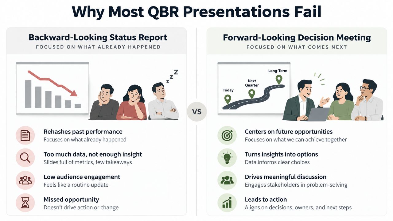
The most popular advice about sales presentations is also some of the least useful: start with your company, explain your product, add proof, and finish with a call to action. That structure assumes buyers are waiting for a linear performance from a seller who controls the room. They aren’t. Buyers forward decks, skim them between meetings, replay recorded explanations, and evaluate vendors without the original presenter present.
A sales presentation now has to work as a live conversation, an executive brief, an asynchronous review, and an interactive evaluation. The practical question isn’t how to make a sales presentation. It’s how to engineer a buying experience that stays relevant when the audience changes, the format changes, and the buyer’s attention is fragmented.
Table of Contents
- Rethinking the Pitch Deck for Modern Buying Committees
- Structuring a Narrative That Hooks Attention Instantly
- Designing Interactive Slides That Drive Evaluation
- Integrating Live Data and Native 3D Models
- Scaling Production with AI and Brand Governance
- Delivering via Omnichannel Links and Measuring Impact
Rethinking the Pitch Deck for Modern Buying Committees
A conventional pitch deck is built as though one person will sit through every slide in sequence. That assumption breaks down in complex B2B sales. In B2B purchases, an average of 5.4 people now have to formally sign off on each deal, according to Harvard Business Review’s analysis of B2B buying groups, and each stakeholder may judge the purchase through a different lens. An executive wants strategic fit and business impact. A technical evaluator wants architecture and validation. Finance wants commercial clarity. An end user wants to know whether the workflow will improve.
Adding slides to satisfy everyone usually creates a deck that satisfies nobody. Dense product specifications may reassure the person who requested them, but they can bury the business case for everyone else. The better move is to separate the presentation into modular evidence, with each module answering a specific stakeholder question while preserving one shared narrative.
A useful pitch deck still has a central story, but it shouldn’t be a single, inflexible path. Build a core narrative around the buyer’s problem, then attach modules for the people likely to influence the decision.
- Executive brief: Summarize the business issue, consequence, proposed outcome, proof, and decision required.
- Meeting narrative: Use discovery, diagnosis, fit, evidence, and next steps as the live path.
- Technical module: Add architecture, integrations, security material, code blocks, or workflow detail only when the evaluator needs it.
- Commercial module: Provide pricing logic, assumptions, implementation ownership, and procurement information.
- Self-serve layer: Let readers open demos, charts, videos, product tours, and supporting documents in their own order.
Practical rule: Build one story with several entry points, not several unrelated decks.
This changes how the team defines a pitch deck. It isn’t merely a file that supports a meeting. A clear explanation of what a pitch deck is helps establish the traditional definition, but modern revenue teams need to extend that concept into a connected system of buyer-facing assets.
The system should survive forwarding. A recipient who wasn’t in the meeting should understand the account context, the recommendation, and the requested next step without relying on a seller’s commentary. It should survive replay, too. If a prospect revisits the deck later, the first screen of every module should identify the question it answers and the evidence supporting it.
The trade-off is obvious. Modular content takes more planning than duplicating a generic company deck. It also creates governance work, because teams must decide which modules are approved, current, and appropriate for each stage. That effort pays off when salespeople stop rebuilding presentations from scratch and start assembling a deliberate buying path.
Structuring a Narrative That Hooks Attention Instantly
The opening isn’t an introduction to your company. It’s a test of whether the buyer sees their situation in the next few screens. In an analysis of sales and marketing presentations updated for 2026, 31% of viewers who bounced left within the first 10 seconds, while 82% of people who reached the first three slides finished the deck, according to Storydoc’s reader-behavior analysis. Your opening sequence therefore has one job: establish relevance before the buyer has a reason to leave.
Start with the buyer’s operating reality
Use account research, CRM notes, discovery transcripts, and relevant performance data to write the first slide. Don’t open with “About us” or a broad industry trend. Open with a precise observation about the buyer’s current state, then make it easy for the buyer to confirm or correct it.
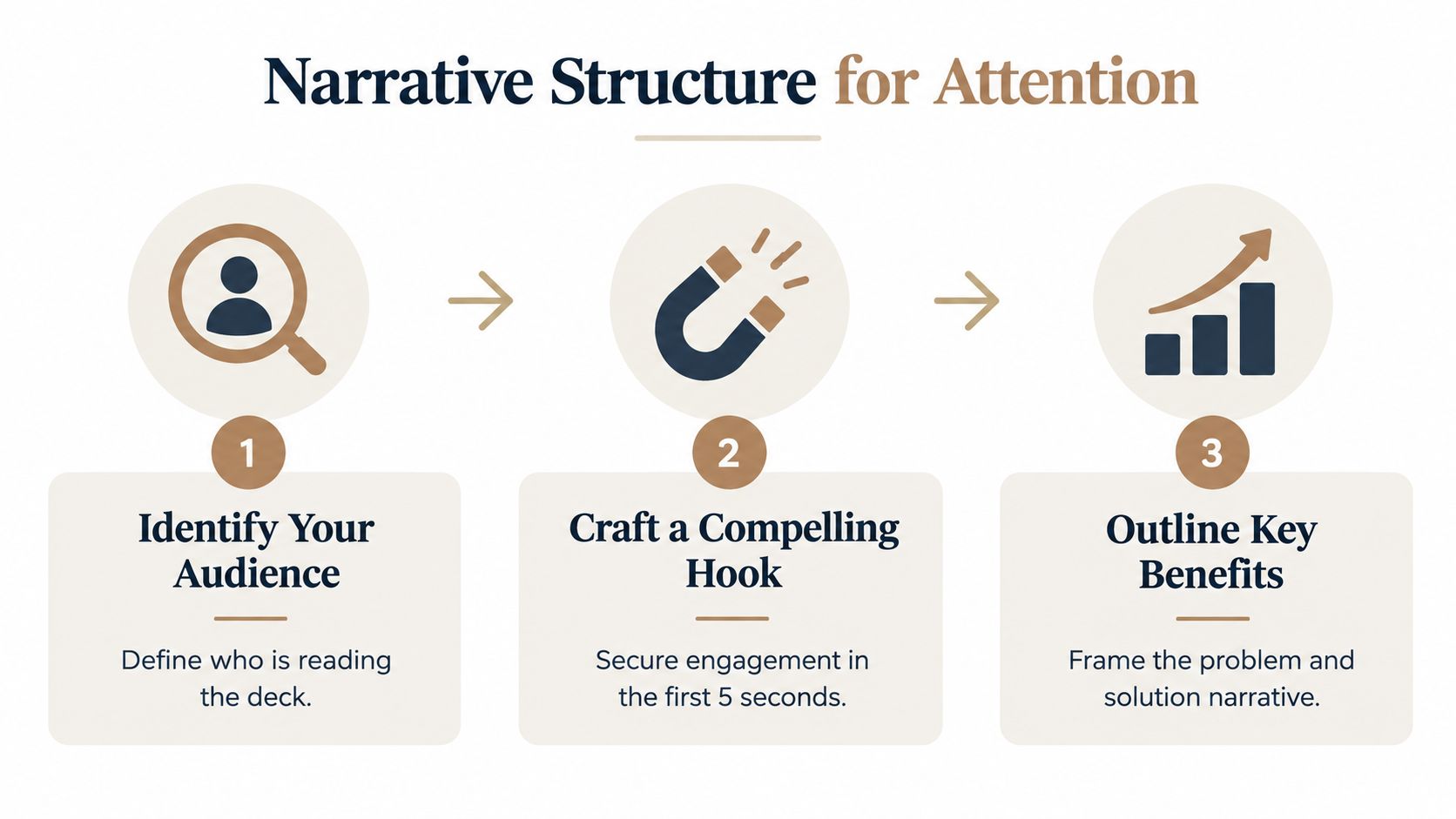
A strong opening sequence can follow this order:
- Identify the audience. Name the business context, stakeholder role, and decision under consideration. The same solution may need an executive opening focused on risk and a practitioner opening focused on workflow.
- Name the problem. Describe the operational friction in the buyer’s language. Avoid inflated claims and generic pain points that could apply to every company in the category.
- Show the consequence. Connect the problem to a measurable business concern, a delayed initiative, an overloaded team, or a decision that cannot move forward.
- Establish the desired outcome. Describe what a better operating state would look like before introducing your product.
- Preview the proof. Signal the evidence you’ll use, such as account data, a relevant workflow, an implementation plan, or a product demonstration.
The principles of storytelling in presentations are useful here because the narrative should create tension before offering resolution. That doesn’t mean dramatizing the buyer’s problem. It means making the cost of inaction and the logic of change visible enough for the audience to engage.
Keep the live path tight
Pitch-deck research reported an average viewing time of 2 minutes 24 seconds in 2024, down from 3 minutes 44 seconds in 2021, and found that the first three slides account for 70% of the investment decision, as summarized in Whitepage Studio’s pitch-deck statistics. Those findings point to a practical design choice: keep the live presentation tightly scoped rather than treating every available detail as part of the main event.
A useful working range is 12 to 18 slides, paced at 30 to 45 seconds per slide, based on the closed-won and lost-deal benchmark cited by Prospeo’s sales-pitch-deck guidance. The first half should focus on diagnosis, proof, and fit. Implementation belongs later, once the buyer understands why the recommendation matters.
Your slide sequence might look like this:
- Slides 1 to 3: Account context, problem, and consequence.
- Slides 4 to 6: Desired outcome, relevant proof, and strategic fit.
- Slides 7 to 9: Solution experience, workflow, or interactive demonstration.
- Slides 10 to 12: Implementation, commercial logic, objections, and next step.
Don’t confuse short with shallow. A concise deck can link to deeper modules for people who need them. The live narrative earns attention, then gives each stakeholder a route to the information they need.
Designing Interactive Slides That Drive Evaluation
A screenshot can show what a product looks like. It can’t let a buyer test a workflow, inspect a scenario, or ask the presentation to answer a different question. Static slides are especially weak after buyers have begun researching independently, because the audience already has a mental model and wants to validate it rather than receive another product tour.
Visuals help, but the format matters. Presentations using visual aids are reported as 43% more persuasive than presentations without them, while the same source reports that after three days people retain about 65% of visual information versus about 10% of written or spoken information, as compiled by Presentations.ai’s presentation statistics. Treat those figures as a reason to design for visual comprehension, not as permission to decorate every slide.

Give every widget a job
Interactive elements work when they reduce uncertainty. They fail when they exist only to make a deck look modern. Before adding a widget, write the buyer question it must answer.
- Maps and globes: Use them to show geographic coverage, territory distribution, locations, or deployment context.
- Device mockups: Use them to place the product inside the buyer’s actual workflow, not as a generic interface screenshot.
- Dynamic charts: Use them to let a buyer inspect a trend, compare segments, or change a relevant assumption.
- Gantt charts: Use them when implementation sequence, ownership, and dependencies are part of the decision.
- Code blocks: Use them for technical validation, especially when an evaluator needs to inspect an API call, configuration pattern, or integration approach.
- Embedded product tours: Use them when the buyer needs to explore the experience without waiting for a scheduled demo.
The practical design principle is progressive disclosure. Put the conclusion on the slide, then let the buyer open the underlying detail. An executive can understand the headline without touching the control. A sales engineer can explore the technical layer without forcing the rest of the room through it.
Turn passive viewing into participation
Interactive slides should create a choice. Ask the buyer to select a region, adjust an assumption, open a workflow step, rotate a model, or choose the objection they want to examine. That action gives the presenter a signal about what matters, while the asynchronous viewer gets a self-directed route through the material.
Use interactive presentation ideas for sales conversations as a starting point, then keep the interaction close to the decision. A clickable chart that doesn’t change the buyer’s understanding is noise. A chart that reveals which operating assumption drives the recommendation is evidence.
A slide should either clarify a decision, prove a claim, or invite a useful question. If it does none of those things, remove it.
Don’t hide basic meaning behind interaction. Label axes, define terms, show assumptions, and provide a visible takeaway. Accessibility and usability matter in self-serve review, where nobody is present to explain what the audience is seeing.
Finally, design a fallback. Live data can fail, a browser can block an embed, and a buyer may prefer a PDF for internal circulation. Keep a readable static summary available, but make the interactive version the primary evaluation surface.
Integrating Live Data and Native 3D Models
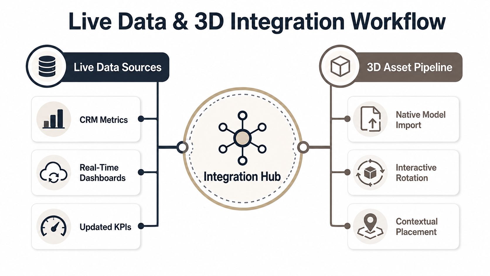
Outdated numbers create a credibility problem that polished design can’t repair. If a pricing table, usage metric, or ROI assumption changes after the deck is exported, the seller either presents stale information or rebuilds the asset manually. A web-native presentation can separate the narrative from the data layer, allowing approved sources to update the evidence without rewriting every slide.
Build the data connection deliberately
Start with the decision the data must support. A live connection isn’t automatically valuable because it updates in real time. It matters when the buyer needs to see current account metrics, compare scenarios, validate usage, or understand how a recommendation changes under different assumptions.
A practical workflow is:
- Define the source of truth. Choose the Google Sheet, REST API, CRM feed, or dashboard that owns the metric.
- Normalize the fields. Use stable names, consistent units, and clear definitions so the presentation doesn’t combine incompatible values.
- Map fields to components. Connect pricing rows, chart values, KPI cards, or calculator inputs to the relevant data fields.
- Set permissions and refresh behavior. Decide what the viewer can see and how often the presentation should synchronize.
- Add a visible timestamp or context note. Buyers should know what period the metric represents and what assumptions shape the output.
- Test failure states. Provide a sensible fallback if the source is unavailable or returns incomplete data.
This workflow keeps the seller from manually refreshing every number before a meeting. It also creates a governance question: live doesn’t mean unreviewed. Revenue operations should define which sources are approved and who owns corrections.
Use 3D when shape affects the decision
Native .glb and .gltf models and embedded Spline scenes are useful when a flat image hides important information. A buyer can rotate and zoom a physical product, inspect a spatial arrangement, or understand how an architectural layout fits its environment. Use 3D for inspection and context, not as an ornamental animation.
Place the model beside the business implication. If the buyer rotates a component, the adjacent text should explain why that component affects installation, maintenance, usability, or fit. Otherwise, the interaction becomes a showroom moment disconnected from the purchase.
A strong setup also includes a noninteractive explanation for forwarded viewers. Add labels, callouts, and a short summary of what the model proves. Browser-based 3D can make evaluation more concrete, but it shouldn’t require specialist knowledge to understand.
The strategic benefit is adaptability. When the buyer changes the scope, the presentation can reflect the relevant account data and evidence without forcing the team to recreate the entire narrative. That makes the deck more useful in live meetings and more trustworthy after it has been forwarded.
Scaling Production with AI and Brand Governance
Personalization fails when every account requires a designer. A rep may know exactly which proof a buyer needs, yet still spend hours changing layouts, checking typography, and rebuilding charts. That production bottleneck pushes teams back toward generic slideware, even when the sales strategy calls for account-specific content.
AI-assisted production helps only when it operates inside clear boundaries. Let AI accelerate assembly and revision, but don’t let it invent proof, alter approved claims, or choose brand treatments without controls.
Separate content decisions from design decisions
The seller should determine the buying context, stakeholder priorities, evidence, and next step. The system can then help assemble those inputs into a coherent presentation, apply a theme, and generate supporting layouts. This division protects the narrative from becoming a formatting exercise.
Use a controlled workflow:
- Approved inputs: CRM notes, research, spreadsheets, documents, product facts, and vetted proof.
- Human review: Validate the diagnosis, assumptions, customer references, and commercial logic.
- AI-assisted assembly: Generate an outline, arrange modules, and adapt language for the intended audience.
- Bulk restyling: Apply one prompt or approved operation to update color, typography, spacing, and layout across the deck.
- Compliance review: Check claims, logos, permissions, accessibility, and required disclosures.
- Version control: Keep a named source presentation and record which account data shaped the output.
One-prompt bulk restyling is useful because it removes repetitive visual work. It doesn’t solve bad positioning. A beautifully restyled deck with an irrelevant opening remains irrelevant.
Make governance usable for sellers
Brand governance shouldn’t require salespeople to ask marketing for permission every time they need a new slide. Establish themes, custom branding controls, reusable modules, and role-based publishing rules. Marketing owns the system’s visual and messaging guardrails. Sales chooses the account-specific route through those guardrails.
The strongest operating model treats templates as components, not cages. A theme should protect typography and color. A modular library should protect approved language and evidence. A review process should catch risk without blocking normal deal work.
This is also where collaboration matters. Sales enablement can identify which modules reps use, revenue operations can maintain data connections and permissions, and marketing can retire outdated assets. AI then speeds up the work that remains instead of disguising a broken content process.
Delivering via Omnichannel Links and Measuring Impact
A file attachment creates a version, not a presentation system. Once a PDF or PPTX leaves your control, the seller can’t easily know which copy a stakeholder opened, whether someone forwarded it, or which evidence prompted a follow-up question. The attachment may still be necessary for procurement, compliance, or offline archives, but it shouldn’t be the default experience for every buyer.
Modern B2B buying is fragmented across formats. Roughly one-third of decision-makers prefer in-person interactions, one-third prefer remote meetings, and one-third prefer digital self-serve at any given buying stage, according to Apollo’s analysis of modern sales presentations. A presentation system should therefore offer a consistent narrative through a meeting, an email link, a recorded explanation, and independent exploration.
Make the link the canonical version
A secure, shareable link gives the buyer one current destination. The same presentation can be responsive on mobile, reviewed asynchronously, and updated when approved data changes. The sales team can keep a PDF or PPTX export for offline requirements, while the web version remains the working source.
Design the delivery path around the likely handoffs:
- After discovery: Send a concise account narrative that confirms the problem and proposed next step.
- After the live meeting: Share the core presentation with relevant modules for absent stakeholders.
- During technical evaluation: Add architecture, code, workflow, or implementation content without changing the executive summary.
- During commercial review: Provide assumptions, scope, pricing logic, and decision responsibilities.
- Before the next meeting: Use the link as a shared agenda, not another generic follow-up attachment.
The link should also explain itself. Add a clear title, audience context, owner, and recommended action so a forwarded recipient knows why the presentation arrived.
Read engagement as a signal, not a verdict
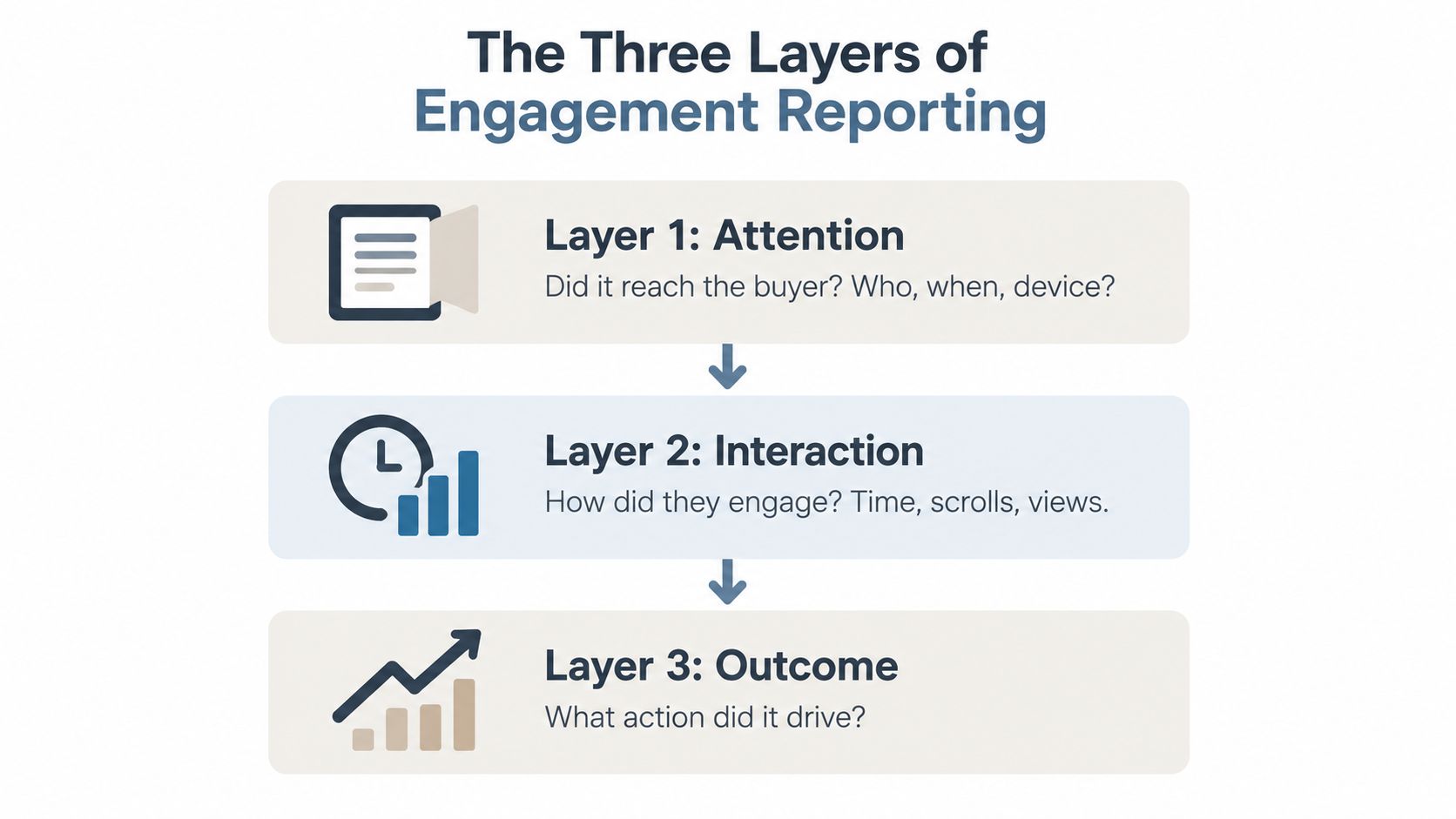
Views and time-on-slide can help the team decide what to do next. A stakeholder who spends time on implementation content may need rollout detail. A stakeholder who opens the commercial module may be involved in budget approval. A slide that receives little attention may be irrelevant, unclear, or easy to understand.
Don’t treat analytics as proof that a deal is healthy. Engagement can indicate curiosity, confusion, or internal circulation. Pair behavioral signals with CRM notes, meeting outcomes, unanswered questions, and stakeholder mapping.
Follow-up rule: Use engagement data to form a question, then confirm that question with the buyer.
The system also needs an exit path. End the presentation with a concrete choice, such as validating the implementation plan, reviewing the commercial assumptions, scheduling a technical session, or confirming the internal decision process. “Let me know what you think” places the burden back on the buyer and produces little information.
A disciplined omnichannel workflow makes every version serve the same commercial outcome. The meeting creates alignment, the link supports internal review, the interactive modules answer stakeholder questions, and the analytics guide a specific follow-up. That is how to make a sales presentation that keeps working after the call ends.
Encelade turns research, CRM notes, spreadsheets, and documents into interactive, web-native sales presentations with live data, widgets, and native 3D. Visit Encelade to build a modular presentation system that your buying committee can review, explore, and share without relying on the original presenter.