Your prospect asks a simple question during the meeting: “Can we see that result by region and customer segment?” The sales deck contains a polished chart, but it’s a screenshot from an earlier export. You can’t filter it, the latest spreadsheet is open in another window, and everyone is now waiting while you search for the right version.
That delay creates more than an awkward pause. It weakens confidence, encourages follow-up questions you could have answered immediately, and turns a useful data point into a frozen picture. A static chart shows what someone decided to export. An interactive chart maker lets the buyer investigate the evidence with you.
The actionable result is straightforward: faster answers, fewer version conflicts, and sales stories that respond to the conversation. Instead of rebuilding a slide whenever a prospect asks for another view, you can let them explore the relevant dimension, whether that means time period, product, market, or account.
This shift matters because dashboards and visualization have become central ways for organizations to consume analytics. Market forecasts reflect it: in a 2020 forecast, Fortune Business Insights projected the global data visualization market to grow from US$8.85 billion in 2019 to US$19.2 billion by 2027. That growth points to a practical change in buyer expectations, not just a design trend.
This guide moves from the basic concept to technical trade-offs, buying criteria, revenue workflows, and a live-data creation process. It also uses Encelade as a web-native example of how interactive charts can sit inside shareable presentations, rather than living as isolated dashboard artifacts. For broader context on how interactive presentation software changes the experience of presenting data, see this guide to interactive presentation software.
Table of Contents
- Introduction: Why Static Charts Cost You Deals
- What an Interactive Chart Maker Really Does
- Core Features and Technical Capabilities That Matter
- How to Choose the Right Interactive Chart Maker
- Use Cases and Workflows for Sales and Revenue Teams
- Creating Interactive Charts and Connecting Live Data With Encelade
- Next Steps to Launch Your First Interactive Chart
Introduction: Why Static Charts Cost You Deals
Static charts fail at the exact moment a sales conversation becomes specific. A quarterly business review might start with total revenue, then move to adoption by team, usage by location, or performance against a target. If each answer requires a new screenshot, the presenter has to leave the story and manage production work in real time.
That workflow also creates competing versions. An account executive may have a chart from last week, a sales engineer may have a newer export, and RevOps may have changed the underlying definition. The buyer doesn’t see the internal explanation. They see numbers that appear uncertain.
Revenue rule: If a prospect can ask a reasonable follow-up question, prepare the chart so it can answer that question without a new export.
An interactive chart doesn’t eliminate the need for judgment. It changes where the judgment happens. You decide which metrics, filters, defaults, and annotations matter, then give the audience a controlled way to explore them. That makes the chart part of the conversation rather than a visual endpoint.
From prepared answers to guided exploration
A static slide says, “Here is the conclusion.” An interactive slide can say, “Here is the conclusion, and here is the evidence behind it.” A buyer can hover over a point, hide an irrelevant series, filter to a segment, or zoom into a period that needs explanation.
For sales teams, that exploration has a clear purpose. It can help an account executive qualify the buyer’s concern, help a solutions consultant demonstrate a use case, or help a manager identify the source of a pipeline change. The interaction should narrow uncertainty, not add decoration.
A useful first chart might contain a trend line with a default view focused on the customer’s business unit. A second control could reveal the broader benchmark. The presenter still leads the narrative, but the audience can test the narrative against the underlying data.
The delivery problem behind the chart
The best chart is ineffective if it arrives as an attachment that quickly becomes obsolete. Revenue teams need a delivery layer that keeps the source current, works in a browser, and gives stakeholders one link to use.
That means evaluating more than chart types. You need to ask whether the tool supports live connections, responsive layouts, collaboration, permissions, accessible interactions, and a fallback for people who need a PDF or PPTX. The chart should be easy to share in a meeting, easy to revisit afterward, and governed well enough that the latest number still means the same thing.
What an Interactive Chart Maker Really Does
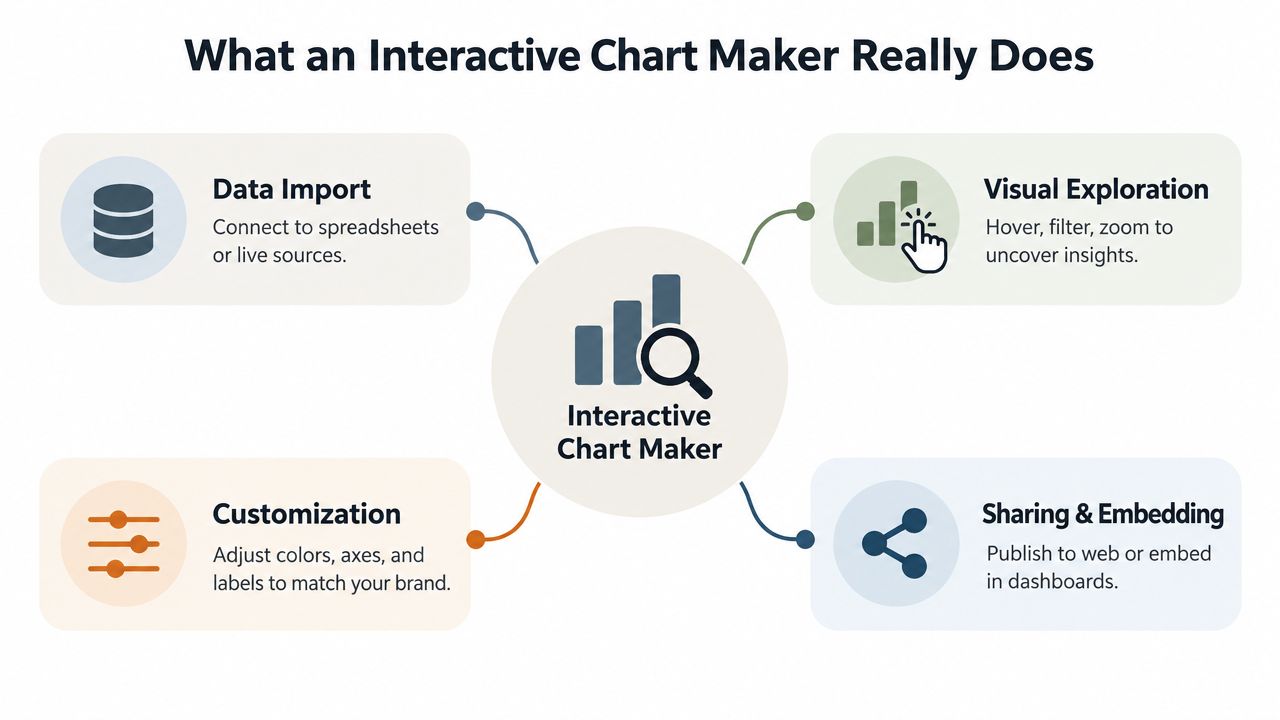
An interactive chart maker turns structured data into a visual that people can inspect through actions. The actions might include hovering for detail, filtering a category, drilling into a total, zooming across a time range, or showing and hiding a series.
A printed report is like a photograph of a dashboard. It captures one view at one moment. A live dashboard is more like the dashboard in a car. It displays the important state, but the driver can use controls to inspect what matters next.
The four jobs the maker must perform
First, it needs to import or connect data. That may mean uploading a spreadsheet, connecting Google Sheets, or reading from a REST API. The important question isn’t only whether the source connects. It’s whether the tool preserves field names, handles missing values clearly, and makes the data definition understandable to the person building the chart.
Second, it needs to support visual exploration. A tooltip can reveal an exact value without labeling every point. A filter can focus the view on a customer segment. A drill-down can move from a regional total to the accounts contributing to it. Each interaction should answer a likely question.
Third, the maker needs customization. Sales teams may need brand colors, readable labels, annotations, targets, and a default view that supports the meeting narrative. Customization should improve comprehension, not hide inconvenient results.
Fourth, it needs sharing and embedding. Browser-based charting can work without plugins. Google Charts renders interactive charts directly in the browser with no plugins, and its line chart documentation states that all code and data are processed and rendered in the browser, with no data sent to a server. Plotly’s browser library, plotly.js, ships with over 40 chart types, including 3D charts, statistical graphs, and maps.
Chart maker, design tool, or BI platform
A static design tool helps you arrange visual elements. It may produce a beautiful slide, but the exported image usually can’t answer a new question. A BI platform often provides deep modeling, permissions, and analytics, but it may be too heavy for a customer-facing deck or a quick account-specific story.
An interactive chart maker sits between those jobs. It focuses on converting data into an explorable visual that can travel through a link, a presentation, a dashboard, or an embedded product surface.
Interactivity matters when it shortens the path from a question to a defensible answer.
That distinction helps sales teams explain the value internally. The goal isn’t to make every chart animated. The goal is to let the audience investigate without asking the presenter to rebuild the artifact.
Core Features and Technical Capabilities That Matter
A chart can look interactive while performing poorly underneath. Buyers should inspect the rendering engine, input behavior, accessibility model, and data pipeline before judging a tool from a polished demo.
Rendering technology sets the ceiling
SVG creates a document node for each mark. That structure makes element-level events and accessible labeling more natural, which suits annotated charts and lower-density dashboards. Its weakness appears when the chart contains many thousands of marks, because the browser has more layout and paint work to manage.
Canvas draws pixels into a bitmap, so it avoids the same DOM cost. That makes it better for thousands to low tens of thousands of points, but hover, selection, and zoom require additional application logic, such as spatial indexing or color-picking.
WebGL becomes the practical choice for 100,000+ points or highly dense interactions. Treat the tiers as a rough rule of thumb, because mark type, hardware, and the library all move them: SVG is generally comfortable up to about 1,000 marks, Canvas fits thousands to low tens of thousands, and WebGL suits 100,000 or more points. Library defaults point the same way. Plotly’s documentation calls SVG appropriate for figures of less than 1,000 data points and WebGL likely necessary above that, while Highcharts’ Boost module switches a series to its WebGL renderer at 5,000 points by default.
| Data situation | Practical renderer | What to verify |
|---|---|---|
| Annotated, low-density chart | SVG | Focus order, labels, and event handling |
| Dense exploratory chart | Canvas | Hover accuracy, zoom behavior, and fallback text |
| Very large or animated dataset | WebGL | Device support, performance, and aggregation controls |
A credible product should switch renderers or reduce the data before a dense chart becomes unusable. Pre-aggregation and sampling aren’t cosmetic compromises. They help the viewer see the pattern without pretending that every raw record can be displayed at once.
Accessibility belongs in the engine
Details that only appear on hover don’t help someone who navigates with a keyboard. Color alone can hide meaning from users with color-vision differences, while an unlabeled Canvas surface gives screen readers little to interpret.
Look for keyboard-operable filters, sufficient contrast, visible labels, focus management, ARIA handling, text alternatives, and a tabular fallback. SVG can expose per-element structure more naturally, but it still needs correct focus and ARIA implementation. Canvas requires the application to reconstruct semantics outside the pixels.
Responsiveness needs measurable guardrails
A chart must remain legible on a phone, not just shrink until labels overlap. Responsive behavior may require fewer visible series, a different control layout, or a summary view that opens details on demand.
A practical budget is under about 200 ms for initial render and under about 100 ms for common interactions such as a hover or a filter change. The 100 ms figure has long-standing support: Nielsen Norman Group describes 0.1 second as about the limit for users to feel that a system is reacting instantaneously, and Google’s RAIL performance model uses the same window for responding to user input. Continuous gestures such as pan and zoom behave more like animation, so they need smooth frame rates rather than a single fast response. Treat those numbers as engineering targets, not promises. Test them with your data, on the devices your audience uses, and under realistic network conditions.
More interaction can also reduce decision quality. Large or messy datasets create risks involving query latency, missing values, mixed formats, cognitive overload, lineage, access control, and metric definitions. A governed chart maker should enforce clear defaults, approved metrics, visible freshness, sampling rules, and permissions instead of giving users unlimited controls with no context.
For revenue teams, the technical standard is simple: the chart must stay fast, understandable, accessible, and trustworthy at the point of use. Live synchronization can support that outcome when the source and refresh design are controlled, as described in this overview of real-time data sync.
How to Choose the Right Interactive Chart Maker
The right tool depends on where the chart will be consumed. A RevOps analyst building an internal performance model has different needs from an account executive sending a customer-facing QBR link.
Start with the delivery question: Will people use this inside a product, inside a presentation, or inside an analytics workspace? Then test the data question: Does the chart need a snapshot, scheduled refreshes, or live API updates? Finally, test the governance question: Who controls definitions, access, branding, and changes?
Interactive Chart Maker Decision Matrix
| Evaluation Criteria | Lightweight Chart Tool | BI Platform | Presentation Native Maker |
|---|---|---|---|
| Primary job | Create and publish focused visuals | Model and analyze organizational data | Build customer-facing stories with interactive elements |
| Live data | Often depends on the connector | Usually strong, subject to data-model setup | Useful when Sheets and REST connections are supported |
| Sharing model | Link or embed | Workspace, dashboard, or embedded view | Shareable presentation link and presentation embed |
| Mobile experience | Varies by implementation | Usually available, but may need layout work | Should be tested as part of the presentation |
| Governance | Basic controls may be enough for simple charts | Typically deeper permissions and metric management | Important for themes, roles, source ownership, and approved content |
| Collaboration | May be limited | Strong in team environments | Valuable when comments, shared workspaces, and review are central |
| Analytics | Often chart-level or minimal | Usually extensive usage and business analytics | Useful when teams need views and time-on-slide for shared decks |
A lightweight tool can be the fastest option for a single chart on a public page. A BI platform is a stronger fit when the main job is governed internal analysis across many teams. A presentation-native maker makes sense when the chart must support a narrative, sit beside research or CRM context, and remain usable after the meeting.
For revenue teams comparing categories, this comparison of data visualization software can help frame the shortlist, but your own workflow should decide the winner.
Red flags that deserve a failed test
- Plugin dependence: A prospect shouldn’t need a special installation to view the chart.
- Unclear freshness: The interface should show when data was last updated or explain the refresh behavior.
- No accessible alternative: A visual without keyboard controls, text context, or a table leaves part of the audience behind.
- Unbounded density: The maker should have a strategy for pre-aggregation, sampling, or renderer changes.
- Weak sharing controls: Public links, internal links, embeds, and exports should have clear permission behavior.
- No audit trail: Teams need to understand which source and metric definition produced the displayed value.
Ask vendors to demonstrate your own scenario. Give them a regional pipeline dataset, request a mobile view, change a filter during a call, and inspect what happens when the source updates. A product that succeeds only with a prepared demo isn’t ready for a revenue workflow.
Use Cases and Workflows for Sales and Revenue Teams
An account executive opens a QBR link before the meeting. The default view shows the customer’s overall trend, while filters reveal performance by team and product. When the customer asks why one segment changed, the presenter doesn’t promise a later analysis. They select the segment and inspect the relevant period together.

That same pattern works in a pipeline review. A sales manager starts with the forecast, filters by stage, and drills into a region where coverage looks unusual. The chart becomes a shared workspace for deciding which opportunities need inspection, rather than a slide that merely reports the total.
Account-specific QBRs
Customer-facing reviews benefit from controlled exploration. Use a small number of meaningful filters, set the customer view as the default, and annotate the moments that need discussion. Keep the broader comparison available, but don’t force the buyer to use a complicated dashboard before understanding the main message.
Charts should be self-explanatory and carry their own context. State the trend along with the date range and the source, and explain the metric so it’s clear what is being measured. If the customer downloads a PDF for internal circulation, the exported version should still communicate the conclusion without requiring the interaction.
Pipeline and pricing conversations
Sales teams can use interactive charts to examine pipeline by owner, segment, stage, or expected close period. Pricing explorations can show how a change in package, usage, or deployment scope affects the relevant business view.
The presenter shouldn’t expose every possible dimension. Too many controls can turn a guided discussion into an unstructured analysis session. Choose interactions that support the decision at hand, and keep sensitive fields behind appropriate access controls.
Post-demo follow-up
A follow-up link can carry more value than a static recap. Instead of attaching screenshots, send a responsive presentation that includes the relevant chart, an explanation of the use case, and a clear next action. Link-based presentation analytics can show who viewed a presentation, time spent per section, and where viewers dropped off, which helps teams decide whether to follow up with a clarification or a deeper technical discussion.
Follow-up practice: Use engagement behavior to choose the next conversation, not to assume that a view equals buying intent.
Mobile and operational use
Field sellers may review a customer story on a phone before entering a meeting. A responsive chart should preserve the headline metric, keep controls discoverable, and avoid requiring precise pointer movements.
Real-time dashboards are particularly useful for operational monitoring. As Improvado’s guide to data visualization tools puts it, tools with live data connections can surface an issue, such as a broken campaign tag or a sudden cost-per-click spike, within minutes instead of the 24 to 48 hour lag typical of manual reporting. Refresh frequency depends on the source: streaming sources can update in real time, while batch sources refresh hourly or daily.
The delivery model matters as much as the visualization. SG Analytics’ 2026 data visualization trends roundup highlights embedded analytics, personalized and role-based dashboards, data storytelling, and cloud-native, mobile-first platforms, and it names sales teams and field staff among the people who need data away from their desks. For revenue teams, the practical lesson is to prioritize lightweight, embeddable, collaborative, mobile-ready delivery over visual novelty.
Creating Interactive Charts and Connecting Live Data With Encelade
Start with a clean source. A spreadsheet should use clear headers, consistent value formats, one row per meaningful record, and an explicit date field. If the chart will update from a REST API, identify the authentication method, the fields you need, and the response shape before designing the visual.
The creation flow is easier when you separate data preparation, visual design, interaction, and delivery. First connect the source. Then select a chart that matches the question. A line chart can expose a trend, a bar chart can compare categories, and a map can show geographic distribution. Add KPI cards or annotations only when they help the audience interpret the main visual.
Configure the live pipeline before the chart
Live data needs an operating plan. When a source can’t push changes, the chart typically polls its API every few minutes; where the source offers webhooks or event subscriptions, use those instead. The workflow should authenticate the request, normalize the response, store the usable fields, and then pass those fields to the chart. Rate-limit tracking and caching help prevent unnecessary requests and throttling.
Decide what happens when the source is late, incomplete, or unavailable. Show the last successful update, label the freshness state, and provide a table or summary fallback. A chart that displays stale numbers can create more risk than a chart that clearly reports a connection problem.
Design the presentation around the meeting
In Encelade, the example platform used here, teams can work in a browser editor, connect Google Sheets or REST APIs, and choose from a library of 50+ interactive widgets that includes charts and other presentation elements. The practical workflow is to place the chart beside the account context, apply a theme, choose whether line, bar, area, and combo charts show a series toggle or a time-range filter, size the hover tooltips, and publish a responsive link. Export to PDF or PPTX remains useful for offline sharing or archiving.
Before sending the link, test the default view on desktop and mobile. Check whether labels remain readable, whether keyboard users can reach the controls, whether the source updates as expected, and whether the chart still tells a coherent story when no filter is selected.
Then check whether the audience engaged after you shared it. Views and time-on-slide can show whether the audience reached the chart and whether the section held attention. Treat those signals as prompts for better follow-up, and don’t assume the buyer understood the metric just because they looked at the right slide.
Next Steps to Launch Your First Interactive Chart
Choose one high-impact deck, not an entire library of reports. Pick a chart that repeatedly triggers follow-up questions, connect one trusted live source, and define the default view before adding optional controls.
Use this launch checklist:
- Select the decision: Write the business question the chart should help answer.
- Prepare the source: Clean the spreadsheet or normalize the API response.
- Test the renderer: Match SVG, Canvas, or WebGL to the data density and interaction needs.
- Add accessible controls: Include keyboard operation, labels, contrast, and a text or tabular fallback.
- Check delivery: Open the link on desktop and mobile, then test the embedded version if relevant.
- Measure use: Review views and time-on-slide after sharing, then improve the chart based on actual behavior.
- Set governance: Document the metric definition, source owner, refresh behavior, and permission model.
The first goal isn’t a spectacular visualization. It’s a reliable chart that answers a real revenue question faster than a static export. Once that workflow works, extend it to account-specific QBRs, pipeline reviews, product demonstrations, and post-demo follow-ups.
Encelade helps sales, marketing, and revenue teams turn spreadsheets, research, CRM notes, and documents into interactive, web-native presentations with live data, responsive links, and embed codes. Visit Encelade to create a first interactive chart deck and replace an outdated static file with a live story your buyers can explore.