The popular advice is wrong. Interactive data visualization software is not just a fancier way for analysts to build dashboards. For a revenue team it is how you explain change, show proof, and keep a prospect engaged while the deal is still live. The category grew out of business intelligence, but its real value shows up somewhere else entirely: when a sales rep, sales engineer, or revenue ops lead needs an explorable story they can share and update as the data moves, without rebuilding slides every time.
That shift matters because the core interaction changed from exporting charts to working inside them. The move from static reporting to self-service exploration helped define the modern form factor that Tableau helped popularize after its 2003 launch, and by the 2020s the market had spread into enterprise BI, embedded analytics, and developer-led stacks like Power BI, Qlik Sense, Plotly, D3.js, and Google Charts. For revenue teams, that means the software is no longer only a back-office reporting tool. It is a presentation layer that can carry customer-facing narratives, internal deal reviews, and guided demos.
The question now is not "Can this make a dashboard?" It is "Can this help a buyer understand the account, the product, and the next step without a lot of manual explanation?"
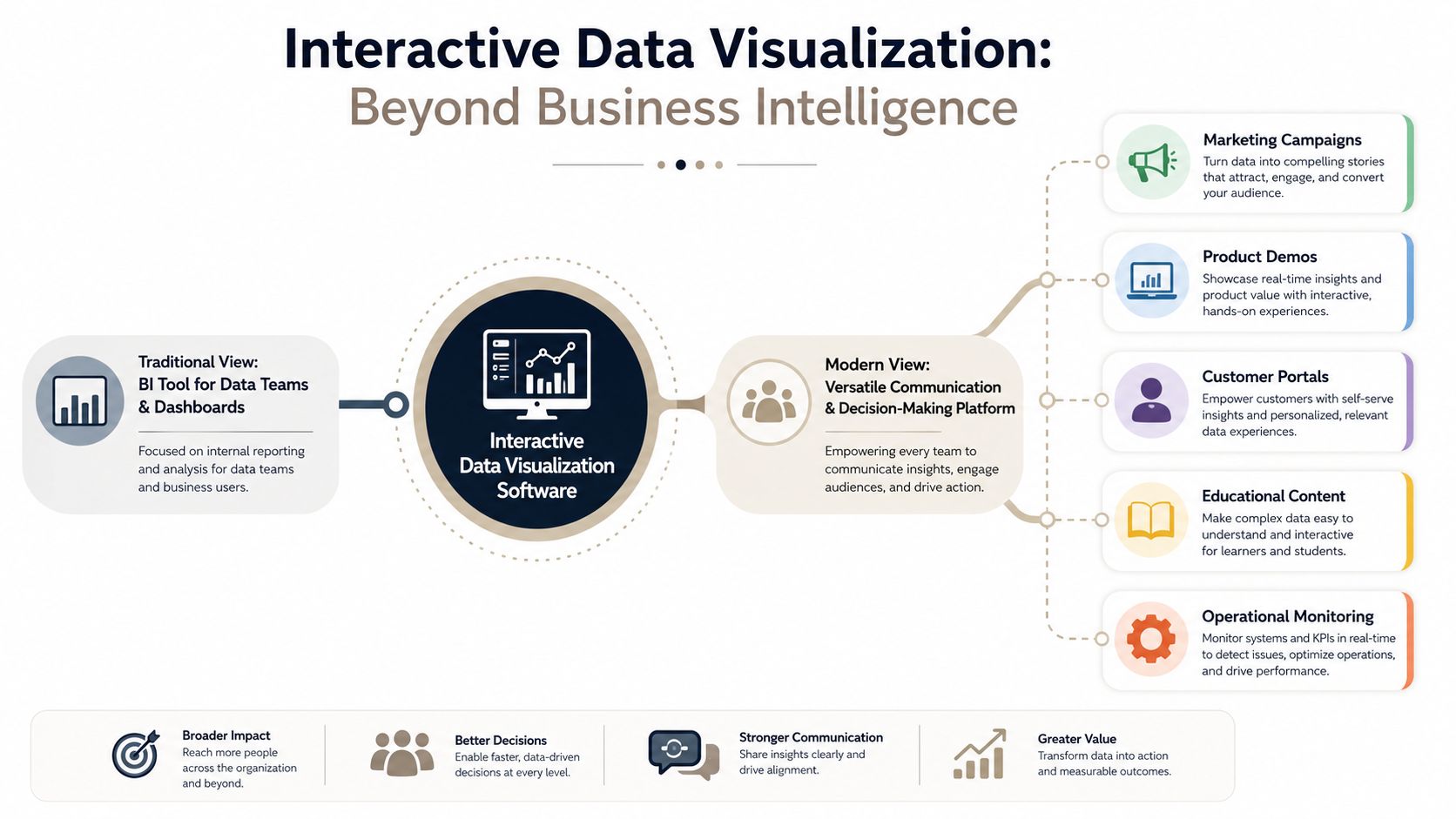
Table of Contents
- Why Interactive Data Visualization Is No Longer Just for Analysts
- How Interactive Visualization Systems Actually Work
- Core Features That Define Modern Visualization Platforms
- Real Business Use Cases for Revenue and Sales Teams
- Technical Integration and Enterprise Considerations
- A Practical Framework for Selecting and Implementing Your Platform
- Where Interactive Visualization Is Heading Next
Why Interactive Data Visualization Is No Longer Just for Analysts
The outdated buying frame is still around, but it no longer matches how revenue work actually gets done. Plenty of teams still treat interactive data visualization software as BI tooling for analysts building internal dashboards. Revenue teams use it for something else: to show pipeline, tell account stories, and walk a prospect through product value in a way static slides never manage.
A better lens is audience intent. Analysts want open-ended exploration. Sales and presales teams want guided interaction, where the viewer can click, filter, and compare without losing the thread of the story. That is why the market now spans enterprise BI, embedded analytics, and web-native presentation tools, alongside libraries and developer stacks such as Tableau, Microsoft Power BI, Qlik Sense, Plotly, D3.js, and Google Charts.
From reporting artifact to revenue asset
When a rep exports a chart into a PDF, the story freezes. When that same chart stays interactive inside a web-native deck, the buyer can drill into the exact segment that matters, whether that is territory performance, usage trends, or implementation milestones. The meeting changes because the rep spends less time narrating the screen and more time answering the questions that matter.
Practical rule: if the buyer has to ask for "the next slide" to understand the current one, the format is too static.
Storytelling matters more than a dashboard grid. University guidance still flags per-tool suitability rather than treating every tool as interchangeable — UC Berkeley's data visualization guide notes, for example, that Tableau is less useful for print while a tool like Datawrapper is built to embed on the web (Berkeley data visualization tools guide). For a revenue team, the equivalent question is whether the platform supports narrative flow, link-based sharing, and audience engagement, not just chart types.
For a practical reference on visual standards and presentation discipline, our guidance on data visualization best practices is useful context. The larger point is simpler. If the output will not travel well in a sales cycle, it is the wrong format.
How Interactive Visualization Systems Actually Work
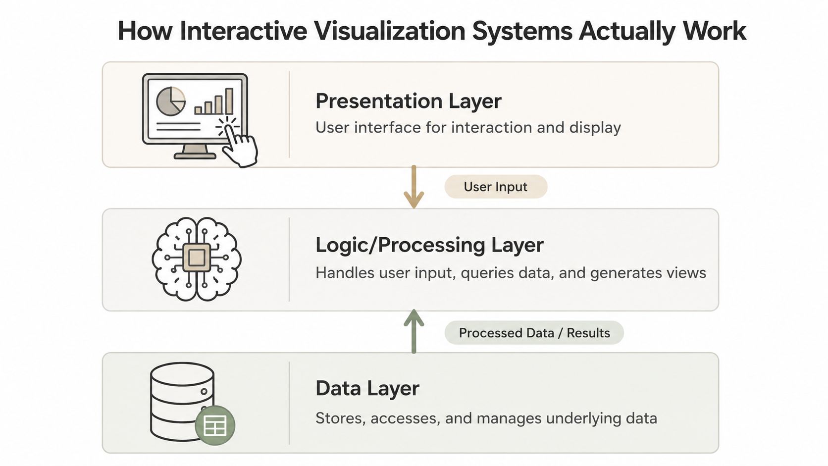
The polished front end is only half the product. Underneath, interactive data visualization software typically runs as a three-layer system, with a presentation layer, a processing layer, and a data layer (Deshwal, European Journal of Computer Science and Information Technology, 2025). That architecture explains why some tools feel fast and reliable while others look good in a demo but stall the moment the data changes.
The restaurant analogy that actually fits
A restaurant makes the layers concrete. The menu is the presentation layer, the kitchen is the processing layer, and the pantry is the data layer. An attractive menu means nothing if the kitchen cannot route orders or the pantry is out of stock. The same is true when a dashboard renders beautifully but cannot refresh a live source, filter cleanly, or re-render after a user clicks.
User experience depends as much on backend logic as on the chart on screen. Clicks, filters, and brush selections trigger event handling, query generation, data transformation, and re-rendering. The fastest chart library will not save a weak data model, and a solid data warehouse will not rescue an interface that cannot turn user intent into the right query.
The demo is not the system. The system is everything between the click and the updated view.
What to evaluate first
Revenue teams should ask three questions before they judge visual polish. Can the platform keep data fresh? Can it handle interaction without noticeable lag? Can it scale when multiple teams reuse the same assets across decks, portals, and campaigns? Those questions matter because the buyer experience is shaped by the full pipeline, not the chart template alone.
For teams comparing presentation tools and operational dashboards, our real-time data dashboard guide is a useful reference point for thinking about live updates and refresh behavior. The key is to stop treating interactivity as a skin on top of reporting. In production, it is an end-to-end system problem.
If you want a fast visual recap of how these layers behave in practice, the short overview below walks through the same architecture end to end.
Core Features That Define Modern Visualization Platforms
The feature set that matters most is the one that reduces prep work and helps buyers understand the story faster. In modern interactive data visualization software, that usually means interactive widgets, live data sync, embeddability, and programmatic generation. A vendor that cannot support those capabilities may still work for internal analysis, but it is unlikely to carry a revenue-facing story well.
Start with the interaction surface
Look for widget libraries that go beyond simple charts. Maps, globes, charts, device mockups, code blocks, and Gantt views are the components that let a sales team explain territory, architecture, rollout timing, or product scope in one environment. Encelade, for example, is a web application for building link-based presentations, with a library of 50+ interactive widgets, live data connections through Google Sheets and REST API support, and native .glb/.gltf 3D plus Spline scene embedding. That combination turns the format from passive slides into an explorable presentation layer.
Demand live data, not manual refresh rituals
Interactive tools should connect to live or operational sources such as spreadsheets, databases, cloud apps, and warehouses, on either a live or a scheduled refresh. For revenue teams, the operational win is simple. A deck that syncs from Google Sheets or a CRM-linked source does not need to be rebuilt before every customer meeting. The number on the slide is the number in the system, and nobody has to remember to update it.
Make room for publishing and automation
The newer differentiators are API and MCP interfaces, because they let teams generate or update assets programmatically instead of rebuilding them by hand. Plotly's current positioning around coding agents and cloud publishing shows how quickly the category is moving toward automation and maintainability rather than one-off chart creation (Plotly). That shift matters for revenue ops teams that need templates, approvals, and repeatable layouts, not just a polished one-time demo.
For broader comparison shopping, our guide to comparing data visualization software is a useful reference, but keep the feature filter strict. If the platform cannot embed cleanly, connect to live data, and support reusable interactive components, it will age poorly in a sales environment.
Real Business Use Cases for Revenue and Sales Teams
Static PDFs stop being enough the moment a buyer wants to explore the "why" behind a number. Interactive decks hold up better because they let the prospect move through the evidence at their own pace. That is the difference between a rep giving a tour and a buyer actually understanding the context.
Product demos that need more than screenshots
A product evaluation usually starts with a screenshot deck and ends with the buyer asking for something more concrete. When embedded widgets and native 3D models are on the table, presales teams can swap fixed images for live product views, rotate a model in the browser, or zoom into technical detail without leaving the presentation. That helps most when the product carries physical, spatial, or workflow complexity that never fits on a flat slide.
Account mapping that stays current
Territory visualizations are only useful when the data still reflects account reality. When CRM fields, pipeline status, or ownership change, live data sync keeps the map current without manual rework. It saves revops and sales managers from rebuilding charts every time a forecast shifts, and it gives AEs a cleaner read on where to spend time before a call.
Revenue team rule: if an asset needs an ops person to refresh it before every meeting, it is a maintenance burden, not a sales tool.
Presales walkthroughs that buyers can control
Interactive presentations also carry technical walkthroughs well. Rather than marching a prospect through a fixed PDF, a presales consultant can build the deck so the buyer explores architecture, integrations, or deployment options in the order that matches their priorities. That pacing makes the meeting feel less scripted and more consultative, which is exactly what most complex deals need.
Value is not novelty. It is fewer custom decks, less duplicate work, and fewer moments where someone in the room says, "That number is old." When the data updates automatically and the presentation stays web-native, the rep can focus on the conversation instead of the file.
Technical Integration and Enterprise Considerations
Buying on features alone is a mistake. At scale, interactive data visualization software lives or dies on integration, identity, governance, and how comfortably it fits into the systems your team already uses. If those pieces are weak, the platform becomes another isolated workspace people avoid.
The integration choices that matter
REST APIs and MCP tools are the clearest signs that a platform can support agent-driven deck generation or deeper workflow automation. Webhooks matter when you want real-time sync instead of scheduled updates. SSO and SAML matter when the platform has to live inside enterprise access control. Multi-tenant API architecture matters when the output needs to support white-label deployment or multiple customer environments.
| Integration approach | Best for | Key trade-off |
|---|---|---|
| REST API | Programmatic generation, custom workflows | More flexible, but requires engineering ownership |
| MCP tools | Agent-driven creation and orchestration | Powerful for automation, but still emerging in many orgs |
| Webhooks | Real-time data sync and event triggers | Fast updates, but adds a dependency on reliable source events |
| SSO / SAML | Enterprise identity and access control | Cleaner governance, but more setup and coordination |
| Multi-tenant APIs | White-label delivery and customer-specific experiences | Strong scaling model, but governance gets more complex |
JavaScript or Python
The National Research Council of Canada recommends JavaScript libraries such as Leaflet, D3, and DataTables for highly customizable interactive visuals, while Python stacks like Bokeh, Plotly, and Pandas suit periodic or rapid modification workflows (NRC-OCRE report for the International Joint Commission, 2017). That trade-off still holds in practice. JavaScript ecosystems usually win when the visual experience needs browser-native detail and deep interaction. Python stacks win when the team needs to update and operationalize content quickly.
Customization is expensive when no one owns the pipeline. Simplicity is expensive when the buyer needs a richer interaction model.
For revenue operations leaders, the right question is not "Which stack is more powerful?" It is "Which one fits our publishing rhythm, our security rules, and our people?" A platform can be technically impressive and still fail if it does not match how your team ships content.
A Practical Framework for Selecting and Implementing Your Platform
Good buying decisions come from a process, not a polished demo. Qlik frames interactive visualization as four steps: data integration, goal definition, visualization design, and collaboration or sharing (Qlik), and that arc maps cleanly onto how a revenue team should evaluate and roll out a platform. The version below is tuned for a sales cycle rather than an analytics team.
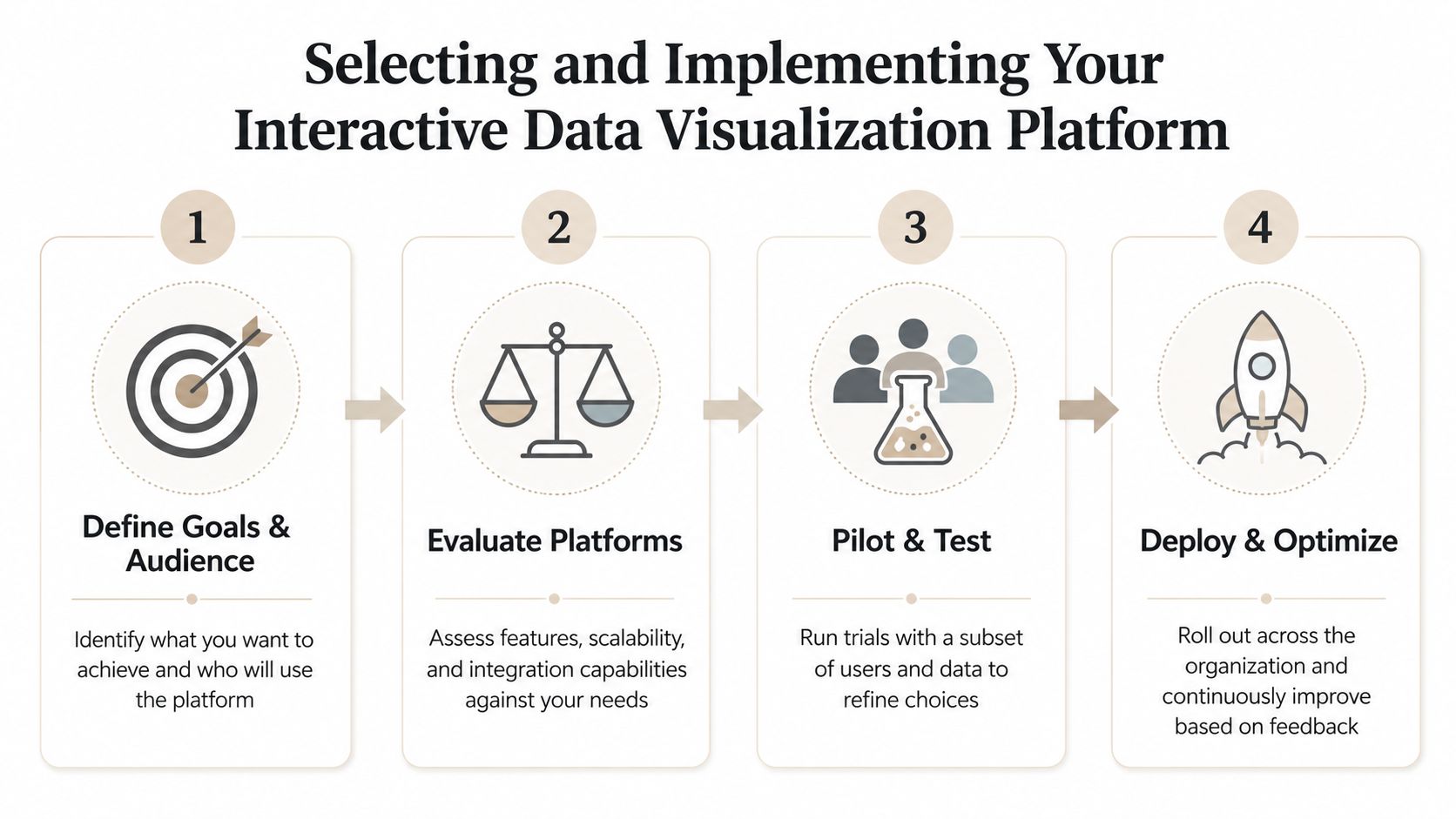
1. Define the goal and audience
Start by separating analyst exploration from customer-facing storytelling. An ops manager can work through a dense dashboard. A prospect in a live meeting usually cannot. If the audience needs direction, the interface should guide the conversation instead of exposing every layer of the data model.
2. Match KPIs to visual form
Each metric deserves a form that supports the story. Revenue teams may need a map for territory coverage, a timeline for implementation progress, or a comparison view for expansion opportunities. If the chart type works against the data, the friction shows up immediately in the room.
3. Build the interface and connect the core systems
Data sources, authentication, and embedding choices matter here. If the platform does not connect cleanly to the operational stack, support permissions, and publish in a format people will actually open, the rollout slows down quickly. The browser, the source data, and the access model all have to work together.
This is also where live data sync, embeddable widgets, 3D views, and API-driven generation start to matter for revenue teams. These features are not just presentation extras. They decide whether a platform can support weekly pipeline reviews, customer-facing updates, and repeatable sales motions without manual rework. For a practical comparison of tools built for that use case, see our breakdown of interactive data visualization software.
4. Test, share, and collaborate
The final output should be embeddable and work on mobile, which Datylon calls out directly (Datylon). If people cannot open the output easily, or it breaks on a phone, adoption stalls no matter how good the underlying data is.
A practical note: pilot the tool with one sales motion, not the whole org. If it works in a named-account demo or a weekly pipeline review, you will learn more than you will from a broad rollout plan.
Where Interactive Visualization Is Heading Next
The next wave is about programmatic production. Visuals are increasingly generated, styled, and published with far less manual assembly than older workflows demand. The bottleneck is no longer whether a platform can draw the chart. It is whether a revenue team can keep decks, apps, and customer-facing views current without constant cleanup.
Governance is the harder problem. Teams need live connections, workspace collaboration, brand rules, permissions, and reusable templates so content stays aligned as source data changes. Without that layer, interactive material drifts, and the result looks like the version-control mess that file-based slide decks have created for years. The teams that get this right treat visualization as an operating system for revenue communication, not as a design exercise.
The platforms that hold up in production combine live updates, web-native delivery, and automation hooks. Buyers should favor tools that cut manual refresh work, support reuse, and make governance visible to the people who own the content. The vendors that survive the next wave will be the ones built for repeatable workflows, not the ones that only look polished in a demo.
If you are evaluating this for a revenue team, Encelade is built around web-native, interactive presentations with live data, widgets, and API-driven generation. To test that approach against your current deck workflow, book a 30-minute demo and compare it with how your sales demos, account reviews, and customer stories work today.