The worst version of a sales deck is the one that looks polished until a buyer tries to use it. A rep is halfway through a regional pitch, the map is a flat screenshot, and the prospect asks a simple question about one location. Suddenly the rep is zooming into a blurry image, the room goes quiet, and the deck stops feeling like a conversation.
That's where an interactive map widget earns its keep. It turns the map from decoration into something a buyer can inspect, compare, and question in real time, which matters in sales meetings where location, coverage, or territory are part of the buying logic. The problem is that some teams only think about the visual layer, not the operational burden that shows up once the widget has to survive a live pitch, a laptop swap, a projector, keyboard navigation, and a prospect who wants to drill down instead of nodding along.
Table of Contents
- Why Static Maps Fail Modern Sales Presentations
- What an Interactive Map Widget Is
- High-Impact Use Cases for Revenue Teams
- Integration Options From Embed to Live Data
- Design and Accessibility Best Practices
- Measuring Engagement With Map Analytics
- Ready to Use Presentation Templates and Examples
- Getting Started With Interactive Map Widgets
Why Static Maps Fail Modern Sales Presentations
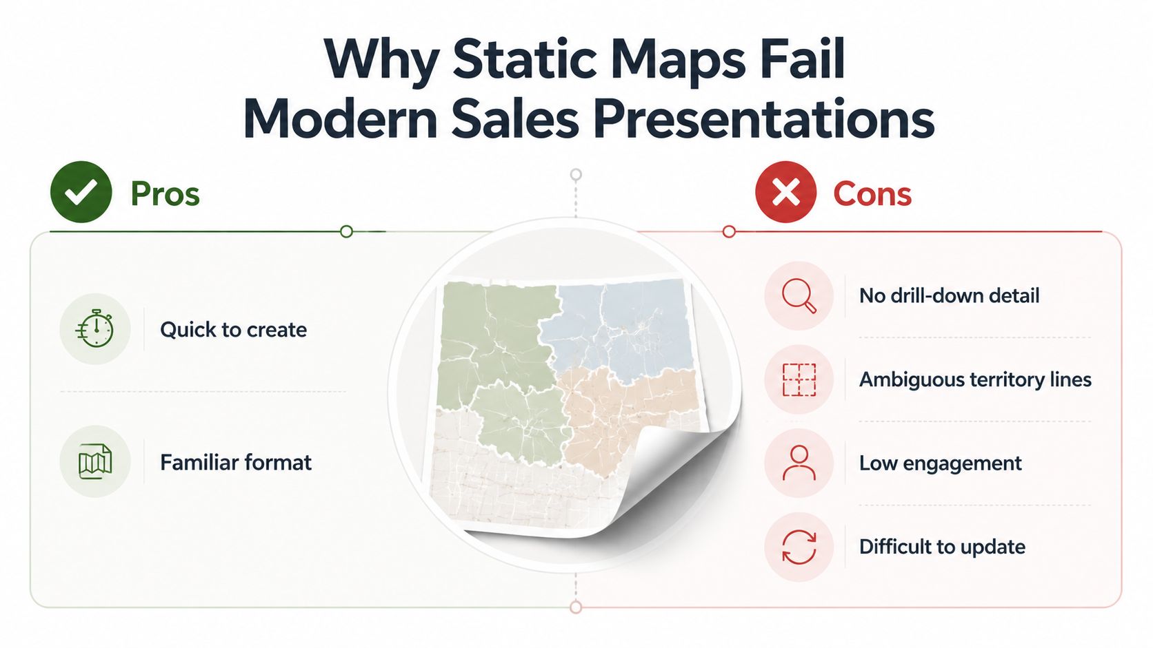
A static map looks safe right up until someone asks a specific question. I've seen this happen in territory reviews, account planning sessions, and logistics pitches, where the shaded regions on the slide are clear to the presenter but not to the buyer. The moment a prospect asks whether a facility sits in one zone or another, the rep is forced into an explanation that should have been discoverable on the slide itself.
Static maps also flatten the conversation. There's no hover state, no click path, no drill-down, and no clean way to bind live data to what the buyer is asking about. That means the rep becomes the interface, which is exactly the wrong role in a high-stakes meeting.
A map should answer questions faster than the seller can narrate them.
The bigger issue is perception. Astute buyers can tell when a deck is a one-size-fits-all artifact, and a screenshot-heavy map slide makes the deck feel frozen in time. It signals that the team prepared a pretty view, not a working tool.
Static maps also create cognitive friction. Each buyer has to memorize what each color means, guess at the precision of the borders, and hope the image on screen is still current. In a sales setting, that trust gap is expensive, because it pushes the rep back into defensive mode instead of discovery mode.
What an Interactive Map Widget Is
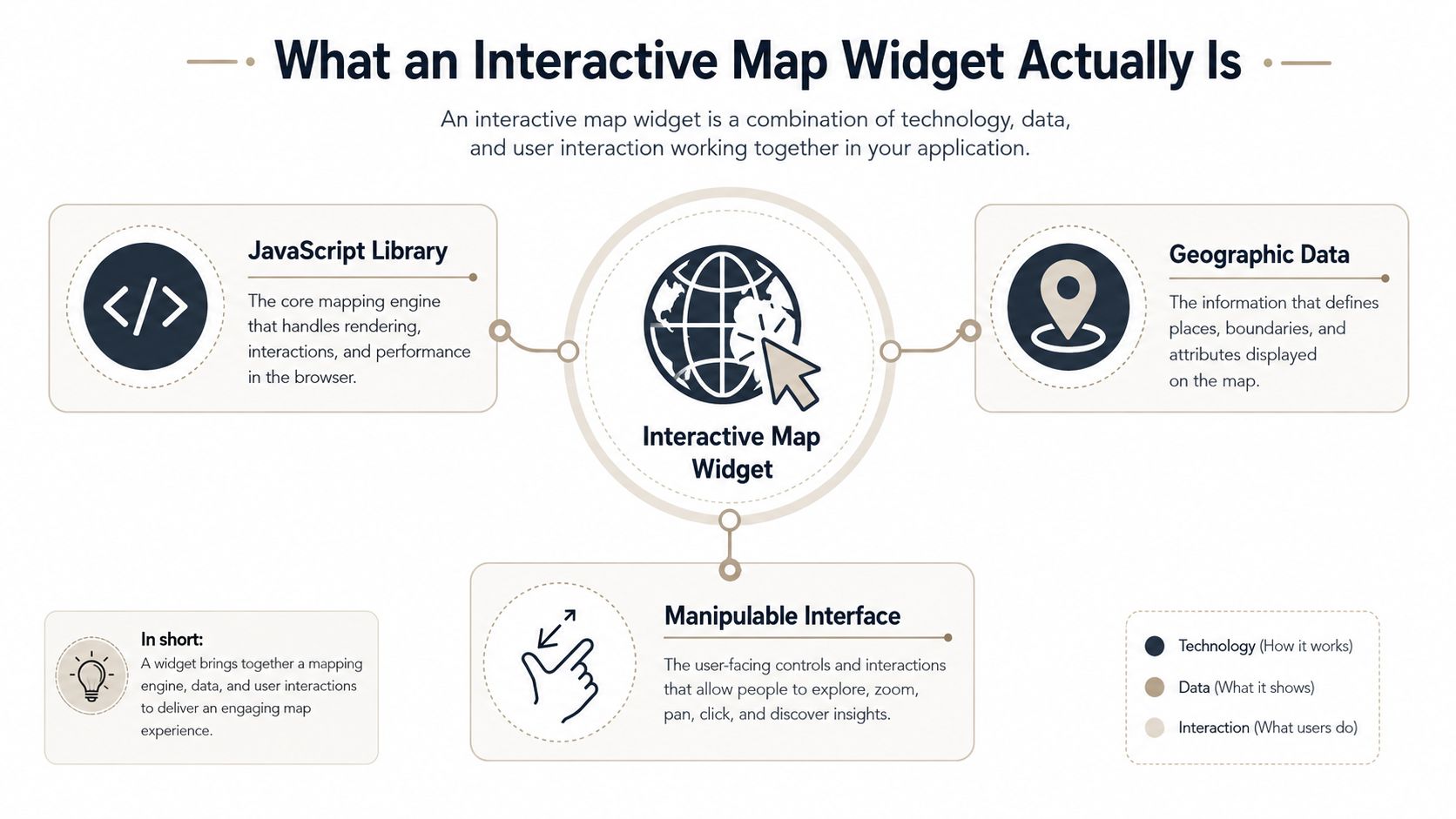
An interactive map widget is a web-native component that turns geography into something a buyer can explore, filter, and test. In practice, it supports panning, zooming, hover-triggered tooltips, click-to-drill layers, and data bindings that pull from spreadsheets, CRM records, or other live sources. A screenshot shows a map. A widget lets someone work with it.
The three pieces that matter
A real widget usually has three layers. The base tile layer provides the map geography, the data overlay layer adds pins, choropleths, or heatmaps, and the interaction layer handles the events that open tooltips, filters, or transitions. If one of those layers is missing, the result is usually a prettier image rather than a functional map.
That distinction matters when vendors blur the term "interactive." A clickable hotspot on an image gives a different experience from a map that responds to user input and data changes. In presentations, buyers notice that difference quickly because they want to test the map against their own questions, not just look at it.
The lineage matters too. A commonly cited early interactive map was the Xerox PARC Map Viewer, built in 1993 by Steve Putz; MapQuest launched in February 1996 as one of the first commercial web mapping services; OpenStreetMap arrived in 2004 as a community-driven alternative; and Google Maps brought the "slippy map" style into the mainstream when it launched in 2005. Those milestones explain why the modern widget feels natural to buyers. It behaves the way people already expect maps on the web to behave.
For teams building decks, the practical boundary is clear. If the map can change state, bind to data, and respond to the viewer without a slide rebuild, it's a widget. If it can't, it's a picture with a better reputation.
For a broader look at how map behavior fits into presentation tooling, interactive data visualization software is a useful reference.
High-Impact Use Cases for Revenue Teams
Interactive map widgets matter most when geography is part of the sales argument, not just the design. That's why they show up in territory reviews, logistics pitches, market expansion decks, and competitive displacement conversations. In each case, the map isn't there to decorate the slide, it's there to answer the question the buyer is already thinking about.
Where the widget changes the sales conversation
| Use case | Static approach | Interactive widget approach | Likely outcome in the room |
|---|---|---|---|
| Territory coverage | A shaded regional PNG with a legend in the corner | Buyers can click regions, inspect tiers, and compare nearby accounts | Better live discussion because the buyer can verify coverage in the room |
| Logistics and supply chain | A fixed shipment map that goes stale after export | A live map can surface current locations and toggle service views | Faster clarification when a prospect asks about current distribution patterns |
| Market expansion | A choropleth image that can't be filtered | A drillable map can show density by area and let teams explore specific pockets | Stronger discovery because the prospect can focus on named markets |
| Competitive displacement | A side-by-side static comparison | An interactive view can contrast footprints and reveal gaps during the pitch | More precise evaluation because the buyer can test assumptions immediately |
The useful pattern here is self-service discovery. When a prospect can inspect the map instead of waiting for a verbal explanation, the rep spends less time translating and more time qualifying. That shift is especially powerful in long enterprise cycles where the same deck gets used by multiple stakeholders with different geographic concerns.
Practical rule: use the widget only when the map carries the argument. If the geography doesn't change the conversation, it's probably just slide clutter.
Teams often get better results when they tie the map to one business question at a time. A territory slide should help a buyer confirm where they fit. A logistics slide should make distribution visible. A market expansion slide should show where the opportunity is concentrated. A competitive slide should make the footprint comparison hard to ignore.
The mistake is to stack every geographic insight into one busy screen. That usually increases explanation time and weakens the story. A cleaner approach is one map, one motion, one question the buyer can answer by interacting with the visual.
Integration Options From Embed to Live Data
The integration option decides whether the map becomes part of the presentation workflow or a maintenance nightmare. Teams generally choose between an iframe embed, an API-driven custom component, or live data synchronization. Each one works, but each one breaks in its own way when the meeting gets real.
Embed, build, or sync
An iframe embed is the fastest path. You paste the widget into the presentation layer, set the size, and the map renders without much engineering overhead. The tradeoff is control, because styling is narrower and interaction events are usually harder to capture for analytics.
API-driven components sit at the opposite end. They take more frontend work, but they give you custom tooltips, branded colors, and event hooks that can feed engagement signals into your CRM. That's the path teams pick when the widget has to behave like a native part of the deck rather than an embedded add-on.
Live data sync is the most operationally demanding option. It connects the map directly to CRM records, territory assignments, or real-time pipeline data, which is useful when accuracy matters more than convenience. It also creates more failure points, especially when a live demo depends on clean data and dependable network access.
| Integration type | Setup time | Customization | Analytics access | Maintenance burden | Best for |
|---|---|---|---|---|---|
| Iframe embed | Low | Moderate | Limited | Low | Fast deployment and simple sales decks |
| API component | Medium to high | High | Strong | Medium | Branded, trackable experiences |
| Live data sync | High | High | Strong | High | Teams that need current records during the pitch |
Many teams overbuild this. A refreshed embed or a lightly connected component handles a lot of use cases without turning every demo into a systems integration project. If you're trying to keep the workflow simple, the right question is whether the buyer needs live truth in the room or just a reliable, current view.
For teams that already live in spreadsheets and want a bridge between live data and presentation assets, Google Sheets live data is one practical route to consider. The key is to match the integration to the operating reality of the deck, not to the theoretical ideal of the demo.
Design and Accessibility Best Practices
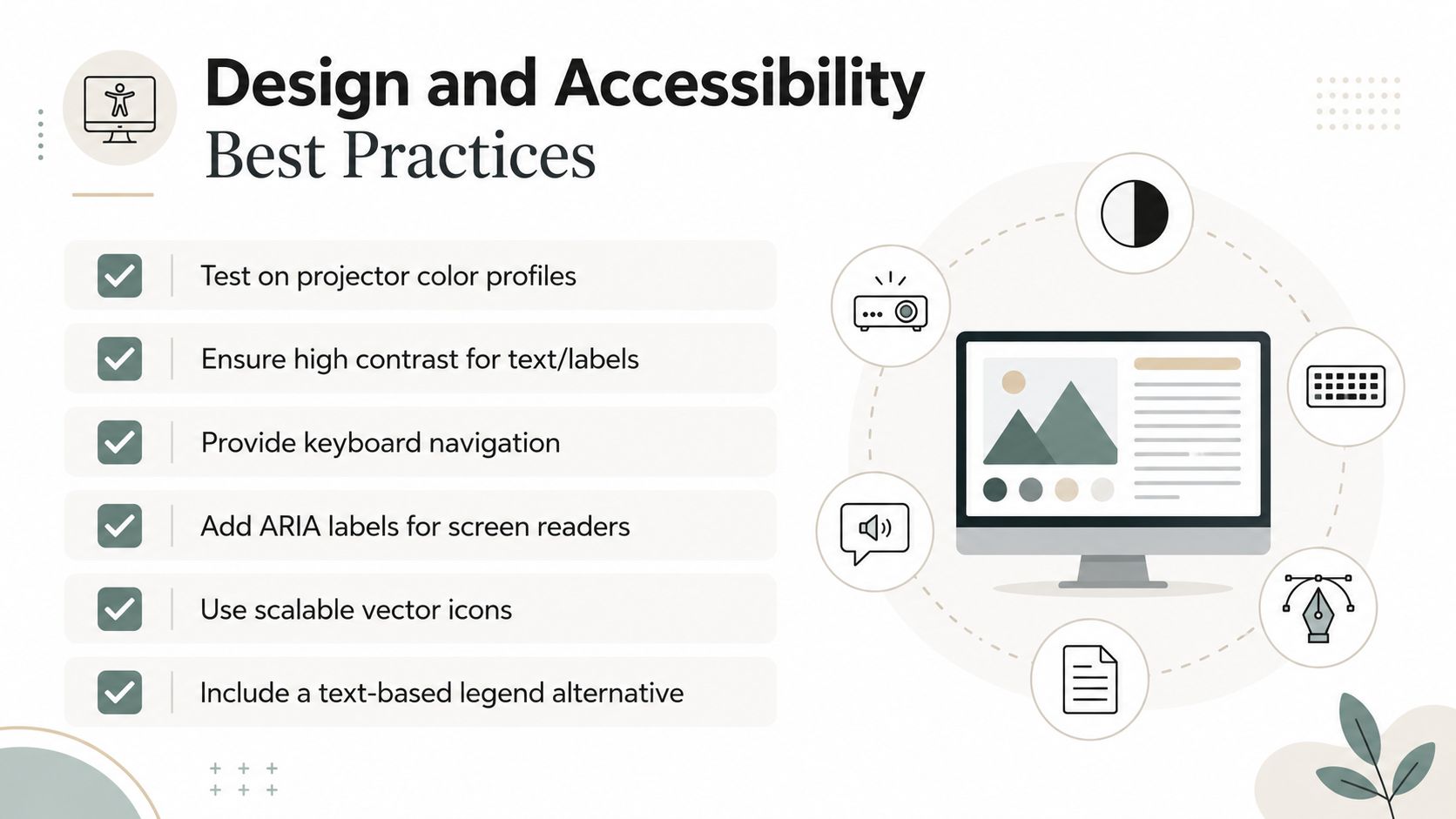
A map that looks crisp on a designer's laptop can look rough the moment it hits a projector, a conference room, or keyboard-only navigation. That's why design decisions and accessibility decisions can't be separated in revenue decks. If the widget is hard to read or hard to use, the buyer runs into friction before they ever reach insight.
Build for the room, not the mockup
Contrast has to hold up under real presentation conditions. Public-sector guidance for interactive maps calls for testing at 1280×1024, zooming the browser to 400%, and checking that all functionality still works and remains accessible, along with contrast ratios of at least 4.5:1 for normal text and 3:1 for large text (Minnesota accessibility guide for interactive web maps). That matters because map overlays, labels, and popups can become unreadable the moment a laptop is projected or zoomed.
Keyboard access is essential. Interactive maps should be fully usable by keyboard alone, with visible focus states and no keyboard traps, because maps that fail keyboard operability become unusable for assistive-technology users even if the visual layer still looks fine (BOIA accessibility tips for interactive maps). If a prospect can't tab through the map predictably, the widget has already failed.
Color alone also isn't enough. Routes, regions, and marker categories should have labels, patterns, or text equivalents, because color-only encoding breaks for anyone with reduced color discrimination and creates ambiguity even for sighted viewers in dim rooms (accessible maps guidance). In practice, that means treating the legend as a support tool, not the whole explanation.
Practical rule: if a salesperson needs to say, "the darker blue is the larger territory," the map isn't doing enough work on its own.
The testing checklist should include keyboard traversal, focus visibility, screen-reader labels, and behavior under zoom or reflow. That's tedious, but it prevents the exact kind of failure that makes a polished deck feel unfinished at the worst possible moment.
For teams comparing implementation maturity against accessibility requirements, guidance now tends to treat interactive maps as live widgets with lifecycle risk, not as one-off visuals. That framing is useful, because it forces the build to account for small screens, overlays, dynamic content, and repeated use across markets and devices (MNIT quick card on interactive maps).
Measuring Engagement With Map Analytics
Most slide analytics are too blunt to be useful. A dwell-time number tells you someone stayed on the slide, but it doesn't tell you whether they studied the map or just waited for the rep to move on. Map-specific events give you much better signal.
What to track and why it matters
The highest-value events are usually zoom depth, tooltip hover duration, region click sequences, and pan behavior. Zooming into a market usually signals that the prospect cares about geography at a granular level. Hovering a tooltip for a long time suggests that a particular data point deserves follow-up. Clicking adjacent regions often points to a comparison mindset, while jumping around can indicate a multi-site evaluation.
The widget becomes a revenue signal instead of just a visual aid. If the map is instrumented properly, the rep can see what the buyer touched before the follow-up call and tailor the next conversation to the actual areas of interest. That is a much stronger starting point than guessing based on which slide was on screen.
| Interaction signal | Sales meaning | Useful rep action |
|---|---|---|
| Zoom into a region | The buyer wants finer geographic detail | Prepare territory-specific follow-up language |
| Hover on a tooltip | One metric or location stands out | Bring extra context for that area |
| Click adjacent areas | The buyer is comparing nearby zones | Show why one region differs from the next |
| Pan across distant areas | The buyer is scanning multiple sites | Confirm whether this is a multi-market evaluation |
Privacy still matters. Prospect interaction data should be collected with clear retention rules and only to the extent needed for the sales motion. If the analytics layer turns into surveillance, it will create trust problems that outweigh the visibility gains.
One practical extension is to map these events back into CRM fields so reps can see which geographic views were used in the meeting. That makes the widget part of the qualification process instead of an isolated design feature.
Ready to Use Presentation Templates and Examples
Teams running territory and logistics pitches get more from a small, reusable set of map templates than from a custom design per account. The map has to survive live use, partial connectivity, and a rep who may be advancing the story while a buyer clicks around. What you want is repeatable structure, not decorative variety.
Territory coverage deck
In this format, the map is color-coded by account tier or service level. The rep opens with the broad coverage view, then lets the prospect click into a metro or region to see where peers are already active. The buyer gets a concrete way to place themselves in the coverage story instead of listening to a verbal summary.
A good fallback matters here. If venue Wi-Fi drops, the rep should have a static snapshot ready that keeps the same hierarchy of information. The map does not need to be flashy to work. It needs to be dependable under pressure.
Logistics optimization pitch
This version overlays warehouse or distribution points against service areas, then lets the rep toggle delivery assumptions while the buyer watches the map update. The map becomes a planning artifact the buyer can watch update in real time. It works well when the buyer wants to see how the network behaves across multiple locations.
If you are building the deck inside a web-native presentation tool, the map can sit beside other interactive content without forcing the team back into image exports. One practical option is Encelade, which includes interactive widgets such as maps inside a browser-based presentation workflow.
Market expansion narrative
This template uses a choropleth view to show where the addressable opportunity is concentrated, then moves from current footprint to likely expansion zones. The strongest version keeps the story tight, one map for current state and one for the next move. That keeps the slide from turning into a geography lesson.
The handoff matters for teams building these decks. Let the prospect take control when they need to verify a location or compare a region, then reclaim the narrative once the question is answered. The map supports the rep's narrative rather than replacing the pitch structure.
For teams that want to turn slides into more interactive assets beyond maps, how to make interactive slides is a useful adjacent concept. The broader lesson stays the same. Build for motion, not for screenshots.
Getting Started With Interactive Map Widgets
The three objections come up every time. Leaders worry that live data will expose gaps during the pitch, that reps will fumble the interaction on stage, and that the build won't justify the effort. All three are fair, and all three are manageable.
Sandbox environments solve the first objection. A rep should never rehearse on production data if the live record could derail the meeting. Guided interaction modes solve the second by limiting which controls the rep can trigger in front of a buyer, so the demo stays on rails without feeling rigid.
The budget question is usually weaker than it sounds if you connect the widget to actual engagement behavior. If the map increases the amount of useful buyer interaction, it's doing work that a static slide can't. That doesn't mean every deck needs one, it means the highest-value geography slide should be the first candidate for replacement.
Start with the map that matters most in live conversations. Then choose an integration path that matches your CRM and data maturity, not the most ambitious version available. After that, run a controlled pilot with two reps across ten deals, watch what buyers do, and scale from there.
Encelade helps revenue teams replace static geography slides with interactive, web-native presentations that carry map widgets, live data, and engagement analytics. To see how a browser-based deck workflow fits the way your team already sells, book a 30-minute demo.