The deal is shifting, the prospect appreciates the implementation story, and someone asked about the timeline again. The version in the slide comes from last week. The spreadsheet shows three conflicting dates, and now your team has to explain the discrepancy between the proposal and the follow-up email.
This is the actual issue when it comes to creating Gantt charts for sales and presales teams. Adding the bars is simple. Keeping the schedule plausible while the deal changes is the part that breaks. A Gantt chart begins as a planning aid, but in revenue work, it must behave like a live asset because buyers notice when a timeline is stale, and a stale timeline will cost more trust than a messy one.
Table of Contents
- Why Static Gantt Charts Fail Revenue Teams
- Structuring Your Gantt Chart Data Model
- Constructing Gantt Charts for Presentation Purposes
- Connecting Live Data Keeps the Timeline Up to Date
- Generating Gantt Charts Programmatically
- Troubleshooting Common Issues and Best Practices
Why Static Gantt Charts Fail Revenue Teams
A member of the presales team makes an evaluation timeline on Monday, exports it to PDF on Tuesday, and has a procurement call on Thursday that kicks off a week later. By Friday, the deck still shows the old date and the customer is looking at the out of date version, and the AE is explaining why the schedule does not align with the actual work being done. This is why static charting fails. Static charting is very effective in creating an appearance of having a fully functioning, updateable chart, but as soon as the chart is exported, it freezes.
The main issue that leads to failure is version drift
Most tutorials teach you to build a chart once, then paste a screenshot or export for the deck. That works when the project is stable. Revenue teams work in a different rhythm, where dates move, stakeholders ask for revisions, and several versions circulate at once. Microsoft's own Excel guidance frames the build around adding the name, starting date, duration, and status of each task to a data table, then rendering it from a template or a stacked bar chart in its Gantt chart walkthrough. That is a sound planning method. It just has no answer for what happens after the file leaves your hands.
A static file fragments the story. Sales has one version, implementation has another, and the buyer could be looking at an old attachment in their inbox. Loss of credibility is avoidable and it's the same failure pattern behind version control for documents.
Practical rule: if the chart will be shown more than once during a deal cycle, it needs a data source, not just a design file.
What buyers actually need to see
While buyers may not appreciate a fancy Excel, what they will appreciate is a clear and workable structure of what order and dependencies look like in a process and where the handoff occurs. The Association for Project Management describes Gantt bars as showing start and end dates, dependencies, and deadlines, as well as the task ownership and how much of the task is completed. If a Gantt slide cannot answer those five questions, it isn't doing the job a Gantt chart exists to do.
The stakes are higher in a deal than in an internal plan, because one timeline often supports a proposal, a technical validation, and an internal approval path at the same time. A chart that lives in a shareable presentation can be updated without rebuilding the file, and is truly a different kind of asset than a slide image.
Structuring Your Gantt Chart Data Model
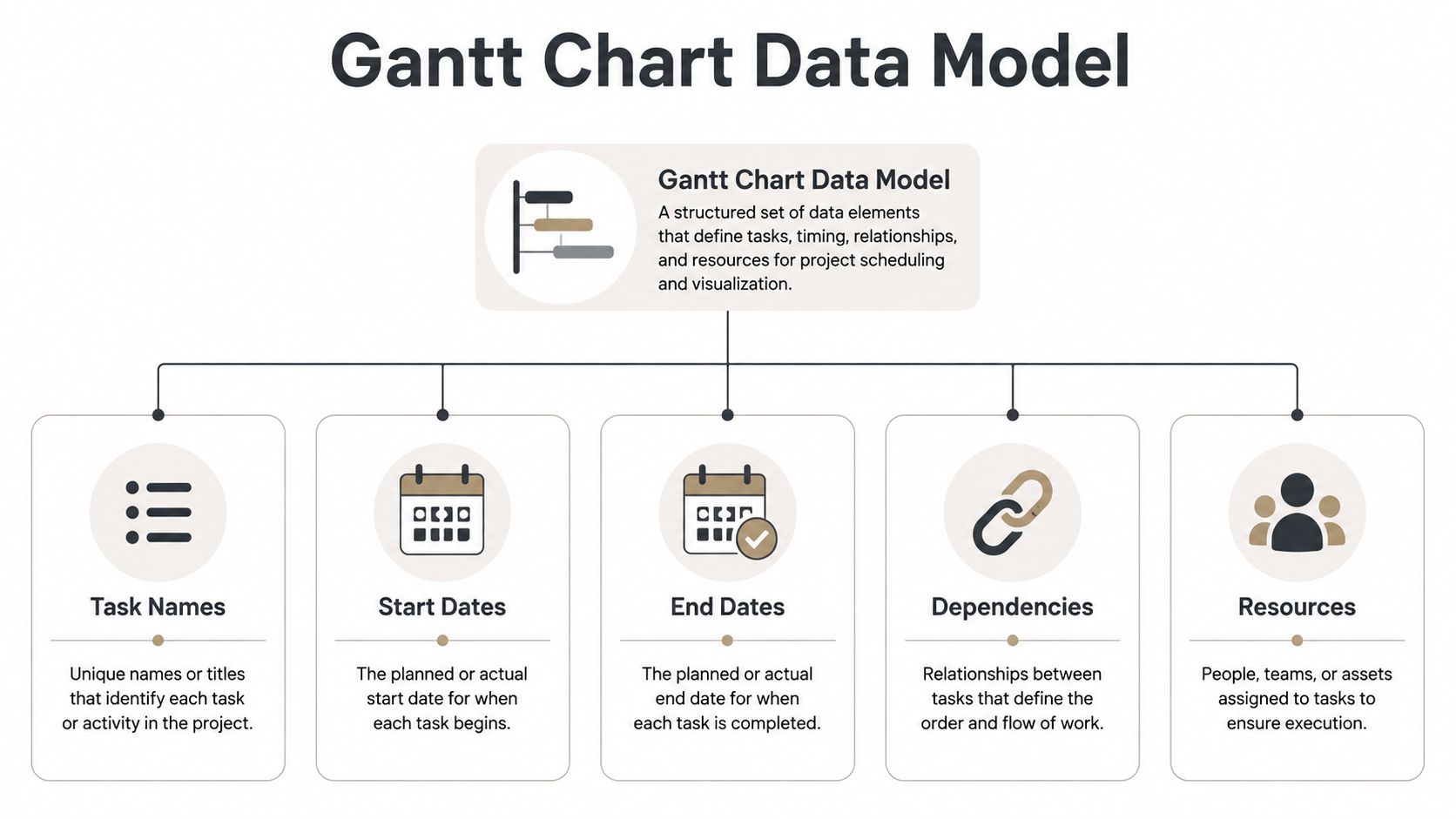
Before any visual tool is utilized, the data must describe the work in a chart-readable format. This usually means one row per task with the dates and relationships needed to place that task on a timeline.
Start with row structure
A typical sales implementation timeline usually includes rows for discovery workshop, security review, sandbox setup, integration validation, and go-live review. Each step should be on its own row. Atlassian says that the build includes defining the scope of the project, listing all of the steps and sub-steps, estimating the durations of the steps, and identifying the dependencies and the tool. Note where dependencies sit in that sequence. They come before tool selection, because order matters as much as length.
The columns that earn their place look like this.
- Task name: the name of a step that a buyer will recognize, not an internal task name.
- Start date: the start date of the step.
- End date: the finish date of the step. If your model shows step duration, determine start date and end date, but select a single source of truth.
- Dependency: a step that must be completed prior to another step. APM is very clear that when a chart is constructed, each step must be identified, an estimate provided for each step, and the task dependencies must be defined. Keep this column even if your presentation tool can't do step dependency arrows, ours doesn't and most won't do so at a presentation fidelity. Fixing the publication date gets this app upstream. Align those correctly and the sequence will appear, since each row is defined by the start date on the chart.
- Owner or resource: the person or team responsible. An owner assignment reads as a staffing commitment, so leave the field blank deliberately rather than by accident.
If a relationship is only known to the presenter, it will not be documented. Overlapping tasks that are not clearly defined as a dependent task will make a schedule look random, and inconsistent date formats across rows are the most common reason a chart will render wrong after a sync.
Treat milestones differently than tasks
Milestones are one-time events, while tasks represent work duration. The Minnesota Department of Health's QI toolbox, excerpted from Nancy R. Tague's The Quality Toolbox, states the convention directly: For events that happen at a point in time, such as a presentation, draw a diamond under the time the event must occur, and for activities that occur over a period of time, draw a bar spanning the appropriate times. In presales that distinction is not cosmetic. A kickoff date, demo, and a signature should never appear to be the same as a three week implementation.
Here's a warning from the revenue side of the business: don't assume reviews or approvals represent definitive moments in time, unless they will actually happen at a defined moment, such as a scheduled meeting. Security reviews and procurement approvals can take days, if not weeks. Starting a timeline with a diamond to represent a security review is lying to a buyer.
Practical rule: if something is durationless, don't enforce it with a bar. If something is of unknown duration, don't reduce it to a diamond.
Most slide-related tools, including ours, have no milestone shape. Every row is a bar. Rather than leaving the end date blank and therefore having your audience infer that the milestone is of no duration, you should give the milestone a span of one day. In our timeline, if the end date is left blank, the milestone will default to a span of a week, thereby extending the duration of your signature. Name the row to identify the event, and group the milestones to achieve spacing.
The structure also determines what you can automate later. If the chart will feed an editable deck or refresh from a source table, the row layout has to stay stable across updates. That is where a static table turns into a presentation asset, and the same discipline shows up in how interactive slides are built.
Constructing Gantt Charts for Presentation Purposes
A Gantt chart designed for stakeholders should be usable outside of a presentation. There are limits when working in a spreadsheet or presentation software that will compromise legibility. Bar charts should also support not contradict the story a slide is trying to tell. A chart that reads cleanly in Excel can lose this legibility. A design should be derived based on audience understanding.
Gantt Charts for Buyers, not Users
A C-suite audience usually wants phases and milestones. A more technical audience wants sequencing and handoffs. The Minnesota guidance advises setting the horizontal time axis in a scale appropriate for the task duration, using days, weeks, or months, and Microsoft's walkthrough suggests verifying the time scale meets your needs rather than accepting the default. The audience should set that scale.
- Gantt Chart Labels for Executives: major phases, Milestones, and handoffs.
- For Evaluators it could be: Validation windows, and dependencies.
- Use already established Microsoft best practices for task name length to determine if there is a need for a group name versus a long name. Task names should also be written as a group and aligned instead of shortened.
There are some alternative examples to the common bar layout in the creative timeline ideas for sales decks post.
Format the visual so it reads in a meeting
The description shows how, with some workarounds, Excel can be used to approximate a Gantt Chart, the most popular method for project planning.
A stacked bar chart is the starting point. The fill for the first data set is removed, and the order is reversed to have the task durations in front. This technique can be easily translated to other presentation software as audiences have trouble understanding bar placement and cannot see the relationships.
Progress needs to be reflected. Microsoft's template guidance explains how to show planned tasks vs. actual tasks, task completion percentages, and a placeholder to represent the current time. While Minnesota's How To does the same thing using a timeline: fill the bar when the work is done, and show the current position using a vertical marker. A Gantt chart shows the phases of a task, planned vs. in progress, which usually answers the question behind the question.
Color should be purposeful and consistent. The meaning should be fixed before a chart is built because teaching the buyer nothing by showing color coding by phase in one deck and status in the next teaches nothing. Our timeline layer fixes this for you: color shows status — planned, in progress, completed — and nothing else, so the presales vs. deliveries split comes from elsewhere.
Swimlane groups are exactly where they belong. Put presales validation in one group and post-sale delivery in another, and the phase boundary reads off the row headers while color stays flexible to address the only question a buyer asks during a meeting: is this completed or not? That also solves the legend issue, since a heading requires no interpretation.
Connecting Live Data Keeps the Timeline Up to Date
To make a Gantt chart look legit during a sales cycle, stop thinking about it as an image. Follow one master schedule (your Google Sheet or CRM milestone table or a project management tool) and have every deck reference that schedule so that the scheduling is done in the governed table rather than built from memory in each deck. The buyer will see one up-to-date schedule rather than multiple old attachment schedules.
Choose a source that matches the team's operating model
Your team's operating model dictates which schedule you use. If your team has a higher spreadsheet management maturity, you can use a single Google Sheet as the master schedule to feed multiple proposals. If your team has a strong system management discipline, you can use the project management or CRM systems to populate schedules using a REST API. Either way, the master schedule source must stay the same, as the chart must understand which field is the task name, start field, and end field.
Practical rule: a stable column name is more important than good formatting. A live chart breaks quicker from a renamed column than bad formatting.
The benefits show up across the account. One implementation timeline can feed the proposal, the follow-up summary, and the internal forecast view without spawning multiple releases.
Be intentional with refreshes
Understand which layers connect to a source and which layers you refresh on purpose, because they react differently in high-pressure situations. In Encelade the chart and statistic layers are the layers that bind to a data source; a timeline layer is refreshed from that same governed table as an explicit step, rather than through a background sync. It is a fair trade-off to provide a customer-facing schedule. A chart that refreshes in the middle of a presentation is as unhelpful and a lagging timeline. However, it only provides that value if someone owns the refresh. Before the meeting, rather than after.
If the schedule remains link-based and real-time, a web-native presentation is the better choice, with a spreadsheet export still being the better choice for offline distribution. If the timeline needs to be placed in a larger operating view, our guide to a real-time data dashboard will assist with bound source widgets that will be placed alongside the timeline.
A step by step walkthrough will be available to show you the inner workings of the spreadsheet, if needed.
Generating Gantt Charts Programmatically
In a scenario where a sales engineering team has numerous proposals, rebuilding Gantt Charts each time is very time consuming and causes a bottleneck. A better approach is to generate timelines from a single task list and have the presentation layer handle the rest.
When To Use Code over Clicks?
Code pays its pay when a chart is constructed using fields from the CRM or account specific tables, and the same layout is required across multiple deals without having to re-style each slide. For small, local, and quick edits; or for small, internal and short schedules, excel methods remain useful. For such repeatable methods, code should be used, especially for presales automation where slight changes are made to the same steps and phases over and over again.
Structure the Data for the Presentation Layer
Separate the work, as the deck and the timeline are built via different paths. Our presentation API assembles the surrounding deck in a single REST call from raw text, URLs, and documents, with a task spreadsheet attached as supporting material that informs the narrative, and it connects through MCP, n8n, LangChain, or CrewAI when the presentation is one step in a longer automation.
The Gantt layer is built natively in the editor, and turns your list of tasks into bars. Each task has a name, start and end dates, status with optional group and owner. Date fields are in the format YYYY-MM-DD. The end date cannot be set earlier than the start date. Paste the rows, and the fields your CRM stores land on the slide in the deck's own theme.
Clean the data because the task list validates sets rather than rows. Each individual issue, like a missing name, date that is set before the start, or a misplaced field, leads to rejection of the whole set. The safest option is to reject an entire set, to ensure that only complete, valid sets are used. However, this also means that the reason for rejection must be read.
The exception is worth noting, because it rejects in an opposite manner. An empty name field is valid. As such, an empty name field in a spreadsheet will be shown as an empty cell, and will not prevent an update. This means that an empty cell must be checked manually. Confusingly, the strongest setup is usually mixed: The API builds and rebrands the deck around the story, and a given task table populates the time line layer.
In practice, finished decks will remain linked, and will be exported to PDF and PPTX formats when a file copy is needed by a stakeholder.
Troubleshooting Common Issues and Best Practices
A Gantt chart will typically fail during a meeting, as problems that should have been identified earlier surface. An update that was never made will result in a timeline that exceeds the bounds of the slide. The fix is rarely more styling.
Fix the common failure points
- Dates that never land: normalize every row in the source to a date-only
YYYY-MM-DDformat to resolve issues with dates that "never land." A timestamp extracted from a CRM export is not "one day off" and is rejected; because a list is validated as a set, one of them will cost you the entire update. - Cluttered sequencing: minimize cluttered sequencing by removing dependency metadata in the source table, leaving only the dependencies that impact a decision. Resolve sequencing by remove clutter from the timeline slide. Rows should be the primary constituent of clutter.
- Unreadable timelines: reduce the task count, split across pages, or move the range from weekly to monthly to quarterly until the audience can follow the sequence.
Then proofread it the way the Minnesota method prescribes: check that every task of the project is actually on the chart, and keep it updated during execution. In revenue work the first version is almost never the not become final versions.
Match the chart to the stakeholder
Presales charts should be tighter than delivery plans. Executives need decisions, risks, and milestones. Technical reviewers need sequencing and blockers. A chart that tries to satisfy both usually satisfies neither, and the honest fix is two views rather than one compromise.
Practical rule: if a buyer has to ask what a chart means, the chart is too detailed for that meeting.
Instead of squeezing too much onto one slide and making everything shrink, choose multiple views. The difference between a chart that advances the discussion and one that stops the discussion in its tracks is usually that.
If you want Gantt charts that stay current inside proposals, account plans, and customer-facing decks, build them as live presentation assets rather than static screenshots. Encelade generates web-native decks with native timeline layers and programmatic workflows, so the schedule keeps up with the deal, or book 30 minutes here to see it on a real implementation plan.