You have just finished the strongest part of your presentation. The demo worked, the stakeholders nodded, and the buyer finally raised the objection you wanted to hear. Then the last slide appears: "Thank you" in oversized type, with no obvious way to ask a question or continue the conversation.
That ending feels polite, but it often leaves momentum without a destination. A strong thank you and questions slide should work as a live handoff, helping the audience remember the point you want them to retain, take part in the discussion, and move on one useful next step.

Table of Contents
- Why Your Closing Slide Decides What Happens Next
- What to Put on a Thank You and Questions Slide
- Designing Layout and Copy That Invites Questions
- Turning Your Final Slide Into an Interactive Handoff With Encelade
- Making Your Closing Slide Accessible and Ready for Any Screen
- Your Final Check Before You Present
Why Your Closing Slide Decides What Happens Next
The awkward ending usually arrives after a well-structured deck. The presenter reaches the final slide, says thanks, asks whether anyone has questions, and waits. The audience looks at a blank-looking screen while deciding whether speaking up is worth the effort. If nobody moves first, the meeting ends with polite smiles instead of a follow-up commitment.
The reason this matters goes beyond presentation etiquette. The serial-position effect, one of the more durable findings in memory research, holds that people recall the beginning and the end of a sequence far better than the middle (a reference on the primacy and recency effects). Whatever is on screen when the discussion opens is what the room is most likely to carry out the door. The practical lesson is clear: the final screen deserves the same strategic attention as the opening.
A closing slide has to do three jobs without competing with the discussion:
- Reinforce the one takeaway you want repeated after the meeting.
- Make questions feel explicitly welcome.
- Point people toward one clear next action.
Practical rule: if the audience has to decide what to do next, your closing slide hasn't finished the job.
For revenue teams, the last minute can determine whether a prospect books a follow-up, requests a proposal, or files the presentation away. A closing slide that names a single, concrete next step gives that decision somewhere to go, while a bare "thank you" leaves it to chance. The same logic favors a short, structured recap over a decorative sign-off: when the final screen restates the one or two points you want repeated, it works with the recency effect instead of wasting it.
None of this means every deck needs a sales pitch on its final screen. It does explain why "thank you" alone is passive. Your closing slide should make the next conversation easier to start.
For a fuller treatment of the final moments of a talk, see our guide to concluding a presentation. The strongest ending combines gratitude with a deliberate invitation, a memorable takeaway, and a frictionless path to continue.
What to Put on a Thank You and Questions Slide
A good thank you and questions slide is intentionally restrained. It should look complete at a glance, not like a compressed summary of the entire presentation. A useful working limit is a thank-you heading, a contact block, one optional visual, and one optional call to action. Guidance on closing-slide design makes the same argument from the other direction: try to fit everything and the slide becomes a cluttered mess. One closing-slide layout guide puts it plainly — clutter destroys credibility, and a thank-you slide should feel open.
Start with the invitation
Use a brief heading such as "Thank you", "Questions?", or a more conversational combination such as "Thank you. What should we unpack?" The wording should make it obvious that discussion is welcome. A vague ending forces the presenter to carry the entire invitation verbally, while a clear prompt gives the audience a visual cue to act.
Add one useful contact path
Include the speaker's name and title, then choose one contact method. That might be an email address, a website, a scheduling link, or a QR code. Keep the total copy short — a line or two, not a paragraph — so the route to reach you reads instantly from across the room.
Multiple links create a choice problem. If your audience sees an email, website, social profile, calendar link, and QR code, they have to work out which one matters. Pick the route that matches the meeting objective.
Use one call to action
The CTA should describe a concrete next step, not a general hope. "Book a technical review," "Send us your priority use case," or "Request the implementation outline" gives the audience a clearer path than "Learn more."
For research and technical presentations, include acknowledgments when contributors or collaborators need recognition, but don't let that block overpower the handoff. Put detailed sources, methodology notes, anticipated objections, and backup data in appendix slides instead. A well-organized appendix lets you answer a difficult question without abandoning the main presentation flow.
Remove anything that belongs elsewhere
Don't add a dense summary, a second CTA, a long list of links, or every participant's contact information. The final slide should signal closure while remaining useful during Q&A. Research- presentation guidance recommends displaying the presenter's name, email, and social handles on a Questions slide so follow-up can continue, alongside an acknowledgments section that thanks the people and programs behind the work (this research presentation guide). The goal is a screen that stays clean and readable while still giving people a way to reach you.
Designing Layout and Copy That Invites Questions
The audience should understand the slide from the back of a room and from a phone screen. That starts with hierarchy. Make the invitation to participate the dominant element, place the takeaway close to it, and keep the contact path visually distinct but secondary.

A practical layout might use a large question prompt on the left and a compact contact card on the right. Beneath the prompt, add one sentence that reinforces the presentation's central value. The contact card can carry the speaker's name, role, and one action link. This arrangement gives the audience a clear focal point without turning the slide into a miniature landing page.
Replace vague copy with a conversational prompt
"Any questions?" is familiar, but it doesn't always help people decide where to begin. Specific prompts reduce the social friction of asking the first question:
- "Which part of the rollout needs more detail?"
- "Would it help to review the security workflow?"
- "What would prevent your team from piloting this?"
- "Should we explore the reporting or implementation path?"
Each prompt directs attention toward a useful conversation. For an executive audience, use a business question. For a technical audience, invite scrutiny of the architecture, data flow, or deployment process. For a fundraising audience, point toward the decision or information needed next.
A short takeaway line can also make the closing more memorable. "The platform keeps account research, proof points, and next steps in one buyer-ready experience" does more work than a decorative slogan because it reminds the audience what the presentation was supposed to establish.
Thoughtful storytelling choices in presentation design can help you connect that takeaway to the narrative that came before it. The final line should feel like the natural conclusion of the argument, not a new claim introduced after the evidence has ended.
Use large, high-contrast type, generous spacing, and a consistent template. The slide needs to stay legible while the presenter repeats questions, pauses, and answers. A visually crowded close competes with the person speaking, exactly when the audience's attention should move toward dialogue.
Turning Your Final Slide Into an Interactive Handoff With Encelade
A static closing slide can invite action, but a web-native close can remove several steps between intent and follow-up. Instead of showing a QR code that leads to a generic homepage, connect the audience to a purpose-built contact card, scheduling page, product resource, or account-specific next step.
The important distinction is not "more interactivity." It is useful interactivity. A widget belongs on the final slide only when it helps the audience understand, decide, or continue.
Match the interaction to the conversation
A sales presentation might use a live contact card with a scheduling link. A product evaluation could include a device mockup that lets the buyer revisit the workflow discussed during the demo. A geographically distributed rollout might benefit from a map showing service coverage or deployment locations. A technical review could use a compact architecture visual or a link to the relevant implementation resource.
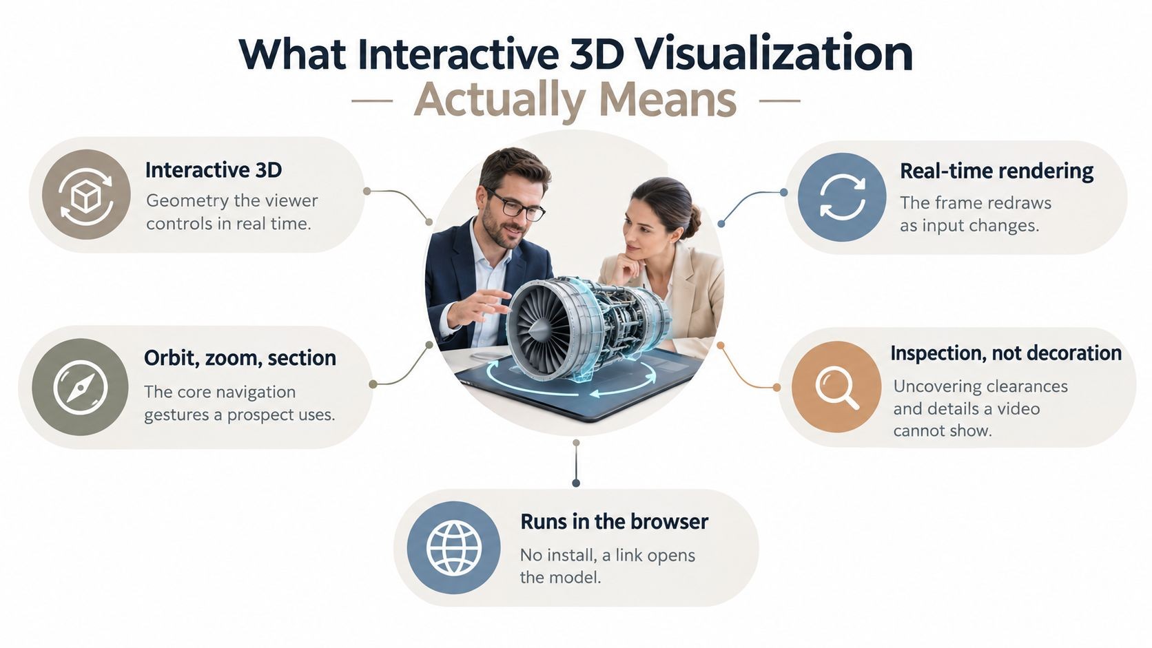
Native 3D can also support brand recall when the final slide stays visible during a long Q&A. A product model, environment, or logo treatment can give the screen a polished visual anchor, but it shouldn't distract from the question prompt or CTA. The audience needs to know what to click or ask before it explores anything else.
Keep the handoff live after the meeting
Link-based sharing gives everyone one current version instead of a collection of downloaded files. That matters when contact details, scheduling availability, product metrics, or supporting resources change after the presentation. A responsive layout also keeps the CTA usable when someone opens the deck on a laptop or phone rather than the conference-room display.
For teams generating decks from account research, CRM notes, spreadsheets, or documents, an API workflow can make the closing slide part of the deck-generation process rather than a manual afterthought. The Encelade Presentation API supports programmatic presentation generation, which can help teams apply a consistent closing structure across customer-facing decks.
Bulk restyling is useful when the close works but the branding doesn't. A single prompt can update color, typography, and layout across a deck, reducing the chance that a last-minute brand change leaves the final slide inconsistent with the rest of the presentation.
The trade-off is discipline. Don't add a map, 3D model, chart, live feed, QR code, and scheduling widget just because the platform supports them. Pick the interaction that supports the meeting's next decision, then make that action prominent and test it before presenting.
Making Your Closing Slide Accessible and Ready for Any Screen
A closing slide often stays on screen longer than any other slide, so small design failures remain visible throughout the discussion. Low contrast, tiny contact details, crowded layouts, and broken links don't just look untidy. They make it harder for people to participate and harder for remote attendees to continue the conversation.

Test what people actually see
Start with contrast. Text should stand out clearly from the background, and the CTA should stay distinguishable without relying on color alone. Use readable type, avoid decorative fonts for contact information, and check the slide from the back of the room before assuming it works.
A common design benchmark is to keep body type around 28pt or larger so it reads from the back row. Treat that as a starting point rather than a universal rule, and test the actual room, projector, and viewing distance — the right size depends on the screen and the space.
Use plain English for the question prompt and CTA. Short, direct language helps people understand the invitation quickly, including attendees who are reading on mobile or working in a second language. Add descriptive alt text for meaningful graphics, icons, and QR codes in the digital version so people using assistive technology aren't left without context.
Check the technical handoff
Before presenting, open every live link. Scan the QR code with a phone, confirm that it reaches the intended destination, and verify that the destination doesn't require an unexpected login. Test the slide at presentation size, laptop size, and mobile width. Responsive layouts should preserve the question prompt, contact path, and CTA in that order.
Keep one core action on the slide. Minimal text, a consistent template, and a single operational focus keep the final screen from competing with the discussion. For technical presentations, prepare an appendix index with likely objections and data clarifications. That lets you jump to supporting material quickly instead of searching through the deck while the questioner waits.
During delivery, repeat the question, acknowledge the person who asked it, pause, and answer concisely. The pause can feel longer to the presenter than to the audience, but it gives you time to confirm what the person wants to know and prevents a rushed response. Treat the close as an operational handoff rather than a decorative final frame.
Your Final Check Before You Present
Run the closing slide through a short preflight before the audience arrives. You're not checking whether it looks impressive in the design file. You're checking whether a buyer can understand the invitation, remember the point, and continue without asking for help.
Verify the message
Ask four questions:
- What single takeaway should remain after the meeting?
- Does the slide explicitly invite questions?
- Is there one contact path that matches the meeting objective?
- Is the next action specific enough to complete?
If you can't answer each question quickly, revise the slide. A generic "Thank you" can work as a spoken courtesy. In fact, one pointed argument against the thank-you slide holds that you can thank the audience out loud and skip a dedicated slide altogether, because the last slide is what the room looks at longest during the question period — so it should summarize the messages you want remembered rather than say nothing (this commentary on closing slides). The distinction is the useful part: the screen should earn its place by reinforcing the takeaway or the next step.
Verify the experience
Check the copy length, contrast, font size, reading order, alt text, responsive behavior, link destinations, and QR code. Hide nothing important in a tiny footer. Don't make the audience choose between several competing CTAs.
Finally, rehearse the transition into Q&A. Thank the audience out loud, state the prompt shown on screen, and pause. Let the slide hold the contact information and next action while you focus on the person asking the question.
A closing slide that drives follow-ups isn't louder than the rest of the deck. It's clearer. It gives the conversation somewhere to go after the applause stops.
Encelade helps revenue teams build interactive, link-based presentations with live data, responsive layouts, native 3D, and widgets that keep a closing slide useful during Q&A. To turn your next thank-you and questions slide into a branded handoff that captures the next action while the conversation is still live, book a 30-minute demo.