For a 10 minute presentation, the two most common answers are 10 slides or 5 slides. The familiar one slide per minute convention points to 10. A leaner, pitch-style deck that gives each idea about two minutes points to 5.
If you’re building a deck right now, that split probably feels unhelpful. You’ve got a calendar invite coming up, a half-finished PowerPoint or Google Slides file open, and one practical question: do you need more slides to cover everything, or fewer slides to land the message?
A short presentation is usually a trade-off between coverage and impact. More slides let you touch more points. Fewer slides give you room to tell a story, explain a chart, handle a transition, and sound like you know the material instead of racing through it. The right slide count depends less on a magic rule and more on what the audience needs to do when you’re done.
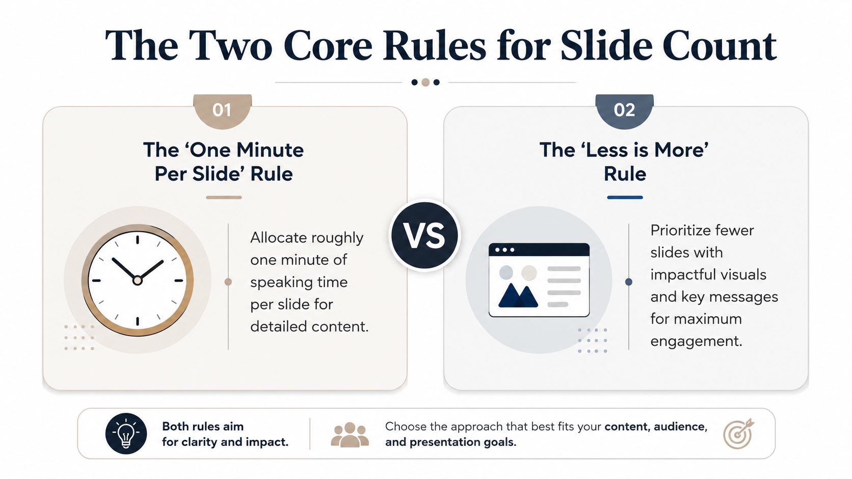
The Two Core Rules for Slide Count
You have 10 minutes, a decision-maker in the room, and a deck that keeps growing. That is usually where slide count becomes a strategy question, not a formatting question.
The familiar baseline is one slide per minute, which works out to a 10-slide deck for a 10-minute talk. It’s worth being honest about where that number comes from: it is presentation-coaching convention, not a research finding. Nobody has demonstrated that 10 slides beats 9 or 11. What the rule really does is force one clear point per slide and give you a rough pacing check, which is genuinely useful when your audience needs a fast scan across several topics.
The leaner approach is often attributed to Guy Kawasaki’s 10/20/30 rule. Quoted exactly, it says a PowerPoint presentation “should have ten slides, last no more than twenty minutes, and contain no font smaller than thirty points”. Two caveats matter here. First, it’s a venture-capital pitch rule — the ten slides are specific topics like problem, solution, and business model. Second, it never scales slides to duration; Kawasaki’s stated reason for ten is that “a normal human being cannot comprehend more than ten concepts in a meeting,” which is a ceiling on ideas, not a rate.
So the popular “10/20/30 means 5 slides for 10 minutes” move is an extrapolation, not something Kawasaki wrote. It’s a reasonable one — the rule implies roughly two minutes per slide, and halving the time halves the deck — but it’s our arithmetic, so treat it as a starting point rather than an authority.
When 10 slides makes sense
Use the higher count when the job is to cover ground cleanly. Internal updates, research summaries, project reviews, and academic presentations often fall into this category. The audience is tracking multiple points, not following one dramatic argument from start to finish.
A 10-slide deck usually fits if:
- Your content breaks into distinct parts. Context, evidence, options, risks, and recommendation can each sit on their own slide.
- You need clear signposting. Frequent visual changes help the audience stay oriented.
- The audience expects breadth. They want to see the full picture, even if each point is brief.
This approach has a cost. More slides mean more transitions, and every transition takes a few seconds. If the deck is dense, you can hit slide 8 with two minutes left and start rushing. For a related benchmark, this guide on how many slides fit a 15-minute presentation shows how deck density shifts as the speaking window gets longer.
When 5 slides is stronger
Use the lower count when the goal is persuasion. Investor pitches, executive proposals, keynote-style talks, and decision meetings usually benefit from fewer slides because attention stays on the argument, not on the mechanics of flipping through the deck.
A simple test helps here. If the audience only needs to leave with three remembered points, a 10-slide deck often spreads attention too thin.
The 5-slide model forces sharper choices. You need a stronger opening, better transitions, and a clearer close. You also have less room to hide extra context that does not change the decision.
Structuring Your 10-Minute Narrative Flow
You have ten minutes, the room is waiting, and slide 3 is still doing the job of slides 3 through 6. That is how short talks go off the rails. The problem usually is not the slide count by itself. It is a weak narrative shape.
If you want coverage, the story needs tighter segmentation so the audience can track more ground quickly. If you want impact, the story needs more space around fewer points so the audience can absorb the argument and remember it.
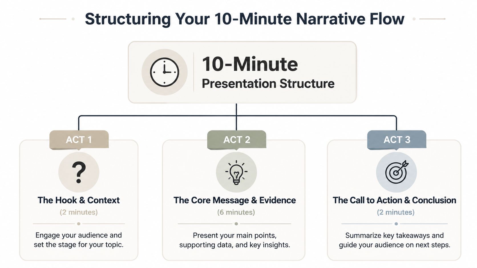
Opening and context
Use the first minute to earn attention. In practice, that usually means 1 to 2 slides.
The opening needs to answer three questions fast:
- What problem or decision are we here to address?
- Why does it matter now?
- What will the audience have by the end of these ten minutes?
A title slide is fine if it carries the opening with it. A weak title slide wastes time. A strong one frames a decision, a tension, or a consequence the audience already cares about.
In an executive review, the stakes should land within the first 20 to 30 seconds. Conference talks allow a little more room for scene-setting, but not much. Ten minutes is short enough that every slow opening steals time from the proof.
Core message and proof
The middle is where the deck either earns trust or starts to sprawl. This section usually takes 5 to 7 slides, but the underlying rule is simpler. Give each slide one job.
A short talk works best when the middle follows a clean sequence: point, proof, implication. If one slide is trying to explain background, show evidence, compare options, and recommend action, the audience has to sort the logic for you. They will not do that under time pressure.
Coverage decks and impact decks handle the middle differently. A coverage deck may use more slides with lighter explanation so you can touch context, evidence, options, and risk. An impact deck should slow down around the few points that change the decision. That is why fewer slides often feel stronger in pitches, budget requests, and recommendation meetings.
If the middle still feels crowded, fix the order before you cut words. Good storytelling in presentations comes from sequencing ideas as tension, evidence, and resolution, not from stacking topics because they all seem important.
Closing and call to action
Finish with 1 to 2 slides and make the landing clear.
One slide should lock in the takeaway. The final slide should state the ask in plain language. Approval. Budget. Feedback. A pilot. A next meeting. Pick one.
A practical close sounds like this:
- Decision meeting: I recommend option B, for these two reasons.
- Project update: We are on track, and we need sign-off on the timeline change.
- Pitch: The next step is a pilot, and here is why it is worth doing now.
If the audience leaves clear on the problem, the proof, and the next action, the narrative worked. If they leave remembering only that you moved through a lot of slides, it did not.
Pacing Your Delivery Beyond the Slide Count
A deck can have the right number of slides and still feel chaotic. The reason is simple. Audiences don’t experience slide count. They experience pacing.
One title slide may only need a brief introduction. A product architecture slide might need a slower walkthrough. A single image can flash by quickly if it’s there to create mood or emphasis. The useful unit isn’t just slides. It’s time per concept.
Why pacing breaks short talks
The most common mistake is adding “just a few more examples.” Examples feel cheap when you build the deck and expensive when you present it, because every example needs setup, explanation, and a transition out. Three extra example slides can quietly consume the time you reserved for your recommendation.
There is real research behind cutting them. In multimedia learning, the coherence principle holds that people learn more deeply when extraneous material is removed rather than added — even when that material is interesting and relevant-adjacent. In Richard Mayer and Logan Fiorella’s review in The Cambridge Handbook of Multimedia Learning, the effect held in 23 of 23 experimental tests, with a median effect size of d = 0.86. That is a large, consistent result, and it points the same direction every time: subtraction beats addition.
Note what that research does and does not say. It does not identify a slide-count cliff, and you should be sceptical of any article that claims one. It says extraneous content costs you comprehension. A slide that doesn’t change what the audience thinks or does is extraneous content.
A better way to time slides
Use three timing buckets during rehearsal:
- Fast slides: title, section divider, simple image, one-line takeaway.
- Medium slides: a normal point with one chart, one framework, or one example.
- Slow slides: a complex chart, a comparison, a live demo setup, or a critical recommendation.
If one slide needs careful explanation, let it have the time. Borrow time by deleting a weaker slide elsewhere.
This is why a 5-slide presentation can work brilliantly and a 10-slide presentation can still be right. The question isn’t “How many slides fit?” It’s “How many ideas can you explain clearly without rushing?”
How Presentation Goals Change Your Slide Count
The biggest weakness in most slide-count advice is pretending every 10-minute talk has the same job. It doesn’t. A sales pitch, a board update, a conference talk, and a technical walkthrough may all last 10 minutes, but they ask the audience to do very different things.
There is a useful constraint underneath all of them. Working memory is small. Nelson Cowan’s reconsideration of short-term memory capacity puts the limit at roughly four chunks of information for adults under conditions that prevent rehearsal and grouping — notably lower than the “seven plus or minus two” figure people still quote. Whatever your slide count, the number of ideas your audience carries out of the room is small. Decide which four matter before you decide how many slides to build.

Sales pitch versus update deck
A pitch needs momentum. The audience should feel a problem, see the solution, understand the difference, and know the next step. That’s why fewer slides often perform better in revenue conversations.
An internal update is different. The team may need context, milestones, blockers, ownership, and timing. In that case, more slides can be useful because they separate topics cleanly and make follow-up discussion easier.
Use this lens:
- Persuade: keep it tighter, more visual, and more narrative.
- Inform: allow more segmentation if each slide earns its place.
- Demonstrate: use fewer static slides and spend more time in the product, prototype, or workflow.
Technical demos need a different count
A technical demo often breaks the usual slide math. You may only need a few setup slides because the main presentation happens inside the product. If you’re showing Figma, a SaaS app, a dashboard, or a workflow in Chrome, the deck becomes a support tool, not the main event.
The practical takeaway is straightforward. Decide first whether the audience needs a decision, an understanding, or an experience. Then choose the slide count that serves that outcome.
When the room is senior
Executive audiences compress everything further. They interrupt, they skip ahead, and they often decide before your last slide. That changes the deck: the recommendation moves to the front, and the supporting detail becomes an appendix you open only if asked.
This talk from the Moxie Institute covers the delivery side of presenting to senior leadership — it’s about how to hold an executive room rather than how to structure slides, which makes it a useful companion to the pacing advice above:
Design and Rehearsal for Maximum Impact
A strong slide count won’t rescue weak slides. In a 10-minute talk, design problems become timing problems fast.

Design for instant comprehension
Busy audiences don’t study slides. They glance and listen. That means each slide needs a visible point, not a wall of text.
A simple working checklist:
- Keep one idea per slide: if you need to explain two separate ideas, split them.
- Use large, readable type: especially if the room is bigger than your laptop screen suggests.
- Favor contrast and whitespace: dark text on a light background or the reverse. Make the point obvious.
- Choose charts people can read fast: if a chart takes a minute to decode, simplify it before the meeting.
Design check: If someone can’t tell the point of the slide in a few seconds, the slide isn’t ready.
Rehearse like the clock matters
Practice out loud with a timer. Silent review doesn’t count. Slides that look short often take much longer once you speak transitions, explain context, and answer the “why should I care?” part.
Rehearsal should answer a few blunt questions:
- Where do you drift? Those slides need trimming.
- Where do you rush? Cut content instead of speaking faster.
- Where do you lose the thread? Fix the transition, not just the wording.
- What can live in speaker notes? Details you need for confidence don’t belong on-screen by default.
A good short presentation feels calm. That usually comes from subtraction, not from squeezing more into the deck.
Sample 10-Minute Presentation Outlines
If you want a ready-to-use model, start with one of these and adjust for your audience. The difference isn’t just slide count. It’s the job the deck needs to do.
For a stronger starting framework, this guide on mastering your PowerPoint presentation outline is useful before you start building slides.
The 10-slide comprehensive update
Roughly one minute per slide. Best when the audience needs breadth and expects to ask follow-up questions.
| # | Slide purpose | Est. time |
|---|---|---|
| 1 | Title and context | ~1 min |
| 2 | Current state | ~1 min |
| 3 | Key finding one | ~1 min |
| 4 | Key finding two | ~1 min |
| 5 | Supporting evidence | ~1 min |
| 6 | Risks or blockers | ~1 min |
| 7 | Options | ~1 min |
| 8 | Recommendation | ~1 min |
| 9 | Next steps | ~1 min |
| 10 | Close and ask | ~1 min |
The 5-slide high-impact pitch
Roughly two minutes per slide. Best when you need a decision and can afford to leave secondary detail in an appendix.
| # | Slide purpose | Est. time |
|---|---|---|
| 1 | The problem | ~2 min |
| 2 | Why it matters now | ~2 min |
| 3 | The solution | ~2 min |
| 4 | Proof or differentiation | ~2 min |
| 5 | The ask | ~2 min |
The decision is simple once you frame it correctly. If you need coverage, build toward the fuller deck. If you need impact, strip it down and give each slide room to work.
If your team needs to turn research, CRM notes, spreadsheets, and raw ideas into polished, interactive decks faster, Encelade is built for that job. It helps sales, marketing, and revenue teams generate web-native presentations, add live data and interactive widgets, keep branding consistent, and share a single link instead of chasing file versions.