
You can spend an entire evening rebuilding a proposal deck and still lose the buyer in the first ten seconds because one quoted testimonial came in with a different font, the chart labels inherited a stale theme, and a title slide kept the old line spacing from a legacy template. That’s the kind of drift that makes a brand look improvised even when the content is strong. Typography consistency is the cheapest repair you can make before a deck reaches a client, a renewal call, or a boardroom screen.
Table of Contents
- When a Deck Quietly Loses Its Brand
- What Typography Consistency Actually Means
- The Four Pillars of Consistent Typography
- Building a Type Scale You Can Reuse Everywhere
- Why Consistency Converts Better Than Creativity
- Enforcing It Across Decks With Themes and Bulk Restyling
- The Pre-Send Audit Checklist
- Where Most Consistency Advice Falls Short
When a Deck Quietly Loses Its Brand
The failure usually starts with a senior AE under pressure. She opens three old decks, copies in the strongest proof points, pastes a customer quote, then resizes a logo until it fits the slide without wrapping. By the time the file is ready, the deck has four heading fonts, two body weights, and one quote slide that feels like it was imported from a different company.
A buyer sees that drift before they read the value proposition. They scroll, the quote box feels off, the chart annotation looks pasted in, and the deck starts to read as a patchwork of deadlines rather than one coherent story. That’s why style is often the first thing a stakeholder notices and the last thing a busy author has time to police.
The lowest-cost brand repair
Typography is the first place to tighten because it’s visible everywhere and expensive to fix later. If the type system holds, a deck can survive recycled slides, imported screenshots, and last-minute edits without looking careless. If it doesn’t, every other brand element has to work harder to compensate.
Practical rule: fix the type system before you fix the visual flourishes. A clean hierarchy and stable spacing buy you more trust than another decorative slide treatment ever will.
The pain point is usually not the headline slide. It’s the quote block, the appendix chart, or the pasted screenshot that arrives with its own styles baked in. Once those fragments land inside a deck, the brand breaks at the edges.
What Typography Consistency Actually Means
Typography consistency isn’t “pick a font and stick with it.” It’s a governed system of tokens that tells every contributor what to do with headings, body copy, captions, pull quotes, and labels. In print, publishers don’t approve a book by naming one typeface and walking away. They define a house style, then enforce it through master pages and rules for each text role.
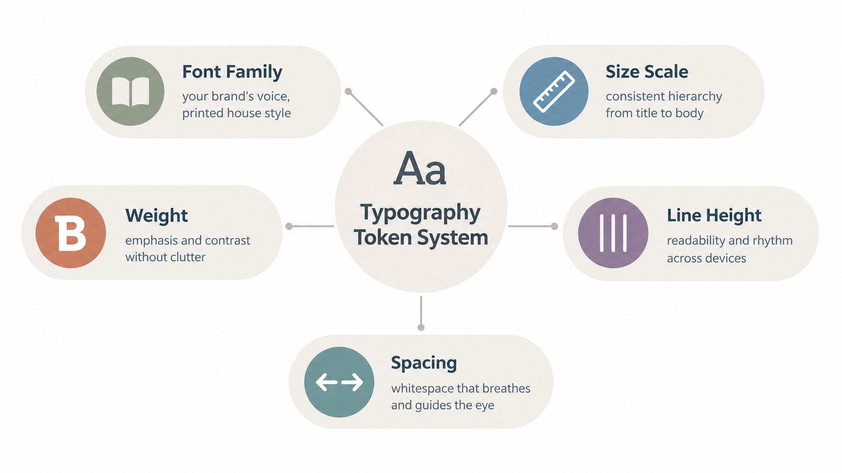
In decks, the equivalent is a theme plus master slides plus a token set. The token set should name the role, not just the style, so people choose heading-lg, body-md, or caption-sm instead of improvising with whatever looks close enough. That matters because brand consistency is much easier to enforce when the system is a menu, not a judgment call.
What belongs in the token set
A usable typography system covers more than font family. It needs the assigned sizes, weights, line heights, letter spacing, and the pairing between display and text faces. It also needs fallback behavior for exports, screenshots, and locked-down machines where the primary font might not be available.
The best systems keep the number of decisions low without flattening the brand. A designer can still make a deck feel sharp or formal, but only inside a controlled set of choices. That’s how you preserve voice without letting every author reinvent the rules.
Consistency survives when the system names the role first and the font second.
Once that shift happens, the work changes from art direction to governance. You’re no longer asking authors to “make it look on-brand.” You’re giving them tokens, defaults, and enforcement.
The Four Pillars of Consistent Typography
A deck usually starts to drift when typography is left to local judgment. One title gets too heavy, another subtitle sits too close to the body, and the whole presentation begins to feel assembled slide by slide. The four pillars that prevent that drift are hierarchy, scale, spacing, and alignment. In practice, they work best as governed rules inside a token system, not as a one-time style choice.
The test is simple. If a reader can scan a 30-slide deck without pausing to decode what matters, the typography is doing its job. If they have to stop and sort out the page, the system is failing even when the font looks polished.
Hierarchy and scale do different jobs
Hierarchy establishes order. Scale determines the perceived distance between levels.
A deck breaks down when title, subtitle, and body all carry the same visual weight. The eye has nowhere obvious to land, so even strong content feels flat. A clear size ladder gives each layer a distinct job, which is why the system needs tokens that define those relationships before anyone starts restyling slides by hand.
Spacing and alignment carry the system
Spacing does more than make text look tidy. Line spacing that moves from 100% to 120% can improve reading accuracy by up to 20% and reduce eye strain by 30% (typography guide). Long-form copy also needs enough leading and a controlled line length, with 45–75 characters per line as the widely cited comfortable range and 66 characters as the classic benchmark for long text—WCAG treats 80 characters as the accessibility ceiling.
Alignment is the quiet control layer. A caption that slips off-grid or a title that starts one margin in and ends somewhere else makes the deck feel improvised. I see this most often after a fast chart paste or a screenshot crop, when the restyle should be bulk-applied but instead gets patched one slide at a time.
Consistency survives when these four pillars are governed together. Tokens set the baseline, themes apply it, and bulk restyling keeps authors from rebuilding the same decisions on every deck.
Building a Type Scale You Can Reuse Everywhere
A reusable type scale works best when it has a base size, predictable steps, and a small number of approved levels. In practice, I’ve had the most success when the deck system maps cleanly across slides, emails, and PDFs instead of treating each format as a separate typographic universe. The goal is to make typography travel without mutating.
| Level | Size | Weight | Line Height | Use |
|---|---|---|---|---|
| H1 | 40pt | Bold | 1.1 | Cover slides and major section openers |
| H2 | 32pt | Semibold | 1.15 | Slide titles and strong section labels |
| H3 | 24pt | Semibold | 1.2 | Subheads and callouts |
| Body | 16pt | Regular | 1.5 | Main paragraph text |
| Caption | 12pt | Regular | 1.4 | Notes, labels, and annotations |
A clean scale reduces decision fatigue because the author doesn’t need to negotiate every slide from scratch. The system already knows what a title is, what body copy is, and what deserves a caption treatment. That’s a better use of design time than debating whether a quote slide should be “a little stronger” than the last one.
Pair the scale with a font strategy
Two-font systems usually hold up well in decks, one humanist sans for body text and one geometric or slab face for headlines. The body face carries readability. The display face carries character. That split lets the system feel branded without turning every slide into a showcase for type novelty.
Use a fallback stack for environments where the primary face is missing. If a deck opens on a locked-down machine or gets exported into another format, the fallback should preserve proportions and weight contrast rather than collapsing into a generic default. That’s especially important when the deck has already been restyled across many templates and no one wants a surprise substitution on delivery day.
For a practical setup workflow, I’d start with a presentation template and then bulk-apply the scale across legacy material, rather than rebuilding slide by slide. The structure behind that approach is outlined in this presentation template workflow, which is useful when you need the system to survive reuse instead of just looking polished once.
Why Consistency Converts Better Than Creativity
Creativity still matters, but only after the deck has earned trust. A consistent type system makes the message easier to absorb, and that lowers the friction between interest and action. Buyers don’t reward decorative risk when they’re scanning a proposal, a renewal packet, or a nurture deck. They reward clarity.
The strongest benefit is cognitive. When hierarchy stays stable, decision-makers spend less energy decoding the layout and more energy evaluating the claim. That matters in sales collateral because professionalism is often judged before the argument is fully read. A clean deck signals operational discipline, which is a credibility signal in itself.
Consistency keeps the story moving
Every time a slide breaks the pattern, the reader slows down. That slowdown isn’t always conscious, but it still costs attention. If the deck keeps teaching the eye a new rule, the message loses momentum.
A consistent system helps the whole funnel because marketing and sales assets stop feeling like different brands. Nurture content, renewal decks, and account proposals should look like they came from the same governance model. When they don’t, the buyer has to reorient on every touchpoint.
Practical rule: consistency should reduce interpretation effort, not just improve appearance. If a reviewer has to ask what changed, the system is doing too much behind the scenes and too little on the slide.
I’ve watched this difference show up most clearly when teams compare a polished but rigid deck against one that’s visually varied but semantically messy. The first may feel restrained. The second feels like a risk.
Enforcing It Across Decks With Themes and Bulk Restyling
A deck usually loses consistency the moment someone copies in an old slide and edits around the edges. Theme enforcement stops that drift at the source. Master themes lock the font families, spacing, and color pairings, so every new slide inherits the same rules. A PDF style spec can describe the system, but it cannot prevent a rogue slide from entering a live proposal.
Bulk restyling handles the other half of the problem. Instead of touching every slide one by one, you can update a legacy deck in a single pass. If your team is moving presentations between tools, a workflow like PowerPoint to Google Slides conversion can surface the places where typography rules break before the deck spreads further. Encelade supports one-prompt bulk restyling that updates color, typography, and layout across an entire deck, which matters when teams inherit dozens of files and cannot afford manual cleanup.
What the governance layer should control
Restrict fonts to approved families only. Lock the master slides so authors cannot rewrite the template while moving a chart or changing a title. Add approval gates for any new theme token, because centralized updates only work if the source of truth stays enforced.
A practical setup usually has three parts. Theme files hold the base rules, role-based permissions decide who can edit them, and a review step handles content that needs custom treatment. That keeps the system flexible enough for real selling, while limiting the one-off rebuilds that creep in when every deck becomes a special case.
When I have had to rescue old decks, the fastest path has been to map the existing content into the new token set, then bulk-apply the rules in one pass. Manual cleanup sounds precise, but it often creates fresh inconsistencies while fixing the old ones. Bulk restyling gives you one controlled edit instead of fifty quiet deviations.
The Pre-Send Audit Checklist
A final typography pass should feel mechanical, not subjective. If a reviewer can’t explain what’s wrong in under three minutes, the checklist isn’t tight enough. The point is to replace vague “feels off” feedback with specific, visible checks that catch drift before it ships.
| Audit Point | Consistent Slide | Drifted Slide |
|---|---|---|
| Font family usage | Only approved tokens appear | A stray legacy font shows up in one text box |
| Heading hierarchy | Three or fewer distinct levels on the slide | Too many title styles compete for attention |
| Line length and spacing | Body copy stays within the chosen measure and leading | A text block feels cramped or overextended |
| Color contrast | Body text stays readable against the background | A label fades into the slide background |
| Capitalization | Label families use one pattern consistently | Mixed case appears in the same component set |
| Orphans and widows | Line breaks land cleanly at the edge | One awkward word hangs alone |
| Image-text collisions | Captions keep comfortable spacing from visuals | Text crowds charts or photos |
| Theme inheritance | The slide reads from the master | Ad-hoc overrides replace the template rules |
What to check before you send
- Font family usage: confirm only approved tokens appear, including charts, captions, and pasted notes.
- Heading hierarchy: keep the slide to three or fewer distinct levels, or the page starts to feel improvised.
- Line length and spacing: watch for cramped blocks and overlong lines that strain the eye.
- Contrast and collisions: verify body text stays readable and captions don’t press against images.
These checks are fast because they’re visual. You don’t need a brand council meeting to spot a rogue font or a slide that ignores the master. You just need a disciplined pass and a clear definition of what belongs.
Where Most Consistency Advice Falls Short
Standard typography advice tends to stop at font selection, which leaves teams without the governance layer needed at scale. Accessibility, cross-cultural rendering, and platform differences can still break a polished system without warning. Section 508 guidance emphasizes legibility, font size, contrast, and design choices for users with visual impairments or dyslexia, and it calls for text that reflows without horizontal scrolling rather than assuming type will behave the same across every screen and magnification level (Section 508 fonts and typography guidance).
Typography also does not land the same way in every market. Monotype’s research with Neurons, based on 1,957 participants, found that font perception depends on geography and context, which means a system that feels consistent in one region can still read differently in another (Monotype research summary). That does not make consistency impossible. It means governance has to include fallbacks and, in some cases, deliberate regional variation.
The failure is often silent on live decks. A font uploaded into a theme may be missing on a co-author’s laptop, or a third neutral face may be needed for code samples, legal notes, or pull quotes. Good systems account for those exceptions instead of pretending every slide should obey one rigid rule forever. The strongest deck systems behave like governed tokens, not frozen style-guide PDFs nobody opens.
For teams comparing tools, the core question is whether the software supports theme inheritance, bulk restyling, and controlled overrides. That’s why a practical top slideshow software review matters: the enforcement layer decides whether typography consistency survives real editing, or falls apart the first time someone pastes in a legacy slide.